Get Indexology® Blog updates via email.

In This List

Don't Put All Your Eggs In One Basket

A Glance at the Liquidity of the Sukuk Market

Defining a fast growing investment trend: ‘Smart Beta’

An Immediate Risk Measure

Index of Leading Indicators Kicks-Off the Week

Don't Put All Your Eggs In One Basket

Contributor Image
Jodie Gunzberg

Former Managing Director, Head of U.S. Equities

S&P Dow Jones Indices

It’s a little late for an Easter post but this saying is about one of the key investment principles, diversification.  Simply put, diversification happens when assets inside your portfolio move in opposite directions. The investment measure of diversification is correlation and it can range from -1.0 to +1.0. If correlation is -1.0 between two assets, then they have moved exactly opposite each other; conversely, if the correlation is +1.0, then they move exactly together.  Correlation of -1.0 is the holy grail of diversification to produce a more efficient portfolio – meaning for the same return, there is less risk, or for the same risk, there is higher return.

Commodities, which by definition of being the natural resources that are used to build society, are meaningfully different than financial assets like stocks and bonds. While they have been around since the beginning of time, most investors did not consider them a portfolio asset until about 10 years ago. They grew wildly popular with the institutional crowd as the major benchmark passed its 10-year track record, and with the advancement of ETFs, became popular (at least gold and oil) with retail investors.  At least for the institutions, the main reason for the attractiveness of the asset class was diversification.

Unfortunately for many, the diversification investors hoped for from their allocations to commodities fell flat as the correlation between commodities and commodities to other asset classes rose to almost 0.8 post the financial crisis.

There are two main reasons this happened:

1. The inventories were built up starting in the late 90’s to very high levels by 2005. Then the financial crisis hit, demand dropped and supply shocks (like the weather, war or pipeline bursts) lost their impact. This source of return from supply shocks or surprises, called expectational variance, that drives return patterns of commodities to be different from each other (gas to corn to gold) and to be different than other asset classes like stocks and bonds disappeared in the sea of excess inventory after the crisis.

2. The unprecedented quantitative easing caused a risk-on/risk-off environment where either the stimulus worked or didn’t work. If a commodity investor did not feel the insurance risk premium was high enough to supply to the producer, no investment was made. Without the supply of insurance, the incentive for producers diminished and the volatility of prices increased. This proved too much risk for the investors to bear that drove the game of risk transfer back to the producers. Now, not only is backwardation back from the diminished inventories, but the result of that in conjunction with the tapering of quantitative easing, is that diversification is back.

precrisis correlations 
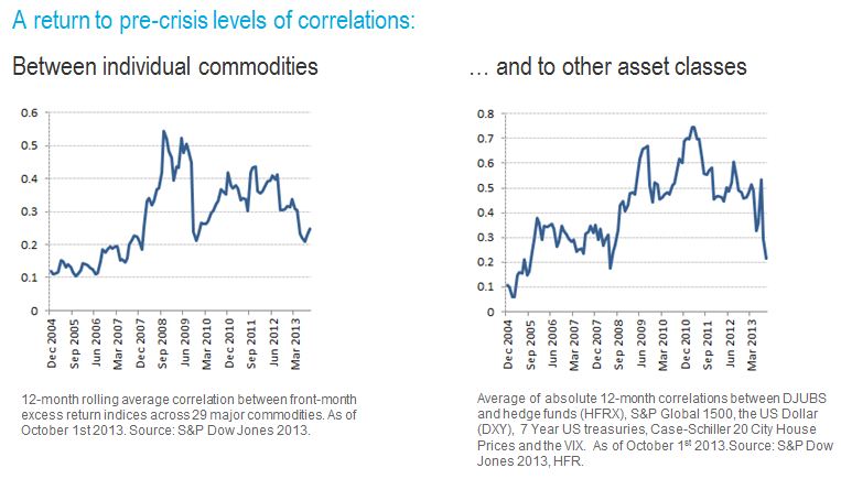
Notice in the charts above that both correlation of commodities to each other and to other asset classes has fallen to precrisis levels of about 0.2, indicating little movement together with stocks and bonds and little movement together with each other.  This makes commodities, once again, an asset class to provide diversification, and institutional investors are taking notice.

Last, the key question is… Will this diversification continue?

Based on the correlation patterns of the S&P 500 to the S&P GSCI, there is a compelling case this will continue.

Source: S&P Dow Jones Indices and/or its affiliates. Data from April 25, 2005 to April 24, 2014. Past performance is not an indication of future results. This chart reflects hypothetical historical performance. Please see the Performance Disclosure at the end of this document for more information regarding the inherent limitations associated with backtested performance.

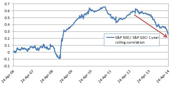
The 12 month correlation between the S&P 500 and S&P GSCI at 0.26 is lower than at any point since November 2008 and heading down fast. Shorter term measures such as the 90 day and 30 day correlation are even lower at 0.17 and 0.01, suggesting that as correlation “catches up” with the history, it will head down further. 

Special thanks to my colleague, Timothy Edwards, who helped with this.

The posts on this blog are opinions, not advice. Please read our Disclaimers.

A Glance at the Liquidity of the Sukuk Market

Contributor Image
Michele Leung

Former Director, Fixed Income Indices

S&P Dow Jones Indices

Despite the challenging global environment and the shrinkage in sukuk issuance in 2013, the liquidity of the sukuk market, as tracked by the Dow Jones Sukuk Index, showed a slight improvement in the same period.

The Dow Jones Sukuk Index is designed as an independent benchmark to measure the performance of the U.S.-dollar-denominated, investment-grade sukuk issues in the global market.  Demonstrated in Exhibit 1, while the total trading volume was relatively stable in 2012, there was a trend of decreasing in volume observed in 2013, which was in-line with tighter liquidity conditions seen in global market. Also, the average monthly trading volume rose to USD 43 million, par amount in 2013, which represented a 5.69% increase over the previous year.

Total Trading Volume of the Dow Jones Sukuk Index Constituents

Further studies found evidence that that new sukuk are substantially more liquid than vintage sukuk and have dominated the total market volume.  In addition, the most-liquid sukuk tend to have a larger outstanding par amount, which the USD 1 billion outstanding par amount seems to be a threshold for better liquidity.

For more details, please read our Practice Essentials®, “Sukuk Liquidity Trends.”

The posts on this blog are opinions, not advice. Please read our Disclaimers.

Defining a fast growing investment trend: ‘Smart Beta’

Contributor Image
Aniket Ullal

Founder

First Bridge Data

If finance were high fashion, ‘smart beta ETFs’ would be the showcase of this year’s Spring collection. They are receiving a lot of press attention and surveys of institutional investors show that they plan to increase their adoption of smart beta ETFs. In this article, we answer the question: What specifically are smart beta ETFs and what assets have they gathered to date? Looking beyond the label is very important to both retail and institutional investors.

To do this, we first need to define ‘traditional’ beta ETFs. In its purest form, an ETF providing ‘traditional beta’ exposure is one that tracks a market capitalization weighted broad market index.  So if this is traditional ‘beta’, then what is a ‘smart beta’ ETF?

A theoretician may define it as an ETF providing index-based exposure to any investment risk factor other than broad market risk. By this narrow yardstick, even an ETF that tracks the S&P Small Cap 600 could be considered ‘smart beta’ since it provides targeted exposure to the ‘size’ risk factor. Taking this definition very literally, even an ETF that tracks the S&P 500 wouldn’t be ‘pure’ beta exposure, since the S&P 500 screens stocks for profitability prior to inclusion.

We are more interested in the practitioner’s definition of ‘smart beta’. Here is a working definition of a smart beta ETF:

An ETF that tracks a rules based index providing exposure to a specific investment risk factor other than market cap weighted size, style (growth/value) or industry sectors.

We can break down this definition into its key components:

Index based: This eliminates ‘active’ ETFs i.e. those that don’t track an index. Essentially ‘smart beta’ ETFs are ‘index-izing’ what may earlier have been marketed as an active strategy. As I argued 2 years ago on Seeking Alpha, this represents a blurring of the distinction between traditional ‘passive’ and ‘active’ investing.

Specific risk factor: These ETFs should give you access to a targeted, definable risk factor or strategy such as low volatility, momentum etc. We exclude quantitative strategy ETFs even if they are index based, if the targeted risk factor or strategy is not tightly defined.

Excluding cap weighted size, style and sectors: This is clearly a judgment call, but a useful and important one. The practice of index based investing in market cap weighted size (e.g. small cap), style (e.g. value) and industry sectors has been well established for several years. Through the term ‘smart beta’ we are trying to identify those strategies that investors did not have access to via low cost, index-based products till recently. We also exclude inverse & leveraged ETFs.

The table below shows the assets for US listed ETFs that provide domestic US equity exposure. It shows the breakdown of assets into ‘traditional beta’, ‘smart beta’ and ‘other’ categories based on our definition above. The ETF Data (ETF classifications and assets) is from the First Bridge ETF database.

Aniket

As we can see, ‘smart beta’ currently accounts for a sizable $75B in assets (or almost 9% of assets for US listed ETFs that provide domestic equity exposure). Given the interest in this space, we can expect this percentage to grow. At some point this has to hit a natural limit, since by definition, market participants in aggregate need to hold the market portfolio. However since ETFs as a category are still a minority of assets relative to mutual funds and individual security holdings, theoretically there is still adequate headroom for growth.

While ‘smart beta’ is a snappy marketing phrase, it could misleadingly imply that investing in these ETFs is ‘smarter’ than investing in traditional market cap weighted broad market ETFs. In reality, different risk factors will perform differently across market cycles.  For example:

  • Volatility vs. High Beta: The S&P High Beta Index has performed extremely well in the trailing 5 years (28% annualized total return through 3/17/14) vs. 19.5% for the S&P Low Volatility Index.  This is to be expected since we are 5 years from the trough in March 2009, and the S&P 500 has had an annualized total return of 21.6% since that time. Going forward however, the current crisis in Ukraine, the slowdown in China and the relatively high equity valuations in the US could weigh on the market, and a rotation back into Low Volatility is likely.
  • Equal Weighted vs. Market Cap Weighted: In the same trailing 5 years, the S&P equal weight index has significantly outperformed the S&P 500 (27% annualized TR vs. 21.6%). This is because equal weight ETFs are essentially providing a tilt towards relatively lower cap stocks, and mid-cap and small cap stocks have significantly outperformed large caps in this period. Once we move into a market environment where investors are more risk averse, we can expect this performance differential to reduce. In the case of equal weighting however (unlike with low volatility), its advocates will argue that its superior performance may persist relative to traditional cap weighting due to the ‘size premium’.

In conclusion, we estimate the size of the smart beta ETF space for domestic US equity exposure is already about $75B or 9% of the total ETF assets for domestic US equity. However ‘smart beta’ does not imply that these products will always outperform traditional market cap weighted products. Once we move into a more volatile environment, investors will rotate from high beta into low volatility ETFs and the performance differential between equal and cap weighted ETFs will reduce.

The posts on this blog are opinions, not advice. Please read our Disclaimers.

An Immediate Risk Measure

Contributor Image
Tim Edwards

Managing Director, Index Investment Strategy

S&P Dow Jones Indices

Volatility and correlation are history.

In fact this is a consequence of their definitions.  The calculation of volatility and correlation – the preeminent measures of risk – requires multiple observations.  Quite a few periods are needed if the resulting estimates are to be relied upon as robust.   Because of this, volatility and correlation are not particularly quick to capture new and changing market dynamics[1].

Shorter term measures can help.  For any market – the S&P 500® for example – at any given moment in time the price of each stock (or the level of the index) provides an immediate indication of market outlook.  Looking over a single period tells us, at the most basic level, if and by how much the market was up or down.  But within a single period there is more information — such as the percentage of winners and losers, or how different the performances were among individual stocks. This last measure we call dispersion, and because dispersion is a single period measure, we can use it to capture changes in market dynamics more immediately.

Periods2

Dispersion is a useful concept considered in isolation, but the question of how it is connected to the multi-period measures arises naturally.  Our most recent research describes the conceptual link between dispersion, market volatility and correlation.

Just as “How much did the market move today?” provides an indication for future measures of volatility that include today’s returns, one can use dispersion to provide intelligence about how volatility and correlation will evolve, as “history” catches up with new dynamics. The relationship is more subtle and occasionally technical.  But three practical conclusions emerge:

  1. Dispersion is driven by the difference between the volatility of an index and the average volatility of the index’s components. Otherwise said, it measures the “diversification benefit”.
  2. It’s not too much to say that volatility, dispersion, and correlation are like three legs of a right triangle – if you know two, you can figure out the other. This relationship can be particularly useful in using volatility and dispersion to estimate the average correlation among an index’s components. 
  3. We’re recently been in a period of relatively low dispersion and relatively low volatility.  If market volatility is to increase, either correlations or individual stock risk (i.e. dispersion) must rise.


[1] A 60-day rolling calculation of market volatility is only 1/60th influenced by the most recent day. Part of the widespread popularity of the VIX as a measure of market sentiment is due in no small part to its more forward-looking nature.

The posts on this blog are opinions, not advice. Please read our Disclaimers.

Index of Leading Indicators Kicks-Off the Week

Contributor Image
Kevin Horan

Former Director, Fixed Income Indices

S&P Dow Jones Indices

The yield on the 10-year Treasury as measured by the S&P/BGCantor Current 10 Year U.S. Treasury Index suddenly moved higher to 2.78% from the previous day’s 2.64%.  Thursday’s upward movement before the Good Friday Holiday was a result of negotiations over the Ukraine crisis possibly resulting in an accord to defuse the conflict.

Yields in the U.S. have remained lower as political tensions in Ukraine have kept Treasuries as the safety trade.  In addition to global political issues, domestic indicators that measure the U.S. labor market have not shown a consistent amount of improvement.

This week’s economic calendar started with the Chicago Fed Activity Index coming as expected at a 0.2 and the U.S. Leading Index stronger than the expected 0.7% and the previous 0.5%, at a 0.8% for March.  The week is full of reporting’s that will affect the bond markets and their indices.  Tuesday kicks off the housing numbers with the FHFA House Price Index (0.5% expected), Existing Home Sales for March (4.55m expected) and the Richmond Fed Manufacturing Index (2 expected).  Wednesday continues the housing and manufacturing theme as MBA Mortgage Applications, New Home Sales (450k) and the Markit US Manufacturing PMI (56 expected) are due.  Later in the week Durable Goods Orders (2% expected), Initial Jobless Claims (313K expected), and the University of Michigan Confidence Survey (83 expected) close out the week.


The S&P U.S. Issued Investment Grade Corporate Bond Index is returning 0.6% month-to-date which is a much better start than all of March’s return of 0.04%.  Thursday’s jump in Treasury yields was evident in corporates as well with the index giving up 0.37% in one day.  Year-to-date the index has returned 3.52%.

The S&P U.S. Issued High Yield Corporate Bond Index is slightly behind the investment grades returning 0.3% for the month and 3.27% year-to-date.  The spread to Treasuries of the high yield bonds is only slightly wider than from the beginning of the month.  Presently the BB and single B indices are only slightly wider on the month while the S&P U.S. Issued CCC & Lower High Yield Corporate Bond Index is 29 basis points wider.


One of the big headlines last week was TIAA-CREF’s $6.25 billion acquisition of Nuveen Investments.  The single B rated term loan B-structure issued by Nuveen Investments Inc., holds a 1.15% weight in the S&P/LSTA U.S. Leveraged Loan 100 Index which returned 0.02% last week.  Month-to-date this index is down-0.01% while returning only 1% year-to-date.


Source: S&P Dow Jones Indices, Data as of 4/17/2014, Leveraged Loan data as of 4/20/2014.

The posts on this blog are opinions, not advice. Please read our Disclaimers.