Get Indexology® Blog updates via email.

In This List

COCOA Is The New Valentine

Obfuscation is Good, or How to Destroy an Economic Indicator

Keep those flowers short on Valentine's day

Good News About the Federal Deficit

WARNING: Hot Coffee May Burn

COCOA Is The New Valentine

Contributor Image
Jodie Gunzberg

Former Managing Director, Head of U.S. Equities

S&P Dow Jones Indices

Perception might be that lovers everywhere have always enjoyed the confection of affection, chocolate. However, it has taken some time for many Asian countries to adopt the taste, but it seems now they have fallen in love.  The Singapore-based Cocoa Association of Asia said that in the fourth quarter of 2013 demand rose 10% from Asia including Malaysia, Singapore and Indonesia. Further, for Valentine’s Day in India, gold jewelry demand has dropped between 5-10% while confectioners estimate chocolate demand is up about 20%.

Maybe Ghana got it right, when in 2007, the Ghana Tourism Authority and the Ministry of Tourism re-branded Valentine’s Day, which falls on February 14, as National Chocolate Day. As you can see in the chart below, the S&P GSCI Cocoa gained 83.4% since Feb 2007.

Source: S&P Dow Jones Indices and/or its affiliates. Data from Jan 1998 to Feb 2014. Past performance is not an indication of future results. This chart reflects hypothetical historical performance. Please see the Performance Disclosure at the end of this document for more information regarding the inherent limitations associated with backtested performance.

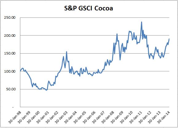
The growing demand has driven cocoa to be one of the best performing commodities in the S&P GSCI in 2014, despite abundant arrivals from West Africa. The S&P GSCI Cocoa has gained 8.4% YTD, only behind coffee and natural gas in the index.

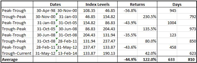
Notice in the analysis below that it is possible cocoa could reach a new all-time high. The current gain from the bottom in May 2012 is 42.0% and has occurred over 623 days, which is 169 days short of the shortest historical gain in the table. It is also between 6-7 months shorter than the average historical gain. Also notice the average gain has been 122% or 80% more than the current gain. If the S&P GSCI Cocoa only gained in this bull run as much as the smallest trough to peak gain, it would still add another 38.0%, but if the gain were as big as the biggest gain in the 2000-2003 period, it has another 188.4% to go. However, if we look at the high that occurred in Feb 2011, it is only 24.9% greater than today’s level, which means it wouldn’t be surprising to see cocoa break a record high, especially given the supportive fundamentals.  

Source: S&P Dow Jones Indices and/or its affiliates. Data from Jan 1998 to Feb 2014. Past performance is not an indication of future results. This chart reflects hypothetical historical performance. Please see the Performance Disclosure at the end of this document for more information regarding the inherent limitations associated with backtested performance.


The posts on this blog are opinions, not advice. Please read our Disclaimers.

Obfuscation is Good, or How to Destroy an Economic Indicator

Contributor Image
David Blitzer

Former Managing Director and Chairman of the Index Committee

S&P Dow Jones Indices

In her testimony to the House Financial Services Committee on Tuesday, Fed Chairwoman Janet Yellen commented that with interest rates near zero the Fed must rely on such less traditional tools of monetary policy as forward guidance and asset purchases. Asset purchases are being phased out as tapering slowly ends quantitative easing. That leaves the Fed with forward guidance: telling the market and the world what it will do when a chosen economic indicator hits a particular number.  In December 2012, the Fed offered forward guidance when it said that the Fed funds rate would remain between zero and 25 basis points until the unemployment rate dropped below 6.5%, as long as inflation was projected to remain below 2.5% and long term inflation expectations remain well anchored.

Inflation is one percent and long term inflation expectations are well anchored in low numbers.  Now that the unemployment rate is 6.6% and trending down, the Fed is revising its forward guidance. Chairwoman Yellen, in the same testimony, noted that the FOMC said in December and January that its current expectation “is that it likely will be appropriate to maintain the current target range [0 to 25 bp]for the federal funds rate well past the time the unemployment rate declines below 6.5%.”  Meanwhile, analysts are  debating the accuracy and utility of the unemployment rate. These developments leave us with less trust in the monthly employment numbers and less comfort about what the central bank might do next.

For the Fed, the answer may be to be vague.  We should stop kidding ourselves that the Fed, or anyone else, can confidently and competently forecast the reaction of the unemployment rate to monetary policy, economic shifts and politics a year or more in advance.  For most of the history of the Fed, markets accepted that the Fed couldn’t offer precise schedules for future policy adjustments. Forecasting has improved, but not enough.  A comment attributed to John Maynard Keynes, “When the data change, I change my mind; what do you do?” summarizes the difficulties with forward guidance.

Given cold and snowy weather in large parts of the nation, the weather is a favorite reason to not believe the employment numbers.  Other arguments focus on why a person should be looking for a job as well as out of work to be counted as unemployed; if we counted full time students and retirees as unemployed, the number would be larger and meaningless.  Behind all these explanations there is a Murphy’s Law of economic indicators, and the unemployment rate may be the current corollary.   When the market focuses on a particular number as the key to understanding the future, that number loses reliability.   Past efforts at gauging monetary policy tried various definitions of money and each was abandoned as it lost meaning.

Whether we like it or not, the economy, the future and especially the future of the economy is uncertain.  A little obfuscation in pronouncements about future policy might acknowledge the uncertainty.

The posts on this blog are opinions, not advice. Please read our Disclaimers.

Keep those flowers short on Valentine's day

Contributor Image
Howard Silverblatt

Senior Index Analyst, Product Management

S&P Dow Jones Indices

Historically (from 1928), as defined by the S&P 500, 52.1% of the trading days are up (average +0.745%) and 46.2% are down (average -0.789%).  For Valentine’s day there is a thorn. On February 14th the market has been up only 40.0% of the time and down 56.9% of the time (it was flat in 1944 and 1935; it was down for the Saint Valentine’s Day massacre in 1929).  The DJIA 30 was up 43.1% of the time (for the same time period), and down 56.9% of the time.

Oh well, the market is still our sweetheart, even if the returns are shorts.

Source: S&P Dow Jones Indices

———————————–

Please note that the statistical data is based on publicly available information, most of which is available in S&P products such as Capital IQ, Compustat Research Insight and S&P Index Alert.  Analysis and projections are my own, and may differ from others within S&P/McGraw Hill.  Nothing presented is intended to, or should be interpreted as, a buy/sell/hold recommendation.
My notes vary in topics, but are market related. The intent is to quickly inform. The assumption is that you don’t need a basic education, editorial or sales pitch, just specific facts and maybe some observations. If the information does not suit your needs, please e-mail me and I will take you off the list. Unless otherwise noted all data is for public dissemination, and may not be used for commercial purposes.  Finally, any incoming correspondence from you will be considered confidential unless you specify otherwise.
DISCLAIMER
The analyses and projections discussed within are impersonal and are not tailored to the needs of any person, entity or group of persons.  Nothing presented herein is intended to, or should be interpreted as investment advice or as a recommendation by Standard & Poor’s or its affiliates to buy, sell, or hold any security.  This document does not constitute an offer of services in jurisdictions where Standard & Poor’s or its affiliates do not have the necessary licenses. Closing prices for S&P US benchmark indices are calculated by S&P Dow Jones Indices based on the closing price of the individual constituents of the Index as set by their primary exchange (i.e., NYSE, NASDAQ, NYSE AMEX).  Closing prices are received by S&P Dow Jones Indices from one of its vendors and verified by comparing them with prices from an alternative vendor. The vendors receive the closing price from the primary exchanges.  Real-time intraday prices are calculated similarly without a second verification.   It is not possible to invest directly in an index.  Exposure to an asset class is available through investable instruments based on an index.  Standard & Poor’s and its affiliates do not sponsor, endorse, sell or promote any investment fund or other vehicle that is offered by third parties and that seeks to provide an investment return based on the returns of any S&P Index.  There is no assurance that investment products based on the index will accurately track index performance or provide positive investment returns.  Neither S&P, any of its affiliates, or Howard Silverblatt guarantee the accuracy, completeness, timeliness or availability of any of the content provided herein, and none of these parties are responsible for any errors or omissions, regardless of the cause, for the results obtained from the use of the content.  All content is provided on an “as is” basis, and all parties disclaim any express or implied warranties associated with this information.  The notes and topics discussed herein are intended to quickly inform and are only provided upon request.  If you no longer wish to receive this information or if you feel that the information does not suit your needs, please send an email to Howard.silverblatt@spdji.com  and you will be removed from the distribution list.  A decision to invest in any such investment fund or other vehicle should not be made in reliance on any of the statements set forth in this document.  Standard & Poor’s receives compensation in connection with licensing its indices to third parties.  Any returns or performance provided within are for illustrative purposes only and do not demonstrate actual performance.  Past performance is not a guarantee of future investment results.  STANDARD & POOR’S, S&P, and S&P Dow Jones Indices are registered trademarks of Standard & Poor’s Financial Services LLC.


The posts on this blog are opinions, not advice. Please read our Disclaimers.

Good News About the Federal Deficit

Contributor Image
David Blitzer

Former Managing Director and Chairman of the Index Committee

S&P Dow Jones Indices

The Congressional Budget Office (CBO), the government’s bi-partisan budget researchers released its latest report and projections for the federal budget deficit.  The deficit is back to the average percentage of GDP experienced since 1974.  The bulge in spending and the drought of revenues caused by the financial crisis is behind us.  The chart shows that the current gap is back to its average.

Source: US Congressional Budget Office, February 4, 2014.

Fiscal policy – using taxes and spending adjustments to help guide the economy — has been pretty much off limits in recent years because the financial crisis pushed the federal deficit to almost 10% of GDP in 2009.  That was the highest level since the second world war when, with a largely controlled economy, the deficit was close to 27% of GDP in 1943. This doesn’t mean that we can spend like it was 2008 again.  In fact the CBO analysis points to a rise in the deficit as a percentage of GDP in another couple of years.  The “culprits” are an aging population, social security and health care spending.

There was other encouraging news about the deficit: the House of Representatives agreed to raise the debt ceiling through March 2015 without any conditions.  This means that citizens and investors will be spared battles and grand-standing about government shutdowns for a year.  A couple of words about the debt ceiling:  First, the deficit is not the same as the debt.  The deficit is the difference between government revenues and spending – if the government spends more money that it collects with taxes and fees, there is a deficit.  It borrows money to make up the difference instead of stopping its spending (although there are some politicians who would like it to just stop spending no matter who wouldn’t get paid.) The money the government borrows is the debt.  Some time ago, Congress began to worry about the growing government debt, even though the growth of the debt was due to laws for spending and taxes passed by Congress. So they passed a law to put a cap on the debt.  Now, whenever that cap is hit by growing debt the Congress debates and then raises the cap. If the cap weren’t raised, the US government wouldn’t be able to borrow to pay its bills,

Hopefully the recent progress on the deficit may inspire Congress to focus on spending, taxation and fiscal policy instead of the debt ceiling

The posts on this blog are opinions, not advice. Please read our Disclaimers.

WARNING: Hot Coffee May Burn

Contributor Image
Jodie Gunzberg

Former Managing Director, Head of U.S. Equities

S&P Dow Jones Indices

There are too many funny coffee jokes to single one out but this one I found seriously relevant:

Coffee

Though I take my coffee black, I also take it seriously since it is one of the commodities in the S&P GSCI and DJ-UBS. Coffee has been the best performing commodity this year, up 23.9%.  As I mentioned in a prior post,  Coffee is up since the consumption of coffee in China is expected to grow by an annual rate of 9% for the next five years. This is not only from China’s large population but it’s rising middle class, which is expected to grow to 630 million people from 230 million.  Further, the International Coffee Organization reported “annual consumption should continue to grow at around 2.4% per year, and demand for coffee remains buoyant and should provide potential for further growth in the long term”.

Additionally, dry weather in Brazil has supported coffee returns this year. According to the International Coffee Organization, “The recent publication of official Brazilian production estimates for crop year 2014/15, which is due to start in April, suggests that output could fall for the second consecutive crop year, giving an initial forecast of between 46.53 and 50.15 million bags. This uncertainty over the 2014/15 crop, exacerbated by notably dry weather in some coffee-producing regions, has given support to coffee prices over the last month.”

However don’t be fooled by the seemingly supportive economics. Let’s take a look at history because it looks like the 30.1% increase since October 2013 could be a head fake.  Below is a cumulative return chart of monthly index levels since the index inception in 1981:

Source: S&P Dow Jones Indices and/or its affiliates. Data from Jan 1981 to Feb 2014. Past performance is not an indication of future results. This chart reflects hypothetical historical performance. Please see the Performance Disclosure at the end of this document for more information regarding the inherent limitations associated with backtested performance.

Historically, the major drawdowns have lasted on average about 5.5 years with a loss of 81.1%. The gains from trough to peak on average with the exception of the 2008 financial crisis period lasted 4.8 years with average gains of 387.1% that includes the gain between 2001-2011.  The last drawdown ending 10/31/2013 only lasted 2.5 years and was only down 64.8% before gaining 30.1% until now.  If the next drawdown looks like the past, it is possible to see a downward spiral for another 2.5-3 years with a loss of 58.6%.  Please see the table below:

Coffeepeaktrough

The posts on this blog are opinions, not advice. Please read our Disclaimers.