Get Indexology® Blog updates via email.

In This List

Stock Picker's Market?

No Tricks, Just Treats From The Fed This Halloween

Where's my free lunch?

You Take My “Breadth” Away

A Simple Hedge Strategy

Stock Picker's Market?

Contributor Image
Craig Lazzara

Former Managing Director, Index Investment Strategy

S&P Dow Jones Indices

This morning’s Wall Street Journal cites an adviser who opines that “the current stock market environment favors…active fund managers, who pick individual stocks in an attempt to beat broad market indices.”  This immediately raises the question of how to define a stock picker’s market, and how to determine whether today’s conditions are more auspicious for stock picking than they were, say, a year ago?

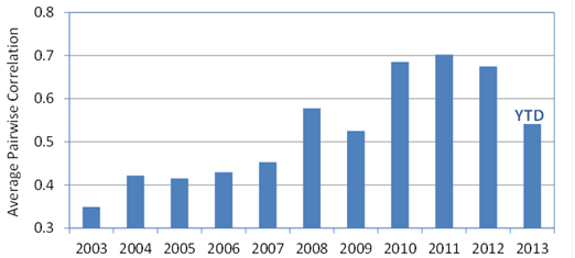
We recently introduced a metric called dispersion, one application of which is to answer precisely this sort of question.  Dispersion is a cross-sectional measure — that is, it tells us at any point in time whether the constituents of a particular index are behaving largely alike or largely differently.  Times of high dispersion represent great opportunities for stock pickers; low dispersion, not so much.  We plot dispersion for the S&P 500 Index here:

Source: S&P Dow Jones Indices. Max S&P 500 = 1630.74. Data from Dec. 1996 to Sept. 2013. Graphs are provided for illustrative purposes.

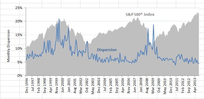
As the graph shows, the S&P 500’s dispersion is very near the low end of its historical range — in other words, the variation in performance among the 500 members of the index is much lower than it has typically been.  If variation in performance is low, it means that the benefit of picking the “best” stocks versus the “worst” stocks is correspondingly low.

None of this means that stock selection is more or less difficult than it usually is.  What it does mean is that the rewards to successful stock picking are likely to be small by historical standards.  We are by no means in a stock picker’s market.

The posts on this blog are opinions, not advice. Please read our Disclaimers.

No Tricks, Just Treats From The Fed This Halloween

Contributor Image
Kevin Horan

Former Director, Fixed Income Indices

S&P Dow Jones Indices

It recently struck me that the announcement day for the Federal Reserve’s policy meeting would coincide with what is known locally as “Mischief Night”. Mischief Night is the night before Halloween when kids play trick on neighbors by hanging toilet paper in the trees or soaping car windows. If anyone was positioned to play a dirty trick it was the Fed, whose announcement, if it wasn’t a consistent message, could have put a scare into the markets greater than any Halloween costume.

True to form the Fed stuck to its message and reaffirmed that its stimulus purchases of Treasuries and mortgage-backed securities would continue. It was a smart move, as investors have been concerned with the party politics that lead to the U.S. debt ceiling impasse, and how the issue has been kicked further down the road into 2014. The speed of the economic recovery has not yet reached a pace which would give investors much confidence that the possibility of a backwards slide has passed. The yield-to-worst (YTW) on the S&P/BGCantor Current 10 Year U.S. Treasury Index is 8 basis points tighter on the month at 2.53%. This yield was as low as 1.63% at the beginning of May, increasing to a high of 2.99% before the FOMC’s September meeting when the markets thought the Fed might begin tapering its asset purchases. The steady Fed message of continued stimulus has helped to settle rates back down.

In mid-November, newly nominated Chairwoman Janet Yellen will appear before the Banking Committee for her confirmation hearing, which could add some insight into how she plans to manage the stimulus program. For now, the markets are looking past the December Fed policy meeting for any changes, and have pushed their expectations to March or beyond for the start of any possible tapering.

One point of note is in the U.S. TIPS market. Month-to-date the S&P U.S. TIPS Index is up 1.11%, as the U.S. Treasury auctioned off $7 billion of 30-year notes last week. The auction was 2.76 times bid with an increase to 19.1% in the number of direct bidders which includes domestic money managers. Though inflation remains low, the thinking is that the longer the Fed continues its stimulus, the greater the chances are that inflation will eventually begin to rise.

Away from the Treasury market, municipal bonds look to be cheap as a result of  news about Puerto Rico and arbitration results for States that have issued tobacco settlement bonds. The S&P National AMT-Free Municipal Bond Index, with a duration of 5.3 years, is yielding 2.93% (YTW). In comparison with the S&P U.S. Issued Investment Grade Corporate Bond Index, it is yielding 2.97% (YTW), but with a longer modified duration of 6.38 years and more assumed credit risk. Both the S&P Municipal Bond Puerto Rico Index and the S&P Municipal Bond Tobacco Index have returns that are positive for the month. The indices are returning 1.67% and 0.45% respectively, though the year-to-date returns are still deeply in the red at -15.03% and -7.61%.


Source: S&P Dow Jones Indices as of Oct. 31, 2013. Past performance is not a guarantee of future results.


The posts on this blog are opinions, not advice. Please read our Disclaimers.

Where's my free lunch?

Contributor Image
Tim Edwards

Managing Director, Index Investment Strategy

S&P Dow Jones Indices

Ever since Harry Markowitz published his June 1953 paper on portfolio selection, investors both institutional and retail have subscribed to the theory that diversification – and its use in combination with mean-variance optimized allocations – universally widens and almost always improves the possibilities of risk and return.

At its core, the theory states that an investor should consider including assets with a) positive return expectations and b) low correlations to existing investments.  Faithfull acolytes of Markowitz as many of us have now become, the years subsequent to the financial crisis have challenged if not the theory, then at least the practice of expecting diversification to provide a “free lunch”: macro-economics dominated performance as condition b) above remained persistently obstinate in its absence.

Average strength of multi-asset correlations, based on 12-months returns*.

Multi-asset Corr

Sources: S&P Dow Jones, Barclays, JP Morgan, HFRI. Charts and graphs are provided for illustrative purposes. Past performance is no guarantee of future results.

And in due course, the great minds of investment and allocation have bent their efforts into ever-more esoteric assets.

But it’s not just about correlation, which measures the strength of linear relationships. It’s also about differing market betas, and about conditional relationships between financial assets. It’s about how disperse the returns are, this month and next. In an environment of high dispersion, not only does it matter more which allocations you make, it also – at least in theory – implies a greater benefit from diversification. If you’re wondering whether it’s worth expanding your investment footprint beyond a core set of exposures, or even how much difference your decisions really make, that’s a particularly useful concept to keep in mind.

We recently offered some thoughts to define, examine and to some extent publicize dispersion. Not only because we think it’s an under-celebrated and remarkably useful measure of market opportunity, but also because it has much to say about the current diversification of existing portfolios (like the S&P 500®) and – in tandem – can provide a useful guide to the factors that are most important in understanding Index returns.

* Average of absolute values of 12-month correlations between the S&P GSCI Commodities, S&P 500®, S&P Europe 350®, S&P Emerging Market BMI, JP Morgan Core EMBI, Barclays Aggregate U.S. Corporate High Yield, S&P 7-10 year U.S. Treasuries and HFR Global Investable Indices. Note that negative correlations are counted as positive – it is the strength not the sign of the relationship that we wish to emphasize.

The posts on this blog are opinions, not advice. Please read our Disclaimers.

You Take My “Breadth” Away

Contributor Image
Howard Silverblatt

Senior Index Analyst, Product Management

S&P Dow Jones Indices

An overview of the market shows that breadth, the number of issues up compared to the number down, is running very strong this year.  Year-to-date (YTD), 451 of the S&P 500 issues are up (47 down), which on an annual basis is the best since 458 issues increased in 2003.  The 2003 number is also a record high from 1980, when my data series starts.  The number is significant since it shows the depth of the recovery.  In the late 1990s, the market aggregates became dominated by technology, which grew on ‘faith’ and ‘hits’, as compared to sales and cash-flow.  In 1998, the market returned 26.67%, yet only 57.8% of the issues were up, and in 1999, the market grew 19.53%, but less than half, 48.2% of the issues, were up.  For the 2013 YTD, 90.2% of the issues are higher, with the market aggregate up 23.39%; 270 issues are above that aggregate, with 140 issues up at least 40%.  Surely, a significant number of people are seeing large gains, and surely, many are not, since they remain out of the market.

At the beginning of this year, when we did not fall off the financial cliff, investors poured billions into the market (the 1/2/2013 opening of 2.54% remains the best day since the 2.98% opening on 12/20/2011) – partially in relief, but also partially because frustration grew over not getting any return for their money after being out of the market in 2012 (the market was up 13.41%; 16% with dividends in 2012).  Chasing returns is not a good reason to invest, but when enough do it, the short-term impacts are more buying and higher prices- which we may be getting close to if the market stays anywhere near its current level. (FYI – Friday set two new official highs, an intraday of 1759.82, and a close of 1759.77)

Please note that the statistical data is based on publicly available information, most of which is available in S&P products such as Capital IQ, Compustat Research Insight and S&P Index Alert.  Analysis and projections are my own, and may differ from others within S&P/McGrawHill.  Nothing presented is intended to, or should be interpreted as, a buy/sell/hold recommendation.

My notes vary in topics, but are market related. The intent is to quickly inform. The assumption is that you don’t need a basic education, editorial or sales pitch, just specific facts and maybe some observations. If the information does not suit your needs, please e-mail me and I will take you off the list. Unless otherwise noted all data is for public dissemination, and may not be used for commercial purposes.  Finally, any incoming correspondence from you will be considered confidential unless you specify otherwise.    

DISCLAIMER
The analyses and projections discussed within are impersonal and are not tailored to the needs of any person, entity or group of persons.  Nothing presented herein is intended to, or should be interpreted as investment advice or as a recommendation by Standard & Poor’s or its affiliates to buy, sell, or hold any security.  This document does not constitute an offer of services in jurisdictions where Standard & Poor’s or its affiliates do not have the necessary licenses. Closing prices for S&P US benchmark indices are calculated by S&P Dow Jones Indices based on the closing price of the individual constituents of the Index as set by their primary exchange (i.e., NYSE, NASDAQ, NYSE AMEX).  Closing prices are received by S&P Dow Jones Indices from one of its vendors and verified by comparing them with prices from an alternative vendor. The vendors receive the closing price from the primary exchanges.  Real-time intraday prices are calculated similarly without a second verification.   It is not possible to invest directly in an index.  Exposure to an asset class is available through investable instruments based on an index.  Standard & Poor’s and its affiliates do not sponsor, endorse, sell or promote any investment fund or other vehicle that is offered by third parties and that seeks to provide an investment return based on the returns of any S&P Index.  There is no assurance that investment products based on the index will accurately track index performance or provide positive investment returns.  Neither S&P, any of its affiliates, or Howard Silverblatt guarantee the accuracy, completeness, timeliness or availability of any of the content provided herein, and none of these parties are responsible for any errors or omissions, regardless of the cause, for the results obtained from the use of the content.  All content is provided on an “as is” basis, and all parties disclaim any express or implied warranties associated with this information.  The notes and topics discussed herein are intended to quickly inform and are only provided upon request.  If you no longer wish to receive this information or if you feel that the information does not suit your needs, please send an email to Howard.silverblatt@spdji.com  and you will be removed from the distribution list.  A decision to invest in any such investment fund or other vehicle should not be made in reliance on any of the statements set forth in this document.  Standard & Poor’s receives compensation in connection with licensing its indices to third parties.  Any returns or performance provided within are for illustrative purposes only and do not demonstrate actual performance.  Past performance is not a guarantee of future investment results.  STANDARD & POOR’S, S&P, and S&P Dow Jones Indices are registered trademarks of Standard & Poor’s Financial Services LLC.


The posts on this blog are opinions, not advice. Please read our Disclaimers.

A Simple Hedge Strategy

Contributor Image
Craig Lazzara

Former Managing Director, Index Investment Strategy

S&P Dow Jones Indices

Alternative investments for high net worth investors are like the weather — everyone talks about it, but no one does anything about it.  In fairness, alternative investments — hedge funds, private equity, and the like — are often hard to access and complicated to explain.  But if they can deliver on their promise of uncorrelated returns — i.e., can serve as an effective hedge to an investor’s equity portfolio — then the game may well be worth the candle.

Not all alternative strategies are complicated or inaccessible.  The S&P Dynamic VEQTOR Index, e.g., exploits the well-known inverse correlation between the equity market and volatility.  When volatility spikes, in other words, the equity market typically plunges, whereas when volatility is declining, equities typically do well.  So an index which is long both volatility and equities has the potential to deliver a relatively smooth pattern of returns compared to either asset class in isolation.  That, it a nutshell, is what VEQTOR aims to do.

And successfully so, as the graph below demonstrates.  We’ve graphed trailing 252-day (i.e. approximately one year) returns for both the S&P 500 and the S&P Dynamic VEQTOR Index.  When the equity market was at its worst (e.g. during the 2008 financial crisis), VEQTOR did extremely well, since that’s exactly when its long volatility position was paying off.  During more normal equity environments, VEQTOR tends to lag.

VEQTOR vs S&P 500

One of the remarkable things about VEQTOR is that it’s relatively uncommon for it to show a loss on a trailing 252-day basis.  (Notice how the red line in the graph is typically above zero.)  We can measure this effect by asking how often VEQTOR lost money:

VEQTOR Probability of Loss

The chart tells us that, of all the 252-day lookback periods in our data, the S&P 500 lost more than 20% 12.7% of the time.  VEQTOR never lost that much.  The other rows have an analogous interpretation.  Most notably, VEQTOR lost money only 11.2% of the time — substantially less than the S&P 500.

This pattern of returns — limited downside with negative correlation to the equity market — is exactly the pattern of returns that makes alternatives appealing .  VEQTOR demonstrates that such patterns can be both attractive and accessible.

The posts on this blog are opinions, not advice. Please read our Disclaimers.