Get Indexology® Blog updates via email.

In This List

The Fox and the Hedgehog

Good Calls and Bad Calls of Covered Calls

Inside the S&P 500: Dividends Reinvested

SEC Takes a Troubling Step Back from Transparency

Inside the S&P 500: What Made it Rise... or Fall?

The Fox and the Hedgehog

Contributor Image
Craig Lazzara

Former Managing Director, Index Investment Strategy

S&P Dow Jones Indices

The ancient Greeks tell the story of the fox and the hedgehog.  The fox, it is said, knows many things, but the hedgehog knows one big thing.

Anyone who reads the Wall Street Journal or listens to CNBC will recognize the vulpine nature of much of the financial world.  One key to investment success is to emulate the hedgehog and remember one big thing.  That big thing is that index portfolios typically perform better than active managers operating within the same market segment.

We were reminded of this recently when we came across a paper analyzing the returns of state pension funds.  It concluded that “State pensions showed mixed results in their ability to exceed U.S. and non-U.S. stock returns over the 10 year period.  Median excess returns centered near zero, with fairly modest upside returns, topping off at 0.7%.  Furthermore, there was material downside (negative excess return) for engaging in active management…”

Of course, this problem is not unique to institutional investors.  Actively-managed mutual funds have had an equally-challenging time outperforming their benchmarks, and there’s little evidence that relative success in one year persists into the next.  Forming portfolios of active funds increases the likelihood of underperformance relative to indices — illustrating that there are at least some situations in which diversification is a bad idea.

Investors do well to emulate the hedgehog and remember one big thing: those who place indices at the core of their portfolio have had an above-average chance of earning above-average returns.


The posts on this blog are opinions, not advice. Please read our Disclaimers.

Good Calls and Bad Calls of Covered Calls

Contributor Image
Jodie Gunzberg

Former Managing Director, Head of U.S. Equities

S&P Dow Jones Indices

Generally investors use covered calls to earn extra income from investments they think might not have much upside potential.  For example, if a CEO has a very large stock holding in his or her company but doubts the stock price will increase (or decrease much), writing (selling) options on the stock to collect a premium may be a good solution to earn some extra income.

In the past few years, one of the index innovations has expanded on this concept for commodities in the S&P GSCI Covered Call Select. The index is an equally weighted composite of 10 single covered call commodity indices based on the liquidity in the options market, where the annual options volume must be at least 10% of the underlying commodity futures volume. The commodities included in the index currently are: coffee, corn, cottonWTI crude oilgold, natural gas, silver, soybeans, sugar, and wheat. The index intends to produce income and reduce volatility as well as negative roll yield from contango.

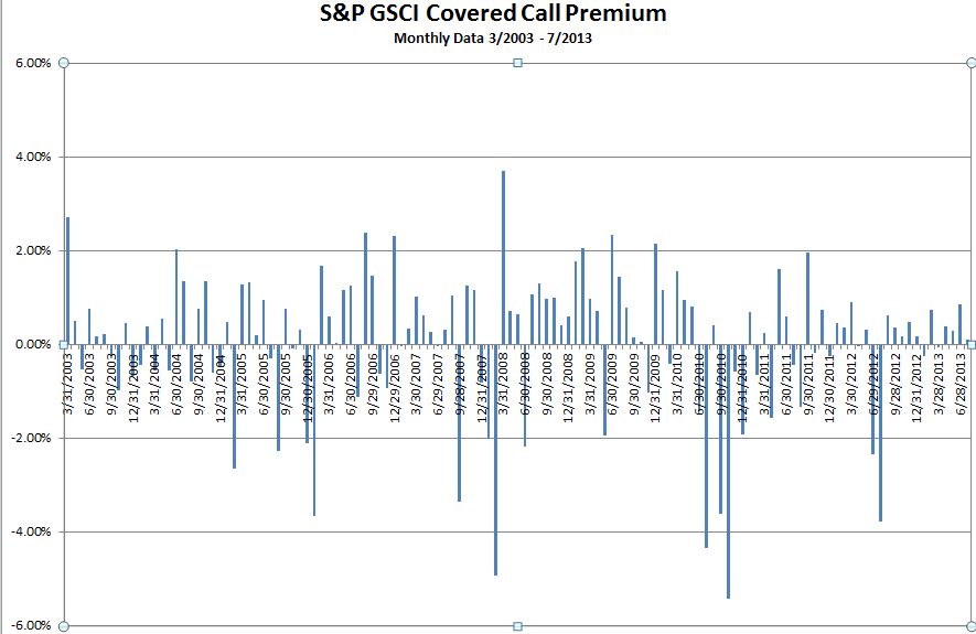
Overall, the option risk premium for the S&P GSCI Covered Call Select was 8.1% in the time frame from Mar 2003 – Jul 2013 (the period we have data for).  See the chart below for the monthly premiums. 63% or 79/125 of the months had positive premiums where in 60% of months prior to 2008, 79% of months between 2008-9, and 58% of months post 2009 had positive premiums.

Source: S&P Dow Jones Indices.  Data from Mar 2003 to July  2013.  Past performance is not an indication of future results.  This chart reflects hypothetical historical performance.  Please see the Performance Disclosure at the end of this document for more information regarding the inherent limitations associated with backtested performance.

Source: S&P Dow Jones Indices. Data from Mar 2003 to July 2013. Past performance is not an indication of future results. This chart reflects hypothetical historical performance. Please see the Performance Disclosure at the end of this document for more information regarding the inherent limitations associated with backtested performance.

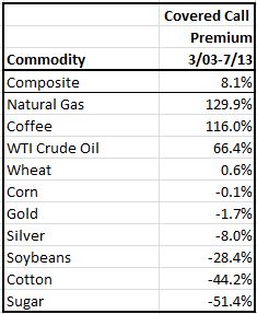
While the broad index result is in-line with expectations, the results vary for single commodities, creating potential opportunity for positive alpha if the “calls” are correct. So, which covered calls were “good calls” and which were “bad calls”?  During the entire time frame, the “good calls” were natural gas, coffee and WTI crude oil, and the “bad calls” were sugar, cotton, and soybeans.

Source: S&P Dow Jones Indices. Data from Mar 2003 to July 2013. Past performance is not an indication of future results. This chart reflects hypothetical historical performance. Please see the Performance Disclosure at the end of this document for more information regarding the inherent limitations associated with backtested performance.
Source: Same as above. 

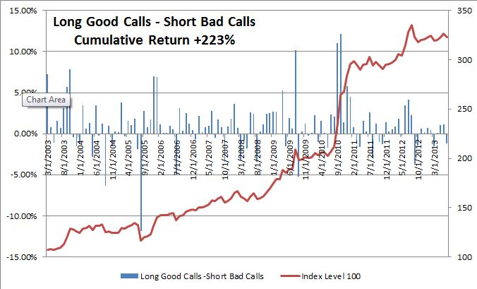
If one had created an alpha strategy by going long an average of the top 3 “good calls” and going short an average of the bottom 3 “bad calls”, the cumulative return over the period would have been 222.9%. Not too bad for a time frame where the S&P GSCI TR returned 5.0% and the S&P GSCI Covered Call Select TR returned 30.5%.  Source: S&P Dow Jones Indices. Data from Mar 2003 to July 2013. Past performance is not an indication of future results. This chart reflects hypothetical historical performance. Please see the Performance Disclosure at the end of this document for more information regarding the inherent limitations associated with backtested performance.

Source: S&P Dow Jones Indices. Data from Mar 2003 to July 2013. Past performance is not an indication of future results. This chart reflects hypothetical historical performance. Please see the Performance Disclosure at the end of this document for more information regarding the inherent limitations associated with backtested performance.

What does this mean about the behavior of covered call indices of single commodities?  Let’s examine gold and WTI crude oil since they are popular commodities and represent a trend and a choppy market.

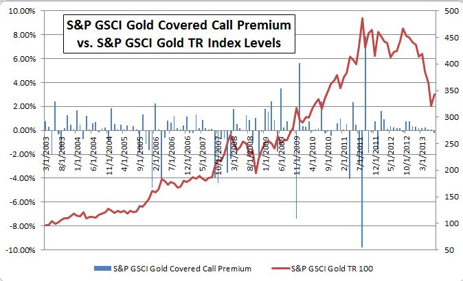
Notice in the chart below that plots the monthly covered call premiums versus the index levels of the commodity that there was a pretty clear uptrend until Aug 2011 that later reversed.  This is the kind of behavior we would expect not to have a great result, and sure enough, the S&P GSCI Gold Covered Call Premium was negative slightly, down 1.7% over the period.

Source: S&P Dow Jones Indices. Data from Mar 2003 to July 2013. Past performance is not an indication of future results. This chart reflects hypothetical historical performance. Please see the Performance Disclosure at the end of this document for more information regarding the inherent limitations associated with backtested performance.

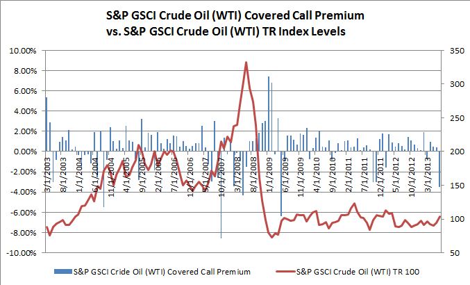
Now let’s look at WTI crude oil, which had much less of a trend despite a large spike and drop in the 2007-8 period. The covered call premium was significant, up 66.4% over the period, as we might expect of a covered call strategy in a relatively flat and choppy market, especially apparent in the 2004-6 and post 2009 periods. Source: S&P Dow Jones Indices. Data from Mar 2003 to July 2013. Past performance is not an indication of future results. This chart reflects hypothetical historical performance. Please see the Performance Disclosure at the end of this document for more information regarding the inherent limitations associated with backtested performance

Source: S&P Dow Jones Indices. Data from Mar 2003 to July 2013. Past performance is not an indication of future results. This chart reflects hypothetical historical performance. Please see the Performance Disclosure at the end of this document for more information regarding the inherent limitations associated with backtested performance

Let me know if there is analysis on other covered call commodities that you would like to see. Curious about what might be trending or choppy?  Thanks for reading.


The posts on this blog are opinions, not advice. Please read our Disclaimers.

Inside the S&P 500: Dividends Reinvested

Contributor Image
David Blitzer

Former Managing Director and Chairman of the Index Committee

S&P Dow Jones Indices

Slightly more than 400 of the 500 companies included in the S&P 500 pay dividends.  At the current rate, these dividends will be a bit over 2% of the value of the index.  In a strong market like the one enjoyed in the last 12 months when the index price rose over 20%, an extra 2% may not seem like a lot.  In a declining market where every little bit counts, the 2% is very welcome.  However, the impact can be a lot more than just two percent over time.

S&P Dow Jones Indices calculates a total return index for the S&P 500 that includes the impact of investing dividends back into the index itself.   In the calculation, dividends are invested in the entire index, not just in the stock that paid the dividend.  The invested dividends then grow (or fall) as the overall index grows (or falls), rather than tracking the stocks that paid the dividends. This index-wide reinvestment approach is typical in most indices.

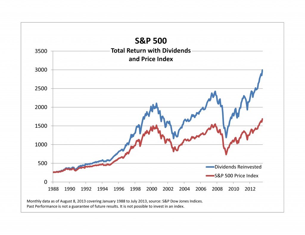
The cumulative impact over time can be substantial: the chart shows the S&P 500 price index in red and the S&P 500 total return index in blue. The two data series are calculated to start in January 1988 at the same level.   One thousand dollars invested in the S&P 500 at the end of January, 1988 would have been worth $5557 at the end of July, 2013. However, if the dividends were reinvested in the index, the investment would be worth $10,635 by the end of July.  Reinvesting the dividends roughly doubled the value of the investment.  Looking at the same time period, the annual return earned by the total return index was 9.71% and by the price index was 6.96%, a spread of 2.75%.

500TR

The posts on this blog are opinions, not advice. Please read our Disclaimers.

SEC Takes a Troubling Step Back from Transparency

Contributor Image
Alex Matturri

Former Chief Executive Officer

S&P Dow Jones Indices

The Securities and Exchange Commission recently issued exemptive orders to three new exchange-traded funds – essentially granting approval to allow these funds to proceed to market – that dramatically liberalize the operations of “self-indexers”. Such firms not only manage the ETF, they (or an affiliated entity) also maintain the index on which that product is based. As recent headlines have all too clearly demonstrated, serious and costly conflicts of interest arise when proper separation is not maintained between index and product management.

Historically, the SEC required that affiliated index methodologies be made public, that third parties be responsible for calculation of the index and that formal firewalls be in place to protect against information leakage between index maintenance and portfolio management. In these new orders, however, the SEC effectively argues that access to daily ETF holdings are all investors need to be assuaged of concerns regarding potential conflicts. Yet, mere awareness of holdings provides no insight into how or why those holdings were selected or otherwise came to be portfolio components.

The extensive manipulation of LIBOR was facilitated by the lack of controls surrounding benchmark maintenance and product issuance. In response to the scandal, a whole host of regulatory authorities – the International Organization of Securities Commissions (IOSCO), the European Securities Market Authority (ESMA), the European Commission, and others – have sought to dramatically increase the controls and transparency surrounding benchmark maintenance. Why, then, has the SEC moved in the opposite direction? Why do these new orders seemingly run counter to the very notion of transparency, one of the central tenets behind the tremendous acceptance of passive, index-based investing?

The Index Industry Association (IIA), of which S&P Dow Jones Indices is a founding member, recently published a set of standards that define best practices for index providers. These practices are designed to ensure the highest levels of quality and integrity and cover areas such as index governance, the quality and transparency of index methodologies, data collection, and index calculation and validation. It is these very types of protections that regulatory bodies should embrace, rather than adopting practices that threaten the very philosophies that made indexing as reliable and popular as it is today.

The posts on this blog are opinions, not advice. Please read our Disclaimers.

Inside the S&P 500: What Made it Rise... or Fall?

Contributor Image
David Blitzer

Former Managing Director and Chairman of the Index Committee

S&P Dow Jones Indices

The first question asked as the market closes is why did it go up? Or, if the results were less appealing, why did it fall?  Either way the usual answer of more buyers than sellers is no answer at all.  The real question is what sectors pushed the market higher or which stocks sent it down.  A little arithmetic with the S&P 500 can go a long way to understanding what is behind a market movement.

Let’s look at July 2013 as an example when the S&P 500 gained 4.95% from June 30th to July 31st before adjusting for dividends.  The contribution of a sector or stock to the overall performance of the index is the weight of the sector or stock at the beginning of the month multiplied by the percentage price increase of that sector or stock.  The table shows the calculations for July:

Index/Sector Performance Share (6-30-13) Contribution
S&P 500 4.95% 100.0% 4.95%
 Utilities 4.2% 3.3% 0.14
 Telecommunication Services -0.7% 2.8% -0.02
 Information Technology 4.1% 17.8% 0.73
 Financials 5.3% 16.7% 0.88
 Health Care 7.1% 12.7% 0.90
 Consumer Staples 3.9% 10.5% 0.41
 Consumer Discretionary 5.1% 12.2% 0.63
 Industrials 5.6% 10.2% 0.57
 Materials 5.5% 3.3% 0.18
 Energy 5.0% 10.5% 0.53

The contribution of a sector depends on both the weight or share and on its performance. Health care was the biggest contributor providing 0.90 percentage points of the 4.95 points the index gained. Financials, which is a larger share of the index (16.7% vs. 12.7% for health care) contributed less to the total performance because it lagged health care’s results.  Fortunately for investors, telecommunication services has a low weight since it was the one sector that slipped on the month.  Since the sector weights in the index are reasonably close to the sector weights for the overall market, looking at the weights can also give some hints to how the market might react.  Materials are 3.3% of the index and gold is in the materials sector — gold’s dramatic rise and fall in recent years was not a major factor in the overall stock market,

One can do the same analysis on a stock by stock basis.  Rather than list all 500 stocks, we can look at just the best and worst, measuring the impact in index points instead of pecentage points of price change. The biggest contributor in July was also one of the biggest stocks, Apple, which saw its stock rise 59 points to 452.5 and added 6.2 index points of the total 72.5 index point gain the S&P 500 index enjoyed. At the other end of the list was Microsoft, which lost 2.8 points to close at 31.83 and subtracted 2.4 index points from the S&P 500.  These are two of the larger stocks in the index, so it shouldn’t be a surprise that they were at the extremes of adding, or removing performance from the overall index.

The same analysis can be done with any division of the S&P 500, or any other index providing one can calculate both weights and performance. Is it more buyers than sellers? No, it’s what they’re buying or selling and how big the things being bought and sold are when compared to the index or the market.

The posts on this blog are opinions, not advice. Please read our Disclaimers.