Get Indexology® Blog updates via email.

In This List

Smart Factories to the Supply Rescue

S&P 500 Twitter Sentiment Indices: Performance Characteristics

Commodities Crushed It in 2021

Focusing on Factor Indices

Active Management: Naughty or Nice?

Smart Factories to the Supply Rescue

Contributor Image
Justin Holt

Senior Director, Research & Design, S&P Kensho Indices

S&P Dow Jones Indices

With the global economy ramping up from the depths of the COVID-19 pandemic, labor shortages and supply chain bottlenecks are hampering manufacturers.

Fortunately, there is relief on the way. Digitalization is sweeping through manufacturing plants and transforming today’s sleepy mills into the smart factories of tomorrow. The catalysts include several of the technological forces driving the Fourth Industrial Revolution: exponential computing power, Big Data, artificial intelligence (AI), and machine learning (ML). The factory of tomorrow will be increasingly autonomous, self-optimizing, and sustainable.

The S&P Kensho Smart Factories Index seeks to track the companies that are enabling this manufacturing revolution. The index includes companies from across the full innovation ecosystem with an emphasis on the following four key technologies.

  • Digital Manufacturing Solutions (52.6% of index weight1): Covers the software enabling connected, integrated digitalization of manufacturing activities, including the equipment used for environment sensing and monitoring, advanced process control, and predictive maintenance. Led by cloud adoption, digital transformation with remote capabilities has gone from nice-to-have to need-to-have.
    • Per an Intel research report,2 manufacturers experience up to 800 hours of unscheduled downtime annually (30% of it unplanned), while their skilled workers are aging, leaving 2 million jobs at risk of not being filled.
    • Cost savings and waste reduction are additional catalysts to adoption. A McKinsey study3 found that AI-enhanced predictive maintenance of industrial equipment can generate a 10% reduction in annual maintenance costs, up to a 20% downtime reduction, and a 25% reduction in inspection costs.
  • The Industrial Internet of Things (IIoT) (22.9% of index weight): Represents the interconnection of big, ubiquitous data, sensors, instruments, and other devices networked together with computers’ industrial applications. It is key to facilitating manufacturers’ ability to connect, automate, track, and analyze industrial activities.

The IIoT provides real-time asset performance monitoring solutions, enabling operators and supervisors to visualize trends graphically from anywhere in the world on any connected device.

  • Industrial Machine Vision (17.2% of index weight): Includes technology that combines sensors, cameras, computers, and ML/AI with visual data to identify product defects and model and predict equipment processes and product results.
  • Digital Twins Technology (7.3% of index weight): Provides a virtual replica of any physical product, piece of equipment, or asset. For example, a digital twin could be a virtual version of a manufactured product, the entire production line, an entire factory, or network of plants.

Big results are expected from digital twins. Gartner4 predicts that organizations will save USD 1 trillion per year in maintenance costs by using digital twins.

In Exhibit 1, we can see the five-year forward growth outlook5 for each key technology and 2021 performance of companies in each segment.

The digitalization of factories promises to upend established manufacturing practices. The S&P Kensho Smart Factories Index offers niche market exposure that is well differentiated from the more traditional emphasis of legacy industrial-focused indices.


1 As of Dec. 31, 2021. Index weight totals are based on companies’ product segment mappings.

2 Intel Research. https://s21.q4cdn.com/600692695/files/doc_downloads/intelligent-factory-infographic.pdf

3 McKinsey Research. https://www.mckinsey.com/~/media/mckinsey/industries/semiconductors/our%20insights/smartening%20up%20with%20artificial%20intelligence/smartening-up-with-artificial-intelligence.ashx

4 Gartner Digital Twin Forecasts. https://www.ey.com/en_au/advanced-manufacturing/how-digital-twins-give-automotive-companies-a-real-world-advantage

5 Digital Manufacturing Solutions Growth. https://www.mordorintelligence.com/industry-reports/digital-transformation-market-in-manufacturing

IIoT Market Forecast. https://www.prnewswire.com/news-releases/industrial-iot-market-worth-106-1-billion-by-2026–exclusive-report-by-marketsandmarkets-301325443.html

Industrial Machine Vision CAGR. https://www.marketsandmarkets.com/PressReleases/industrial-machine-vision.asp

Digital Twins CAGR. https://www.mobinius.com/blogs/digital-twin-trends/

The posts on this blog are opinions, not advice. Please read our Disclaimers.

S&P 500 Twitter Sentiment Indices: Performance Characteristics

Contributor Image
Lalit Ponnala

Director, Global Research & Design

S&P Dow Jones Indices

In a previous blog, we introduced the S&P 500® Twitter Sentiment Index and the S&P 500 Twitter Sentiment Select Equal Weight (EW) Index, highlighting their objective and construction.

At the core of these indices is a model-based sentiment score that captures the direction and magnitude of the sentiment associated with a given company. S&P DJI derives these sentiment scores daily by analyzing the relevant corpus of Tweets containing $cashtags for each company.

Persistent Spread between Quintiles

Using equal-weighted quintiles created from S&P 500 constituents sorted by aggregate sentiment scores each month, we observe a gradual decline in performance from the top quintile to the bottom quintile (see Exhibit 1). We also see that the Q1-Q5 spread was fairly persistent and stable over time (see Exhibit 2). The spread was also generally robust to the choice of parameters used for calculating the sentiment score, demonstrating that Tweet-based sentiment partially satisfies the criteria for being considered a viable systematic factor.

Capturing the Sentiment Premium

The indices capture the sentiment premium in different ways. The broader S&P 500 Twitter Sentiment Index takes a more diversified approach by using a higher stock count (200), while the S&P 500 Twitter Sentiment Select EW Index only selects 50 “high conviction” names. Using two-year rolling windows, we see that both have historically outperformed the S&P 500 over time to varying degrees (see Exhibit 3).

The differences in index construction influence other quantitative metrics as well (see Exhibit 4). The diversified S&P 500 Twitter Sentiment Index has about half the tracking error compared with the S&P 500 Twitter Sentiment Select EW Index, resulting in about twice the information ratio. It has historically beaten the benchmark over 50% of the time in up- and down-market periods, leading to a better overall batting average. Both indices have had relatively high turnover due to the dynamic nature of social sentiment and generally higher volatility of high-sentiment stocks. Due to lower stock count and higher turnover, the S&P 500 Twitter Sentiment Select EW Index exhibited a significantly higher active share.

Sector Attribution

Exhibit 5 shows the results of a multi-period Brinson-Fachler attribution that helps explain the outperformance of the S&P 500 Twitter Sentiment Indices. The allocation effect determines whether over/underweighting a sector relative to the benchmark contributes positively/negatively to excess return. The selection effect measures the contribution of individual securities based on their relative weights. The interaction effect measures the combined impact of allocation and selection.

For the S&P 500 Twitter Sentiment Index, IT was the largest contributor to excess return, with a total effect of 4.99%. The average weight was 3.65% more than the benchmark, and this overweight contributed 1.91% in terms of allocation effect, while superior stock selection contributed 2.64%. Financials underperformed the benchmark over the period examined, and the index benefited from a smaller allocation to it. Though the selection of stocks had a negative effect in this sector, the interaction resulted in a positive contribution, adding 1.72% in total.

The S&P 500 Twitter Sentiment Select EW Index was underweight in seven sectors relative to the benchmark, and with the exception of IT, all contributed positively to excess return. Health Care had a higher weight compared with the benchmark, and the companies in this sector had the most volatile sentiment over the past few years due to frequent COVID-19-related announcements. Though the attribution was sometimes favorable, the compound effect over time resulted in a negative performance impact. Nevertheless, positive contributions from Financials, Industrials, and Real Estate led to a healthy excess return.

Looking at total sector attribution, the outperformance of each index interestingly came from different effects. The allocation effect contributed to the bulk of the S&P 500 Twitter Sentiment Index’s outperformance, while the selection effect was the main driver for the S&P 500 Twitter Sentiment Select EW Index. The interaction effect contributed positively in both cases.


1 Back-tested information reflects the application of the index methodology and selection of index constituents in hindsight. No hypothetical record can completely account for the impact of financial risk in actual trading. For example, there are numerous factors related to the equities, fixed income, or commodities markets in general which cannot be, and have not been accounted for in the preparation of the index information set forth, all of which can affect actual performance. The back-test calculations are based on the same methodology that was in effect on the index launch date. However, when creating back-tested history for periods of market anomalies or other periods that do not reflect the general current market environment, index methodology rules may be relaxed to capture a large enough universe of securities to simulate the target market the index is designed to measure or strategy the index is designed to capture. The back-test for the S&P Twitter Sentiment Indices is calculated for the period January 2018 to October 2021. S&P Dow Jones Indices designed the sentiment scoring model using data from approximately the same time range. The sentiment scoring model is a natural language processing tool based on linguistic classification of the degree to which a Tweet is likely to be positive or negative. Complete index methodology details are available at www.spdji.com. Past performance of the Index is not an indication of future results. Prospective application of the methodology used to construct the Index may not result in performance commensurate with the back-test returns shown.

S&P® and S&P 500® are registered trademarks of Standard & Poor’s Financial Services LLC. Twitter® is a registered trademark of Twitter, Inc. These marks have been licensed for use by S&P Dow Jones Indices for use with the S&P Twitter Sentiment Index Series. The Indices are meant for informational purposes only and are not recommendations to buy or sell any securities. Any investment entails a risk of loss. Please consult your financial advisor before investing.

The posts on this blog are opinions, not advice. Please read our Disclaimers.

Commodities Crushed It in 2021

Contributor Image
Jim Wiederhold

Director, Commodities and Real Assets

S&P Dow Jones Indices

The market standard commodities benchmark, the S&P GSCI, crushed it in 2021, rising 40.35% and outpacing other similar commodity indices and asset classes, as high and rising inflation provided a great backdrop for this inflation-sensitive asset class. Commodities finished strong in December, rising 7.59% over the month as energy bounced back and Omicron COVID-19 variant concerns were brushed aside, with global demand still humming. Supply chain bottlenecks are slowly easing, but freight costs around the world continue to be elevated, contributing to higher commodity prices.

With the highest weight in the S&P GSCI, the S&P GSCI Energy was responsible for most of the strong performance seen in December and throughout 2021. Every petroleum-based commodity rose by double-digit percentages in December and by at least 58% throughout the year. A combination of strong global demand and reduced oil production due to climate concerns helped petrol to post its strongest yearly performance since 1999. On the other hand, the S&P GSCI Natural Gas continued its decline, posting another 17.57% drop in December as warmer weather reduced demand for one of the main ways to heat buildings in the northern hemisphere.

The S&P GSCI Industrial Metals finished the year strong by rising 5.02% in December. The S&P GSCI Aluminum rose the most in 2021, by 38.43%. In a similar narrative to energy-related commodities, aluminum mining and production (which is typically carbon intensive) was curtailed while demand remained strong, especially for electric vehicles. This green transition friction caused prices to outperform the other industrial metals throughout the year. The S&P GSCI Zinc was the second-best performer, rising 28.03% in 2021 and showcasing an exceptionally strong December rise. Supply disruptions for aluminum and zinc are forecast to continue, with exchange warehouse inventories already low and more metal due to leave particularly from the London Metal Exchange.

The S&P GSCI Agriculture rose 24.70% in 2021. The most liquid corn, soy, and wheat commodities saw positive gains for the year, as weather-related supply disruptions were seen throughout the year, and demand came back strong compared to 2020. Incentivized by higher prices, more crop was planted but the demand side continued to prove to be a positive catalyst. The S&P GSCI Cocoa was the only constituent to show negative 2021 performance, at -6.27%. Its other soft commodity cousin, coffee, instead blew past all other agriculture commodities. The S&P GSCI Coffee beat crude oil with a positive 63.71% 2021 performance. It was the best yearly performance for coffee since 2010, the year several major studies were released in North America hyping the cancer-fighting and exercise-performance-enhancing benefits of a cup of coffee.

The S&P GSCI Livestock rose 7.9% in 2021, with lean hogs pulling the weight. Live cattle and feeder cattle prices were flat, but the S&P GSCI Lean Hogs rose 25.06% this year. Demand for pork was strong throughout the year and in another example of inflation everywhere, fast food prices rose considerably as bacon prices moved higher. The cost of a bacon, egg & cheese sandwich may continue to rise, with current high inflation seen broadly.

The S&P GSCI Precious Metals dropped 5.13% on the year as rates moved higher, market volatility came down, and demand for safe havens diminished. Gold’s historically strong inflation hedging ability and safe-haven status were challenged the most this year with crypto becoming prominent, and prices reflected this struggle.

The posts on this blog are opinions, not advice. Please read our Disclaimers.

Focusing on Factor Indices

Contributor Image
Anu Ganti

Senior Director, Index Investment Strategy

S&P Dow Jones Indices

Factor indices have two important uses. First, they can be used as benchmarks to help clients of specialist managers disentangle how much of the manager’s performance is attributable simply to factor exposure, and how much is attributable to the manager’s stock selection beyond the factor. Second, factor indices can be used as investment vehicles to “indicize” a factor or set of factors, thereby delivering in passive form a strategy formerly available only via active management.

Our recently released paper, Factor Indices: A Simple Compendium, describes S&P DJI’s approach to eight factors: value, dividend yield, growth, quality, momentum, size, low volatility, and high beta. For each factor, we ranked the constituents of the S&P 500® by factor score, sorting them into equal-weighted quintiles, where Quintiles 1 and 5 contain the stocks with the highest and lowest factor exposure, respectively.

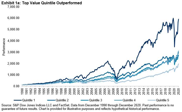
Taking value as an example, Exhibit 1a shows that the cheapest quintile of value stocks handily outperformed the others over time. Quintiles 2-4 are relatively close together, with Quintile 5 trailing. In contrast, Exhibit 1b shows that the quintile analysis for momentum supports an exclusionary approach to portfolio construction, as Quintiles 1-4 are clustered together, while Quintile 5 underperformed significantly. These results show that the performance of quintiles varies across factors; this has important implications for index design. 

Factor performance also varied across different market regimes. Exhibit 2 shows that Quintile 1 of value, size, and high beta outperformed during rising markets, while Quintile 1 of dividend yield, quality, momentum, and low volatility outperformed during down markets, highlighting their defensive characteristics.

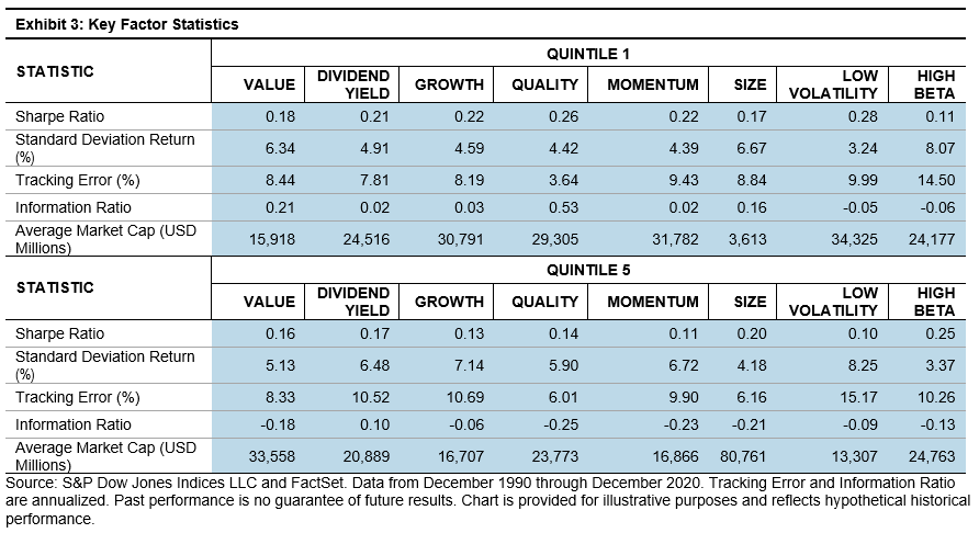
Exhibit 3 allows us to make several other observations about these factors. For the period from 1991 through 2020, Quintile 1 of value, size, and high beta were more volatile than their Quintile 5 counterparts. Looking at Quintile 1 across factors, low volatility had the highest Sharpe Ratio, and quality had the highest Information Ratio. The average market cap of Quintile 1 was greater than that of Quintile 5 for dividend yield, growth, quality, momentum, and low volatility, illustrating a large-cap bias.

Understanding performance differences across factor quintiles is critical to understanding index performance and optimizing index construction.

The posts on this blog are opinions, not advice. Please read our Disclaimers.

Active Management: Naughty or Nice?

Contributor Image
Craig Lazzara

Managing Director, Index Investment Strategy

S&P Dow Jones Indices

The history of active investment management is, for the most part, a history of failure and frustration. Most active managers underperform most of the time, and success in one period seems not to predict subsequent success. We have long argued that active underperformance is not coincidental—it happens for identifiable and understandable reasons, and is therefore likely to continue.

But—most of the time is not all of the time, and most active managers are not all active managers. Some market environments may be more conducive to relatively favorable (or, to be precise, relatively less unfavorable) active performance. As I write in mid-December, 2021 is far enough advanced for us to attempt some informed speculation about what SPIVA® will reveal when the final results are in.

There are both positive and negative signals about the prospects for active management:

  • One of the most consistent challenges for active managers arises because, in most years, most stocks in the S&P 500® underperform the index. Returns are typically driven by a relatively small number of strong performers, which pull the index’s return above that of most of its constituents. Through the end of November, this was precisely the situation in the S&P 500: the index was up 23%, versus a gain of only 19% for the median stock. Only 42% of index members outperformed through the first 11 months of the year. Needless to say, fewer outperformers make for more challenging stock selection.

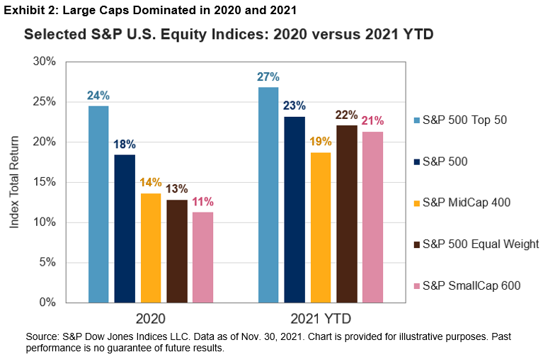
  • Strong markets historically have been somewhat more challenging for active managers; this is particularly true when the strong market is driven by some of the index’s largest names. Exhibit 2 shows us that the largest 50 stocks in the S&P 500 are comfortably in the lead for 2021. While it’s relatively difficult for active managers to overweight the largest names in their benchmark index, the reverse is not true. In fact we’ve found that large-cap managers tend to do better in periods when the superior performance of mid- or small-cap names gives them a chance to “cheat” (I use the term lovingly) down the cap scale. Not this year—although the performance of larger names may give mid- and small-cap managers an edge.


  • Dispersion began the year at a relatively modest level, but has recently begun a noticeable rise, closing November well into the top quartile of its historical range. Although dispersion tells us relatively little about the success of active managers as a group, heightened dispersion suggests that the range of active outcomes will be greater than usual. The best active performers should shine, as the value of stock selection skill rises when dispersion is high.

Readers can form their own opinions about the proper balance of these observations. Recognizing the hazard intrinsic to all predictions, my guess is that when we draw a line under 2021, active underperformance, at least for large-cap U.S. managers, will persist.

Of course, the conditions that make active management more or less difficult can change. If, e.g., 2022 sees a declining market, with megacaps and lower volatility names leading the way down, it’s conceivable that active underperformance could become less prevalent. That may be cold comfort to the active management community and its customers—but sometimes cold comfort is all the comfort there is.

The posts on this blog are opinions, not advice. Please read our Disclaimers.