Get Indexology® Blog updates via email.

In This List

Credit Risk Premium in the Equity Market

Unpacking SPIVA Europe: Did Volatility Provide Opportunity?

When Active Management Looks Easier

Equity: Diversity and Inclusion

Mean Reversion and Momentum

Credit Risk Premium in the Equity Market

Contributor Image
Wenli Bill Hao

Director, Factors and Dividends Indices, Product Management and Development

S&P Dow Jones Indices

Firms with low credit risk generally have higher stock market returns than firms with high credit risk.1 The S&P 500® Higher Credit-Rating Ex Insurance Equity (HCREIE) Index is designed to capture the credit risk premium in the equity market. In this blog, we will introduce the index design, performance, and factor exposure.

Index Design

The S&P 500 HCREIE Index uses a company’s issuer credit rating (ICR)2 from up to three rating agencies—S&P Global Ratings, Moody’s, and Fitch—to select its constituents from the S&P 500 universe. To be eligible for index inclusion, a company’s long-term credit rating needs to be at or above ‘A-’/‘A3,’ from at least one rating agency.3

This index can be used by trusts, funds, or mandates seeking to invest in high quality assets. One example is Regulation 114 Trusts by reinsurers.4 The index requires that its constituents be U.S.-incorporated companies and excludes those classified by the Global Industry Classification Standard (GICS®) as insurance companies (GICS Code: 4030).

Once selected, index constituents are first weighted by float-adjusted market capitalization (FMC), then those FMC weights are adjusted so that the sector weights in the index equal the sector weights in the S&P 500. That is, the S&P 500 HCREIE Index is sector neutral relative to S&P 500.

Performance

During the back-testing period from June 30, 2015, to April 30, 2021, the S&P HCREIE Index outperformed the S&P 500 by 10.22%. Rebasing the S&P 500 HCREIE Index and the S&P 500 to 100 on June 30, 2015, the S&P 500 HCREIE Index reached 237.7 on April 30, 2021, while the S&P 500 reached 227.4 (see Exhibit 1).

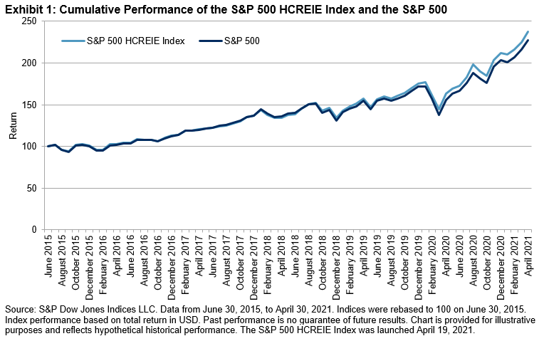
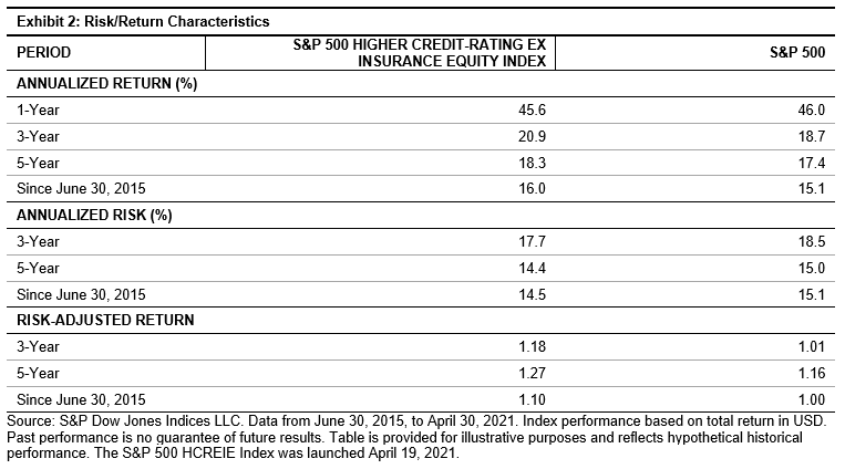
Exhibit 2 shows the detailed risk/return profile of the S&P 500 HCREIE Index versus the S&P 500. Over the studied period, the S&P 500 HCREIE Index outperformed the S&P 500 by 0.87% on an annualized return basis. The reduced volatility helped the strategy deliver a better risk-adjusted return (1.10) than the S&P 500 (1.00). Furthermore, the S&P 500 HCREIE Index also had superior risk-adjusted returns over the three- and five-year periods.

Factor Exposure

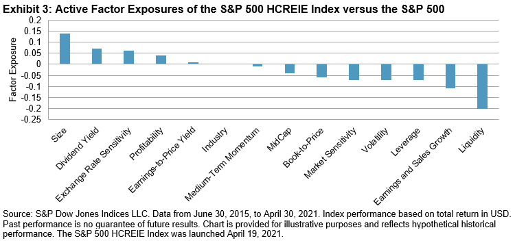
Using the risk factors from a commercial risk model, we present the active exposures5 of risk factors. In comparison with the S&P 500, the S&P 500 HCREIE Index had higher exposures to size, dividend yield, and profitability,6 and lower exposures to liquidity, growth, and leverage (see Exhibit 3). The factor exposure results imply that the constituents in the S&P 500 HCREIE Index tend to be the larger, more mature, and higher quality companies in the S&P 500 universe.

Conclusion

To capture the credit risk premium in the equity market, the S&P 500 Higher Credit-Rating Ex Insurance Equity Index selects stocks with higher long-term credit ratings at or above of ‘A-’/‘A3’. Factor exposure analysis shows that the index constituents tend to be larger, more mature, and higher quality companies. Moreover, the S&P 500 HCREIE Index had better return and risk-adjusted return than the S&P 500 during the period studied.


1 Avramov, Doron, Chordia, Tarun, Jostova, Gergana, and Philipov, Alexander, Credit Ratings and the Cross-Section of Stock Returns (2009). EFA 2008 Athens Meetings Paper, Available at SSRN: https://ssrn.com/abstract=940809.

2 If long-term issuer defaulting rating is not available, then senior unsecured debt rating is used as a proxy.

3 See the S&P 500 Higher Credit Rating Ex Insurance Equity Index Methodology for more details.

4 Regulation 114 is the Official Compilation of Codes, Rules and Regulations of the New York State Insurance Department (NYSID). Regulation 114 Trusts are created under a relatively standard form of tripartite agreement involving a single ceding insurance company, i.e. the beneficiary; a financial institution, i.e., the trustee; and a single non-admitted reinsurer, i.e., the grantor, who grants the beneficiary control over the ceded premiums.

5 Active factor exposure is defined as the strategy factor exposure minus the benchmark factor exposure.

6 Refer to Axioma United States Equity Factor Risk Models for more information about factor definitions.

The posts on this blog are opinions, not advice. Please read our Disclaimers.

Unpacking SPIVA Europe: Did Volatility Provide Opportunity?

How did active managers respond to record volatility and soaring spreads in 2020 as the pandemic brought Europe to a halt? Tim Edwards and Andrew Innes of S&P DJI join Rebecca Chesworth of State Street Global Advisors and Pio Benetti of Kairos Partners SGR to explore the latest results from SPIVA Europe and the active and passive landscape.

The posts on this blog are opinions, not advice. Please read our Disclaimers.

When Active Management Looks Easier

How can style bias impact the perception of active manager outperformance? S&P DJI’s Craig Lazzara and Anu Ganti discuss how a better understanding of style bias can help market participants interpret active manager performance and our SPIVA results.

Learn more: https://www.spglobal.com/spdji/en/research/article/style-bias-and-active-performance/

The posts on this blog are opinions, not advice. Please read our Disclaimers.

Equity: Diversity and Inclusion

Contributor Image
Craig Lazzara

Former Managing Director, Index Investment Strategy

S&P Dow Jones Indices

We can think of an active equity portfolio as a combination of a benchmark (the S&P 500®, for example) and a set of active bets that measure the portfolio’s deviation from the benchmark. The relative size of the active bets is sometimes called “active share,” and is a convenient way to judge a manager’s aggressiveness. An active share of 0% is associated with an index fund; an active share of 100% implies that the manager has no holdings in common with his benchmark. (It may also imply that we’re using the wrong benchmark for the manager in question, but that’s another story.)

It’s been suggested that high active share is associated with outperformance, although the evidence on the question is far from conclusive. Although high active share may (or may not) be a necessary condition for active success, it cannot be a sufficient condition. Can an underperforming manager improve his results by randomly selling half the names in his portfolio, thus creating more concentration? Doing so will increase active share for sure, but it stretches credulity to think that such a course would automatically improve performance.

In our view, the stronger argument runs the other way: other things equal, more names are better than fewer. This is because stock market returns tend to be positively skewed. Rather than being symmetrically distributed around an average, return distributions typically have a very long right tail; a relatively small number of excellent performers has a disproportionate influence on the market’s overall return.

Exhibit 1 illustrates the skewness of the S&P 500 over the last 20 years. The median stock in the index returned 63%, while the index’s return was 322%. Only 22% of the names outperformed the index, which helps explain why active results have been so disappointing. When a randomly chosen stock has roughly one chance in five of beating an index fund, successful stock selection is very difficult. A portfolio manager who opts to concentrate his holdings will need a level of predictive accuracy that most portfolio managers demonstrably do not have.

Instead, the implication of Exhibit 1 is that more diversified portfolios, by including more stocks, stand a better chance of outperformance. Skewed returns mean that an active portfolio’s success depends on whether it is overweight a relatively small number of names. The more names a portfolio holds, the more likely it is to own one of the relatively small number of big winners.

Otherwise said: rather than picking the 50 stocks she likes the best and holding them, an investor benchmarked against the S&P 500 might be better served by eliminating the 50 stocks she likes the least and holding the other 450. True, active share would be lower for the larger portfolio. But the likelihood of owning one of the relatively rare big winners would be nine times as high. When returns are skewed, increasing diversity increases the odds of success.

The posts on this blog are opinions, not advice. Please read our Disclaimers.

Mean Reversion and Momentum

Contributor Image
Anu Ganti

U.S. Head of Index Investment Strategy

S&P Dow Jones Indices

After almost four years of underperformance, we witnessed a change in fortune in February 2021, as the relative performance of the S&P 500® Equal Weight Index turned positive. By the end of April, Equal Weight had outperformed the S&P 500 by 11% over the prior 12 months, as we see in Exhibit 1.

Equal Weight’s recent rebound naturally had an impact on its factor exposures, particularly for the momentum factor. To provide context, in Exhibit 2, we plot the annual relative performance of Equal Weight on the x-axis and Equal Weight’s (risk-adjusted) momentum exposure on the y-axis, including the most recent 12-month period, as of April 30, 2021.

There is a strong positive relationship between relative performance and momentum, with an R2 of 0.60. Unsurprisingly, when Equal Weight is doing well, its momentum score rises. But over time, despite Equal Weight’s outperformance (averaging 2.5% over 22 calendar years), its momentum score is typically negative, at a median of -7.6%. This is a function of the way Equal Weight rebalances—every quarter, it sells its relative outperformers and buys more of its relative underperformers, which has the effect of muting its exposure to the momentum factor.

Interestingly, Equal Weight’s momentum exposure is currently flat. This last occurred at the end of 2016, as Equal Weight’s relative performance turned positive. Equal Weight experienced the strongest positive momentum exposures when its outperformance was at a peak, such as in 2001, 2003, and 2010.

To provide further context, Exhibit 3 shows a time-series of the historical momentum exposures of the S&P 500 Equal Weight Index. What is striking is the speed with which Equal Weight’s tilt against momentum in December 2020 was neutralized by the end of April 2021, paralleling the swiftness of its performance rebound.

The recent comeback of smaller caps and Equal Weight, resulting in a neutral exposure to momentum, indicates a moderately strong relative return environment. It is important to remember that factor exposures are not constant and experience fluctuations as we experience reversals in performance. If Equal Weight’s outperformance continues, we can anticipate a further increase in its exposure to momentum. We can look to history to provide perspective on these changing relationships.

The posts on this blog are opinions, not advice. Please read our Disclaimers.