Get Indexology® Blog updates via email.

In This List

Recalled to Life: The S&P SmallCap 600’s Persistent Outperformance after the Russell Reconstitution

Factoring Inflation Into Retirement Planning

S&P 500 and the U.S. Presidential Election

The Flood of U.S. Treasury Issuance and Duration Supply Continues

Why the S&P 500 Reduces Portfolio Volatility for Indian Investors

Recalled to Life: The S&P SmallCap 600’s Persistent Outperformance after the Russell Reconstitution

Contributor Image
Berlinda Liu

Former Director, Multi-Asset Indices

S&P Dow Jones Indices

S&P DJI’s paper, A Tale of Two Benchmarks (first published in in 2009 and later updated in 2015 and 2019), showed that the S&P SmallCap 600® has structurally outperformed the Russell 2000, primarily benefiting from S&P DJI’s index inclusion criteria for profitability, liquidity, and public float. The paper also delves deeper into several secondary attribution analyses, including one of the most well-known market anomalies: the excess returns around the Russell reconstitution, which we’ll explore more deeply here.

As a brief review, index modifications to the S&P 500®, S&P MidCap 400®, and S&P SmallCap 600 are driven by changes in companies’ size, free float, corporate actions, new IPOs, and meeting inclusion criteria. These are constantly monitored by the Index Committee, and index changes are made throughout the year on an as-needed basis.1

In contrast, the Russell indices originally rebalanced on a quarterly basis, then on a semiannual basis, before moving to the current annual rebalance in 1989. In response to long-standing criticism regarding excessive turnover and significant price volatility on the rebalance day, starting in 2004, Russell published provisional indices, moved the day of the annual rebalance within June, and used NASDAQ’s (then-new) Closing Cross mechanism for determining effective prices.2 Later changes included quarterly IPO additions.

However, these changes failed to address the underlying inefficiency stemming from potential front-running of the rebalance trade that remains a several months-long process. Rather than disentangle the complex pre-inclusion effects, we’ll focus on what happens after the rebalance, as this is of most relevance to passive index portfolios.

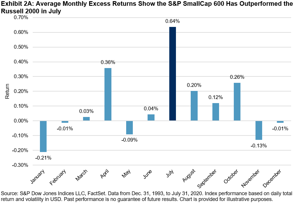
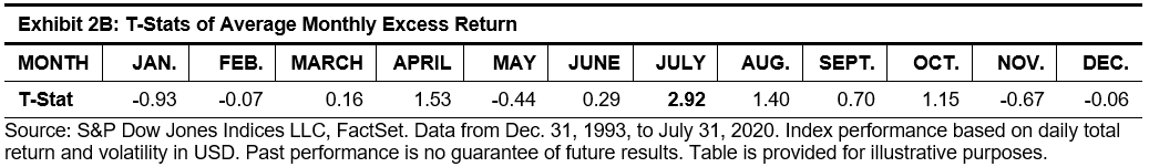
Exhibit 2A shows the differences in the average monthly returns of the S&P SmallCap 600 and the Russell 2000. The particularly notable average July outperformance of the S&P SmallCap 600 is 0.64% (t-stat = 2.92), as components entering the Russell 2000 at artificially elevated levels mean-revert. As a result, the S&P SmallCap 600 has outperformed the Russell 2000 in July for 19 of the 27 years observed (70.4%).

This reversion does not happen instantly on one trading day either, as would happen for a momentary closing imbalance. Just as the reconstitution is in reality a several months-long process, the unwind has a long tail. Exhibit 3 illustrates the excess returns measured from the rebalance date to selected intervals afterward. While the dislocations have been less extreme in recent years, especially closer to the reconstitution date, a conspicuous gap persisted and continued to widen even after one month.

While fundamental index construction factors have contributed significantly to the S&P SmallCap 600’s persistent outperformance versus the Russell 2000, the annual reconstitution continues to drive a secondary trading-driven inefficiency every July. Passive index portfolios often show little tracking error to the benchmark in the era of hyper-liquid markets and low commissions, but may still regularly pay these invisible costs to arbitragers based on their choice of index.

1 It is important to note that these indices (and the committee) seek to reflect the U.S. equity market in its entirety, including sector coverage, rather than mechanically select the largest companies in order. For more details, please refer to the S&P U.S. Indices Methodology.

2 Matturri, Alex, “2004 Russell Reconstitution Recap,” Northern Trust, July 2004.

The posts on this blog are opinions, not advice. Please read our Disclaimers.

Factoring Inflation Into Retirement Planning

How might inflation impact retirement income? S&P DJI’s Hamish Preston, DFA’s Grady Smith, and DCIIA Retirement Research Center’s Warren Cormier discuss.

Learn More: https://www.spglobal.com/spdji/en/documents/performance-reports/dashboard-sp-stride.pdf


The posts on this blog are opinions, not advice. Please read our Disclaimers.

S&P 500 and the U.S. Presidential Election

Contributor Image
Hamish Preston

Head of U.S. Equities

S&P Dow Jones Indices

2020 has certainly been an extremely unusual year as economies, companies and individuals have grappled with the impacts of COVID-19.  Although this year’s market movements have arguably been even more difficult to predict than usual, and many active managers were wrong-footed earlier this year, investment outlooks have kept at least one eye on the outcome of one extremely well-telegraphed event – the U.S. Presidential election.  With November’s election less than three months away, what is the S&P 500®’s historical record around U.S. elections?

Exhibit 1 shows that the S&P 500 typically rose during U.S. Presidential election years: the benchmark posted a positive price return in 17 of the last 23 election years, giving it a hit rate of roughly 74% and an average return of 7.05%.  But there was substantial cross-sectional variation in election returns: there was a return spread of over 75% between the S&P 500’s best election year (1928) with its worst (2008).

Before anyone uses Exhibit 1 to make inferences about the potential impact of the 2020 election on the S&P 500, it is important to recognize that the performance of the S&P 500 during election years has typically been similar to its performance during other years.  Exhibit 2 shows that the average (and median) calendar year S&P 500 price return, volatility and risk-adjusted returns have been similar across election and non-election years.  Similar results were also observed during the fourth quarter, albeit with slightly greater differences.

Although it can be difficult to identify a clear impact of U.S. Presidential elections at a market level, there appears to have been considerable impact at a sector level.  Exhibit 3 shows the average range in monthly S&P 500 sector returns – calculated as the best-performing sector minus the worst performing sector – between 1990 and 2019.  The highest average range (15.18%) was observed in November during election years, far above the 10.8% average difference across all months.  Notwithstanding the relatively small sample size, this suggests that election impacts were typically observed when investors priced-in the anticipated impact of the election winner’s policies on different market segments.

One recent example of this dynamic came in the 2016 election. While the S&P 500 rose around 4% in November 2016, a whopping 19.34% separated the best-performing sector (Financials) and the worst-performing (Utilities). Hence, correctly identifying who would win the 2016 Presidential election and the anticipated sector impact offered considerable value in 2016.

As a result, although the S&P 500 has been unperturbed by election outcomes, historically, evidence suggests it may be worthwhile to consider the potential benefits of using sectors to express views.  Indeed, not only can picking sectors offer around half the potential value of stock-picking – Exhibit 5 shows that the average monthly S&P 500 sector dispersion (3.08%) was around half the average S&P 500 stock dispersion (6.77%) – but S&P 500 sectors have offered greater capacity for investors looking to express views.

The posts on this blog are opinions, not advice. Please read our Disclaimers.

The Flood of U.S. Treasury Issuance and Duration Supply Continues

Contributor Image
Hong Xie

Former Senior Director, Global Research & Design

S&P Dow Jones Indices

In its Q3 2020 refunding statement1 released on Aug. 5, 2020, the U.S. Treasury announced its plan to increase auction sizes across all nominal coupon tenors over the August-October quarter, with larger increases in longer tenors (7-year, 10-year, 20-year and 30-year).

To gauge the demand appetite for U.S. Treasuries, let’s review the size and composition of U.S. Treasury holdings by one of the larger buyers these days, the Federal Reserve. Since March 2020, the Federal Reserve has stepped in with a broad array of actions to limit the economic damage from the COVID-19 pandemic, including the resumption of security purchases. On March 23, 2020, the Fed made the purchases opened, saying it would buy securities “in the amounts need to support smooth marketing function and effective transmission of monetary policy to broader financial conditions.”

Exhibit 1 shows the significant increase of the Fed’s security holdings. Since the end of February 2020, the total amount of securities held in the Federal Reserve System Open Market Account (SOMA) increased from USD 3.8 trillion to USD 6.2 trillion, with 69% of that increase (USD 1.6 trillion) in U.S. Treasury notes and bonds. Exhibit 2 shows that as of the end of July 2020, the Federal Reserve held 28% of outstanding U.S. Treasury notes and bonds, the highest since 2003, compared with 11% in March 2009, when the Fed announced U.S. Treasury purchases in QE1.

The increase in the Fed’s share of outstanding U.S. Treasuries since March 2020 shows that the Fed’s purchases have outpaced net issuances of U.S. Treasuries. However, looking closer at the composition of the Fed’s holdings, we find that 24% of its holdings are in U.S. Treasury bonds with maturities longer than 10 years, much lower than the 59% in U.S. Treasury notes with maturities between 1 and 10 years (see Exhibit 3).

As a result, the Fed’s aggressive purchases are not immediately easing pressure on long-dated U.S. Treasury yields. Since the refunding announcement to Aug. 14, 2020, the end of the week that included three auctions of 3-year, 10-year, and 30-year U.S. Treasury bonds, 10-year U.S. Treasury yields went up by 16 bps, while 30-year U.S. Treasury yields rose by 23 bps. Weak demand for the record-sized 30-year U.S. Treasury bond auction on Aug. 13, 2020, may indicate an early sign of indigestion. At the same time, a short position has been built up, as Commodity Futures Trading Commission data show net non-commercial positions in long bond futures (15-25 years) as of Aug. 11, 2020, were at a record high level since 2000.

1  https://home.treasury.gov/news/press-releases/sm1081

The posts on this blog are opinions, not advice. Please read our Disclaimers.

Why the S&P 500 Reduces Portfolio Volatility for Indian Investors

Contributor Image
Pratik Oswal

Head - Passive Funds

Motilal Oswal Asset Management Company

Home bias has been a prominent theme in India since the beginning of the mutual fund industry. Investors historically questioned why they should diversify their high GDP growth portfolio (India) with lower growth economies such as the US. This hypothesis has been tested over the last decade. India has delivered a high GDP growth but has fallen short in terms of profitability. The US has had the opposite effect. Despite low GDP growth, profitability has been better than any analyst would have predicted a decade ago.

Investors, as a result, have finally started to realize the importance of geographical diversification. It is a concept well accepted in developed parts of the world, such as the US and Europe, where most investors tend to have globally diversified portfolios.

So global investments have delivered good returns over long-term horizons. What else is there for Indian investors?

Low Correlation with Indian Equities

Commonly, investors have invested in multiple equity mutual funds with the hope of diversification. Historically, domestic mutual funds have tended to move in the same direction. Most Indian mutual funds have a correlation of 90%+, giving very little diversification to the investor. Investors in India who are looking to diversify their domestic portfolio tend to accept asset classes with traditionally lower yields such as debt, gold, and real estate.

However, international equity is an asset class where investors have experienced equity-like returns and lower volatility due to diversification. The following chart shows calendar returns of the S&P 500 vs. broad-based index funds across categories.

With a lower correlation, investors have seen India and the US deliver good yield returns when combined with lower volatility.

Currency as an Asset Class

The S&P 500 offers Indian investors two asset classes: US Stocks + USD as a currency. With the rupee falling most years (~5% CAGR) over the last ten years, international diversification can potentially give added protection over a falling currency. With investors increasing their spend in USD terms (foreign trips, education, electronics, etc.), it has become attractive to have some wealth invested in dollar-based assets such as the S&P 500.

Higher Dividends and Stock-Level Diversification 

The S&P 500 provides higher dividends in addition to sector-based diversification to Indian investors. India tends to be heavy on financial services, whereby the US tends to have a higher allocation towards Technology and Telecommunications. Access to some of the leading companies with globally diversified revenue streams adds well to the mix of stocks in an Indian investor’s portfolio.

In conclusion, international diversification has taken off partly due to high historical returns over the last decade and partly due to the disappointment in domestic markets. However, diversification is key when considering international investments.

The posts on this blog are opinions, not advice. Please read our Disclaimers.