Get Indexology® Blog updates via email.

In This List

How Are Insurance Investors Using ETFs?

Big Sector Shifts in Low Volatility Composition

Symbiotic Sentiments

Sector Spotlight: Healthcare in India

VIX Back to Normal? Not Really

How Are Insurance Investors Using ETFs?

Contributor Image
Kelsey Stokes

Director, Multi-Asset Index Sales

S&P Dow Jones Indices

S&P Dow Jones Indices recently published its fifth annual analysis of exchange-traded fund (ETF) usage by U.S. insurers in their general accounts. Regulatory filing data, which details the individual securities that insurers hold, showed that in 2019, ETF AUM in insurance general accounts grew to USD 31 billion—a 16% increase over 2018. While this headline figure shows the continued growth of ETFs in insurers’ portfolios, the trends that underlie this data are perhaps more interesting.

Insurers Sold ETFs That Weren’t Equity or Fixed Income

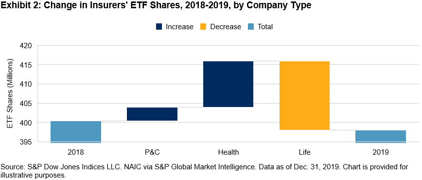
The number of ETF shares insurers held declined in 2019 to 398 million from 400 million in 2018, indicating that while AUM grew, insurers were net sellers of ETFs in 2019. If we break down the data in terms of asset class, however, we see that insurers bought equity and fixed income ETFs and sold ETFs classified as “other,” a category that includes currency, commodity, multi-asset, etc. Insurers’ holdings of non-equity and non-fixed income ETFs saw a 38% year-over-year decrease in AUM and a 45% decrease in shares. Exhibit 1 shows how each asset class contributed to the change in insurers’ ETF shares from 2018 to 2019.

Life Insurers, in Particular, Sold ETFs

If we look at what drove the decline in insurers’ ETF shares now in terms of company type versus asset class, we see that while Property and Casualty (P&C) and Health companies were net buyers of ETFs in 2019, Life companies were net sellers (see Exhibit 2).

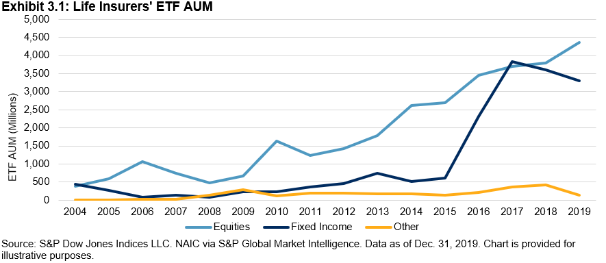
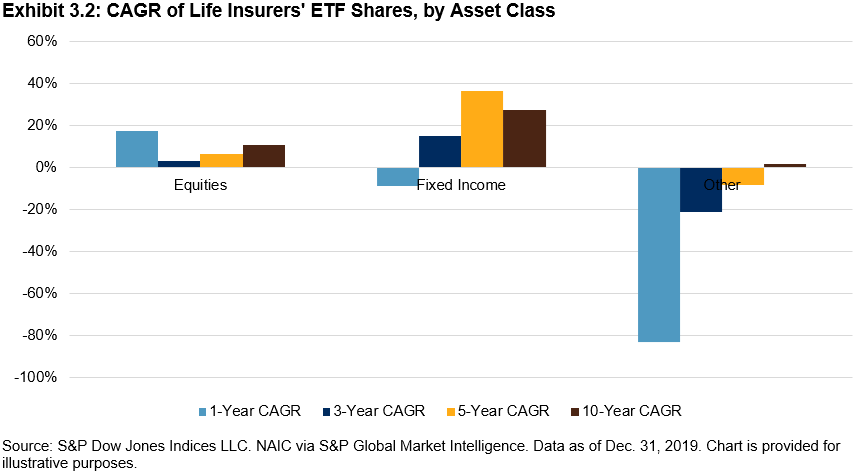
Life insurers sold fixed income ETFs last year, a reversal in the significant buying that took place between 2015 and 2017 (see Exhibits 3.1 and 3.2).

Most of Insurers’ Fixed Income ETF AUM Was in IG, but High Yield (HY) Gained Traction

Fixed income ETF usage within insurance general accounts overall, however, continues to grow, with AUM up 13% year-over-year and shares up 11% year-over-year. While nearly 80% of insurers’ fixed income ETF AUM was in investment-grade bond ETFs, HY bond ETFs are gaining traction, particularly with P&C insurers, which increased their buying of HY bond ETFs by 169% in 2019 (see Exhibit 4).

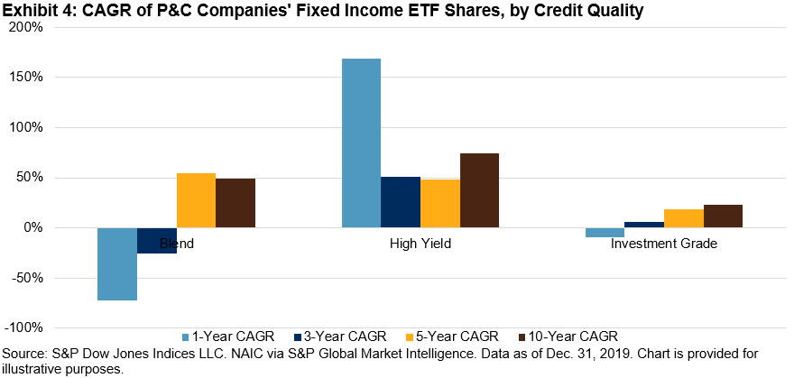
HY bond ETFs comprised 38% of P&C insurers’ fixed income ETF holdings—more than four times the percentage of the broader insurance market’s HY bond ETF holdings.

We offer these insights with the caveat that much has changed this year in the financial markets, and as a result, insurers’ ETF holdings may look quite different today than they did at the end of 2019. We’ll be taking a closer look at the quarterly data and publishing a companion to this report to better understand how COVID-19 may have affected insurers’ holdings.


The posts on this blog are opinions, not advice. Please read our Disclaimers.

Big Sector Shifts in Low Volatility Composition

Contributor Image
Fei Mei Chan

Former Director, Core Product Management

S&P Dow Jones Indices

In March, COVID-19 inspired volatility roiled markets across the globe. Similarly, the volatility of the S&P/TSX Composite also jumped. The increase, however, was not balanced across all sectors. We see this manifested in the most recent rebalance for the S&P/TSX Composite Low Volatility Index.

Effective after the close of trading April 24, 2020, Exhibit 1 reflects the sector allocation of the low volatility index. Thirty of the 50 names were replaced in the index, for a weight change of 56%. (For context, median annual turnover for the index is 60%.) Needless, to say this reflects a quarter of major commotion.

Notably, we saw a significant scaling back of Real Estate (-16%), Utilities (-12%), and Financials (-11%). In their place, Industrials (+19%) and Consumer Staples (+10%) rose as the two highest allocations of the index.

S&P DJI’s low volatility methodology does not apply constraints around sector allocations.  Though the low volatility index searches for the lowest volatility at the stock level, sector allocations (as shown in Exhibit 2) can sometimes offer context around where things are relatively more stable. Not surprisingly, Energy, Utilities, and Financials experienced the biggest spikes in volatility, and all are on the higher end of the volatility spectrum while Consumer Staples and Industrials are relatively less volatile.

The posts on this blog are opinions, not advice. Please read our Disclaimers.

Symbiotic Sentiments

Contributor Image
Anu Ganti

Senior Director, Index Investment Strategy

S&P Dow Jones Indices

Sectors and factors are different ways of viewing the world, but they are not mutually exclusive.  We find an example of such a close, symbiotic relationship between the technology sector and the quality factor.  Exhibit 1 shows that the S&P 500 Information Technology index has a strong tilt towards quality, while the biggest overweight in the S&P 500 Quality Index is towards information technology.

Source: S&P Dow Jones Indices LLC and FactSet. Data as of April 2020. Chart is provided for illustrative purposes.

Both technology and quality have outperformed during both calendar 2020 and the 12 months ending April 30.   This raises an obvious question: Has technology done well because of its exposure to quality, or has quality done well because of its exposure to technology?

We begin our inquiries by calculating quality scores for all the constituents of the S&P 500, based on the following metrics: return on equity, financial leverage and accruals ratio.  We then rank the constituents by their quality score, and slice the S&P 500 into quality quintiles.  Finally, we analyze how much of S&P 500 Info Tech’s weight is in each of these quintiles.

Exhibit 2 illustrates that an astonishing 70% of S&P 500 Info Tech’s weight is in the top quality quintile.

Source: S&P Dow Jones Indices LLC and FactSet. Data as of April 2020. Chart is provided for illustrative purposes.

Quality is clearly important to the technology sector, but how important is technology to the quality factor? To answer, we turn the tables and look at technology’s weight in the S&P 500’s top quality quintile.

We observe in Exhibit 3 that 53% of the capitalization of the top quality quintile in the S&P 500 is in technology, dominating the other sectors.  But an even greater share – 70% – of large-cap technology comes from the top quality quintile. Therefore, we can conclude that quality’s influence on technology is greater than technology’s influence on quality.

Source: S&P Dow Jones Indices LLC and FactSet. Data as of April 2020. Chart is provided for illustrative purposes.

Both S&P 500 Info Tech and the top quality quintile of the S&P 500 are highly concentrated, as we see in Exhibit 4. While the five largest names in Info Tech are all in the top quality quintile, only three out of the five largest names in the top quality quintile are in Technology, further confirming our conclusion that quality’s influence on technology outweighs technology’s influence on quality.

Source: S&P Dow Jones Indices LLC and FactSet. Data as of April 2020. Chart is provided for illustrative purposes.

While we cannot fully disentangle the overlap between the technology sector and the quality factor, the data argue that quality has greater significance to technology than the other way around. Understanding both perspectives is not only helpful, but also important to recognizing the intertwined relationship between sectors and factors.


The posts on this blog are opinions, not advice. Please read our Disclaimers.

Sector Spotlight: Healthcare in India

Is Healthcare providing a potential opportunity for Indian investors? Explore recent sector performance with S&P DJI’s Koel Ghosh and see how India’s Healthcare sector stacks up to broader markets.

Read more here: https://www.indexologyblog.com/2020/05/11/covid-19-revelations-health-care-is-wealth/

The posts on this blog are opinions, not advice. Please read our Disclaimers.

VIX Back to Normal? Not Really

Contributor Image
Berlinda Liu

Former Director, Multi-Asset Indices

S&P Dow Jones Indices

The U.S. equities market had a wild start in 2020. Following the March 2020 sell-off, the S&P 500® posted its largest monthly gain (12.8%) since 1987. Meanwhile, VIX® went from its long-term median to an all-time high within a month before it settled around 30. One thing that has been debated lately is whether VIX, often referred to as the “fear gauge,” has gone back to normal and indicates that the market has hit the bottom. To answer this question, we need to investigate several aspects of VIX and its related trading activities.

VIX Futures Curve Not Completely Back to Contango

As pointed out in a recent VIX paper from the CFA Institute Research Foundation, the VIX futures curve is in contango about 80% of the time and usually goes into backwardation in distressed markets. On Feb. 24, 2020, the VIX futures curve flipped into backwardation, and it kept this downward sloping shape until May 6, 2020—the shaded area in Exhibit 1 shows the backwardation period of the VIX futures curve. However, the current price difference between the first- and second-month VIX futures is small, and the curve is more flat than upward sloping. In fact, the futures curve went back to mild backwardation on May 12 and May 13, 2020. This is unlike typical contango in VIX term structure.

VIX Level Remains Elevated

On Feb. 21, 2020, VIX closed at 17.08, near its long-term median of 17.27. In less than a month, it skyrocketed to an all-time high of 82.69. As of May 22, 2020, it was hovering around 30. Although this most recent level seems rather tame compared with its March peak, investors should understand that the current VIX readings are around its 90th percentile level of 28.7.

History has demonstrated that although volatility may rise rapidly, it often declines slowly. In other words, the market tends to remain volatile for a while after a shock occurs. A VIX level of 30 implies annualized volatility of 30%, or daily moves of 1.9% in the market during the next 30 days. Given that the S&P 500 has moved about 0.76% daily on average since 1990, the current VIX level implies that investors collectively anticipate outsized daily moves, at least in the short term.

VIX Derivatives Trading Volume

Derivatives trading on VIX dropped from its March peak, but it picked up again during the week of May 15, 2020. VIX options’ average daily volume (ADV) during the week of May 15 was only a quarter of the ADV during the week of March 13; however, it almost doubled the ADV from the week of April 24. The pickup in trading volume was accompanied by a jump in VIX levels and futures prices, indicating that investors were pricing elevated risk into June 2020 contracts. This is not surprising given that many states were positioned to reopen their economies after May 15, 2020.

Conclusion

It is yet to be seen whether reopening the U.S. economy will fuel a resurgence of COVID-19 cases. On top of that, President Trump’s statement to cut ties with the second-largest economy in the world cast an additional shadow over the market outlook. The VIX levels, futures curve, and trading activities seem to tell us that, despite the improved optimism in the market, elevated risk is likely to be the new norm, at least for a short while.


The posts on this blog are opinions, not advice. Please read our Disclaimers.