Get Indexology® Blog updates via email.

In This List

S&P High Yield Dividend Aristocrats Part II: Risk/Return

The Outperformance of the S&P U.S. High Yield Low Volatility Corporate Bond Index since Q4 2018

Coffee Drips to a New Low

Illustrating the Value of Liquidity

Using Sectors To Express Views

S&P High Yield Dividend Aristocrats Part II: Risk/Return

Contributor Image
Wenli Bill Hao

Director, Factors and Dividends Indices, Product Management and Development

S&P Dow Jones Indices

From Dec. 31, 1999, to June 30, 2019, the S&P High Yield Dividend Aristocrats® generated a total return of 590.3%. Of the contribution, about 57% was from dividend income, while 43% came from price appreciation. In this blog, we will look at the risk/return characteristics in detail.

Favorable Risk-Adjusted Returns

The S&P High Yield Dividend Aristocrats delivered significant outperformance against its benchmark, the S&P Composite 1500®, over the long-term horizon. Rebasing both indices to 100 on Dec. 31, 1999, the S&P High Yield Dividend Aristocrats reached 690.30 on June 30, 2019, whereas the S&P Composite 1500 reached 315.15 over the same period, as shown in Exhibit 1.

Exhibit 2 shows the detailed risk/return profile of the S&P High Yield Dividend Aristocrats versus the S&P Composite 1500. Over the studied period, the S&P High Yield Dividend Aristocrats outperformed the S&P Composite 1500 by 4.3% on an annualized return basis. The reduced volatility helped the strategy deliver a much better risk-adjusted return (0.75) than the S&P Composite 1500 (0.41). Furthermore, the S&P High Yield Dividend Aristocrats also had superior risk-adjusted returns over the 5-, 10-, and 15-year periods.

Defensive Characteristics

The S&P High Yield Dividend Aristocrats demonstrated defensive features during the down markets of the studied period, with the strategy having a smaller maximum drawdown, less loss, and a lower beta than the S&P Composite 1500, as shown in Exhibit 3.

Upside Participation and Downside Protection

Another defensive feature of the S&P High Yield Dividend Aristocrats was that it participated in the upside when the market[1] was up and provided downside protection when the market was down. As illustrated in Exhibit 4, the S&P High Yield Dividend Aristocrats, on average, participated in 88.2% of market returns during the up months. On the other hand, it experienced only 59% of market drops during the down months. Overall, the strategy tended to outperform, with a persistent hit ratio[2] of 75.9% in down markets and 37.8% in up markets.

In the next blog, we will discuss the performance attributions of the S&P High Yield Dividend Aristocrats.

For more information, please see the first part of this blog series here.

[1] The market is defined as the monthly performance of the S&P Composite 1500 from Dec. 31, 1999, to June 30, 2019.

[2] The persistent hit ratio is defined as the total number of periods when the strategy outperforms the benchmark and is expressed as a percentage.

The posts on this blog are opinions, not advice. Please read our Disclaimers.

The Outperformance of the S&P U.S. High Yield Low Volatility Corporate Bond Index since Q4 2018

Contributor Image
Hong Xie

Former Senior Director, Global Research & Design

S&P Dow Jones Indices

The S&P U.S. High Yield Low Volatility Corporate Bond Index[1] is designed as a low volatility strategy in the high yield bond universe. The index aims to deliver higher risk-adjusted returns than the underlying broad-based benchmark through mitigating uncompensated credit risk. The back-tested index performance demonstrated the efficacy of the low volatility strategy, with reduced return volatility and drawdowns in stressed markets (please refer to our previous research paper).

In 2017 and the first three quarters of 2018, high yield credit spreads continued grinding lower, reflecting persistent yield chasing (see Exhibit 1). On Jan. 26, 2018, the option-adjusted spread (OAS) for the S&P U.S. High Yield Corporate Bond Index reached its tightest level since the 2008 financial crisis, at 266 bps. However, in Q4 2018, global risk assets sold off sharply amid concerns over global trade and slowing economic growth. The S&P U. S. High Yield Corporate Bond Index’s OAS widened by 174 bps as the S&P 500® declined by -14%.

How did the S&P U.S. High Yield Low Volatility Corporate Bond Index perform during the recent market turmoil? In this blog, we show that in the latest spread widening, the low volatility strategy outperformed the broad-based underlying universe, with the outperformance being driven by spread positioning.

Exhibit 2 displays the stress scenario analysis for the S&P U.S. High Yield Low Volatility Corporate Bond Index since 2000. During the Q4 2018 and early January 2019 sell-off, when the broad market high yield bond index OAS widened by 199 bps from trough to peak, the S&P U.S. High Yield Low Volatility Corporate Bond Index outperformed the broad-based S&P U.S. High Yield Corporate Bond Index by 1.2%, while the latter suffered a loss of 4.1%. Other periods of market stress are also included that point to the defensive nature of the S&P U.S. High Yield Low Volatility Index.

Exhibit 3 details the monthly relative returns from October 2018 to August 2019. Cumulatively, the S&P U.S. High Yield Low Volatility Corporate Bond Index outperformed the broad-based universe by 1.75%, with positive performance during 7 out of the 11 months over the studied period. Most of the outperformance came from credit spread positioning, confirming that uncompensated credit risk mitigation could improve the performance of a low volatility strategy.


[1]   For information about the methodology, please refer to https://spdji.com/documents/methodologies/methodology-sp-us-high-yield-corporate-bond-strategy-indices.pdf.

The posts on this blog are opinions, not advice. Please read our Disclaimers.

Coffee Drips to a New Low

Contributor Image
Jim Wiederhold

Former Director, Commodities and Real Assets

S&P Dow Jones Indices

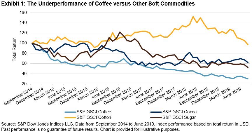
Over the past five years, the S&P GSCI Coffee underperformed the other soft commodities, as can be seen in Exhibit 1. Broad oversupply issues that have been seen in most commodities have been particularly pronounced in the coffee market. In addition to the major coffee-producing countries’ respective economic problems, these countries also generally suffer from high exposure to commodities, a strong U.S. dollar, and the ripple effect of the ongoing trade war between the U.S. and China. One alternative to stem the price decline may be for these countries to collaborate, similar to the way cocoa-producing countries do. In July 2019, Ghana and Côte d’Ivoire reached an agreement for a price floor in an attempt to counteract the lower cocoa prices in the past few years.

The supply picture is not helping coffee at the moment. In early September 2019, the International Coffee Organization increased its 2018-2019 global surplus estimate to 4.96 million bags from 3.92 million bags estimated the prior month. This estimate compares with the 2017-2018 surplus of 2.05 million bags and would be the second consecutive year with a surplus. This contrasts with a deficit of 1 million bags during 2016-17, and so the oversupply is worsening even with demand picking up globally.

Two of the top three coffee-producing countries have experienced big shifts in their economies over the past five years. Brazil, the largest exporter with 16% of global coffee exports, recently came out of a multi-year recession ending in 2017. Meanwhile, Colombia’s GDP was cut in half over that time as its exports declined by an annualized rate of 9%. About half of Colombia’s exports are crude petroleum and coal, two markets that, along with coffee, experienced extensive price declines over the past five years. Vietnam was the only one of the top three exporters to see an uptick in economic growth, although recent growth forecasts have been more pessimistic owing to elevated debt levels and large fiscal deficits. The World Bank believes Vietnam’s real GDP peaked in 2018.

Coffee consumption globally continues to creep higher, but due to the latest record harvests in Brazil, coffee prices have continued to decline. Starbucks recently proposed it may see a boost from lower costs, as the company projects coffee prices to continue to underperform. However, it is unclear where coffee prices might go from here given the uncertainty present in the global economy and associated levels of consumer consumption. Tastes and habits of consumers are also constantly shifting throughout the world. The S&P GSCI Coffee is designed to provide investors with a reliable and publicly available benchmark for investment performance in the coffee market. S&P Dow Jones Indices offers different versions of this index to cater to the needs of market participants. These versions include enhanced roll yields, dynamic roll yields, covered calls, forwards, and currency and regional indices. Single-commodity indices could offer investors an efficient way to access the return streams of unique assets such as coffee.

The posts on this blog are opinions, not advice. Please read our Disclaimers.

Illustrating the Value of Liquidity

Contributor Image
Chris Bennett

Former Director, Index Investment Strategy

S&P Dow Jones Indices

Let’s suppose for a moment that you are given a choice between two hypothetical exchange traded funds (ETFs) tracking the same index.  Fund A has an annual management fee of 0.4% while Fund B has an annual management fee of 0.1%.  At first glance, Fund B seems like the better option: it offers similar performance at a lower cost.

But you still have to purchase the fund and – at some later point in time – you may wish to sell it.  Trading costs can be complicated, but, at least for a small position, we can assume that they are accurately represented by the bid-ask spread for each ETF.

Suppose both Fund A and Fund B have a fair value of $100 per share, but Fund A can be bought for  $100.05 a share and sold for $99.95 a share while Fund B can be bought for $100.25 a share and sold for $99.75 a share.  Fund A has a $0.10 bid-ask spread, while Fund B has a $0.50 bid-ask spread.

Over the next year, suppose that both funds precisely track an index gain of 10%.  Assuming the same spreads, which fund would have given you the best total return after costs if you sold at year-end?

Though Fund A’s management fee was higher, the cost to get in and out of Fund B more than covered the difference.  Said another way: Fund A’s liquidity compensated for its higher fee.

Naturally, the relative importance of trading costs and management fees varies with the time for which positions are held.   The more one trades, the more important the trading costs will be in determining long-term returns.

A wide range of factors will go into determining the trading costs in an ETF, including whether or not there are other ways to trade exposures linked to the same index – such as other ETFs, or perhaps futures and options linked to the same index.

The chart below compares the average bid-ask spreads in equity-linked ETFs listed in the U.S. over the past year based on data from Bloomberg.  We also computed the averages for ETFs linked to S&P DJI Indices, and to the average for ETFs tracking a select few of S&P DJI’s indices that associated to a wide ecosystem of trading vehicles – in particular the S&P 500®, S&P Select Sector indices, and The Dow®.

As the chart shows, products linked to S&P DJI’s indices tend to have lower spreads than average, and products linked to our best-known indices (specifically the S&P 500, DJIA and Select Sector family) are some of the most liquid.

As our most recently published paper illustrates, several of S&P DJI’s indices have developed a deep ‘ecosystem’ of trading and liquidity.  Accordingly, users of index-based products may wish to consider the trading volumes associated with the underlying index as an important factor in choosing an appropriate investment allocation.

The posts on this blog are opinions, not advice. Please read our Disclaimers.

Using Sectors To Express Views

Contributor Image
Hamish Preston

Head of U.S. Equities

S&P Dow Jones Indices

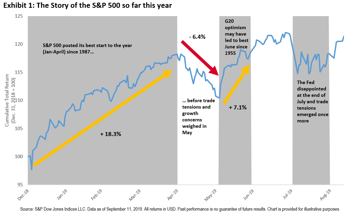
The S&P 500® is up 21.42% year-to-date and is within striking distance of its all-time high.  Although this may suggest the presence of a strong “risk-on” environment, there are signs that the bull market’s stride is changing.  Defensive assets have fared relatively well amid concerns over economic growth and trade tensions, while the inversion of several sovereign yield curves points to the unease being felt by many market participants.

Against this backdrop, many market participants may have considered switching asset allocations to adopt a more defensive approach – moving from equities to bonds, for example.  However, such a strategy is not without its challenges:  given the difficulty in timing the market correctly, one runs the risk of missing out on equity market gains or not having the desired downside protection when it is most desired.  An alternative approach may be to use equity sectors.

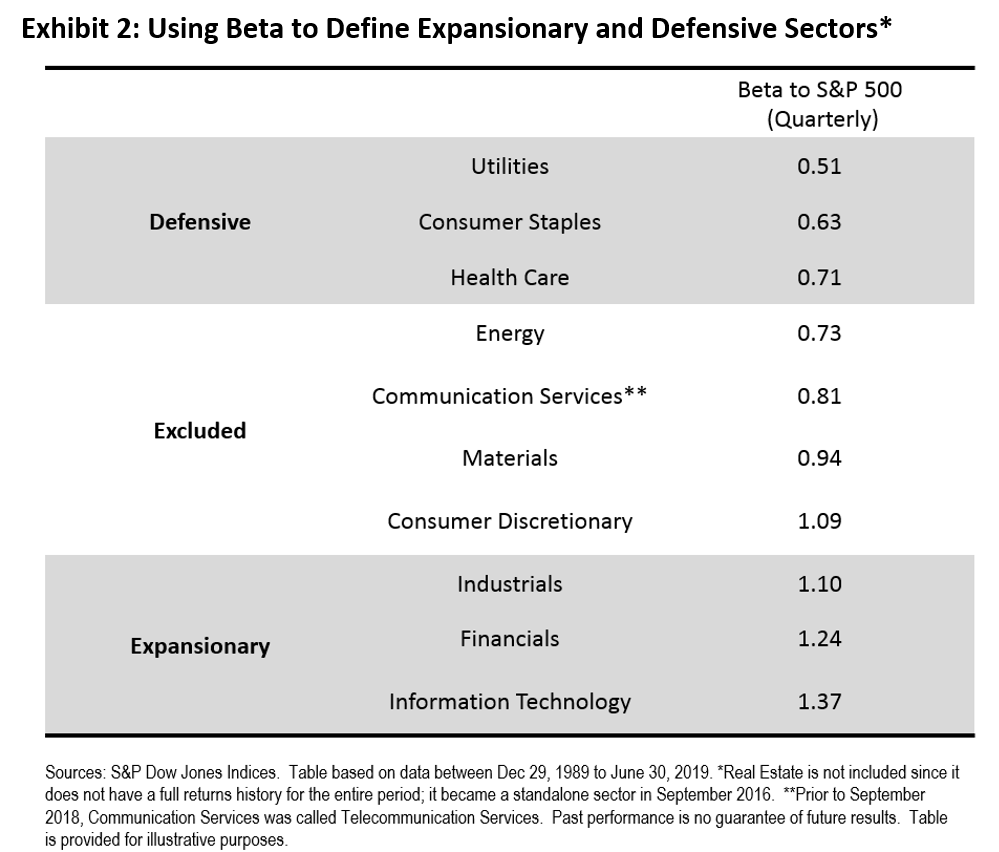
When implementing forecasts, it is imperative to know two pieces of information.  First, what is going to happen?  And once in possession of that information, what is to be done?  Bypassing the challenges involved with predicting the future, we assume that market participants have perfect foresight over U.S. GDP growth.  In order to help answer the second question, Exhibit 2 offers a simple categorization of S&P 500 sectors according to their betas to the S&P 500, based on quarterly total returns between Dec. 1989 and Jun. 2019.  These categorizations are used in the hypothetical sector rotation strategy.

Next up, we compare the performance of 3 hypothetical portfolios, each of which rebalances at the end of each quarter and maintains approximate 60/40 equity/bond allocations.  The “Benchmark 60/40” portfolio maintains a 60% allocation to the S&P 500 and a 40% allocation to the S&P U.S. Treasury Bond Index.  The “Asset Rotation” strategy prescribes a 70/30 (or 50/50) ratio between the S&P 500/S&P U.S. Treasury Bond Index when U.S. GDP growth over the next quarter is above (or below) its median value for the period between Dec. 1989 and June 2019.  The “Sector Rotation” portfolio maintains 40% allocations in each of the S&P 500 and the S&P U.S. Treasury Bond Index, and allocates 20% to an equally-weighted portfolio of expansionary (defensive) sectors when U.S. GDP growth in the next quarter is above (below) its median value for the entire period.

Exhibit 3 shows that both the hypothetical “Asset Rotation” and “Sector Rotation” portfolios offered similar risk/return characteristics, with higher annualized returns than the hypothetical “Benchmark 60/40” strategy.

Although this example involves substantial look-ahead bias – one would have needed perfect foresight over U.S. GDP growth to implement the hypothetical rotation strategies described above – the results illustrate a broader point: sector rotation strategies can be just as powerful as asset allocation in allowing market participants to express views.

The posts on this blog are opinions, not advice. Please read our Disclaimers.