Get Indexology® Blog updates via email.

In This List

Mapping the S&P 500 Trading Ecosystem

What Mega Insurers’ Turn to Passive Could Mean for Other Large Institutions

VIX® Dropped Below S&P 500® Realized Volatility

Rotating Between Growth and Value: The S&P 500® Growth Value Rotator Index

The Calm That Was

Mapping the S&P 500 Trading Ecosystem

Contributor Image
Tim Edwards

Managing Director, Index Investment Strategy

S&P Dow Jones Indices

A new paper published today provides a new perspective on the active usage of products linked to S&P DJI indices, and illustrates the network of liquidity that has developed around the S&P 500® and other popular benchmarks.

“Active” and “passive” are colloquial terms, and it can be hard to distinguish one from the other at times.  A portfolio replicating a broad, capitalization-weighted index is the archetypal passive strategy, yet timing the market by buying and selling such a portfolio on a daily basis would qualify under most definitions of active investing.

Seeking for a precise definitional distinction between active and passive investments may be a distraction: some investors will trade more frequently than others, nearly all will adjust their positions over time.  What is needed is a sense of not whether an investment strategy is active, but how much activity occurs. 

Exchange-traded funds (ETFs) illustrate the point.  An ETF tracking the S&P 500 is likely to be passively managed by the fund’s sponsor, but may have active owners who trade in and out of their positions frequently.  Futures and options seem easier to classify: with their predetermined expiry dates, they are built to serve shorter-term needs.  Yet such products can be used to replicate passive portfolio performance, potentially for years or decades if positions are rolled.

A Window on Index Liquidity

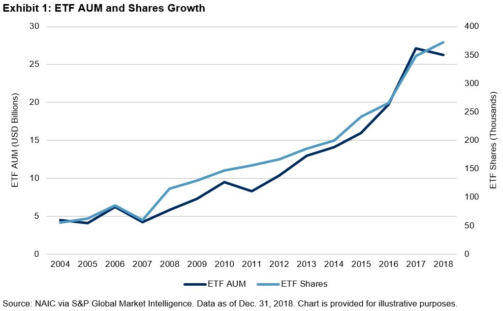
Our new research provides a snapshot of trading volumes associated with the range of tradeable products linked to S&P DJI indices – including futures, ETFs, options and other listed products.  These statistics begin to fill in some of the gaps in our understanding of the active use of ‘passive’ products, enabling us to infer average holding periods, or map out where liquidity may be found.

The data range over 1,300 individual products linked to 500 different indices, traded in more than 30 countries.  With annual volumes in the trillions of U.S. dollars for more popular indices, one conclusion of the research is that active investors play a major role in products linked to S&P DJI’s indices: average holding periods of a few months or less are typical.

The S&P 500 Ecosystem

Since the launch of index options and futures in the 1980s, followed by ETFs in the 1990s, the S&P 500 index has provided the basis for investors to access a growing range of exposures.  And – while several of our indices are associated to significant trading – the S&P 500 stands apart.

Over time, a S&P 500 ‘trading ecosystem’ has developed, with links extending across different product lines such as futures and options, and different—but related—indices such sectors, factors (“smart beta”) and other derivatives of the parent index.  The paper illustrates this network, and the value of associated trading in billions of U.S. dollars in the 12 months ending June 30, 2019.

The S&P 500 Ecosystem – Index Equivalent Trading Volume in Billions of U.S. Dollars

The proportion of assets managed ‘passively’ has become a much-debated statistic, particularly for large-cap U.S. equities.  But some of the universe putatively owned by passive investors may be mislabelledClick here to read the full report.


The posts on this blog are opinions, not advice. Please read our Disclaimers.

What Mega Insurers’ Turn to Passive Could Mean for Other Large Institutions

Contributor Image
Kelsey Stokes

Director, Multi-Asset Index Sales

S&P Dow Jones Indices

Of the more than USD 3.4 trillion invested in ETFs in the U.S.,[1] retail investors comprise the majority of the market. While pensions and endowments have been slow to use ETFs in their investment portfolios, one segment of the institutional market—insurance—has been steadily increasing their usage of ETFs. Earlier this year, S&P DJI analyzed the use of ETFs in the U.S. insurance industry, using regulatory data. These trends may offer insight for other institutional investors.

Despite a market correction in Q4 2018, insurance companies continued to increase their use of ETFs last year, holding assets in-line with long-term growth trends with USD 26.2 billion invested in ETFs. The insurance industry, however, exhibited a divergence in its investment patterns; with varying levels of investment depending on factors like size. Companies that had previously been slow to adopt ETFs increased their usage, while others that were more heavily invested in ETFs cut back.

Insurers have increasingly used ETFs in their portfolios for a range of strategic and tactical functions. Mega insurers, or those companies with more than USD 50 billion in assets, in particular, have historically employed ETFs for cash equitization, as a “liquidity sleeve” (an overlay for liquidity management), or as part of a risk barbell strategy, for example. Based on 2018 data, Mega insurers are investing more assets in ETFs than ever before, which could be a case study for other large institutions who have not yet begun investing in ETFs.

Mega insurance companies owned most of the admitted assets belonging to insurance companies in 2018, and they held approximately one-third of the insurance ETF holdings (see Exhibit 2).

What’s notable, however, is that these Mega companies increased their AUM by 39% over 2017 (see Exhibit 3).

While Large companies comprised the majority of insurance ETF assets in 2018, Mega companies were quickly reaching parity, demonstrating the greatest compound annual growth rates, across 1-, 3-, 5-, and 10-year time horizons. By contrast, Large companies’ ETF investments saw a 25% decrease in 2018.

Unlike prior years, equity ETFs—not fixed income ETFs—drove the growth in AUM from Mega insurers, exhibiting a 43% growth rate versus 2017. In 2018, equity ETFs comprised 63% of Mega insurers ETF assets invested.

As other large institutions, such as pension funds, endowments, and foundations, seek efficient and low-cost investment vehicles for their portfolios, the growth of ETF usage among mega insurers may serve as inspiration for their investments.

To learn more about the 2018 trends in ETF usage among insurers, read our latest analysis of “ETFs in Insurance General Accounts.”

[1] Source: Investment Company Institute

The posts on this blog are opinions, not advice. Please read our Disclaimers.

VIX® Dropped Below S&P 500® Realized Volatility

Contributor Image
Berlinda Liu

Former Director, Multi-Asset Indices

S&P Dow Jones Indices

While everyone has been concerned about the inverted yield curve, the CBOE Volatility Index® (VIX) has been under the 21-trading-day realized volatility of the S&P 500 since Aug. 16, 2019. Since volatility traders care not only about what is expected but also what actually transpired, the spread between implied volatility and realized volatility is one of the most important gauges for them to keep an eye on.

Historically, implied volatility tends to stay above realized volatility due to the skewed distribution of stock returns. When implied falls below realized, it usually suggests option premiums are relatively cheap, therefore favoring option buyers.

Implied volatility represents the current market price for volatility, or the fair value of volatility based on the market’s expectation for movement over a defined future period of time. VIX is arguably the most-followed gauge of the U.S. equities market implied volatility in the next 30 calendar days.

Realized volatility, on the other hand, is the actual movement that occurred in a given underlying over a defined past period. For VIX, that underlying is the S&P 500. Since the S&P 500 trades only when the market is open, the convention is to compare VIX with the realized volatility from the previous 21 trading days, approximately one calendar month.

Calendar-year averages since 2000 show that it is “normal” when VIX is above the realized volatility of the broad equity market (see Exhibit 1). The spread, calculated as VIX minus the 21-trading-day realized volatility of the S&P 500, is usually around 3-4 points. It tended to narrow during periods of market turbulence (e.g., in 2000 and 2008); 2008 was the only year that average VIX readings, which were higher than usual, fell short of the realized volatility. On the contrary, while the 2017 VIX level was lower than usual, the relationship between implied and realized volatility remained fairly “normal.” 

On a day-to-day basis, if we marked all the days as 1 when VIX was higher than the realized volatility and as -1 when VIX was lower than the realized volatility, we can visualize the frequency of positive and negative implied/realized volatility spreads over the past 20 years (see Exhibit 2). Since July 1, 1999, negative spreads occurred on 796 days out of 5,070 (15.7% of the time). Prolonged periods of negative spreads tended to occur in turbulent markets such as those in 2000 and 2008. The most recent stretch of negative spreads occurred from Q4 2018 to early 2019 during the market sell-off.

Why is implied volatility normally higher than realized? From a behavioral finance perspective, this is an indication of risk aversion—investors are willing to pay a premium to buy protection against risk. From an option pricing perspective, it is because stocks and stock indices do not follow the log-normal distribution assumption of Black-Scholes. The empirical distribution of stock returns has a negative skew and hence reflects larger losses than a normal or log-normal model using the ex-post mean and standard deviation would predict. Implied volatility takes into account large but rare events, while realized volatility will only include such events if they have occurred in the look-back calculation period. Since low-probability events are rare by definition, realized volatility tends to understate the potential for large losses most of the time. However, in a distressed market, realized volatility tends to overstate the risk of large losses when these sudden moves indeed occurred in the calculation window.

Nevertheless, in the relationship between implied and realized volatility, realized volatility serves as the baseline, while implied volatility defines the relative values of option premiums. The negative spread between VIX and realized volatility reflects overall complacency in the market.

The posts on this blog are opinions, not advice. Please read our Disclaimers.

Rotating Between Growth and Value: The S&P 500® Growth Value Rotator Index

Contributor Image
Qing Li

Director, Global Research & Design

S&P Dow Jones Indices

Growth and value are two investment styles based on fundamental analysis. A growth company typically has promising earnings potential and tends to invest more in future growth rather than dividend payouts, while a value company tends to be more established, with stable growth rates and dividend distributions.

While most market participants are familiar with single-style investment strategies, rotating between growth and value could help enhance return potential. The recently launched S&P 500 Growth Value Rotator Index uses a simple momentum rotation signal to switch between growth and value strategies, and it outperformed single-style benchmarks and the broad equity market with lower risk (see Exhibit 1).

Studies[1], [2] have not shown any strong evidence that one style consistently outperforms the other. If we use the S&P 500 Growth and the S&P 500 Value to represent growth and value stocks, we can see that growth stocks outperformed value stocks 51% of the time, while value stocks produced better returns 49% of the time, both on a total return basis, from January 1995 to July 2019.

The goal of the S&P 500 Growth Value Rotator Index is to take advantage of the two styles. It shifts between growth and value strategies based on the momentum rotational signal, calculated as the 12-month return of the growth or value indices. The strategy is constructed as an index of indices, taking the total returns of the S&P 500 Growth Index and S&P 500 Value as the underlying benchmarks. At the end of each month, if the 12-month return of the S&P 500 Growth is greater than the 12-month return of the S&P 500 Value, the index allocates to the S&P 500 Growth, and vice versa. The existing index selection remains unchanged if the one-year returns of growth stocks and value stocks are the same.

The S&P 500 Growth Value Rotator Index delivered significant outperformance from February 1995 to July 2019, producing an average monthly excess return of 0.15% over the overall stock market, as measured by the S&P 500. In addition, the index outperformed the S&P 500 Growth and the S&P 500 Value by 1.38% and 2.75% on an annualized basis, respectively. The reduced volatility enabled the S&P 500 Growth Value Rotator Index to achieve the highest risk-adjusted return among the individual style indices and the S&P 500 (see Exhibit 1).

The outperformance of the S&P 500 Growth Value Rotator Index was most evident in long-term horizons. In the 10-, 15-, and 20-year periods ending in July 2019, the strategy demonstrated consistent outperformance over the single-style strategies and the broad market, on an absolute and risk-adjusted return basis (see Exhibit 2). Over short-term horizons (the three- and five-year periods), the S&P 500 Growth Value Rotator Index notably outperformed the S&P 500 Value and the S&P 500, while its return slightly underperformed the S&P 500 Growth. This is not surprising since the market has been in an expansion stage in recent years. Furthermore, the S&P 500 Growth Value Rotator Index exhibited the smallest maximum drawdown of 49.73%, compared with 56.82%, 53.40%, and 50.95% for the S&P 500 Value, the S&P 500 Growth, and the S&P 500, respectively.

[1] N. Beneda [2003] Growth Stocks Outperform Value Stocks Over the Long Term

[2] A. Ang [2018] Value Investing: The Long-term Appeal of the Underdog; Grow is not the Opposite of Value

The posts on this blog are opinions, not advice. Please read our Disclaimers.

The Calm That Was

Contributor Image
Fei Mei Chan

Former Director, Core Product Management

S&P Dow Jones Indices

Through the end of July, equities had netted a nice gain for 2019 (though the picture looks a lot different so far in August). Unusually, the S&P 500 Low Volatility Index® outperformed in an environment when it has typically lagged its benchmark. (The S&P 500 gained 20.2%, while the low volatility index was up 20.8%, thru July 2019.)

Similar to its last quarterly rebalance, turnover in the low volatility index was limited, with changes taking place following the market close on August 16, 2019. Sector allocations are strikingly similar to the previous rebalance, with Financials, Technology and Utilities adjusting slightly higher while Consumer Discretionary, Health Care and Real Estate scaled back marginally.

The Latest Rebalance for the S&P 500 Low Volatility Index Yielded Minimal Changes

Trailing one-year volatility for S&P 500 sectors, a gauge we use sometimes use to gain insight, barely budged in the last three months. This is consistent across all 10 sectors. It’s therefore not surprising that turnover activity over the last two rebalances is at the lowest annualized level on record.

252-Day Volatility Changed Little Across All S&P 500 Sectors Compared to Three Months Ago

The posts on this blog are opinions, not advice. Please read our Disclaimers.