Get Indexology® Blog updates via email.

In This List

Sector Analysis of the S&P MidCap 400®

The Heat Is On for High Yield in July

Sustainability in South Africa: The Swing from SRI to ESG

Get to Know Mid-Cap U.S. Equities

Why Taking a Local Approach to Index Construction Matters in Canada

Sector Analysis of the S&P MidCap 400®

Contributor Image
Hamish Preston

Head of U.S. Equities

S&P Dow Jones Indices

U.S. mid-cap equities – as represented by the S&P MidCap 400 – outperformed both their larger and smaller counterparts since the early 1990s.  In decomposing relative returns, sector analysis can be useful to understand the drivers of performance.  For example, the S&P MidCap 400’s underweight position in Information Technology at the start of the 21st century helped it beat the S&P 500 by a stonking 26.61% in 2000, the year the Tech Bubble burst.

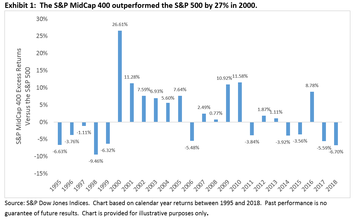
While sector allocations contributed to the S&P MidCap 400’s excess returns in 2000, the performance of mid-cap I.T. stocks also helped: the mid-cap benchmark’s Information Technology sector fell 4.7% in 2000 compared to a 40.9% plunge by the corresponding S&P 500 sector.  So which effect was more important in explaining the mid-cap index’s outperformance – its sectoral allocations or the selection of stocks within each sector?

Conventional Brinson attribution analysis suggests that stock selection was typically around three times more important than sector allocation.  To help illustrate this, we constructed two hypothetical portfolios that rebalance at each year end.  The “constituent match” portfolio combines the capitalization-weighted S&P MidCap 400 sector indices in proportions that match the S&P 500’s sector weights.  The hypothetical “sector match” portfolio combines the capitalization-weighted S&P 500 sector indices in proportions that match the mid-cap index’s sector weights.  Exhibit 2 shows the cumulative total returns for these two hypothetical portfolios, as well as for the S&P 500 and the S&P MidCap 400, since December 1994.

Quite clearly, the hypothetical “constituent match” portfolio offered almost identical return streams to the S&P MidCap 400; changing sectoral allocations did not have a material impact on relative returns.  Instead, stock selection within each sector was far more important in explaining the S&P MidCap 400’s outperformance; the “sector match” portfolio’s returns was much closer to the S&P 500.  Similar results were also observed when comparing the mid-cap index to the S&P SmallCap 600.

The relative importance of stock selection suggests that mid-cap companies may possess a strategic advantage relative to firms within different size ranges.  Indeed, mid-caps have generally overcome the risks of small-cap companies while remaining nimble enough to take advantage of growth opportunities that may be unavailable to their large-cap counterparts.

The posts on this blog are opinions, not advice. Please read our Disclaimers.

The Heat Is On for High Yield in July

Contributor Image
Kevin Horan

Former Director, Fixed Income Indices

S&P Dow Jones Indices

All bonds are not the same, and when it comes to high yield they can be more like equity than fixed income at times. High yield’s lower credit ratings and reliance on funding add risk, and some investors have relied on this asset class over the past couple of years in search of yield. An increasing number of companies selling high-yield bonds to refinance short-term debt means more refinancing will be required over the next few years. At the same time, high yield is more likely to behave like an equity investment.

Exhibit 2 shows the history of a one-year rolling correlation between the S&P U.S. High Yield Corporate Bond Index and the S&P 500. The historic correlation between these two indices since 1993 has been 0.23 for the period presented. As of July 19, 2019, the 0.50 level is reaching a high point comparable to the Oct. 27, 1997, high point of 0.53, the day of the “October mini-crash.”

The Oct. 27, 1997, mini-crash was a global stock market crash that was caused by an economic crisis in Asia. The point loss that the Dow Jones Industrial Average® suffered on this day ranks as the 23rd biggest point loss and 15th biggest percentage loss since 1900’s. This crash is considered a “mini-crash” because the percentage loss was relatively small compared to some other notable crashes. After the crash, the markets still remained positive for 1997 (+31%), but the “mini-crash” may be considered as the beginning of the end of the 1990s economic boom in the U.S. and Canada, and when both returned to pre-crash levels, they began to grow at an even slower pace than before the crash.

The more recent comparable high point was 0.56, which marked the beginning of the inaugural events in Washington D.C. prior to the inauguration ceremony for U.S. President Trump. Another significant political turning point after eight years of economic policy run by the Obama administration.

The July 10, 2019, comments by Federal Reserve Chairman Jerome Powell essentially locked in a rate cut for the July 30th and 31st meetings. Speculation on the rate move now stands on whether it will be 25 bps or possibly 50 bps. This would be a substantial change in current central bank policy, which had been implementing rate increases. The messaging now is that a rate cut will provide insurance against an economic slowdown, continuing a long-running expansion. Ahead of the U.S. Fed move, global central banks have and most likely will continue to coordinate a global easing cycle. Continued lowering of global rates will not leave much room or impact for using rates as a tool, significantly raising downside risk in the future.

Lower rates signal slower economies and the need to stimulate them. Beneficial in the short run, but the potential for a sudden reaction in high yield due to economic or geopolitical risks is higher, and a threat to continued refunding as the market pulls back making capital less accessible could affect default rates. As upcoming events play out, continued focus on the direction of both indices’ is warranted.

The posts on this blog are opinions, not advice. Please read our Disclaimers.

Sustainability in South Africa: The Swing from SRI to ESG

Contributor Image
Mona Naqvi

Global Head of ESG Capital Markets Strategy

S&P Global Sustainable1


Socially responsible investing (SRI) has deep roots in the South African market. Indeed, some of the earliest records of this type of investing date back to the boycotts against South African companies during the era of Apartheid. The movement paved the way for a generation of socially conscious investors seeking to affect social change, giving renewed meaning to the adage of “putting one’s money where one’s mouth is.”

As an investment strategy, SRI removes “sin” stocks such as tobacco, alcohol, and weapons from portfolios with negative screens. Values aside, this is potentially risky due to a lack of portfolio diversification. SRI therefore got somewhat of a bad rep for being “values-based investing” in mainstream finance circles. But contrary to what mainstream investors might think, environmental, social, and governance (ESG) investing, on the other hand, is not some virtuous strategy relegated to those investors who are willing to put their beliefs before their returns. ESG can simply be a prudent approach to encompassing a broader information set that focuses on material issues with the potential to affect the long-term viability of company business models.

For example, the value of a company like Aspen Pharmacare is not only driven by its physical assets, but also by its innovation and access to patients. With rising healthcare costs and diminishing patient trust in providers, a holistic valuation might also consider its intangible assets like innovation management and business ethics. These are, to a large extent, informed by metrics such as R&D productivity, product recalls, and customer satisfaction—precisely the types of issues that would get captured by a diligent ESG research process. Though there are many sustainability topics to consider, they are not all relevant. ESG can, and often does, simply focus on the most financially material factors for a given industry.

The Myth of an ESG versus Performance Tradeoff

Since the early days of SRI, sustainability data has greatly improved. Companies increasingly disclose to qualify for exchanges like the JSE SRI Index that was launched in 2004. While initiatives such as the King Code on Corporate Governance (with various iterations from 1994-2017) have played a role. Investor demand for greater transparency has also risen with growing awareness of the materiality of ESG issues.[1] Revised Regulation 28 of the Pension Funds Act in 2011 calls for trustees to assess the materiality of ESG factors in their investments, on which FSCA released additional guidance in June 2019. Furthermore, the 2011 Code for Responsible Investing in South Africa encourages institutional investors to integrate ESG into their investment process as well. Investors are thus pushing for more information on the sustainability performance of the companies they own.

The data that has emerged offers the possibility of nuanced approaches to responsible investing—amplified by the launch of S&P DJI ESG Scores.[2] The scores unleash decades of sustainable investing insights and variation in sustainability characteristics among companies within even the same sector. With such datasets, inclusive approaches to tilt, reweight, or optimize a strategy rather than simply exclude sectors are now possible. Thus, with industry-neutral approaches, ESG investing need not imply a tradeoff with returns. For example, the S&P South Africa Domestic Shareholder Weighted (DSW) Capped ESG Index outperformed the benchmark over the past three-year period (see Exhibit 2). By targeting 75% of market cap by ESG rankings within industry groups, whose weights remain unchanged, the index offers a compelling rebuttal to the myth of an ESG versus performance tradeoff.

A Real (Economy) Problem

ESG can also help to address unprecedented trends unfolding in the global economy. Some of which, like global warming, invite policy responses that translate these real economy impacts into material concerns for investors. For instance, measures like the South African Carbon Tax Act No. 15 are, by design, transforming the underlying economics to favor carbon-efficient technologies across all industries. Investors looking to safeguard against the rising costs of a carbon-intensive portfolio might thus opt for low-carbon solutions, like the S&P South Africa DSW Capped Carbon Efficient Index (see Exhibit 3). The index closely tracked the benchmark over the past three years and achieved a 58% carbon reduction as of July 2019,[3] demonstrating that investors can make good on their values without compromising their returns.

A Primarily Pragmatic Approach

Not to be confused with SRI, which is deliberately principled, ESG offers a pragmatic approach to addressing financially material issues through a broader information set. ESG index solutions can facilitate similar—if not better—risk/return profiles to broad market benchmarks, upending the view that this type of investing necessarily implies a trade-off with returns. The added possibility of achieving some positive social impact might just be a bonus.

[1] A 2007 report led by UNEPFI found that 70% of South African investment professionals surveyed claimed that most ESG issues were at least somewhat material in “evaluating the likely performance of investments.”

[2] For more information about S&P DJI ESG Scores see here: https://spdji.com/documents/education/education-discover-material-insights-with-sp-dji-esg-data

[3] Calculated using Trucost carbon emissions data based on the aggregation of operational and first-tier supply chain carbon of index constituents per USD 1 million in revenue (tCO2e / USD million). For more information, visit www.spdji.com/esg-metrics.

The posts on this blog are opinions, not advice. Please read our Disclaimers.

Get to Know Mid-Cap U.S. Equities

Contributor Image
Louis Bellucci

Senior Director, Index Governance

S&P Dow Jones Indices

S&P Dow Jones Indices’ recent paper “The S&P MidCap 400®: Outperformance and Potential Applications” shows that mid-cap stocks have often been overlooked in favor of other size ranges in investment practice and in academic literature. This is despite the fact that the S&P MidCap 400 has outperformed the S&P 500® and the S&P SmallCap 600® at an annualized rate of 2.03% and 0.92%, respectively, since December 1994. While the mid-cap index was, on average, roughly 15% more volatile than its large-cap counterpart, its higher returns more than compensated over longer periods.

Market capitalization is the main determinant of size classifications, however there is no universally accepted way to define the mid-cap universe. Some index providers use a fixed-count, ranked approach to determine the mid-cap universe, while others target a proportion of free-float-adjusted market cap coverage instead.

The S&P MidCap 400 is designed to measure the performance of mid-sized U.S. equities, reflecting this market segment’s distinctive risk/return characteristics. S&P Dow Jones Indices defines mid-cap companies as those with total market capitalizations between USD 2.4 billion and USD 8.2 billion. This range is reviewed by the Index Committee from time to time to assure consistency with market conditions. The committee also considers other criteria—such as a financial viability screen and sector representation—when considering companies for addition to the S&P MidCap 400. Due to the upper bound on the market capitalization thresholds, the S&P MidCap 400 is less concentrated than the large-cap S&P 500. The top 10 companies account for 6.74% of the index weight, which is significantly less than the 22.79% weight held by the top 10 companies in the S&P 500.

Many mid-cap companies may possess a strategic advantage relative to firms of larger or smaller sizes, having successfully navigated the challenges specific to small companies, such as raising initial capital and managing early growth, and now offering stability with the potential of additional growth opportunities. Mid-cap companies have generally overcome the risks of small-cap companies, but they still have the potential to grow before exhibiting the growth deceleration often seen in large-caps. Mid-caps often have established infrastructure, access to capital, and developed distribution systems, but they are still nimble with motivated management teams to take advantage of opportunities quickly.

In the market-cap-weighted structure of indexing, the winners often graduate to the S&P 500, if they aren’t acquired first, and the losers decrease in weight and may even leave the index, making the overall index weighted more heavily with relative winners. Without knowing exactly which ones will be the big winners, allocating to the whole basket makes sense. From Jan. 1, 2014, to June 28, 2019, 77 S&P MidCap 400 components graduated to the S&P 500, 79 were demoted to the S&P SmallCap 600, and another 111 were acquired.

Additionally, the mid-cap segment has unique valuation characteristics. The S&P MidCap 400 maintains a similar trailing price-to-earnings ratio to the S&P 500, indicating similar valuations of mid-cap and large-cap companies. Meanwhile, the price-to-book value and price-to-sales ratios are much more similar to the small-cap segment, represented by the S&P SmallCap 600. These potential strategic advantages of the individual components and sector allocations may help to explain the mid-cap segment’s fundamentals relative to the large- and small-cap segments. On average, the S&P MidCap 400 has historically had higher exposures to Real Estate, Utilities, and Materials, and has been underweight Information Technology and Health Care.

With an overview of what makes the mid-cap segment distinct, take a closer look at the driving forces behind mid-caps’ outperformance (including stock versus sector selection and factor exposure), gauge how mid-cap active funds fare against their passive counterparts, and explore the potential benefits of dialing up exposures in core portfolios. Check out the latest research here to learn more.

The posts on this blog are opinions, not advice. Please read our Disclaimers.

Why Taking a Local Approach to Index Construction Matters in Canada

Contributor Image
Michael Orzano

Head of Global Exchanges Product Management

S&P Dow Jones Indices

While nearly everyone in the Canadian investment community has heard of the S&P/TSX Composite, few are aware of the key methodological intricacies that distinguish it from other broad market Canadian equity benchmarks.

The most notable distinction is that the S&P/TSX Composite is designed specifically for Canadians (as are all S&P/TSX Indices), while many other Canadian equity indices, such as the FTSE Canada All Cap Index, are simply country slices of global benchmarks and, therefore, take the perspective of foreign investors. Now, why does this matter you might ask? Well, Canada has foreign ownership limits that affect several industries, such as telecommunications, broadcasting, transportation, and real estate. So, whether or not these limits are accounted for in the index is significant.

As an example, Bell Canada (BCE)—the largest Canadian telecommunications company—was the 10th largest company in the S&P/TSX Composite, with a weight of 2.3%, as of June 28, 2019 (see Exhibit 1). However, foreign investors are restricted from owning more than one-third of BCE under Canada’s Telecommunications Act. As a result, BCE’s weight in the FTSE Canada All Cap Index is reduced by two-thirds from its natural market-cap weighting to roughly 0.75%.

Real estate investment trusts are also subject to a 49% ownership limit, which results in the weight of the Real Estate sector being reduced in the FTSE index relative to the S&P/TSX Composite. Ultimately, the differing treatments of foreign ownership limits is a key driver of the FTSE Canada All Cap Index’s higher concentration in Financials and lower exposure to other sectors such as Communication Services and Real Estate, as illustrated in Exhibit 2.

Differing definitions of what constitutes a Canadian company for index assignment purposes are also important to consider. For example, Shopify—the Canadian e-commerce company—was added to the S&P/TSX Composite in March 2017. However, FTSE Russell classified Shopify as a U.S. company until January 2019, which prevented it from being included in the FTSE Canada All Cap Index until earlier this year.

The S&P/TSX Indices also include companies structured as limited partnerships (LPs), whereas FTSE Russell’s global equity index methodology excludes them. Because of this, several Brookfield Partnerships that own and operate infrastructure, real estate, and renewable energy assets are excluded from the FTSE Canada All Cap Index. These companies represent a weight of about 1.5% in the S&P/TSX Composite.

Finally, the S&P/TSX Composite is a broader representation of the Canadian equity market relative to the FTSE Canada All Cap Index. As of June 28, 2019, the S&P/TSX Composite included 239 constituents, representing a total index market cap of nearly CAD 2.3 trillion, while the FTSE Canada All Cap Index included 205 components and a 6% smaller aggregate index market cap of CAD 2.15 trillion. This disparity is partially driven by the inclusion of LPs, but it is largely due to the relatively more inclusive size and liquidity requirements of the S&P/TSX Composite.

While the returns of the two indices have historically tracked fairly closely, the methodology differences discussed have contributed to meaningful performance differences over time. As depicted in Exhibit 4, the 3.87% total return of the S&P/TSX Composite was nearly 1% greater than the FTSE Canada All Cap Index over the trailing 12-month period. Over the past 10 years, the S&P/TSX Composite has outperformed by 42 bps per year with slightly lower volatility.

In summary, it is important to look under the hood and understand the design features of seemingly similar benchmarks. Because of its comprehensive nature and Canadian-centric design features, the S&P/TSX Composite may more fully and accurately reflect the investment opportunity set available to Canadian investors in comparison to other market indices.

As a final note, you may often see the S&P/TSX Capped Composite cited, given that it underlies several index-based products, and wonder how it differs from the headline S&P/TSX Composite. The term “capped” refers to the fact that the methodology includes a 10% cap—or limit—on the weight of any single stock. The capped version of the index was introduced back in 2000, when Nortel Networks grew to become so large that it represented nearly one-third of the weight of the S&P/TSX Composite. However, Nortel soon shrank and the S&P/TSX Composite and S&P/TSX Capped Composite have been identical since 2001, as no company has held a weight in excess of 10%.

To learn more about the S&P/TSX Indices and recent trends in Canadian equities, please watch our recently released video:  Finding Opportunity at Home with the S&P/TSX indices.

The posts on this blog are opinions, not advice. Please read our Disclaimers.