Get Indexology® Blog updates via email.

In This List

Evolution of Canadian REITS

Why Your Interest In Weights Should Rise With Rates

Palladium, More Precious Than Silver, Platinum, and Gold

ESG Meets Behavioral Finance – Part 3

Visualizing the SPIVA® Europe Scorecard

Evolution of Canadian REITS

Contributor Image
Smita Chirputkar

Former Director, Global Research & Design

S&P Dow Jones Indices

The Canadian REITs industry will mark its 25th anniversary in June 2018. In light of this milestone event, it is worthwhile to review the evolution of the market as well as the characteristics of the asset class.

Canadian REITs were born after the recessionary period in the late 1980s and early 1990s. There were five REITs in the Canadian market by late 1996. From 1998 to 2000, when technology stocks were soaring, REITs were trading at a discount in Canada. After the burst of the technology bubble, market participants were searching for companies that owned the hard assets, and REITs became a widely accepted vehicle, as they owned or managed the physical assets and satisfied the income needs of investors at that time. The total market capitalization of Canadian REITs grew from CAD 16 billion in June 2005 to over CAD 57 billion by December 2017, as measured by the S&P Canada REIT.

REITs Have Low Correlation With Traditional Asset Classes

In Canada, REITs have outperformed the equities and fixed income asset classes on an annualized return basis over the past 20 years. Despite higher returns, the risk over the test period was similar to that of equities (see Exhibit 2). Over the period studied, the average rolling 12-month correlation of REITs against equities was 0.43, while that of fixed income was 0.21. Correlations of REITs with traditional asset classes are time varying, and the correlation with equities reached a peak of 0.89 shortly after the 2008 financial crisis (September 2009) and gradually fell to 0.29 by December 2010.

REITs Have Low Correlation With Other Dividend-Paying Equity Sectors

Utilities and telecommunication services are typically regarded as high-dividend-paying sectors. Over the period observed, REITs had average correlations of 0.41 and 0.26 with the utilities and telecommunication services sectors, respectively. The correlation with utilities peaked at 0.88 in June 2003, while the correlation with telecommunication services peaked at 0.8 in October 2009, when the Canadian market experienced downturns. Given the low average rolling correlations to other income-producing sectors, REITs and stocks from the utilities and telecommunication services sectors could potentially offer diversification benefits for market participants seeking income.

In the next blog, we will explore in detail the S&P TSX Capped REIT Income Index, which is designed to serve as an income-producing strategy.

The posts on this blog are opinions, not advice. Please read our Disclaimers.

Why Your Interest In Weights Should Rise With Rates

Contributor Image
Jodie Gunzberg

Former Managing Director, Head of U.S. Equities

S&P Dow Jones Indices

Historically as interest rates have risen, equities have done well.  As illustrated in this post, since 1971, the S&P 500 (TR) has gained about 20% on average in rising rate periods, has gained 8 of 9 times and has gained nearly 40% twice with less than a 4% loss for its worst rising rate period.  Also shown in the same note is that every sector, size and style rise on average with rising interest rates, though small caps do particularly well.  This is since growth and inflation are taken into account in many cases when measuring equity duration, where if the growth and inflation outpace the discount rate (based on the interest rate,) the impact is likely positive for stocks.  Given the relatively strong performance of small caps with rising rates, inflation, GDP growth and the falling dollar, now is an interesting time to examine the alternative weighting index performance from the market capitalization weighted indices.

Market cap weighted indices by design, are meant to measure the most basic beta, or systematic risk of the market.  In other words, they just reflect the market composition, so bigger companies get bigger weights resulting in less exposure to smaller companies.  While those indices represent the markets well, the resulting risk and return may or may not be suitable for particular investment goals.  One of the oldest and most common solutions is to include more of the small cap premium by equally weighting each stock in the index, and as shown in this post, equally weighted indices work well historically on average.

Another way to adjust weights is by style, commonly split by value and growth.  Although there are indices that only include style specific stocks many of them still weight the stocks by market cap; however, weighting the stocks by style is more potent, especially for large caps.  So, equally weighted large caps at the core with large cap pure style weighted indices, both growth and value, can give more of performance usually generated by a separate small cap allocation.

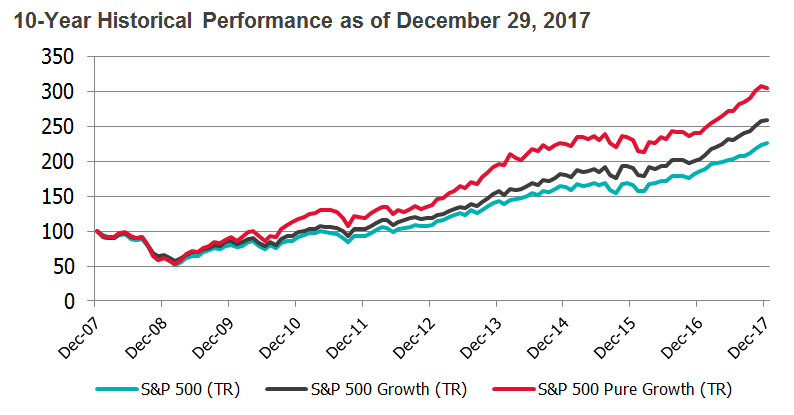
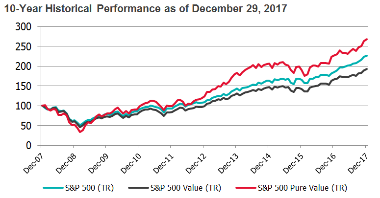
Source: S&P Dow Jones Indices. Monthly total returns from December 31, 2007 to December 29, 2017.

The S&P 500 Pure Growth outperforms largely due to its over-weights in financials and health care and under-weights in technology.  Similarly, the S&P 500 Pure Value outperforms from its over-weights in financials and consumer discretionary at the expense of technology in addition to energy, industrials and materials.

Source: S&P Dow Jones Indices. Monthly total returns from December 31, 2007 to December 29, 2017.

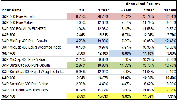
The S&P MidCap 400 Pure Growth also adds alpha, particularly with a falling dollar, since the index is more heavily weighted towards information technology.  This mid-cap sector benefits most from the weaker dollar due to more international growth prospects than in any other sector. While the pure growth and equal weights mostly outperformed across sizes, the pure value outperformance only held in large caps.  This is since much more of the weight is redistributed across the large cap spectrum than in the mid and small cap range.

Source: S&P Dow Jones Indices, LLC. As of close of business Mar. 8, 2018.

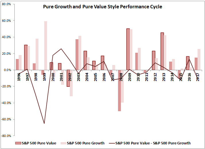
Although the pure styles have provided outperformance particularly in large caps, the returns between the styles cycle, just like in the size cycle.

Source: S&P Dow Jones Indices, LLC. As of close of business Dec. 29, 2017.

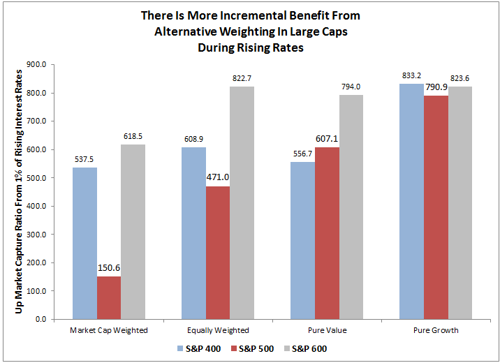
Wherever one may believe the cycle is, one thing that is clear is that in periods of rising rates, large caps benefit most from an alternative weight like equally weighted or pure style, and given longer term size and style premiums exist, these may be strong core choices.  For every 100 basis point rise historically, the S&P 500 has risen on average 1.5%, whereas the S&P 500 Equal Weight rose 4.7% and the Pure Styles of Value and Growth rose a respective 6.1% and 7.9%.  While the small caps still outperform in rising rates, the best bang for the buck from alternative weights is in large caps.

Source: S&P Dow Jones Indices.


The posts on this blog are opinions, not advice. Please read our Disclaimers.

Palladium, More Precious Than Silver, Platinum, and Gold

Contributor Image
Marya Alsati

Former Product Manager, Commodities, Home Prices, and Real Assets

S&P Dow Jones Indices

On March 5, 2018, S&P Dow Jones Indices launched the S&P GSCI Precious Metals, Platinum & Palladium Equal Weight to provide market participants with a reliable and publicly available benchmark for investment performance in the gold, palladium, platinum, and silver commodity markets. The index is equally weighted on a quarterly basis.

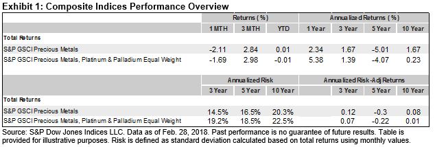
What is the added value, if any, of utilizing equal weighting and adding palladium and platinum to the S&P GSCI Precious Metals, which includes only gold and silver with a weight ratio of approximately 9:1? Exhibit 1 depicts the performance of the two indices.

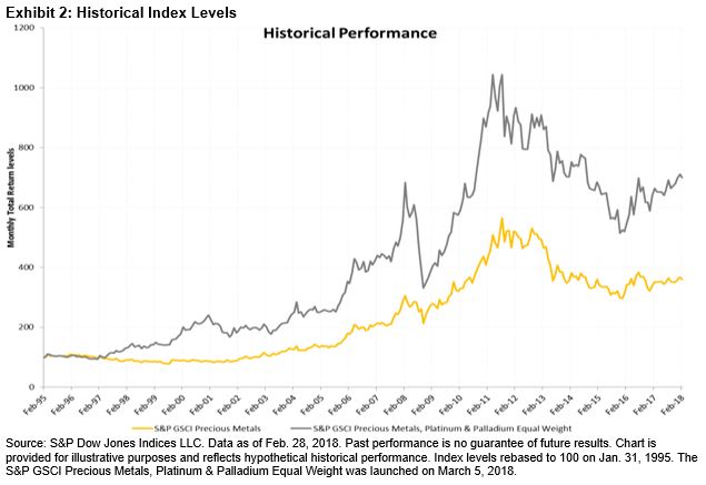
Looking at performance over a 10-year period, it appears that adding palladium and platinum to gold and silver, with an equal weighting improved the performance over the shorter horizon, but how do the indices fair when compared since their base values on Jan. 16, 1995?

The S&P GSCI Precious Metals Index gained over 250% since its base date, compared with the S&P GSCI Precious Metals, Platinum & Palladium Equal Weight, which gained almost 600%. The appreciation was mostly driven by palladium, which increased by over 1,000% since 1995.

Palladium was also the best-performing single commodity for the other annualized time frames, and its stellar performance compensated for its higher annualized risk levels, which resulted in better risk-adjusted returns (see Exhibit 4).

Gold, the second-best-performing precious metal and generally considered a safe haven asset during turbulent market conditions, tends to lose its attractiveness when market participants can obtain better returns elsewhere. Palladium, a byproduct of platinum and nickel, is similar in its status because of its use in precious jewelry and its sensitivity to changes in the U.S. dollar, as it is traded in dollars and becomes expensive when the dollar value increases compared with other currencies. However, palladium also has an industrial application, as it is used in catalytic converters in cars and trucks to reduce pollution, as well as capacitors in consumer electronic equipment. In addition, palladium has been in a deficit since 2012, when it was plagued by challenges in the mining sector and mine closures in Zimbabwe and South Africa, the third- and fifth-largest platinum-producing countries.

Finally, the low correlation in performance of platinum and palladium compared with the traditional precious metals may have a diversification benefit. For comparison, gold and silver have a correlation of 0.72, while gold’s correlation with palladium and platinum is 0.25 and 0.57, respectively.

The posts on this blog are opinions, not advice. Please read our Disclaimers.

ESG Meets Behavioral Finance – Part 3

Contributor Image
Lauren Smart

Managing Director, Global Head Financial Institutions Business

Trucost, part of S&P Global

Black Swans and Green Elephants: Time Inconsistency, Salience, and the Tragedy of the Horizon

“When the well is dry, we know the worth of water.”[1] These were Benjamin Franklin’s cautionary words over 250 years ago. March 22, 2018, is World Water Day, and this year the residents of Cape Town will be feeling the poignancy of his words as they approach “Day Zero”—the day the taps will be turned off (July 9, 2018). Their three-year drought has caused households and businesses to take radical measures to reduce water consumption.[2] Cape Town will not be alone, as the UN warns that by 2030, global demand for fresh water will exceed supply by 40%.[3]

Franklin’s words remain as true today as they were then, because we humans are irrational in how we quantify value and risk at different points in time. This is evidenced by behavioral finance experiments in which it was observed that losing something makes us approximately twice as miserable as gaining the same thing makes us happy.[4] However, preserving what we have is also subject to biases, as we tend to undervalue future risks, particularly if there is a short-term “cost.” Humans are prone to temptation, procrastination, and status quo bias, which explains why so many New Year’s resolutions are broken and why vices such as smoking and drinking remain prevalent, despite our knowledge of the negative consequences.

The interplay of value, risk, and time inconsistency presents a problem for the pension industry. Behavioral factors need to be addressed to encourage people to save more for their retirement, and the investment industry itself needs to tackle the structural and behavioral causes of short-termism. Myopic assessments of risk/reward drove the “irrational exuberance” at the heart of many financial bubbles, and they are a key reason why 50% of investors do not take environmental issues into account.[5] Mark Carney, Governor of the Bank of England, calls this “The Tragedy of the Horizon,”[6] which also alludes to the “Tragedy of the Commons,” a term used in environmental economics to describe the inefficient use of seemingly “free” natural resources. Climate change and resource depletion have short-term financial impacts, too—as the tourism and agriculture industries in Cape Town can attest to—but these will intensify and accelerate over time. In order to mitigate the worst impacts, we need efficient allocation of capital that accurately weighs up short-term costs with long-term benefits. The rational man of classical economics would have no problem with this exponential discounting, but human deviation from rationality leads to environmental externalities, misallocation of resources, and market failure. A good example of the latter is water, where the market price is inversely correlated with its scarcity (see Exhibit 1).

Market failures are not our only challenge; the relatively short-term focus of financial models can cause blind spots for investors. The Organisation for Economic Co-operation and Development (OECD) recently argued that modern portfolio theory is inadequate for incorporating ESG issues because it supports short-termism, is not forward looking, and leads to herding.[7]. It also argues it is ill equipped for the types of discontinuous risk associated with climate change. As the NGO the 2 Degrees Investing Initiative eloquently put it, “All swans are black in the dark.”[8] We must also remember that climate impacts will accelerate, so the future will not look like the past, and as Carney states, “The past is not prologue and the catastrophic norms of the future can be seen in the tail risks of today.”[6] This presents particular problems for new funds trying to break the status quo bias and take a forward view on environmental issues, because back-tests are often used to judge their potential future performance.

Salience can make a difference. If an event is recent and emotive, it is easier to recall, and there is a higher probability of it occurring again. In Cape Town right now, the financial and human impact of water shortages will be particularly salient, but let us hope that we do not have to wait for further catastrophic climate events to make us take the true cost of environmental issues into account. As we enter a new era of lower-carbon, more resource-constrained economic development, we would be wise to remember the disclaimer, “past performance is no guarantee of future results.”

If you liked this blog, you may also like part 1, “‘Nudging’ Sustainable Finance Into the Mainstream: How Behavioral Finance Could Transform Capital Flows to ESG,” and part 2, “The Big Green Elephant in the Room: Why Do We Assume That “Green” Investing Means Sacrificing Returns?

[1] Benjamin Franklin (1746), Poor Richard’s Almanac.

[2] Curnier, Benjamin, The Economist Intelligence Unit, (Feb. 28, 2018), “Cape Town’s water crisis shows the reality for cities on the front line of climate change.”

[3] UN World Water Development Report 2015, (2015), Paris: UNESCO Publishing.

[4] Thaler, Richard and Cass Sunstein (2009), “Nudge.” Yale University Press.

[5] The CFA Institute (2017), “ESG Survey 2017.”

[6] Carney, Mark, (Sept. 29, 2015), “Mark Carney: Breaking the tragedy of the horizon – climate change and financial stability

[7] OECD (2017), “Investment governance and the integration of environmental, social and governance factors.”

[8] 2 Degrees Investing Initiative and the Generation Foundation (February 2017) “All Swans are Black in the Dark: How the Short-Term Focus of Financial Analysis Does not Shed Light on Long Term Risks.”

If you enjoyed this content, join us for our Seminar Discover the ESG Advantage in
London on May 17, 2018.

The posts on this blog are opinions, not advice. Please read our Disclaimers.

Visualizing the SPIVA® Europe Scorecard

Contributor Image
Andrew Innes

Head of Global Research & Design

S&P Dow Jones Indices

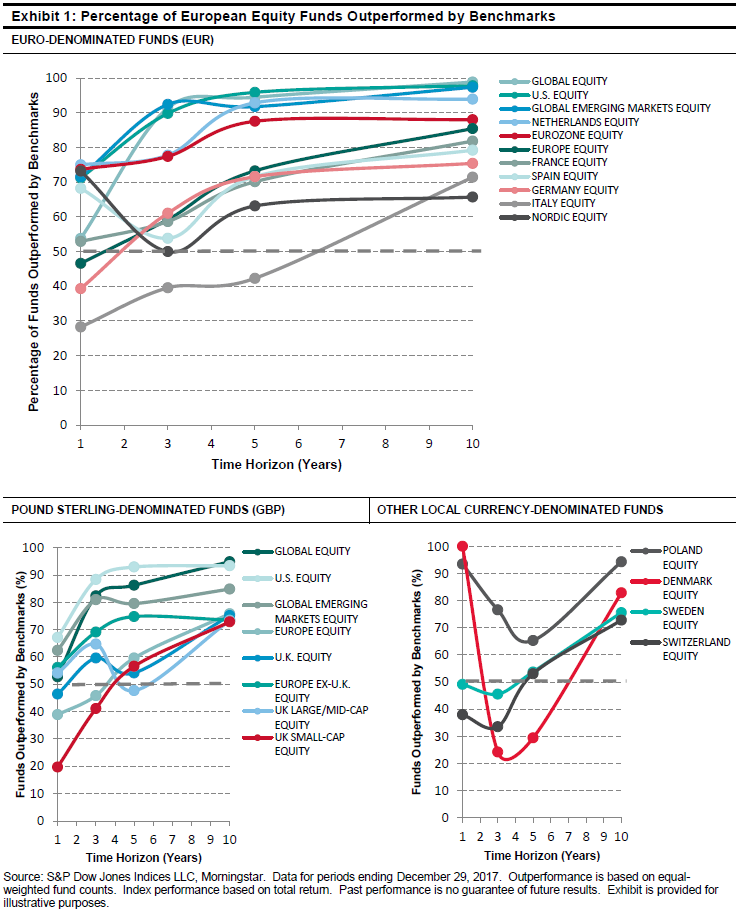
The S&P Indices Versus Active (SPIVA) Europe Year-End 2017 Scorecard is composed of a rich dataset of active fund performance figures and insights for those wishing to participate in the active versus passive debate. The coverage and detail in the report may be extensive, but the conclusions needn’t be complex. By visualizing the data as charts, the findings can be brought to life. Here are three key takeaways that the charts help depict more clearly than numbers ever could.

1. The majority of funds have underperformed their benchmark over long time horizons.

While the percentage of funds that were beaten by their benchmark over any single year can fluctuate between each SPIVA report, the long-term trend has always persisted. No active fund category in the SPIVA Europe Year-End 2017 Scorecard had a majority of outperforming active funds when measured over a 10-year period.

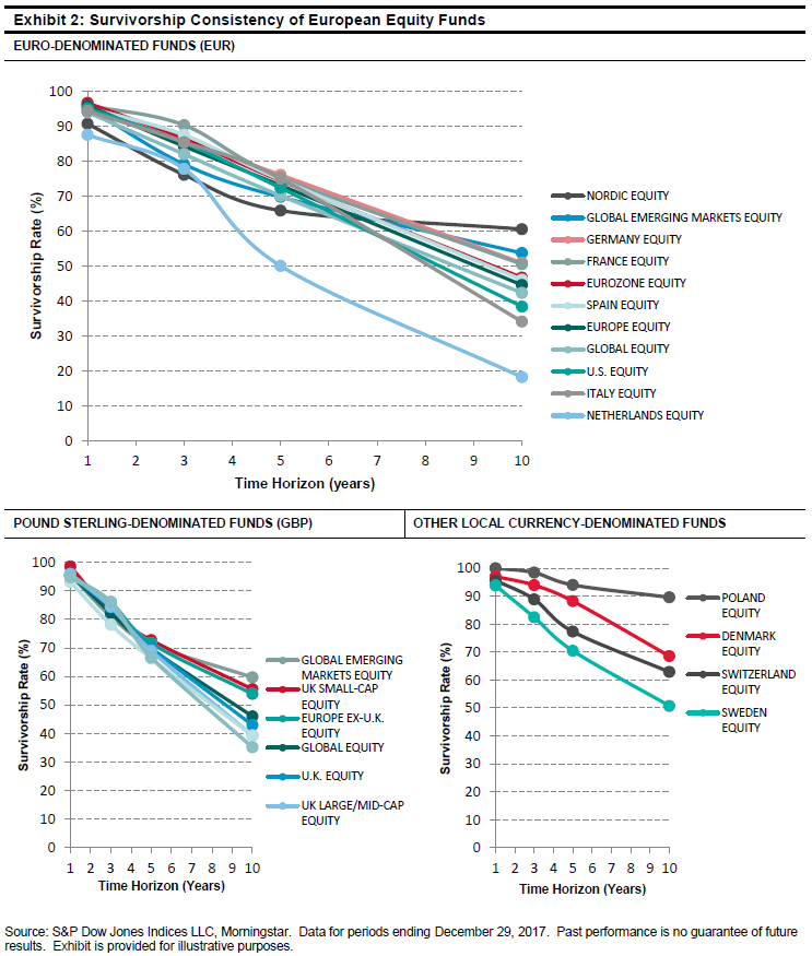
2. Funds have consistently struggled to survive across most fund categories.

Underperforming funds may eventually face closure. The survivorship rates show us that active funds have steadily disappeared over time. The charts clearly show how the rate of survivorship across many fund categories was surprisingly similar.

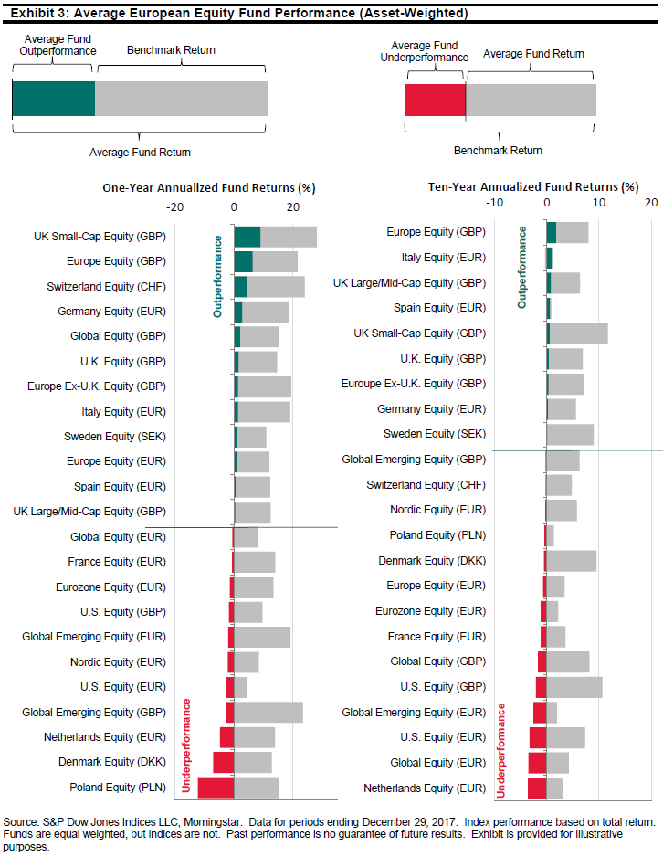
3. Outperforming fund categories have reduced over longer time periods.

Just 9 out of 23 active fund categories across the European-domiciled equity funds analyzed were able to provide average asset-weighted returns above their corresponding benchmarks over a 10-year period. By cross-checking each of these nine fund categories with the SPIVA Europe Scorecard, we can see that within each, less than a third of funds beat the benchmark. The success of a minority of funds was therefore responsible for lifting the average.


Within the pages of the SPIVA Europe Scorecard, the relative performance and survivorship of active funds across multiple time periods and multiple fund categories are measured against the performance of their respective S&P DJI benchmark indices. To find out more, please see the latest SPIVA Europe Year-End 2017 Scorecard.

The posts on this blog are opinions, not advice. Please read our Disclaimers.