Houses or Stocks
Either could be an investment, if only we knew which would perform better? We don’t, but a recently released academic paper, “The Rate of Return on Everything, 1870-2015” offers understanding and some unexpected facts from the past. The paper covers 16 developed markets and compiles the real and nominal returns on equities, houses, bonds and short term bills or money market instruments. With a few exceptions, the data run from 1870 to 2015.
Across the entire sample – 16 countries and 100+ years, houses returned 7.05% annually after inflation, edging out equities which gave 6.89%. Moreover, volatility of houses was half of equities: 9.98% vs. 21.94%. Stocks pushed ahead in more recent years; in the period since 1950, stocks returned 8.28% with volatility of 24.20% compared to houses returning 7.44% with volatility at 8.88%. Of course, no one owns 16 houses, one in each country. In the US across the whole history houses returned 6.03% while equities returned 8.39%, a 233 basis point margin. Since 1950 equities widened the margin to 313 basis points: houses returned 5.62% and stocks 8.75%. The spread was even wider from 1980 to 2015. Houses appear to be better inflation hedges than stocks. However, this shouldn’t be an either-or-choice. The correlation between houses and equities is modest. Moreover, while equities over time appear to be becoming more correlated across countries, houses are not.
The data on the return from owning a house includes both the price appreciation and the imputed rent that accrues to the home owner. When ones owns and lives in a house, she benefits by not paying rent to a landlord – the savings is rent she pays to herself and is part of the return of owning a home much like a dividend is part of the return to owning a stock.
The Risk Premium
The paper reports the risk premium as the return on stocks and houses less the return on bills and bonds. As shown below, the risk premium for the US and for the combined 16 countries is consistently positive and usually large.
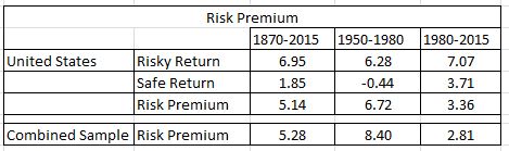
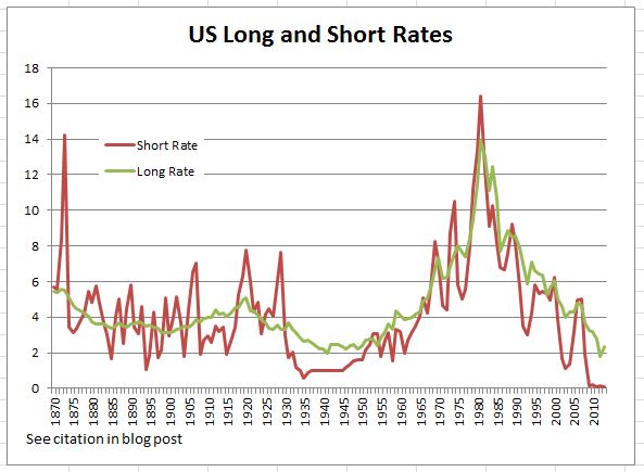
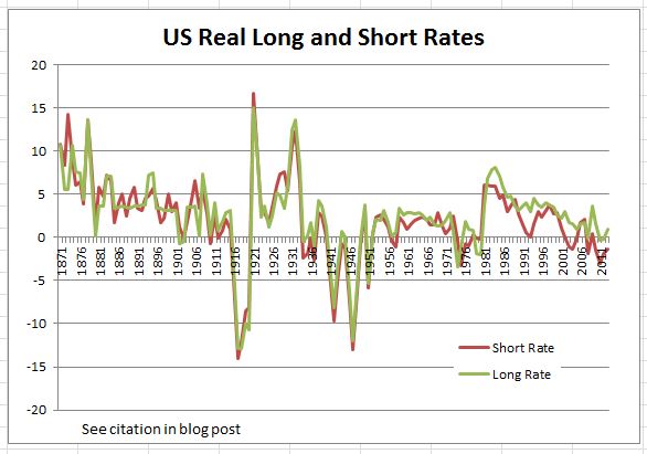
The low risk premium in the most recent period (right-most column) is due to the high interest rates prevailing for most of the last 35 years. Close to zero or negative real interest rates came with Quantitative Easing in the aftermath of the financial crisis. In the 1980s and 1990s interest rates were substantially higher than today. The risky returns in the US were higher in the recent period than over the entire period or the 1950-1980 time-frame. The same pattern is seen among the other nations included in the data. The charts below show nominal and real short and long rates in the US from 1870 to 2013. These data are from a data set compiled by the authors of the paper. This confirms the implication of the risk premiums – the high rates of the 1980-2015 period were the anomaly, not the low rates (or negative real) rates that dominate most of the last 145 years.
Citations:
Oscar Jorda, Katherine Knoll, Dmitry Kuvshinov, Moritz Schularisk and Alan M. Taylor, “The Rate of Return on Everything 1870-2015”, National Bureau of Economic Research, December 2017
Data used for charts: Òscar Jordà, Moritz Schularick, and Alan M. Taylor. 2017. “Macrofinancial History and the New Business Cycle Facts.” in NBER Macroeconomics Annual 2016, volume 31, edited by Martin Eichenbaum and Jonathan A. Parker. Chicago: University of Chicago Press.
The posts on this blog are opinions, not advice. Please read our Disclaimers.