Get Indexology® Blog updates via email.

In This List

Low Volatility, VIX and Behavioral Finance

Diwali Gold Buying May Be The Safest Since 1996

Turning Point?

Timeline of Percentage of Active Funds That Underperformed Their Benchmarks

Comparing Active and Passive in Latin America – SPIVA® Latin America

Low Volatility, VIX and Behavioral Finance

Contributor Image
Tim Edwards

Managing Director, Index Investment Strategy

S&P Dow Jones Indices

As this week’s award of the Nobel Prize in Economics to Richard Thaler confirmed, the existence of behavioral biases in finance is no longer a controversial theory.   People often prefer a small chance of a large gain to a near-certain chance of a small gain, even if the expected return from the latter is higher.  Anyone who doubts this should reflect on the ubiquitous profitability of lotteries; governments have found them a reliable source of revenue, despite the fact that the expected value of buying a lottery ticket is negative.

Analogously, we sometimes attribute the so-called Low Volatility Anomaly to behavioral causes; risk-seeking investors prefer to buy exciting stocks for their perceived upside potential, while investors in lower-volatility stocks reap the reward of risk-seekers’ undue enthusiasm; figuratively, they are selling lottery tickets.

Low Volatility equity strategies have generated their long-term outperformance in part  by mitigating losses in down markets; the price of this loss mitigation is that low vol strategies underperformed in rising markets. This is illustrated in Exhibit 1 for the S&P 500 Low Volatility Index:

Participating in only three quarters of gains can be frustrating for some investors; one way to limit the risk of lagging in bull markets is to combine Low Volatility with different equity factors.    Another approach is to look beyond equities for complementary exposures.  Low volatility investors are not the market’s only behavioral economists.  Volatility-linked investments (such as VIX futures) can also display lottery-like characteristics, with the potential for large returns in a crisis if VIX spikes, and persistent losses otherwise.   Thus, selling VIX futures is another way in which some investors can profit from the lottery-seeking behavior of others.

The S&P 500 VIX Short Term Futures Inverse Daily Index measures the performance of continuously holding and rolling a short position in near-dated VIX futures.  Although it has an intimidatingly long name (we shall use “Short VIX” to refer to it), it has inviting characteristics as a potential diversifier for Low Volatility.  While the same behavioral dynamics may underlie the historically impressive returns both of buying lower-volatility stocks and selling VIX futures, the market dynamics affecting their performance are very different.  Exhibit 2 shows that in months when Low Volatility underperformed the S&P 500, on average Short VIX outperformed.   In months when Low Volatility outperformed, on average Short VIX underperformed.

The Short VIX strategy has a much higher level of absolute risk: an equal combination of Low Vol and Short VIX will be dominated by the latter.  (And the higher volatility of the Short VIX strategy also means that rebalancing frequently might be necessary to keep weights in proportion.)  With those characteristics in mind, Exhibit 3 shows the performance of a hypothetical portfolio (“MIX”), comprising a small position in Short VIX (7.5% weighting), with the remainder in Low Volatility.  The total returns of the S&P 500, and the S&P 500 Low Volatility Index, are shown for purposes of comparison.

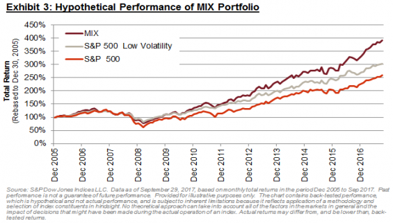
While the long-term outperformance of the MIX portfolio is unsurprising (both Short VIX and Low Volatility have outperformed), the key feature of MIX is its upside/downside capture ratio, shown in Exhibit 4:

On a hypothetical basis, the MIX portfolio achieved roughly 100% upside capture (i.e. it did not lag in bull markets), while retaining a considerable degree of protection (77% downside capture).  The MIX portfolio also demonstrated favourable performance statistics over longer periods.  Over all possible rolling 12-month periods during our study, Low Volatility outperformed around 59% of the time; this increases to 72% for the MIX portfolio (Exhibit 5).

The last year reminds us that it can be difficult to remain invested in lower volatility stocks during strong bull markets. The potential addition of a small, rebalanced position in a strategy such as Short VIX could act to diminish the risk of underperformance in rising markets, and provides a potentially coherent way to capture two complementary sources of behavioral outperformance.

The posts on this blog are opinions, not advice. Please read our Disclaimers.

Diwali Gold Buying May Be The Safest Since 1996

Contributor Image
Jodie Gunzberg

Former Managing Director, Head of U.S. Equities

S&P Dow Jones Indices

In light of the gold buying tradition for the upcoming Diwali festival in India, many might be wondering how valuable their gifts may be based on the price of gold.  Several factors influence the price of gold that make timing gold as an investment difficult; however, now there might be upside potential for gold, especially since its volatility is so low.

Currently, the 90-day annualized volatility (ending on Oct. 10, 2017) of the S&P GSCI Gold is 12.3%.  It has been hovering around this level since July and is at its lowest since August 2005.  Though 12 years is a long time, when gold’s current volatility is compared with its volatility during past Diwali celebrations, one needs to look all the way back to Diwali 1996 to find lower volatility.  In all of gold history since 1978, the 2017 Diwali period exhibits the sixth lowest volatility on record and is only higher than levels observed in 1991, 1992, 1994, 1995 and 1996, denoted by the vertical lines in the chart below.

Source: S&P Dow Jones Indices

Like other factors in isolation, the low gold volatility does not have strong predictive power over future gold price moves.  However, when gold had big losses of more than 30% in one year, there was always greater than 30% volatility.

Source: S&P Dow Jones Indices

On the other hand low gold volatility has been present when big positive returns of more than 40% in one year have happened.  Interestingly, big returns have also happened when the gold volatility was very high.  Though, when gold volatility was moderately high in the 25% – 40% range, it never returned more than 40% except in 1979 when gold returned 263.3% from Jan. 19, 1979 – Jan. 21, 1980 with 90-day annualized volatility of 32.6% (the data point was removed for scale.)

Source: S&P Dow Jones Indices

Based on the history, it seems there may be more upside potential than downside risk for gold with its current low level of volatility.  What may be more important though is how solidly gold has provided diversification from equities.   Given the historically strong bull run the stock market is having, if the market has corrected as it has in the past, some gold as protection may be useful.

Other factors to watch for moves on gold are the U.S. dollar, inflation, GDP growth and interest rates:

  • Gold rises on average about 3% for every 1% the U.S. dollar drops, but gold still holds up, gaining about 20 basis points for every 1% rise in the dollar (using year-over-year monthly data from Dec. 1986 – Jun. 2017.)
  • Gold is also sensitive to inflation, moving on average about 5.9% for every 1% U.S. CPI moves and about 4.5% for every 1% Chinese CPI moves (using year-over-year monthly data from Aug. 2007 – Aug. 2017.)
  • Gold gains significantly more with decelerating economic growth in the U.S. and U.K. (in-line with the diversification,) but gains more with accelerating growth in emerging economies like China (using annual year-over-year data from 1978 – 2016:)
    • In the U.S., gold rises on average 7.7% when GDP growth falls 1%, but gold loses on average 1.4% for every 1% of rising GDP growth.
    • In the U.K., gold rises on average 6.3% when GDP growth falls 1%, and gold also rises on average 1.3% for every 1% of rising GDP growth.
    • In China, gold rises on average 2.1% when GDP growth falls 1%, but gold rises more on average, gaining 3.2% for every 1% of rising GDP growth.
  • Gold rises on average 27.7% during rising interest rate periods (using monthly data from Jan. 1978 – Feb. 2017.)

The bottom line is that there may be more upside potential for gold given its low volatility, in conjunction with several other factors in question like continued dollar strength, economic growth, rising inflation and interest rates.

The posts on this blog are opinions, not advice. Please read our Disclaimers.

Turning Point?

Contributor Image
Anu Ganti

U.S. Head of Index Investment Strategy

S&P Dow Jones Indices

Here are six notable developments in the U.S. financial markets in September 2017.

  1. Smaller caps outperformed large caps.
  2. Value outperformed growth.
  3. Energy was the top-performing sector, and the utilities sector was the worst-performer.
  4. Developed markets posted gains, while emerging markets lost steam.
  5. Commodity indices rebounded, driven by recent strength in energy.
  6. U.S. 10-year and 30-year Treasury yields rose.

What do these events have in common?

They are all reversals from the January-August 2017 period, where large caps outperformed smaller caps, growth outperformed value, and energy lagged due to weakness in oil compared to the utilities sector, which was the second top performer in August.  Meanwhile, emerging markets outperformed developed ex-U.S. markets, while Treasury yields fell.

What was different about September 2017?

The bull market in equities deepened through the cap spectrum.  While smaller caps, value, and energy still lag on a YTD basis, the S&P SmallCap 600® was up 8% in September 2017 compared to the S&P 500®’s 2% gain.  Similarly, the S&P 500 Value gained 3% compared to the S&P 500 Growth’s 1% gain.  Energy made a turnaround as the top-performing sector in September, thanks to the rebound in oil prices, which also drove the gains in the S&P GSCI.  Meanwhile, utilities performed poorly in September, declining 3%, a reversal from the prior month, indicating market participants’ return to a risk-on appetite.  Emerging markets also stumbled, with the S&P Emerging BMI down 1%.

Is the “Trump” trade making a comeback?

Flash back to November 2016, when the U.S. equity markets and small caps in particular rallied post the U.S. Presidential election, with the S&P SmallCap 600 up 13% that month, while emerging markets declined.  Treasury yields rose, while energy posted gains and the utilities sector was the worst performer.  The S&P 500 Value gained 6%, outperforming the S&P 500 Growth’s 1% gain.

November 2016’s market performance sounds eerily familiar to that of September 2017.  We would argue that these themes are not six independent things—they are six different manifestations of one “big thing”.  That “big thing” is the perception that the U.S. economy is strong and poised to continue growing at a rapid clip.  One of the drivers of this perception is the possibility of growth-oriented tax reform, which will aid in boosting companies’ earnings and thereby solidify market fundamentals.

Will the coming months offer a continuation of these trends?  We caution that predicting market outcomes is challenging given the many geo-political uncertainties at stake.  Time will tell.

The posts on this blog are opinions, not advice. Please read our Disclaimers.

Timeline of Percentage of Active Funds That Underperformed Their Benchmarks

Contributor Image
Akash Jain

Director, Global Research & Design

S&P BSE Indices

The active versus passive debate has been a continuous subject of discussion in the evolving asset management industry.  S&P Dow Jones Indices launched the first SPIVA India scorecard in 2013 to provide a barometer on this subject. The Indian market has witnessed significant growth (albeit from a small base) in passive investment products that offer lower cost and more transparent access to targeted segments of the market compared with the actively managed products.  Passive investment products have been evolving, and there have been an increasing number of products that implement various investment strategies that were once considered exclusive tools used mostly by active fund managers.

Exhibit 1 reviews the percentage of funds that underperformed their respective benchmarks in each category for the five-year rolling period between December 2013 and June 2017.  The majority of Indian Equity Large-Cap, Indian Government Bond, and Indian Composite Bond funds underperformed their respective benchmarks for most of the period.  Indian ELSS funds had the highest percentage of actively managed funds leading the benchmark over the period.

Exhibit 1: Percentage of Active Funds That Underperformed Their Respective Benchmarks (over a rolling 5-year horizon) 

Source: S&P Dow Jones Indices LLC.  Figures based on Mid-Year and Year-End SPIVA India scorecards since December 2013 to June 2017.  Chart is provided for illustrative purposes.  Past performance is no guarantee of future results.

Indian Equity Large-Cap funds generated relatively slight excess returns over the S&P BSE 100 for the five-year rolling horizon (see Exhibit 2).  Moreover, more than 50% of funds failed to beat their benchmarks.  Both categories of bond funds—Indian Government Bond and Indian Composite Bond—generated negative excess returns for the five-year rolling horizon, with more than 75% underperforming their respective benchmarks as of June 2017.

Among all the fund categories, the Indian ELSS and Indian Equity Mid-/Small-Cap funds offered the most pronounced excess return over their benchmarks, the S&P BSE 200 and S&P BSE MidCap, respectively. On average, Indian ELSS and Indian Equity Mid-/Small-Cap funds offered an annualized excess return of 225 bps and 402 bps, respectively, over the five-year rolling horizon (see Exhibit 2).  After a relook at Exhibit 1, we notice that in the case of the Indian Equity Mid-/Small-Cap category, a fairly large percentage (approximately 40%) of the funds underperformed their benchmark.  Hence, in this category, picking the right active fund becomes critical.

Exhibit 2: Rolling Annualized Excess Returns of Equal-Weighted Funds over Their Respective Benchmarks (over a rolling 5-year horizon) 

Source: S&P Dow Jones Indices LLC.  Figures based on Mid-Year and Year-End SPIVA India scorecards from December 2013 to June 2017.  Chart is provided for illustrative purposes.  Past performance is no guarantee of future results.

The posts on this blog are opinions, not advice. Please read our Disclaimers.

Comparing Active and Passive in Latin America – SPIVA® Latin America

Contributor Image
Phillip Brzenk

Managing Director, Global Head of Multi-Asset Indices

S&P Dow Jones Indices

The SPIVA Latin America Mid-Year 2017 Scorecard was released this week.  The report covers Brazil, Chile, and Mexico in selected fund categories.  In line with the rest of the world, widespread gains were seen in both fixed income and equity markets in Latin America in the first six months of 2017.

The recent rise in the markets didn’t lead to outperformance by active fund managers against category benchmarks, as the majority of managers underperformed across all categories measured.  The percentage of funds outperformed by benchmarks in each category for the one-, three-, and five-year performance lookback periods are shown in Exhibit 1.

In addition to reporting outperformance, the SPIVA scorecard calculates the average fund returns on an asset-weighted and equal-weighted basis.  Conventional wisdom says that funds with larger asset bases have higher economies of scale and better execution than smaller funds, thereby potential ly delivering higher net returns all else equal.  Therefore, if asset-weighted returns are higher than equal-weighted returns, then larger funds did better than smaller funds.  Using data from Report 3 and Report 4 in the SPIVA scorecard, Exhibit 2 compares asset-weighted and equal-weighted returns over a five-year time horizon.

For six of the seven categories, asset-weighted average returns are higher than equal-weighted average returns—the lone exception being Chile Equity.  The most notable difference in returns is in the Brazil Equity category, with the asset-weighted average return 3.1% higher than the equal-weighted average return.

To see the full SPIVA Latin America Mid-Year 2017 Scorecard, please click here.  To dig deeper into SPIVA in Latin America, please watch our webinar replay.

The posts on this blog are opinions, not advice. Please read our Disclaimers.