Get Indexology® Blog updates via email.

In This List

Active Management Underperformance in 2016 Generally Higher Than in Previous Years

Will Oil's Madness Upset Industrial Metals?

Evolution of the Green Bond Market

How Now The Dow? A Q1 Retrospective.

SPIVA® India Year-End 2016 Scorecard: Underperformance of Active Funds Versus S&P BSE Benchmark Indices

Active Management Underperformance in 2016 Generally Higher Than in Previous Years

Contributor Image
Daniel Ung

Former Director

Global Research & Design

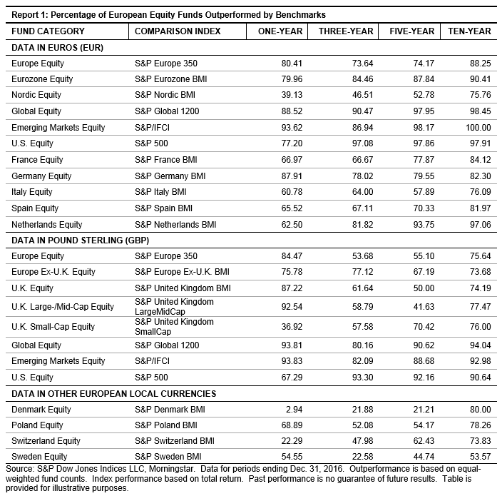
European equity markets, as measured by the S&P Europe 350, went up 3.44% in 2016, yet the average performance of active managers invested in Europe was negative, whether measured on an asset-weighted or equal-weighted basis.  Over the one-year period, more than 80% of active managers invested in European equities underperformed their respective S&P DJI benchmark.  This level of underperformance continued into the long run, and more than 88% of managers underperformed over the 10-year period.

A similar pattern was seen in other fund categories.  More than 88% of managers invested in global markets underperformed their respective S&P DJI benchmark over the one-year period, and over 98% trailed it over the 10-year period.  Underperformance was most severe in emerging market equity funds.  Over 93% of actively managed emerging market funds failed to keep up with their S&P DJI benchmark over the one-year period, and all of the emerging market funds studied in the report trailed it over the 10-year period.

Even though the majority of the statistics looked unfavorable for active managers, there were a few notable exceptions.  Nearly all active managers invested in Denmark and Switzerland beat the corresponding S&P DJI benchmarks over the one-year period.  However, this was not repeated over the long run, and the majority of the managers in these categories underperformed the benchmark over the 10-year period.

For the full details of the report, please click here.

The posts on this blog are opinions, not advice. Please read our Disclaimers.

Will Oil's Madness Upset Industrial Metals?

Contributor Image
Jodie Gunzberg

Former Managing Director, Head of U.S. Equities

S&P Dow Jones Indices

Although many analysts anticipated U.S. oil producers would fill the gap from production cuts by OPEC and some non-OPEC producers, not many probably guessed Brent would have its second worst Q1 in history, losing 7.6%, after the implementation of the production cuts.  According to the Information Energy Agency (IEA,) the U.S. saw a triple surge in supply from rising imports and domestic production as well as lower refinery utilization.  Also while the countries in OPEC have complied pretty well with the cuts pledged, non-OPEC countries have been slower to adhere.  The result is it may take significant time for the market to re-balance despite some demand growth.

Source: International Energy Agency, Oil Market Report. March 2017.

With the demand optimism, the S&P GSCI Industrial Metals started the year out strongly, up 9.2% that is its best first quarter since 2008; however, the sector started to slip slightly in March, ending down 94 basis points for the month.  Given oil prices have become a major macroeconomic factor, there is concern the energy sector chaos could spill into the other commodities.

In March, the S&P GSCI Total Return lost 3.9% bringing its year-to-date loss to -5.1%, and the Dow Jones Commodity Index (DJCI) Total Return fell 2.8% for a year-to-date loss of 2.0%.  The S&P GSCI Energy Total Return was the worst performing sector for the month, losing 4.9%, and S&P GSCI Livestock Total Return was the only positive sector in March, gaining 1.2%, to bring its year-to-date performance up to 1.2%.  Not only were 4 of 5 sectors down but only 7 single commodities were positive, which is the fewest number of positive commodities since Nov. 2015. Natural gas was the best performer in the month, up 12.2% from supply disruptions, and also other gainers were aluminum +1.7%, lead +3.6%, cotton +1.4%%, cocoa +9.8%, feeder cattle +7.1% and live cattle +2.7%.  Sugar was the worst performing commodity, losing 12.8% in the index from a favorable production outlook in Brazil and the prospect of a rebound in Indian output next season.

However, sugar inventories are still relatively low and it is not the only commodity with low enough inventories to be in backwardation.  In March, 8 commodities were in backwardation, which is double the 4 singles that were backwardated in Feb, and is also the highest number of backwardated commodities since July 2016.  In addition to sugar, the other commodities in backwardation are coffee, feeder cattle, Kansas wheat, live cattle, silver, soybeans and wheat.

Another bullish sign potentially is the outperformance of industrial metals over energy.  In the first quarter, the spread is 18.8%, the biggest since the premium of 20.7% in March 2009, that was at the bottom for commodities in the global financial crisis .  Given the favorable upside potential to downside risk in energy at this point, there is a chance industrial metals can continue performing if the economic demand can keep pace.  Even though brent had its second worst start to the year along with gasoil, and unleaded gasoline had it worst ever q1 in history,   aluminum posted its second best ever q1 with other strong starts from lead (4th best q1) and gold (5th best q1.)

Source: S&P Dow Jones Indices


The posts on this blog are opinions, not advice. Please read our Disclaimers.

Evolution of the Green Bond Market

Contributor Image
Dennis Badlyans

Former Associate Director, Global Research & Design

S&P Dow Jones Indices

Over the recent weeks, there has been much debate about the notable increase of issuance in the fledgling green bond market.  Indeed, green bond issuance ramped up significantly in 2016, and the accelerated pace is expected to continue this year.  Total issuance of bonds labeled as green in 2016 amounted to USD 92.9 billion, nearly doubling the size of the green bond market from the previous year (see Exhibit 1).

Chinese issuance accounted for the lion’s share of total issuance in 2016.  In October 2015, Agricultural Bank of China was the first Chinese entity to issue green bonds.  These three bonds were issued in the eurobond market, totaling about USD 1 billion.  In 2016, issuance by entities domiciled (country of risk) in China grew to USD 33.6 billion, or about 36% of the total supply for that year (see Exhibit 2).

In 2016, the green bond market diversified by issuer type and country of domicile.  In addition to the introduction to the market of Chinese issuance in CNY and USD, government-related authorities in Costa Rica, Finland, and Mauritius issued the first green bonds in their respective countries, and the Republic of Poland issued the first National Treasury green bond.  The French National Treasury followed suit in January 2017, issuing USD 7.6 billion, the largest green bond issuance on record.  The inaugural green bond from Argentina (USD) was issued just a month ago by La Rioja Province.

The S&P Green Bond Index is designed to track the green bond market and is composed of CBI-aligned green bonds that satisfy price availability requirements for our fixed income indices.  The S&P Green Bond Index has grown in tandem with the green bond market and covers about 75% of the issuance.  The S&P Green Bond Select Index is a subindex that is subject to additional selection criteria; it includes fewer than 200 of the 1,760 bonds in the S&P Green Bond Index, while covering more than 80% of the market value.

Market analysts expect issuance to continue to ramp up in 2017.  Climate Bond Initiative estimates that CBI-aligned green bond issuance (a subset of all green-labeled bonds) will increase to USD 150 billion for 2017, 85% more than the USD 81 billion of CBI-aligned green bonds issued in 2016.[1]

[1]   https://www.climatebonds.net/

The posts on this blog are opinions, not advice. Please read our Disclaimers.

How Now The Dow? A Q1 Retrospective.

Contributor Image
Jamie Farmer

Former Chief Commercial Officer

S&P Dow Jones Indices

With March in our rear view mirror, let’s take a quick look at some highlights from the Dow Jones Industrial Average’s performance during the first quarter of 2017:

  • In Short – The Dow Jones Industrial Average ended the first quarter of 2017 at 20,663.22 – up 900+ points for a 4.56% YTD return.
  • Biggest Themes – expectations of an economic revival, infrastructure spending, tax reform, deregulation and related themes drove the markets in the wake of the election and inauguration of Donald Trump.
  • Leader & Laggard – Apple (AAPL) made the biggest point contribution while Chevron (CVX) had the most negative impact.
  • Sector Performance – Information Technology, on the back of the aforementioned AAPL return, made the largest contribution.
  • Best Day YTD (In Points & Percent) – March 1st, after Trump’s address to Congress.
  • Worst Day YTD (In Points & Percent) March 21st, anxiety about Trump’s ability to be a change agent sets in.
  • Big Moves – or rather, the lack thereof. Q1 saw very few days of significant movement in the Average.  Further, the spread between the quarter’s High and Low closing index values is 1,383.15 points, the tightest spread since 2005.  Here again, we see the evidence of a period of muted volatility.
  • Advancement – The Dow hit 15 new highs during Q1 and broke through both the 20,000 and 21,000 point levels.

For more about the DJIA during Q1, a complete report card is available here.

The posts on this blog are opinions, not advice. Please read our Disclaimers.

SPIVA® India Year-End 2016 Scorecard: Underperformance of Active Funds Versus S&P BSE Benchmark Indices

Contributor Image
Akash Jain

Director, Global Research & Design

S&P BSE Indices

Various events during the second half of 2016, both global—such as the U.S. Federal Reserve rate hike and the U.S. elections—and domestic—such as passage of the GST bill in Parliament and demonetization—kept Indian markets volatile.  Over the one-year period ending December 2016, Indian equity markets underperformed Indian bond markets.  The S&P BSE 100, which seeks to measure the large-cap equity market in India, ended in the black, at 5.02%.  The mid-cap equity market, as measured by the S&P BSE MidCap, returned 9.28% over the same period.  The S&P BSE India Government Bond Index delivered a total return of 13.51%.

The S&P Indices Versus Active (SPIVA) India Scorecard, which is a biannual report, attempts to capture the performance of active funds (both equity and debt funds) domiciled in India against S&P BSE benchmarks over different time horizons.  The study reveals that over the one-year period ending December 2016, 66.29% of Indian Equity Large-Cap funds, 64.29% of Indian ELSS funds, and 71.11% of Indian Equity Mid-/Small-Cap funds underperformed their respective benchmark indices.  Additionally, the majority of the Indian Composite Bond funds underperformed the S&P BSE India Bond Index over 1-, 3-, 5-, and 10-year periods, whereas the majority of Indian Government Bond funds underperformed the S&P BSE India Government Bond Index over 3-, 5-, and 10-year periods (see Exhibit 1).

Exhibit 1: Funds that Underperformed the Benchmark

Source: S&P Dow Jones Indices LLC, Morningstar, and Association of Mutual Funds in India.  Data from December 2006 to December 2016, based on the SPIVA India Year-End 2016 Scorecard.  Past performance is no guarantee of future results.  Chart is provided for illustrative purposes and reflects hypothetical historical performance.

Over the five-year period ending December 2016, apart from Indian ELSS funds, none of the categories (across equity and debt) had a 100% survivorship rate.  Over the 10-year period, Indian Equity Large-Cap funds showed a survivorship rate of 66.7%, whereas Indian Equity Mid-/Small-Cap funds had a 65.1% survivorship rate.  Over the same period, the Indian Government Bond and Indian Composite Bond funds had even lower survivorship rates, at 51.7% and 58.7%, respectively.

Over the 10-year period, style consistency was fairly low for Indian Equity Large-Cap funds (30.6%) and Indian Equity Mid-/Small-Cap funds (28.6%).  This is particularly important because a market participant may want to understand not only whether a fund has survived the investment horizon but also the percentage of funds that stayed consistent to their initial investment categorization.  Globally, style classification is an important metric that can guide market participants in their asset allocation decisions.  On the other hand, Indian ELSS funds have largely been style consistent.  Not only have a large number of these funds managed to outperform the benchmark, but they have done so with a higher margin over the three- and five-year horizons than any other category, at 3.9% and 2.5%, respectively.

As Indian markets have matured, we have observed convergence to global mature markets in terms of outperformance of benchmark indices and fees.

To discover more about the performance of Indian active funds versus their benchmarks, check out the SPIVA India Year-End 2016 Scorecard.

Exhibit 2: Asset-Weighted Outperformance of Funds Versus Respective Benchmarks

Source: S&P Dow Jones Indices LLC, Morningstar, and Association of Mutual Funds in India.  Data from December 2006 to December 2016, based on the SPIVA India Year-End 2016 Scorecard.  Past performance is no guarantee of future results.  Chart is provided for illustrative purposes and reflects hypothetical historical performance.

Exhibit 3: Equal-Weighted Outperformance of Funds Versus Respective Benchmarks

Source: S&P Dow Jones Indices LLC, Morningstar, and Association of Mutual Funds in India.  Outperformance measured in INR.  Data from December 2006 to December 2016, based on SPIVA India Year-End 2016 Scorecard.  Data from December 2006 to December 2016, based on the SPIVA India Year-End 2016 Scorecard.  Past performance is no guarantee of future results.  Chart is provided for illustrative purposes and reflects hypothetical historical performance.

The posts on this blog are opinions, not advice. Please read our Disclaimers.