Get Indexology® Blog updates via email.

In This List

Multi-Factor Indexes: More Bang for Your Buck

Valuations Are High but Dispersion Is Low

High Yield Bonds in a Rising Rate Environment

Sustainable Investment space in India

Most Things Are Relative

Multi-Factor Indexes: More Bang for Your Buck

Contributor Image
Adam Butler

CEO

ReSolve Asset Management

Many advisors are unsure whether introducing factor-tilt ‘smart beta’ strategies into portfolios will improve client outcomes. In fact, some factor tilt portfolios appear to provide the equivalent of levered exposures to a diverse set of alternative risk premia. This is because factor tilt portfolios may contain much greater than 100% exposure to several risk factors in aggregate.

Consider the iShares S&P 600 Small-Cap Value Index ETF which is constructed to hold small-cap companies with high book-to-market, earnings-to-price, and sales-to-price ratios. Via simple back-tested regression on the underlying index back to inception in 1997, we find that it offers the following factor exposures, which are all significant at the 0.1% level:

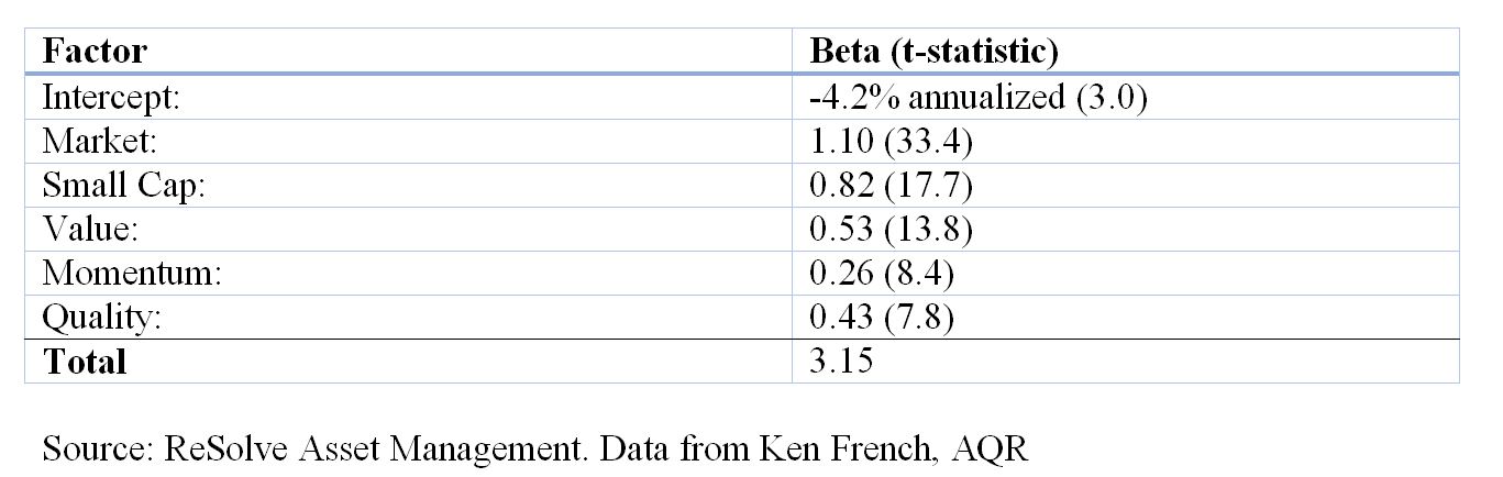
It is useful to think about the factor betas in Table 1 as weights in a synthetic portfolio. Given historical data from Ken French (MKT, SMB, HML and UMD) and AQR (QMJ), and using monthly return data, we calculate the following premia and weighted excess return:

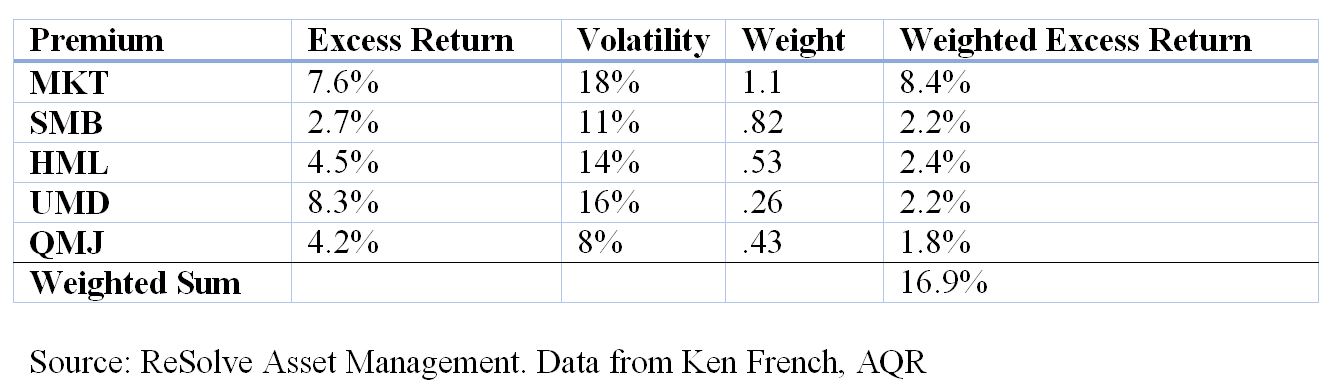
The expected total excess arithmetic return from all factor exposures would be the weighted sum of the factor exposures and the premia, plus the intercept:

1.1*7.6%+0.82*2.7%+.53*4.5%+.26*8.3%+.43*4.2%-4.2% = 12.7%.

Given that the index implies over 300% exposure to risk factors, one might expect the portfolio to exhibit much higher volatility than a market capitalization weighted index. If the factors were all highly correlated, the portfolio would have a volatility approximately equal to the weighted average volatility of all exposures:

1.1*18%+.82*11%+.53*14%+.26*16%+.43*8% = 43.8%.

This would have meaningful implications in terms of compound return, as the implied compound annual return of the portfolio would be the arithmetic mean of 12.7% minus a volatility decay factor equal to half the portfolio variance: 0.127 – 0.5 * 0.438^2 = 3.1%. Compare this to the implied compound return of the market factor alone: 7.6% – 0.5 * 0.18^2 = 6%.

However, the factors are not highly correlated. In fact, the average off-diagonal pairwise correlations of the five factors in Table 1. is just -0.14. As such, we would expect the volatility of the portfolio to be less than the weighted average volatility of the factors. In fact, we can estimate expected volatility of the portfolio (sigma_p) from the following formula:

sigma_p = sqrt(w^T Sigma w),

where w= the factor exposures from Table 1. and Sigma is the covariance matrix of the factors:

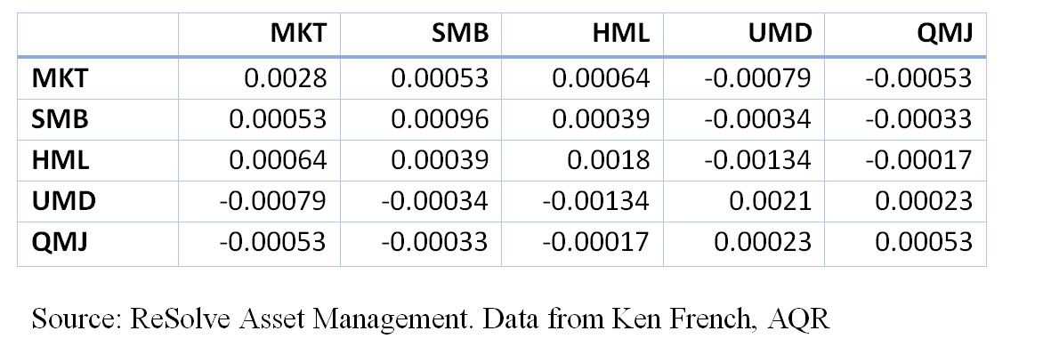
Thus, the implied expected portfolio volatility would be about 25%. The compound excess return would be 12.7% – 0.5*.25^2 = 9.6, which now compares quite favorably to the capitalization weighted market factor. Moreover, the Sharpe ratio of the factor-tilted Index is 12.7%/25%=0.51, compared with the market’s Sharpe ratio of .42.

The posts on this blog are opinions, not advice. Please read our Disclaimers.

Valuations Are High but Dispersion Is Low

Contributor Image
Fei Mei Chan

Former Director, Core Product Management

S&P Dow Jones Indices

Stocks Have Froth but No Bubble,” in today’s Wall Street Journal argues that while stocks are sitting at the highest valuations seen in many years, the market is not in a bubble.  Despite similarities to early 2000 by some measures, other distinguishing features of trading bubbles (such as high trading volume and high leverage) are subdued.

Another way to see this is by looking at the dispersion-correlation map. You don’t have to have high dispersion to have a crisis. But, as the chart below shows, times of calamity are often accompanied by higher dispersion as, for example, in 2000 and 2008. S&P 500 dispersion did rise late last year, but after a temporary spike at the end of November 2016, dispersion has fallen back to historically low levels. It is also significantly lower compared to this time last year. Dispersion can change, sometimes quickly, but until it does indications are that there’s no need to worry as of yet.

The posts on this blog are opinions, not advice. Please read our Disclaimers.

High Yield Bonds in a Rising Rate Environment

Contributor Image
Hong Xie

Former Senior Director, Global Research & Design

S&P Dow Jones Indices

Since the “taper tantrum” back in 2013, the prospect of the Fed easing monetary policy has been one of the top concerns for global market participants.  The Fed has increased rates twice since then: once in December 2015 and again in 2016.  With more rate hikes expected and U.S. inflation firming up, long-term interest rates have risen from their low of July 2016 and the market is watchful for more potential increases.

In a rising rate environment, interest rate risk comes to the forefront, and this is particularly true for fixed income products because of their sensitivity to interest rates, as measured by the concept of duration.  In this blog, we show that among various sectors of U.S. fixed income, the high yield bond market not only has less duration, but also historically has exhibited less correlation with interest rates due to movement of credit spreads.

Exhibit 1 shows the duration comparison of U.S. fixed income sectors.  As of January 2017, the investment grade corporate bond index bears the highest duration of 6.9, while the two high yield indices have much shorter durations of approximately 4.2.

Duration measures bonds’ direct exposure to interest rates.  For spread products such as corporate bonds, their total return is also sensitive to changes in credit spread.  Empirically, corporate bonds’ total returns tend to be less sensitive to interest rates compared with what is indicated by their duration measure, due to the negative correlation between interest rate and credit spread changes.

In a rising rate environment, credit spreads tend to tighten, reflecting improved credit fundamentals in a growing economy.  The positive return due to credit spread tightening could cancel out part or all of the negative return from rising rates.  This can be seen in the historical correlation of the performance of U.S. fixed income sectors with the change in government bond yields (see Exhibit 2).

Both high yield indices demonstrated a positive correlation with rate changes, meaning that high yield bonds had positive returns when government bond yields rose.  In contrast, investment-grade corporate bonds showed a negative correlation with interest rates.  The positive correlation of high yield bonds was further corroborated by the negative correlation of credit spreads and interest rate changes, indicating that when government bond yields moved higher, credit spreads tightened.

While it is understandable that market participants are concerned about interest rate risk in a rising rate environment, it is interesting to note that the high yield bond sector stands out within the fixed income market with less rate sensitivity.  Historical data show that its return profile exhibited positive correlation with interest rate movement.

The posts on this blog are opinions, not advice. Please read our Disclaimers.

Sustainable Investment space in India

Contributor Image
Ved Malla

Associate Director, Client Coverage

S&P Dow Jones Indices

In India, S&P BSE Indices has two investible indices in the sustainable investment space—namely, the S&P BSE CARBONEX and S&P BSE GREENEX.

The S&P BSE CARBONEX seeks to track the performance of the companies in the S&P BSE 100, based on their commitment to mitigating risks arising from climate change in the long run. Index constituent weights are modified in accordance with the companies’ relative carbon performance, as measured by the level of their greenhouse gas emissions and carbon policies. S&P Dow Jones Indices has partnered with RobecoSAM, a global specialist in sustainability investing, to provide the carbon performance scores for Indian companies.

The S&P BSE CARBONEX was launched on Nov. 30, 2012.  Exhibit 1 depicts the historical performance of the index from the base date—Sept. 30, 2010, when the base value was 1,000.

Exhibit 1: S&P BSE CARBONEX Performance 

The S&P BSE GREENEX consists of the top 25 stocks in the S&P BSE 100 that adopt relatively better energy-efficient practices.  Greenhouse gas emission numbers are provided by Trucost Plc, which is a global specialist in providing environmental data.  S&P Dow Jones Indices recently acquired a controlling stake in Trucost Plc.

The S&P BSE GREENEX was launched on Feb. 22, 2012.  Exhibit 2 depicts the historical performance of the index from the base date—Oct. 1, 2008, when the base value was 1,000.

Exhibit 2: S&P BSE GREENEX Performance 

Green investment in India may be in a nascent stage, but it is evolving and expected to gain momentum in the coming years.  Many stakeholders, including the government, corporations, and market participants, have become environmentally conscious and are looking to integrate environmental aspects of businesses in their mainstream investment strategies.  Green investment will not only encourage companies to have environmentally friendly policies, but also help ensure that they remain relevant in the long run to potentially create value for all stakeholders.

The posts on this blog are opinions, not advice. Please read our Disclaimers.

Most Things Are Relative

Contributor Image
Fei Mei Chan

Former Director, Core Product Management

S&P Dow Jones Indices

The S&P 500 Low Volatility Index measures the performance of the 100 least volatile stocks in the S&P 500. In its latest quarterly rebalance (effective at the market close on February 17, 2017), the index scaled back weightings in Utilities, Health Care and Real Estate while adding weight from the Technology, Financials and Consumer Discretionary sectors.

The 7% weight in Technology is still relatively small compared to, say, Utilities, Consumer Staples or Industrials, but it is amongst the highest ever for this sector in the history of our Low Volatility index. Typically Low Volatility holds little to no weight in Technology (see chart below).  Amongst the additions as of the latest rebalance are, notably, Alphabet and Oracle. So have technology stocks become significantly more stable recently?

Though the index methodology measures volatility at the stock level, the recent behavior of S&P 500 sectors provides some context.  Remarkably, the rolling 1-year volatility for all 11 sectors has declined compared to three months prior. The sectors that had the highest reduction in volatility were Energy, Materials and Technology.

Looking at volatility at the sectoral level isn’t the same as looking at volatility at the stock level. But using this rough gauge, it seems the reduction in the weighting of sectors like Utilities came about not because their volatility increased, but because the volatility of other sectors like Technology declined more.

The posts on this blog are opinions, not advice. Please read our Disclaimers.