Get Indexology® Blog updates via email.

In This List

The Highs and Lows of the High Yield Energy and Materials Sectors

The Rieger Report: Liquidity and Bond Index Design

All that Debt

Countdown to Tomorrow

What’s Your Weight in Energy?

The Highs and Lows of the High Yield Energy and Materials Sectors

Contributor Image
Kevin Horan

Former Director, Fixed Income Indices

S&P Dow Jones Indices

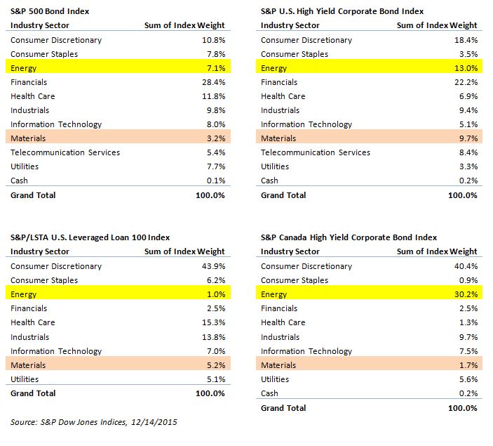
The S&P U.S. Issued High Yield Corporate Bond Index has just over USD1 trillion of par amount outstanding while its total return is down 3.11% for the month and down 4.51% YTD.  The energy and materials sectors have been the sore spot for the high yield market, given the anxiety over credit quality, as current low prices in oil and commodities, along with a Fed increase in rates, may be a cause for concern for future earnings and the cost of capital.  The return of the S&P U.S. Issued High Yield Corporate Bond Index ex energy and materials sectors would be less affected, returning -2.14% for the month and -0.05% YTD.

The growth of the high yield market since the 2008 financial crisis has been significant; the par amount outstanding of the S&P U.S. Issued High Yield Corporate Bond Index increased by 65% from Dec. 31, 2008, to Dec. 15,, 2015.  As shown in Exhibit 1, the growth in issuance within the energy and materials sectors has been significant as well. At its highest in September 2014, the energy sector reached USD 207 billion and has since dropped to USD 122 billion.  Materials was as low as USD 33 billion in March 2009 before peaking at USD 102 billion in December 2014, and it was at USD 81 billion par outstanding as of Dec. 16, 2015.

Exhibit 1: Energy & Materials Sector Growth
Percent Change in Par Amount Outstanding

Source: S&P Dow Jones Indices LLC., Data as of Dec. 15, 2015. Past performance is no guarantee of future results.  Chart is provided for illustrative purposes and contains hypothetical historical performance.

The posts on this blog are opinions, not advice. Please read our Disclaimers.

The Rieger Report: Liquidity and Bond Index Design

Contributor Image
J.R. Rieger

Former Head of Fixed Income Indices

S&P Dow Jones Indices

As the liquidity of recent markets have been tested by the impact of low energy prices a look at index design and results may be valuable.  Focusing on investment grade corporate  bonds we can see dramatic differences in depth of liquidity as a result of index design.

For investment grade corporate bonds two indices tracking these markets have very different liquidity profiles. Let’s compare the liquidity data of the bonds in the S&P 500 Investment Grade Corporate Bond Index to the broader S&P U.S. Issued Investment Grade Bond Index.  The S&P 500 Investment Grade Corporate Bond Index  provides a view of the performance of corporate bonds issued by the blue chip companies in the iconic S&P 500 Index,  other index inclusion criteria including par amount minimums are the same as the broader corporate bond index.

Results:

  • More of the bonds in the index are trading each month: During the six month period of June through November 2015 bonds in the S&P 500 Investment Grade Corporate Bond Index had a higher percentage of trading each month: approximately 95% of the bonds in this index traded each month vs. 89% of the bonds in the S&P U.S. Issued Investment Grade Bond Index. Please refer to Table 1 below for the data.
  • Fewer bonds but significant representation of the bonds trading: The S&P 500 Investment Grade Corporate Bond Index has fewer bonds than the broader index but the average trade volume of bonds in the index as measured by the number of trades, market value of trades and total market value of trades represent a high percentage of the trading volume of the broader index. Please refer to Table 2 below for the data.

Table 1: Trade Volume: Average Par Value Traded, % of Constituents TradedTable 2 Trade Volume

Table 2: Trade Volume:  Market & Par Value TradedTable 1 Trade Volume

The data illustrates that tracking the larger entities such as the blue chip companies in the S&P 500 Index results in significantly better liquidity characteristics for the underlying bonds than broader benchmarks.


The posts on this blog are opinions, not advice. Please read our Disclaimers.

All that Debt

Contributor Image
David Blitzer

Former Managing Director and Chairman of the Index Committee

S&P Dow Jones Indices

As the Fed prepares to raise interest rates on Wednesday – or surprise virtually everyone – it is worth looking at the debt in the economy.  Interest expenses for most of it won’t move very much or very soon, but some believe the Fed is embarking on a two to three year process of pushing interest rates every upward.

The chart tells the story.  The pale green line with the peak at about 2008 is the domestic financial sector – banks, brokerages, insurance companies and so forth. Like most sectors, this one peaked as the financial crisis hit; unlike some sectors it has paid down a lot of debt and then resumed its climb. Since the mid 1990s the growth of financial sector debt outpaced everything else, it may be poised to outpace most other sectors going forward.  The red line – home mortgages — has the second largest dip after financials and it too is recovering.  Neither of these suggests a major change or retrenchment following the financial crisis.  Another sector that gets a lot of attention is the pink line trying to flatten out in the latest couple of quarters – federal government borrowings.  Corporate business, the gold colored line, staged a sharp rise in the last few years.

The bottom four sectors are a bit more stable and represent foreign borrowing in the U.S., state and local government debts, consumer credit and non-corporate borrowing.

The message here is two parts: one reason the last recession was called the Great Recession is the large and rapidly growing debt throughout the economy in 2007-2008; second is the hope that a small rise in interest rates and borrowing costs will moderate the current growth rates well before the next recession.

The posts on this blog are opinions, not advice. Please read our Disclaimers.

Countdown to Tomorrow

Contributor Image
Craig Lazzara

Former Managing Director, Index Investment Strategy

S&P Dow Jones Indices

Tomorrow the Federal Reserve is expected to raise its benchmark Federal Funds rate by 25 basis points  — the first increase in seven years.   This increase, assuming that it comes, must surely rank among the Fed’s most advertised and anticipated moves ever, and Wall Street trading desks are ramping up in expectation of heightened trading volumes.   We have no special insight into the immediate or longer-term aftermath of the Fed’s decision — but we would caution that, for equity investors, there are at least three things that rising interest rates will not do.

First, they won’t tell us whether the stock market is going up or down.  There are good theoretical arguments to support the view that rising rates are bad for stocks.  If dividends are discounted at a higher rate, stock prices should come down, other things equal.  The problem is that other things may not be equal.  If rate increases come in response to a strengthening economy, they may be associated with rising stock prices.   In recent years, in fact, the U.S. equity market has been stronger when interest rates rose than when they fell.

Second, rising rates won’t cause stock market dispersion to increase.  Dispersion indicates by how much the best performing stocks in the market are beating the underperformers.  In a high-dispersion environment, a manager’s stock selection skill is worth more; if dispersion is low, his skill is less valuable.  Dispersion has been well below average for the past several years, which has contributed to the performance difficulties of most active managers.  But there’s no reliable evidence to suggest that an increase in interest rates will drive dispersion upward.  Whatever difficulties stock selection strategies faced with the Fed Funds rate at zero are likely to persist at 25 basis points.

Finally, rising rates won’t help us identify outperforming equity factors.  Rising rates don’t give us a reliable guide to the relative performance of growth vs. value, say, or of low volatility vs. high beta.  Through the first 11 months of the year, growth is well ahead of value, and low volatility well ahead of high beta.  Whether those trends continue or reverse is unlikely to depend on what the Fed does tomorrow.

The posts on this blog are opinions, not advice. Please read our Disclaimers.

What’s Your Weight in Energy?

Contributor Image
Kevin Horan

Former Director, Fixed Income Indices

S&P Dow Jones Indices

Energy has been the hot topic in regard to investments.  The drop in the price of oil (USD 37 per barrel) and prolonged low values of many commodities (S&P GSCI, -33% YTD) has added concern to an already nervous bond market.  The expectation that the U.S. Federal Reserve would follow through on its assumed intention to start raising rates after its Dec. 1516, 2015, round of meetings already had market participants on edge.  Current events in the bond and commodity markets have added a heightened sense of unease.

In this market environment, interest in energy has taken on a life of its own.  The Materials sector can also be included in the concern group as the sector is highly related to commodities such as chemicals, metal & mining and construction materials.  As a point of information and comparison, Exhibit 1 gives insights into a few of our key indices.

Exhibit-1: Index Industry Weights
Index Industry Weight Table


The posts on this blog are opinions, not advice. Please read our Disclaimers.