Get Indexology® Blog updates via email.

In This List

Asian Fixed Income: Rising Momentum of Islamic Finance in China

Global Infrastructure Investments

Scanning Oil: Reading Between The Lines

Understanding Your Benchmark

The Fed Puzzle Continues

Asian Fixed Income: Rising Momentum of Islamic Finance in China

Contributor Image
Michele Leung

Former Director, Fixed Income Indices

S&P Dow Jones Indices

In the Islamic Finance News Report “China- the time is now”, it highlighted a few initiatives that demonstrated the rising momentum of Islamic finance in China, see examples below,

  • Chinese brokerage Southwest Securities forged a partnership with Qatar International Islamic Bank to pave the way for Islamic finance transactions in the country. The Qatari bank confirmed with IFN that it will leverage on this MoU to develop an Islamic finance framework for China.
  • Chinese banking giant, the Industrial and Commercial Bank of China (ICBC), also the world’s largest bank by assets, through its leasing arm entered into a collaborative agreement with the Islamic Corporation for the Development of the Private Sector (ICD), which is targeted to focus on multiple lines to develop Islamic capabilities and opportunities.

Separately, there is news that HNA Group, owner of Hainan Airlines, is planning on issuing USD sukuk.  It would be the first Islamic financing deal by a mainland Chinese company. Chinese property company, Country Garden Holdings, also plans a sukuk programme of at least RM1 billion. Since sukuk is a viable option in a diversified funding approach, more Chinese companies could be expected to tap into the sukuk market.

As of Sep. 10, 2015, the YTD total return of the Dow Jones Sukuk Index is 1.39%.  Among the rating-based subindices, the Dow Jones Sukuk A Rated Total Return Index has outperformed and gained 1.43% YTD as of the same date.

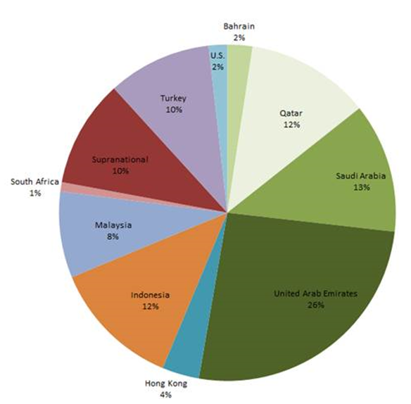
In terms of new issuance, a total par amount of USD 9.5 billion sukuk was added to the index YTD. Sukuk from United Arab Emirates and Malaysia both contributed USD2.75 billion.  Hong Kong issued another USD 1 billion five-year sukuk in June, which reaffirmed Hong Kong’s ongoing commitment to developing Islamic finance in the region.  Currently, sukuk from the GCC represent 53% of the overall market exposure (see Exhibit 1).  Interesting to note, the new issues in the index were all launched in the second quarter, while recent primary activities have been muted on the back of market uncertainty.

Exhibit 1: Market Exposure by Par Amount of the Dow Jones Sukuk Index

Source: S&P Dow Jones Indices LLC. Data as of Sept. 10, 2015. Past performance is no guarantee of future results. Chart is provided for illustrative purposes.
Source: S&P Dow Jones Indices LLC. Data as of Sept. 9, 2015. Past performance is no guarantee of future results. Chart is provided for illustrative purposes.

The posts on this blog are opinions, not advice. Please read our Disclaimers.

Global Infrastructure Investments

Contributor Image
Todd Rosenbluth

Director of ETF and Mutual Fund Research

S&P Capital IQ Equity Research

Once every four years, America’s civil engineers provide a comprehensive assessment of the nation’s major infrastructure categories. The latest report card has a poor cumulative GPA for infrastructure of D+, with rail and bridges each earning a C+. While Congress continues to debate whether, and how, to fund the projects to improve the quality of the nation’s backbone, there has been some encouraging news at the state level. Nearly one-third of U.S. states, including Georgia, Idaho and Iowa, are addressing infrastructure investment through gasoline tax increases to support improvement of local roads and bridges.

Indeed, nearly two thirds of the assets inside the S&P Global Infrastructure index are domiciled outside of the U.S, with China (5%), Japan (4%), Italy (8%), Spain (5%), and the United Kingdom (7%) among the ten largest countries. The S&P Global Infrastructure index seeks to provide broad-based exposure to infrastructure through energy, transportation, and utility companies in both developed and emerging markets.

S&P Capital IQ Equity Analyst Jim Corridore thinks that companies that construct infrastructure are likely to see increased demand over the next several years due to the need for upgrade and expansion of infrastructure both within the U.S. and around the world. Within the U.S., aging and outdated roads, electric transmission grids, and energy transmission facilities are in dire need of repair and replacement, according to Corridore. Meanwhile pipelines, water treatment, and rail are seeing increased demand and need for expansion.

From an industry perspective, transportation infrastructure (40% of assets) are well represented in the global infrastructure index, but this is partially offset by stakes in electric utilities (22%) and oil, gas & consumable fuels (20%) companies. Holdings include Kinder Morgan (KMI) National Grid (NG) and Transurban Group (TCL).

The S&P Global Infrastructure index generated a 9.6% annualized return in the three-year period ended July 2015. However, given the strength in the US dollar relative to most currencies in the last three years, many currency hedged international approaches have outperformed those that hold just the local shares. This is one of those examples, where the currency neutralized infrastructure index was even stronger with a 13.0% three-year return. On a calendar year basis, the hedged index outperformed in 2013 and 2014, after underperforming in 2012.

Meanwhile, from a risk perspective the three-year standard deviation for the hedged S&P Global Infrastructure index was 20% lower.

S&P Capital IQ thinks that global infrastructure needs has created some investment opportunities. However, we think investors need to be mindful of the impact currencies can play.  There are four ETFs that offer global infrastructure exposure and 39 non-institutional mutual fund share classes.

To keep up with ETF trends, follow me at @ToddSPCAPIQ or check out http://trymsatoday.com/

—————————————————————————————————–

S&P Capital IQ operates independently from S&P Dow Jones Indices.
The views and opinions of any contributor not an employee of S&P Dow Jones Indices are his/her own and do not necessarily represent the views or opinions of S&P Dow Jones Indices or any of its affiliates.  Information from third party contributors is presented as provided and has not been edited.  S&P Dow Jones Indices LLC and its affiliates make no representations or warranties of any kind, express or implied, regarding the completeness, accuracy, reliability, suitability or availability of such information, including any products and services described herein, for any purpose.


The posts on this blog are opinions, not advice. Please read our Disclaimers.

Scanning Oil: Reading Between The Lines

Contributor Image
Jodie Gunzberg

Former Managing Director, Head of U.S. Equities

S&P Dow Jones Indices

Barcode symbologies are mappings which allow humans and computers to communicate by simplifying the language into a code of bars and spaces that scanners can read.  If complex information can be depicted so simply that a computer can read it, why not use a barcode to better understand oil? If you see the pattern below, congratulations – you might be a computer (or an oil analyst.) If you don’t see the pattern, then don’t worry – you’re human.

Source: S&P Dow Jones Indices

Let’s walk though the symbology that maps the above barcode to its underlying message.  The first step in decoding the barcode is to show the labels of the chart.

Source: S&P Dow Jones Indices. Monthly data from Jan 1987 - Aug 2015. The monthly return difference of S&P GSCI Crude Oil Excess Return - S&P GSCI Crude Oil is plotted in black as contango if it is negative. It is plotted in white as backwardation if it is positive.
Source: S&P Dow Jones Indices. Monthly data from Jan 1987 – Aug 2015. The monthly return difference of S&P GSCI Crude Oil Excess Return – S&P GSCI Crude Oil is plotted in black as contango if it is negative. It is plotted in white as backwardation if it is positive.

The chart is simple. It’s just binary; 0 for backwardation and 1 for contango, where a black bar represents a month of contango. (As a refresher, contango describes the shape of a forward curve when the contract expiring nearby is cheaper than the contract expiring further out. It is losing for a long only investor. Conversely, backwardation describes the shape of a forward curve when the contract expiring nearby is more expensive than the contract expiring further out. It is profitable for a long only investor.) Notice contango and backwardation tend to come mostly in thick lines, or in other words, there are several consecutive months of either backwardation or contango.

Why is this? Backwardation happens when there is a shortage, and contango happens when there is excess inventory. Since it takes time for inventories to build and deplete, the conditions persist. Not only do the conditions generally persist, they stubbornly persist. There are only 15 of 343 months where oil’s curve shape flipped for only a single month. It was twice as likely to see a shortage peek through for a month during contango than it was to see an excess during backwardation. That should make sense since it is harder to grow, mine and drill enough commodities to replenish inventories during a shortage than it is to buy cheap commodities in a glut.

If by glancing, you think it looks like contango happens more than backwardation, then you are correct. Historically, contango is measured just over half the time, in about 55% of months, and backwardation is measured in about 45% of months. However, backwardation is more potent. Not only is it harder for a surplus to interrupt a shortage but the average monthly return gained (roll yield) from backwardation is 1.7% versus 1.4% lost in months of contango.

On average since 1987, there is only a slightly negative roll yield of 2 basis points per month, but the contango since 2005 helped drive the S&P GSCI Crude Oil Total Return down to the lowest since 1999 (on Aug. 24, 2015,) wiping out an additional 10 years of gains for investors.

Since then, there were a few historically winning days, driving oil up 15.6% by the end of Aug. However, contango still persists, making the S&P GSCI Crude Oil Total Return’s loss of 10.3% month-to-date through Sep. 10, 2015, on track for the worst month in history.

Finally, will contango persist? To put the contango streak into historical context, if Sep. stays in contango, that will be the 10th month straight which is not even close to a record losing streak. Plus the glut from OPEC, the U.S. and others in a market share competition for China as a consumer can prolong it, especially since China’s economy is under pressure and their currency is devalued, making it more expensive for them to import oil. There are six longer contango streaks than the current one at 10 months, and the longest lasted three years that was part of a 61 month streak from June 2008 – June 2013 that was only interrupted by two separate months of backwardation in Oct. 2008 and Nov. 2011. Please see the table below:

Source: S&P Dow Jones Indices.

The S&P GSCI Crude Oil Total Return has only fallen 30.9% since its recent high on May 6, 2014. That again is far from its worst total return loss of 82.3% in the global financial crisis. From the current index level, another 74.3% needs to be shaved off to match that drawdown but with the help of persistent contango, it’s possible.

To hear more about views on oil, please join us for our 9th annual commodities seminar.

The posts on this blog are opinions, not advice. Please read our Disclaimers.

Understanding Your Benchmark

Contributor Image
Utkarsh Agrawal

Associate Director, Global Research & Design

S&P Dow Jones Indices

The ability to measure, and to quantify what has been measured, is important for advancement.  It gives us a sense of the current state of things and helps us to gauge the amount of improvement that can be attained.  For example, it does not help if a runner only knows that she runs fast, but it certainly helps if she can measure her speed every time she runs and then improve it.  The measurement can be absolute or relative.  For example, the runner might know her speed, but it will be more helpful if she knows her position among the other runners who are participating in a competition.  She can then compare herself with them and strive to improve even further.  Basically, she gets a benchmark, a reference point against which similar things can be compared—in this case, and the speed of the other runners in the competition.

Like other fields of study, benchmarks are also required in finance, and in capital markets, indices generally serve this purpose.  Indices are an important means of understanding the market.  They are hypothetical portfolios of assets against which the performance of real portfolios can be assessed.  All investors collectively own the entire capital market, and an index designed to include each and every asset would be a true gauge of that market.  In general, it is not possible to track the entire capital market because of reasons such as the lack of up-to-date information on prices, among other things.  Hence the indices are designed so that they are a close proxy.  They have relatively infrequent, rules-based constituent changes that are not motivated by short-term alpha.

Indices used to be primarily limited to equities, but now they have sprung up in almost all of the asset classes, representing virtually every strategy.  They are designed to reflect all kinds of styles, categories, sizes, etc. of the asset classes.  For example, in equities, we have different sizes and sector-based indices.  In fixed income, we have different maturity time spans, ratings-based indices, and more.  Indices are designed to be either broad-based or investable.  For example, a broad-based, mid-cap equity index would include all the mid-cap stocks in the equity market.  On the other hand, an investible mid-cap equity index would include only a subset of highly liquid stocks from a broad-based, mid-cap equity index.  Indices can seek to measure either the price return or the total return, which reflects the income from dividends.

For the Indian equities, Asia Index Private Limited recently launched the S&P BSE AllCap.  It is a broad index suite that seeks to measure the different sizes and sectors of stocks.  It is divided into three size segments by total market capitalization, in which the top 70% make up the large-cap category; the next 15% make up the mid-cap category, and the smallest 15% are in the small-cap category.  It is also divided into 10 sectors.  From these broad indices, we can take out investable or strategy indices.  The S&P BSE MidCap Select is a sub-set of the S&P BSE MidCap.  Similarly, the S&P BSE SmallCap Select is a subset of the S&P BSE SmallCap.

Within the Indian fixed income universe, we have the S&P BSE India Bond Index.  The index is divided into two subindices: government and corporate.  The government section is further subdivided into sovereign bonds, agency bonds, government bills, and provincial bonds, while the corporate section is further subdivided into financials, utilities, services, and industrials.  With these indices, we can attempt to get a clear view of the risk and return of the fixed income market in India.

A well-designed index is transparent and clearly states the market segment it seeks to measure.  Selecting the right index as a benchmark for an actively managed fund is becoming more and more important given the amount of money that has been mobilized in the industry over the years.  The fund manager should look for an index that is closest to the fund’s investment objective and risk and return characteristics.  Moreover, if the fund is fully collateralized, a total return index may be the right index for comparison.  The fund manager may then use his selection and allocation skills to outperform the index.  This is how indices play an important role as benchmarks in capital markets.

Click here for Info-graphic on Benchmark.

The posts on this blog are opinions, not advice. Please read our Disclaimers.

The Fed Puzzle Continues

Contributor Image
David Blitzer

Former Managing Director and Chairman of the Index Committee

S&P Dow Jones Indices

Among analysts and Fed watchers, no matter what they expected from the Fed, they were all confident that this morning’s August Employment report would reveal the future.  No luck.

If anything, the report had something, but not enough, for everyone. The increase in payrolls was 173,000, far below the 220,000 expected; the previous two months were revised upward by 44,000; the unemployment rate dropped to 5.1%, the lowest since 2008; average hourly earnings rose 0.3% after a string of 0.2% reports and average weekly hours beat expectations at 34.6 vs. 34.5.  The treasury markets were as confusing as the report: at the release yields dropped – and then rose as people re-read the details.

With all the usual caveats of no guarantees and almost two weeks until the FOMC meeting, the odds slightly favor the Fed raising the Fed funds rate by a quarter-point. Set aside the top line payroll number for a moment and the rest of the employment report, and the economy, is solid. The unemployment rate dropped while labor force participation was steady, wages crept up and weekly hours were unchanged. Employment measured on the household survey rose by 196,000 jobs. Like all economic data, the devil is in the revisions. August payroll numbers tend to be low on the initial report but also tend to have large upward revisions. Altogether, the employment numbers favor a rate increase.

There are other factors favoring a September increase.  As Stanley Fischer noted in his speech at the recent Jackson Hole meetings, if the Fed waits until inflation is clearly rising, it will have waited too long. But will inflation begin to rise?  All oil prices have to do to remove downward pressure on inflation is to stop falling – and WTI has been in stuck between $40 and $60 per barrel so far this year.  The speculation about the timing of the rate increase will continue to grow until the Fed makes a move.  And attention is reaching extreme levels: Fed officials arriving for their conference in Jackson Hole last week were met by two groups of demonstrators – one for and one against raising interest rates.  Senators, congressman and presidential candidates are all offering the Fed advice. All the noise will only get louder and louder until there is a rate increase.  While lowering the noise level is not a reason to raise rates, giving the market clear signals of the long term direction is a good reason.

The turmoil in global stock markets is not an argument to wait before raising interest rates or an excuse to re-start quantitative easing.  The Chinese markets were reacting to a weakening Chinese economy, rapid changes in Chinese government policies and attempts by the government to manage stock prices. The US markets were over-valued and due for a long awaited correction.  While a rate increase is a negative for stocks, reducing uncertainty and getting passed the first move is a positive for the markets.

No guarantees, but a 60% change of a rate rise on September 17th.

The posts on this blog are opinions, not advice. Please read our Disclaimers.