Get Indexology® Blog updates via email.

In This List

Don’t Lose Sight Of Sector Exposures Within Factor Indices

Smart Rolls Rise From Select Agriculture

European Equities Ripping Into 2015: Is It Just The ECB?

February Made Bonds Shiver, While Energy Kept High Yield Warm

Australian Bonds Delivered Better Risk-Adjusted Return than Equities

Don’t Lose Sight Of Sector Exposures Within Factor Indices

Contributor Image
Justin Sibears

Managing Director, Portfolio Manager

Newfound Research

Broadly speaking, stocks within the same sector are often exposed to similar risk factors.  Investors with large energy sector exposures have certainly been reminded of this over the last six months.  This is precisely why segregating the U.S. equity universe by sector has been so appealing to investors over the years.  Over the last 16 years, the average annual return differential between the best and worst performing sector has been nearly 40%.

At their core, factor-based equity portfolios are nothing more than groups of securities that share common characteristic(s).  For example, the S&P 500 Pure Value Index includes members of the S&P 500 with the most attractive valuations as measured by earnings per share, book value to price value ratio and sales to price ratio.

Putting these two observations together – stocks within a factor portfolio and stocks within a sector sharing risk factors – it should be no surprise that pure factor portfolios can have sector concentrations that differ substantially from market-cap weighted benchmarks.

Within our U.S. Factor Defensive Equity strategy, we consider five factors: momentum, value, dividend growth, low volatility and small-cap.  The table below presents the current sector weights for five S&P indices that represent these factors.  Along with the sector exposures, we calculate a “Sector Diversification Score” for each of the factors as well as the overall S&P 500.  A Sector Diversification Score of 0 would indicate 100% exposure to a single sector while a Sector Diversification Score of 100 would indicate equal exposure to each of the nine sectors.

Capture

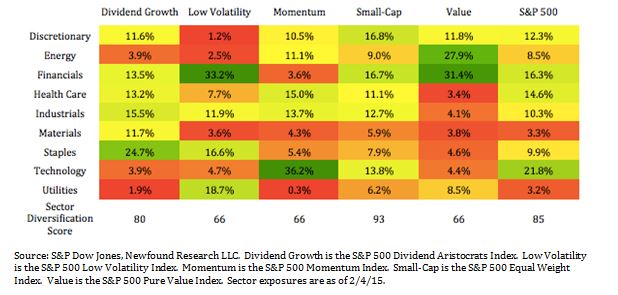
Four of the five factor indices tilt significantly – greater than 10 percentage points – away from the individual sector weights of the S&P 500.  This should not be worrying in the least bit.  If a portfolio looks exactly like a market-cap benchmark, then we surely can’t expect it to do any better than a market-cap weighted benchmark in helping an investor achieve investment goals.

However, it does highlight the need to keep an eye on sector exposures as factor products are incorporated into investor portfolios.

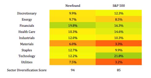
Our U.S. Factor Defensive Equity strategy holds all five of the factors discussed in inverse proportion to their volatility.  The weights in our portfolio as of 1/31/15 are shown below.

Dividend Growth Low Volatility Momentum Small-Cap Value
22% 24% 19% 19% 16%

By building a diversified factor portfolio we are able to increase sector diversification relative to the broad market.

Capture

One final point to keep in mind is that by definition factor-based portfolios and indices will rebalance more often than a market-cap weighted benchmark as the characteristics of the stocks in the overall universe change.  Naturally, these rebalances mean that the sector allocations will change over time.  The velocity of these changes will vary on a factor-by-factor basis.  More frequent changes will be seen in factors that have a price component, including value and momentum.

The posts on this blog are opinions, not advice. Please read our Disclaimers.

Smart Rolls Rise From Select Agriculture

Contributor Image
Jodie Gunzberg

Former Managing Director, Head of U.S. Equities

S&P Dow Jones Indices

The oil price drop has precipitated a flurry of interest around enhanced oil indices since the benefits of enhancing rolls in energy are well understood from the obviously costly storage situations in oil. Below is a chart of the ten year cumulative return of the S&P GSCI Crude Oil Total Return versus the S&P GSCI Crude Oil Enhanced Total Return.

Source: S&P Dow Jones Indices LLC. All information presented prior to the index launch date is back-tested. Back-tested performance is not actual performance, but is hypothetical. The back-test calculations are based on the same methodology that was in effect when the index was officially launched. Past performance is not a guarantee of future results.  Please see the Performance Disclosure at http://www.spindices.com/regulatory-affairs-disclaimers/ for more information regarding the inherent limitations associated with back-tested performance.
Source: S&P Dow Jones Indices LLC. All information presented prior to the index launch date is back-tested. Back-tested performance is not actual performance, but is hypothetical. The back-test calculations are based on the same methodology that was in effect when the index was officially launched. Past performance is not a guarantee of future results. Please see the Performance Disclosure at http://www.spindices.com/regulatory-affairs-disclaimers/ for more information regarding the inherent limitations associated with back-tested performance.

As investors have been interested in oil, questions have come up about the enhanced roll for agriculture since it can also be difficult to store. To shed some light on the return enhancement in agriculture, below is an analysis comparing the S&P GSCI Enhanced Agriculture Select and the S&P GSCI Agriculture Select.  The analysis in the “select” version is easier to understand given just four commodities: Chicago wheat (wheat), corn, soybeans and sugar.  The enhanced rolls are seasonal and are as follows:

  • Wheat is rolled into the December contract annually during the November roll period
  • Corn is rolled only to the July contract annually during the May roll period
  • Soybeans follow the regular S&P GSCI roll schedule
  • Sugar is rolled only to the March contract annually during the February roll period

The weights are based on world production and notice through time since 1995 that wheat has decreased while soybeans have increased but corn and sugar have been more cyclical. The chart below shows the daily historical weights of each commodity in the S&P GSCI Agriculture Enhanced Select. On average wheat was 33.2%, corn 32.9%, soybeans 19.2% and sugar 14.7%. Wheat is now 27.4%, less than its historical average. Sugar is currently at 13.0%, which is also less than its historical average. Corn and soybeans are currently weighted at 35.1% and 24.6%, both above their averages.

Historical Weights

Next, the chart below shows the cumulative performance of daily index returns of the S&P GSCI Agriculture Enhanced Select and the S&P GSCI Agriculture Select.  There is an outperformance of 98.8% from the enhanced rolling strategy.

CumPerf

This is important since there is evidence the commodities “to be grown” have fallen in price through time. One study done by Bessler and Wolff in Aug., 2014, showed “while aggregate commodity indices, industrial and precious metals as well as energy improve the performance of a stock-bond-portfolio for most asset-allocation strategies, we hardly find any portfolio effects for agricultural and livestock commodities.” Further, according to this study by Jacks, real prices for “commodities to be grown” fell by roughly 33% in real terms from 1950.

Source: March 2015. David S. Jacks, Simon Fraser University and NBER

However, when the rolling of agriculture futures contracts is employed strategically according to seasonal adjustments, it has been significantly positive.  The chart below shows the difference in monthly roll yield (excess return – spot) of the S&P GSCI Agriculture Enhanced Select less the S&P GSCI Agriculture Select. On average, the enhanced roll added 39 basis points per month.  Cumulatively, this has compounded to add 144.7% from Jan 1995 – Feb 2015.

Source: S&P Dow Jones Indices LLC. All information presented prior to the index launch date is back-tested. Back-tested performance is not actual performance, but is hypothetical. The back-test calculations are based on the same methodology that was in effect when the index was officially launched. Past performance is not a guarantee of future results.  Please see the Performance Disclosure at http://www.spindices.com/regulatory-affairs-disclaimers/ for more information regarding the inherent limitations associated with back-tested performance.
Source: S&P Dow Jones Indices LLC. All information presented prior to the index launch date is back-tested. Back-tested performance is not actual performance, but is hypothetical. The back-test calculations are based on the same methodology that was in effect when the index was officially launched. Past performance is not a guarantee of future results. Please see the Performance Disclosure at http://www.spindices.com/regulatory-affairs-disclaimers/ for more information regarding the inherent limitations associated with back-tested performance.

If Jacks is correct in pointing out the transition from fixed capital accumulation to a consumption-based economy, and suburbanization is tentatively beginning, then it may be likely to see an increase in demand for goods “to be grown” and an inflection in long-run trend. The sub-trend pricing for goods “in the ground” could be the formation of a new cycle in the medium run. So if it is time for agriculture, an enhanced roll might make sense.

The posts on this blog are opinions, not advice. Please read our Disclaimers.

European Equities Ripping Into 2015: Is It Just The ECB?

Contributor Image
Tim Edwards

Managing Director, Index Investment Strategy

S&P Dow Jones Indices

If there is one thing that the large stimulus programs enacted by central banks in the U.S., U.K. and Japan over the past few years have taught us, it is that they provide a whopping boost to equity markets in the short term.  Is that the only reason Europe is doing so well?

The European Central Bank announced its own €60bn per month bond purchasing program in January, and so far the S&P Europe 350 index of large-cap pan-European stocks has been having its best year ever.  Our end-of-month European dashboard shows a total return of 15% for the first two months of the year; it also shows that every sector and every country represented in the index has gained.

But – as we have seen in Japan – the problem with a rising tide lifting all boats is that the performance of those boats becomes highly dependent on the tide.  Otherwise said, if the stimulus program is all that is supporting the performance of European stocks, then as soon as it is priced in we return to a more volatile, uncomfortable market predicated on the ECB’s next move.

The good news is that this doesn’t seem to be the case.  There are plenty of other reasons to be optimistic about European equities that have nothing to do with Mario Draghi.  Lower energy prices should help the pockets of consumers and businesses, and most economists agree they should act to improve consumption.  Less commonly appreciated, it is actually good news that German workers are striking for higher pay, following a generous deal already completed with the single-largest union.  That’s seen as good news for two reasons: firstly because it helps to assuage fears of deflation, but also because the more expensive German workers are, the more competitive the rest of Europe’s labour force becomes.  Finally, it seems that Greece, her government and their counterparts across Europe will continue to muddle through in compromise.  The risks to markets of a “Grexit” are habitually overstated (Greek equities only account for about 0.2% of the market capitalization of the broad-based S&P Europe BMI), but the uncertainty has plagued markets for half a decade.  From the perspective of sentiment as well as the long-term future of the euro – the outlook is more optimistic than it has been for some time.

Yet, one can always find reasons to be cheerful, if you look hard enough.  So is any of this important?  Or do the ECB’s actions suffice to explain the performance of European stocks?  It’s obviously hard to say definitively, but one way to seek an answer is to look at correlations.  If, day-to-day, stocks have been moving up and down in concert and without respect to their individual circumstances, then it is reasonable to suppose that a shared theme was the dominant driver of performance.  On the other hand, if correlations are relatively low then we might conclude that a widespread combination of factors has been germane.

Source: S&P Dow Jones Indices Dispersion and Correlation Dashboard, February 2015

The results are intriguing.  Just before the turn of the year, the correlation figure for the S&P Europe 350 was recording three-year highs.  So, in advance of the ECB’s announcement it might to be fair to say it was all that mattered.   Since the announcement, however, correlations among European stocks have collapsed to their lowest levels on record.   So the evidence points to a range of factors supporting the performance of European equities, beyond and above the stimulus.  That might be another reason why so many investors are looking to Europe in 2015.

The posts on this blog are opinions, not advice. Please read our Disclaimers.

February Made Bonds Shiver, While Energy Kept High Yield Warm

Contributor Image
Kevin Horan

Former Director, Fixed Income Indices

S&P Dow Jones Indices

Investment-grade corporate yields widened by 15 bps, as the yield-to-worst of the S&P U.S. Issued Investment Grade Corporate Bond Index moved from a level of 2.16% at the beginning of the month to 2.76% at the end of month.  The price return of the index was -1.44% MTD, but 30 bps of coupon return brought the total return down to -1.15%.  February’s negative return was in contrast to the 2.88% gain in January.  The last time this index had a similar negative monthly return was September 2014’s -1.18%.  As of February 28, 2015, the YTD return stands at 1.70%.

High yield, as measured by the S&P U.S. Issued High Yield Corporate Bond Index, showed a contrasting reaction compared with its investment-grade counterpart.  The S&P U.S. Issued High Yield Corporate Bond Index’s yields went from 6.26% at the start of the month to 5.73% at month’s end.  The index returned 2.25% MTD and stands at 3.08% as of February 28, 2015.  February’s return help add to January’s small return of 0.80%.  With oil back up at USD 50 (as quoted by the NYMEX light sweet crude oil futures), the energy sector (15%) of the S&P U.S. Issued High Yield Corporate Bond Index returned 5.73% in February.  The last monthly return of a similar magnitude was October 2013 (2.36%).

The new-issue loan market is quiet, and market participants don’t see this changing in the near term.  The current continuation of lower rates has helped loans claw back some returns.  For the S&P/LSTA U.S. Leveraged Loan 100 Index, the YTD return of 1.67% is the index’s highest level this year.  For February, the index returned 1.45%, following January’s slow start of 0.20%.

The yield of the S&P/BGCantor Current 10 Year U.S. Treasury Index started February at 1.66% and progressively rose to 2.15% by the middle of the month, as expectation on the timing of a rate increase by the Fed was anticipated.  The end of the month saw the index’s yield reverse, moving from a high of 2.15% to a low of 1.97%, before ending the month at 2%.  Concerns from Europe over Greek funding coupled with a statement from Fed Chair Janet Yellen, which included the word “patience” in regard to rates, contributed to the end-of-the-month drop in the index’s rates.  The index returned -2.83% in February and is at 2.28% YTD as of February 28, 2015.

As of March 2, 2015, the U.S. 10-year Treasury bond is yielding 2.06% on the release of a report showing consumer purchases (adjusted for inflation) rose in January, reigniting the expectation that the Fed will take steps toward increasing rates sooner rather than later.  It is reasonable to expect rates to rise in anticipation of an eventual rate increase by the Fed.

The posts on this blog are opinions, not advice. Please read our Disclaimers.

Australian Bonds Delivered Better Risk-Adjusted Return than Equities

Contributor Image
Michele Leung

Former Director, Fixed Income Indices

S&P Dow Jones Indices

Australian equities and bonds both had double-digit returns last year.  Looking at the one-year returns as of Jan 30, 2015, the S&P/ASX Australian Fixed Interest 0+ Index gained 10.22% and the S&P/ASX 200 (TR) rose 12.48%.

While the levels of volatility came down in both markets, the annualized volatility of the S&P/ASX 200 (TR) maintained an elevated level of 11.04%, whereas the annualized volatility of the S&P/ASX Australian Fixed Interest 0+ Index stayed low at 2.19%.

Exhibit 1 shows the risk-adjusted returns of the two indices for the one- and five-year periods, and since year-end 2004.  The one-year, risk-adjusted returns of both indices outperformed the longer periods.  Noticeably, the one-year, risk-adjusted return of the S&P/ASX Australian Fixed Interest 0+ Index came at 4.67, which is four times the equities index’s return for the same period.  The risk-adjusted return seen by the S&P/ASX Fixed Interest 0+ Index is also one of the highest among the major fixed income markets.

The solid performance in the Australian fixed income market was supported by the strong gains in government bonds.  Contrary to historical performance, the S&P/ASX Corporate Bond 0+ Index underperformed other sector-level indices, despite the hunt for yields continued in other markets.  Yield contraction continued; the yield-to-worst of the S&P/ASX Australian Fixed Interest 0+ Index tightened by 103 bps to 2.42% in the same period, which is the lowest level since the index inception on Dec. 31, 2004 (see Exhibit 2 for historical yield-to-worst performance).  Interesting to note is that the current cash rate is 2.25% and the inflation rate was recorded at 1.70% in the fourth quarter of 2014, according to the Reserve Bank of Australia.

20150225a


20150225b


The posts on this blog are opinions, not advice. Please read our Disclaimers.