Get Indexology® Blog updates via email.

In This List

The Scary Thing About Falling Oil Prices

No Big Deal

Bonds in a Rising Interest Rate Environment

Fed a Small Step Closer to Raising rates

Though Not In the Lead, After the FOMC Will Leveraged Loans Be The Turtle That Wins the Race?

The Scary Thing About Falling Oil Prices

Contributor Image
Jodie Gunzberg

Former Managing Director, Head of U.S. Equities

S&P Dow Jones Indices

I don’t believe what the gas experts say, “that there is nowhere for gas prices to go but down.”

After another bloodshed month for crude oil as evidenced by the S&P GSCI Crude Oil return of -10.9% in Oct, bringing it down 24.6% off its high on June 20, one might get excited about further savings at the pump. Save that excitement.

The gas retailers are not looking to save any money for anyone but themselves. At least this is the story using data going back to 1991 from the EIA (U.S. Energy Information Administration) for U.S. Regular Conventional Retail Gasoline Prices (Dollars per Gallon) and S&P GSCI Crude Oil levels.

According to the EIA, what we pay at the pump is split into a chart with the following breakdown:

Source: http://www.eia.gov/petroleum/gasdiesel/

This might be true but only on average.  In the total sample of 251 months, gas prices rose during 196 months where oil prices fell.  In only 55 months was the reverse true. Further when oil fell and rose, it was pretty symmetrical, falling on average 6.6% and rising 6.9%; however, when gas prices fell, they only shaved off 3.8% on average compared with an increase of 4.9% when they rose.  The picture becomes even clearer and more biased when observing the gas price change with the oil price change. When oil prices fell, on average gas prices only fell 2.1% but when oil prices rose, gas prices rose 2.7% – in other words, when oil rose and fell, it moved roughly at a 1:1 ratio; but the amount gas rose was 30% more than the fall. If we put this in terms of a beta, or sensitivity, similar to how we calculate a stock beta or inflation beta, the gas beta (to oil) is only 0.41, showing that it doesn’t fully swing up AND DOWN with the underlying oil.

According the IEA (International Energy Agency), it turns out that macroeconomic factors may have a greater impact on (oil) demand than oil prices. Their demand model therefore gives macroeconomic factors a higher weighting than crude oil price assumptions, which do not directly feed‐through to retail product prices, as taxes and subsidies blunt the impact of crude price changes, and are deemed to play a less significant role than economic growth in terms of influencing demand. These two exogenous variables are however, interrelated: lower prices, for most countries, reduce the cost of doing business and support economic growth, the converse being true for net oil exporters. At this point, the only conclusion is that lower prices offer a cushion of sorts against an otherwise vulnerable macroeconomic backdrop.

Source: International Energy Agency Oct 2014.

Gas retailers aren’t the only retailers trying to profit from the everyday consumer like you and me. This is true for food as well. Although grains had a nice rebound in October, with the DJCI Grains gaining 14.5% this month, the DJCI Softs didn’t fare so well and lost 1.6% driven down by all the treats we love like coffee (-2.8%), sugar (-2.5%) and cocoa (-12.2%).  So let’s get excited about cheaper Christmas treats than Halloween treats, right?! WRONG!!!

According to the USDA (U.S. Department of Agriculture,) the farm to table expenses flow much like the pipe to the pump.

USDAfood retail

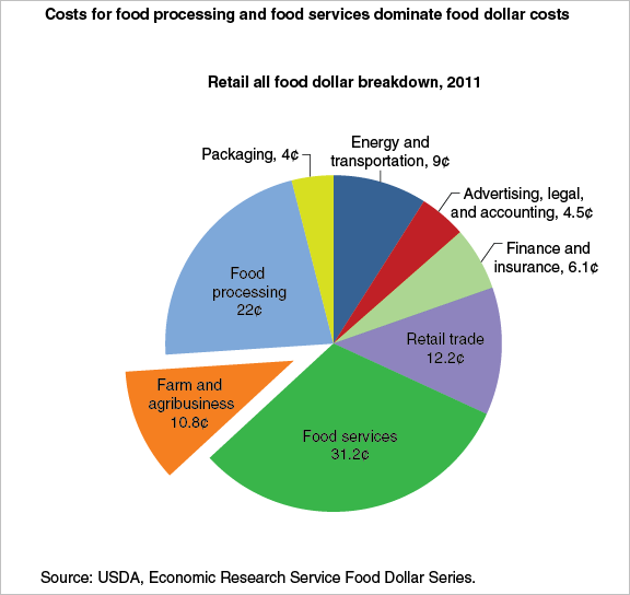
The USDA also reports, one reason for the relative stability in retail prices in relation to commodity prices is that these prices reflect the cost of processing and marketing inputs in addition to commodity costs. ERS’s 2011 Food Dollar Series reports just 10.8 cents of every food dollar goes toward farm commodities and agribusiness expenses. The remainder is allotted to food processing, food service, and other administrative, transportation, and retailing costs, categories which are less volatile due to fixed machinery expenses, multi-year contracts for supplies, and small year-to-year changes in wages. Since 1990, grocery store wages—which make up over 50% of retailing costs—have increased an average of 2.2% per year.

Moreover, the USDA says retailers and restaurateurs are sometimes slow to pass input costs along to consumers through higher prices, which can cause margins to narrow during times of higher commodity price inflation. Delayed price transmission in grocery stores can occur for a variety of reasons, including re-pricing costs (such as printing new shelf price labels) and concerns that input price changes are only temporary. A 2011 ERS study found that retail prices for bread and beef generally respond to changing commodity prices within 1 to 6 months. However, lags for some foods such as eggs and milk are at the upper end—5 to 6 months.

Notice in the chart below how the All Food CPI (green line) actually rises as the Farm Products PPI (blue line) is falling from Sept to Oct. food lags

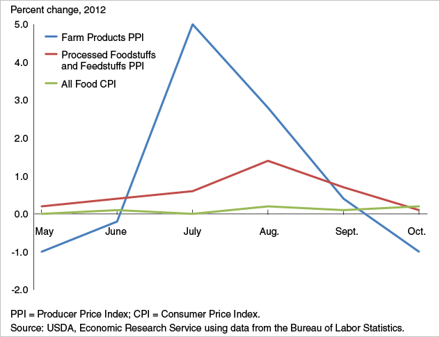
Too bad, you might go broke eating the chocolate to fix your depression from the artificially elevated gas price.


The posts on this blog are opinions, not advice. Please read our Disclaimers.

No Big Deal

Contributor Image
Craig Lazzara

Former Managing Director, Index Investment Strategy

S&P Dow Jones Indices

Twenty years from now, some bright young analyst looking at data for the U.S. stock market could be excused for thinking that the S&P 500’s 2.4% total return for October 2014 was no big deal – just one more routine good month in a long bull run.  If the analyst is particularly inquisitive, he might wonder why strategies that we typically regard as defensive outperformed – for example, the S&P 500 Dividend Aristocrats (up 4.4%), or the S&P 500 Low Volatility Index (up 4.9%).  That’s not what we expect to see in an up month like October – and therein lies our tale.

The key, of course, is to remember that October encompassed two radically different market regimes.   Through October 15, the market was in a sharp downdraft, with the S&P 500 falling 5.5%.  This was followed by an even sharper recovery in the last half of the month, as the 500 rallied by 8.4%.

We all learn in elementary finance that volatility can reduce returns.  If you lose 50% and then make 50%, your compound return is -25%; if you lose 10% and then make 10%, your compound loss is only -1%.  Other things equal, lowering volatility can raise returns over time.  October is a fine example of that principle in action:

Defensive Indices Oct 2014

The table shows the performance of the S&P 500 and of three factor or “strategic beta” indices derived from it.  All three of these indices can rightly be considered “defensive,” although they achieve their defensive character in different ways.  The S&P 500 Dividend Aristocrats Index comprises stocks which have increased their dividends for at least 25 consecutive years, and can be thought of as both a yield and quality play.  The S&P 500 Low Volatility Index holds the 100 least volatile stocks in the S&P 500 and tries to exploit the well-known low volatility anomaly.  Dynamic VEQTOR is a multi-asset index which owns both the S&P 500 and a long position in VIX index futures.

What defensive indices have in common is that they aim to offer protection from declining markets and participation in rising markets.  It’s not perfect protection (the Aristocrats and Low Vol both lost money in the first half of October), and it’s not full participation (all three indices lagged the S&P 500 in the last half of the month).  But when the market is choppy, lowering volatility can enhance returns while also lowering risk.

The posts on this blog are opinions, not advice. Please read our Disclaimers.

Bonds in a Rising Interest Rate Environment

Contributor Image
David Blitzer

Former Managing Director and Chairman of the Index Committee

S&P Dow Jones Indices

After last week’s FOMC meeting, the time when interest rates begin a sustained rise propelled by the Federal Reserve may be drawing closer.  The received wisdom is that no one should own bonds when interest rates are rising because rising rates mean falling bond prices.  While the math demands that bond prices fall, a deeper look at the math reveals that all may not be lost.

Some investors believe that the yield to maturity on a bond measures the return they will earn if they hold the bond until it matures.  Not quite. There is a hidden assumption that the coupon payments received every six months will be reinvested and will earn the same rate as the yield to maturity.  Since interest rates can vary over time and different rates are available for different time frames, this assumption rarely holds.  When interest rates climb after a bond is issued, the price of the bond drops but the returns earned from reinvesting the coupon income benefits from the higher interest rates.  (The reverse also holds, if rates fall after the bond is issued, its price rises but the returns or “interest on interest” from reinvesting the coupons is less.)  If you buy a bond and interest rise far enough and fast enough, you might do better than if rates never moved at all.

A made-up example shows how this might work and how the investor who holds the bond long enough could benefit.  The table shows a theoretical investment in a 2.5% coupon ten year Treasury note bought on January 15, 2015 at a price of 100.  The yield to maturity when purchased is 2.5%.  If rates don’t change and if each semi-annual coupon payment of $1.25 can be invested at 2.5% annual rate for the remaining life of the bond, the investment will be worth $128.20 on January 15, 2025 when the bond matures. The dashed purple line on the graph illustrates this; the right hand scale is the value of the investment in the bond and the coupons.

Now let’s change the example shown on the table – interest rates rise and the yield paid on newly issued treasury notes rises towards 7% as shown in the second column of the table.  Further, the coupon income is reinvested in six-month T-bills which pay 1.25% less than treasury notes.   The table works out this example: every six months a coupon payment is received and it is added to the past coupon income and the total is invested at the T-bill rate. These coupon payments – the interest paid on the bond – earn “interest on interest.” At the end of ten years the accumulated coupons total $31.10 ($25 of payments plus $6.10 interests earned on the coupons). The total investment is worth $131.10.  The green line on the chart plots the investment value.  In the early years the rising rates depress the bond price and send the investment into negative territory.  As the accumulated coupon interest increases and as the bond approaches maturity, the investment moves into positive territory and surpasses the theoretical case of no change in interest rates (the dotted line).

bond-1

If it is possible to make money with bonds when interest rates rise, why are so many people worried that rates will rise?  The blue line at the bottom of the chart plots the price of the bond for the same time pattern of rising interest rates.  Just as the math requires, rising rates mean lower bond prices.  At maturity approaches the price approaches the par value of the bond – the principal to be repaid at maturity. If an investor didn’t reinvest the coupons, if instead he spent the coupon income, all he would have at maturity is the par value.  Likewise, if   the investor had sold out at the low point on the green line (July 15, 2016) the proceeds for the $100 invested would have been $96.50, a loss of $3.50.

There are no magic formulas for bond investing in any interest rate environment, but working the math sometimes helps.

The posts on this blog are opinions, not advice. Please read our Disclaimers.

Fed a Small Step Closer to Raising rates

Contributor Image
David Blitzer

Former Managing Director and Chairman of the Index Committee

S&P Dow Jones Indices

Fed a Small Step Closer to Raising rates

Today’s FOMC statement published after the meeting is more upbeat than the last one in discussing the labor markets and the inflation outlook.  The FOMC noted “solid gains and a lower unemployment rate” and that the “likelihood of inflation running persistently below 2 percent has diminished somewhat” despite lower oil prices.  In announcing the end of QE, the statement noted “substantial improvements in the outlook for the labor market since” QE began.

The balance in the FOMC may be shifting at the same time. There was one dissent from Narayana Kocherlakota of the Minneapolis Fed arguing for a more dovish position than the Committee took. At the previous meeting in mid-September there were two dissents arguing for a more hawkish position and quicker action for higher interest rates.

The full minutes of the previous FOMC meeting included a discussion of Fed operating procedures and how they would raise interest rates in the face of some $3 trillion-plus of excess reserves. The summary statement from that meeting mentioned concerns about removing policy accommodation.  This time the lack of any mention of operating procedures suggests that the FOMC is confident that it can raise interest rates when the time is right.

None of this points to a precipitous move to boost interest rates quickly. However, the Fed recognizes – and the apparently the FOMC acknowledges to itself – that the policy target on unemployment is close at hand and the trend in core inflation is shifting towards 2%.   Markets and investors will begin to react.  Forecasts of when the Fed might move and what the Fed Funds rate might be at the end of 2015 will be revised to the hawkish side.

The CME Group FedWatch, based on trading in 30 days Fed Funds Futures Contracts, reveals that the probability of a rate hike by next June is above 50-50.   The chart below was captured at 3:50 PM Eastern on October 29th. See the Fed Funds Probability tool here.

The posts on this blog are opinions, not advice. Please read our Disclaimers.

Though Not In the Lead, After the FOMC Will Leveraged Loans Be The Turtle That Wins the Race?

Contributor Image
Kevin Horan

Former Director, Fixed Income Indices

S&P Dow Jones Indices

The senior bank loan or leverage loan market as measured by the S&P/LSTA U.S. Leveraged Loan 100 Index ticked up last week as the index has returned +0.10% month-to-date and 1.56% year-to-date.  Last week’s price action of the secondary loan market assisted the index in clawing back against a month-to-date loss from the beginning of the week of -0.51%.  Much of last week’s leveraged loan positive return accompanied a 3.2% rally in equities (S&P 500) and a 0.8% high-yield bond rally as measured by the S&P U.S. Issued High Yield Corporate Bond Index.  Also aiding in last week’s increase in demand for loans was the fact that new-issue launches have slowed to a trickle.

Currently the 10-year Treasury is yielding 2.25%, 2 basis points lower than Friday’s close of 2.27% for the S&P/BGCantor Current 10 Year U.S. Treasury Index.  If the markets are concerned of news from this week’s FOMC Meeting announcements, they haven’t shown it.  To date the more speculative indices S&P/LSTA U.S. Leveraged Loan 100 Index, S&P U.S. Issued High Yield Corporate Bond Index and S&P Municipal Bond High Yield Index are returning 0.10%, 1.11% and a just slightly negative number of -0.16%, respectively.

Market sentiment can change quickly though and if news from the FOMC does undermine the current risk-on environment; leveraged loans could be the least volatile in price.  Compared to the municipal high yield’s 7.35 year duration and the U.S. Issued High Yield’s duration of 4.86%, the weekly reviewed leverage loan index will be least effected to the change in rates.
Speculative Grade Indice ReturnsSpeculative Grade Return Table

The posts on this blog are opinions, not advice. Please read our Disclaimers.