Get Indexology® Blog updates via email.

In This List

Capturing Global Flows: the S&P WCI

Skipping Dessert?! Coffee, Sugar, Cocoa OR Bear, Bear, Bull

Looking for What Works at the Fed

Companies Dying Faster?

Tapering Away

Capturing Global Flows: the S&P WCI

Contributor Image
Nicholas Kennedy

Head of Business Development

NYSE Liffe

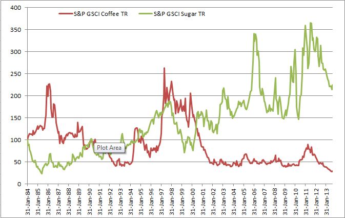
Commodity indices have seen tremendous success as investors look for asset diversification in their portfolio; simple exposure to the asset class; or even a hedge against inflation. Historically, the main commodity indices have been very much US centred and predominately denominated in USD. Why? The main reason is that these indices use exchange traded commodity futures to base their prices on and for many years, these have been listed in the US on US exchanges. Over recent years however, there has been a strong growth in volumes on non-US exchanges, and this has been particularly the case in agricultural derivatives. Europe for example has a physical wheat market which is over twice the size of that in the United States; however due to the lack of a reliable commodity futures contracts in Europe for many years, it was difficult to gain appropriate exposure. This has changed dramatically since the Common Agricultural Policy (CAP) stopped artificially supporting prices in grains in Europe in the early 2000’s. Since then, the Europeans grains futures markets were able to develop.

Nearly 10 years on and the European Wheat and Rapeseed contracts, operated by NYSE Liffe (NYSE Euronext group), have literally exploded and established themselves as global reference prices for European Wheat and Rapeseed.

S&P’s recently launched WCI was one of the first global commodity indices to understand this and has included these contracts, as well as our soft commodity contracts out of London, into their indices. With this index investors can now obtain easy exposure to these major trading flows in Wheat and Rapeseed.

S&P Dow Jones Indices is an independent third party provider of investable indices.  We do not sponsor, endorse, sell or promote any investment fund or other vehicle that is offered by third parties. The views and opinions of any third party contributor are his/her own and may not necessarily represent the views or opinions of S&P Dow Jones Indices or any of its affiliates.

The posts on this blog are opinions, not advice. Please read our Disclaimers.

Skipping Dessert?! Coffee, Sugar, Cocoa OR Bear, Bear, Bull

Contributor Image
Jodie Gunzberg

Former Managing Director, Head of U.S. Equities

S&P Dow Jones Indices

Sorry, grains and meats, you are not one of the four main food groups.

Chocolate Love

Since this is the case, eating may have just become more expensive, especially for the high-end chocolate lover. Not me of course… but once again, as a commodity lady, when I consume goods (or goodies) and notice that prices are increasing or decreasing I think about the prices of the raw materials and how the indices are impacted.  I have noticed the price of chocolate increasing, so decided a deeper dive into the softs might be interesting.

So far in September, sugar, coffee and cocoa are hot. While the S&P GSCI Sugar and the S&P GSCI Coffee are up 5.1% and 3.2%, respectively, MTD through Sept 13, 2013, both are coming off of bear market draw-downs. From Jan 31, 2013- Aug 30, 2013 the S&P GSCI Coffee lost 26.5% and going back to its high in April 2011 the index lost 68.2%. The S&P GSCI Sugar lost 31.8% since July 31, 2012.

Source: S&P Dow Jones Indices. Data from Jan 1984 to Sep 2013. Past performance is not an indication of future results. This chart reflects hypothetical historical performance. Please see the Performance Disclosure at the end of this document for more information regarding the inherent limitations associated with backtested performance

The story for the S&P GSCI Cocoa looks a bit different, and rather than a rebound from a bear market, it looks more like a bull.  From its low on June 27, 2013, the S&P GSCI Cocoa is up 20.1%.

Source: S&P Dow Jones Indices. Data from Jan 1984 to Sep 2013. Past performance is not an indication of future results. This chart reflects hypothetical historical performance. Please see the Performance Disclosure at the end of this document for more information regarding the inherent limitations associated with backtested performance

There have been strong fundamentals supporting the price, both on the supply and demand sides.

Cocoa Supply Demand

Producers have cut capacity because when the cocoa beans are ground, roughly equal parts of cocoa butter and cocoa powder are produced, but consumers have demanded butter over powder, leaving producers with excess powder. The uneven demand profile can be blamed on greater high-end consumer demand, which requires more cocoa butter than powder.  Normally, as the cocoa butter-to-powder ratio increases, cocoa futures drop and the production evens out; however, this time is different since there are worries about a global bean shortage, especially from the Ivory Coast, one of the world’s top producers.

Cocoa bean production

Further supporting the cocoa price is the strong demand coming from growth of the middle class in Asia and Latin America.  The Euromonitor International estimates chocolate consumption in 2013 will be up nearly 2% from a year earlier that is worth about $110 billion. 
The impact can been seen as price increases are now flowing to consumers.  As evidence, below is a picture from a candy supply company.
Chocolate price increases

The posts on this blog are opinions, not advice. Please read our Disclaimers.

Looking for What Works at the Fed

Contributor Image
David Blitzer

Former Managing Director and Chairman of the Index Committee

S&P Dow Jones Indices

The FOMC, the Fed’s policy makers, meet Tuesday and Wednesday this week.  For investors the key agenda items are tapering and the future of QE3. Interest rate policy is almost forgotten as everyone prepares to scan the announcement expected at 2 PM Wednesday and then rush to either buy, or sell, bonds.  Market pundits seem roughly split with a slight tilt towards expecting some cut back in bond buying and QE3.

Paul Krugman, in today’s New York Times, argues for continuing QE3 at its current level. His concern is that starting to wind down QE3 would be seen as a signal that there is little room for additional job growth and that efforts  to create jobs and increase economic growth should be abandoned.  Krugman acknowledges that there is a lot of uncertainty about how strong the economy is and how much room there is for more QE3 – he wants to err on the side of encouraging growth.

As we have been reminded in the fifth anniversary of financial crisis reviews, the US economy recently came through the worst, and most confusing, period since the Great Depression of the 1930s.  Back then it was clear to Franklin Roosevelt and his economics team that there was a lot they didn’t know about the economy.  Their approach was to try a lot of things in the hope that something would work and that the rest wouldn’t do much damage.  Despite some 75 years of advances in economics, the Fed is still trying things to see what works.  QE3 is one thing the Fed tried. While no one knows for sure if it works, the economy is better off than a year or two ago and most agree that low interest rates and easy credit deserve some credit for the gains.   With interest rates up from last May, leaving QE3 fully in place a little longer would be reasonable.

The posts on this blog are opinions, not advice. Please read our Disclaimers.

Companies Dying Faster?

Contributor Image
David Blitzer

Former Managing Director and Chairman of the Index Committee

S&P Dow Jones Indices

MIT’s Technology Review pitches an argument by Richard N Foster, well known consultant, which uses exits from the S&P 500 to show that companies suffer shorter lifespans these days and are dropping off indices faster than they used to.  Foster includes a chart showing a seven year moving average of corporate lifespans including a forecast beyond the year 2025. He blames the increasing pace of technology and the need for rapid innovation for the losses.

Changes to the S&P 500, the Dow and other indices report shifts in the corporate world and rather than causing them. However, there is more going on here than the speed of innovation and technology.  About two-thirds of all exits from the S&P 500 are caused by M&A; and, more often than not, both the acquirer and the target are in the S&P 500.  When a company is acquired, it may drop off the index but its activities, products, revenues and (hopefully) profits remain – and stay in the index if the acquirer is in the index.  Sometimes a company is acquired specifically because it has great technology.  The better measure of lifespan might be to look at the handful of companies that leave the S&P 500 because they have shrunken or filed for bankruptcy.  Any measure of corporate senility must be balanced against the list of companies that have been in the S&P 500 since it became 500 stocks in 1957 or since it began as a 90 stock index in 1926.  There are some long lived entities still going strong.


The posts on this blog are opinions, not advice. Please read our Disclaimers.

Tapering Away

Contributor Image
Craig Lazzara

Former Managing Director, Index Investment Strategy

S&P Dow Jones Indices

Next week the Federal Open Market Committee, meeting for the first time since July, is widely expected to announce the tapering of its quantitative easing program.  Whether the Fed begins to reduce its bond purchases now or later this year, most observers recognize its inevitability.  Indeed, as we’ve noted before, even the anticipation of tapering has caused an increase in interest rates.

Should this disturb equity investors?  We all learn early on that, other things equal, rising interest rates are bad for stock prices.  Difficulties arise when we consider that other things may not be equal.  For example, if a strong economy increases both demand for credit and corporate profits, interest rates and stocks prices might both increase, and the reverse is equally possible.

Indeed, the last 15 years illustrate the point:

Interest rates and Stock Performance

Since 1998, in months when 10 year Treasury rates declined, the average return on the S&P 500 has been -0.38%.  When the 10 year rose, the S&P 500 rose by an average of 1.81%.  This counterintuitive behavior suggests that interest rates were not driving stock prices, but rather that both rates and stock values were both being driven by exogenous factors.

Arguably, the Fed’s future behavior will depend on its assessment of the economy — the stronger the economy looks, the more likely a taper becomes.  But a strong economy should also be good for the stock market.  It’s arguable that the variables that will lead the Fed to increase rates will also support higher equity prices.


The posts on this blog are opinions, not advice. Please read our Disclaimers.