Get Indexology® Blog updates via email.

In This List

Does Performance Persistence of Active Managers Vary Over Time?

Do Signals From Earnings Revisions Matter for Size- or Sector-Neutral Fundamental Factor Strategies?

Before & After The Sector Shakeup In The S&P 500 - Part 2

Before & After The Sector Shakeup In The S&P 500 - Part 1

Using Trailing Dividend Yield Versus Indicated Dividend Yield

Does Performance Persistence of Active Managers Vary Over Time?

Contributor Image
Berlinda Liu

Former Director, Multi-Asset Indices

S&P Dow Jones Indices

Our most recent Persistence Scorecard shows that relatively few funds can consistently stay at the top. Out of the 557 domestic equity funds that were in the top quartile as of March 2016, only 2.33% managed to stay in the top quartile at the end of March 2018. That means out of the 2,228 domestic equity funds that were in the opportunity set at the start of March 2015, 557 made it to the top quartile by the end of March 2016. Out of those 557, 45 (8.08%) remained in the top quartile at the end of March 2017. By March 2018, only 13 (2.33%) of those 45 funds managed to stay in the top at the end of March 2018.

One inquiry we often receive from readers is regarding the degree of performance persistence throughout time and whether it varies over time. In other words, how do the current report’s findings compare to previous reports? Are the current persistent scores better or worse than the historical figures?

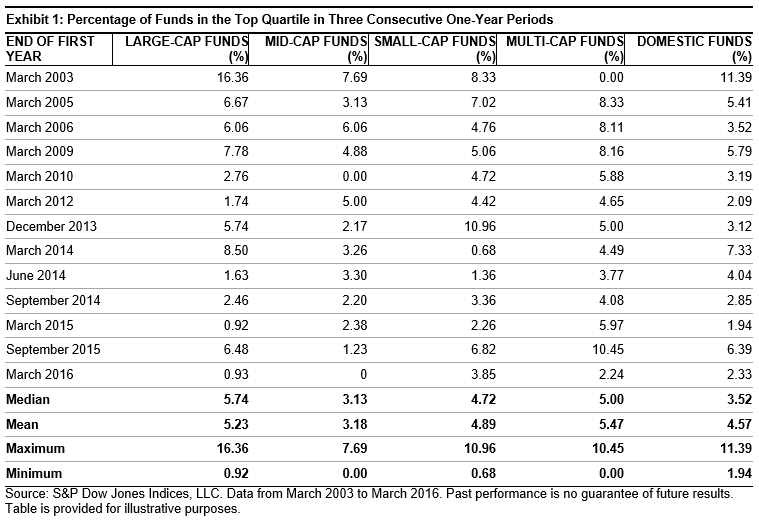
To answer these questions, we take a step back through time to revisit historical reports and summarize the results. Exhibits 1 and 2 show the percentage of funds that managed to remain in the top quartile for three consecutive one-year periods. For example, among all the large-cap funds, 16.36% managed to stay in the top quartile for three straight years starting in March 2003 and ending in March 2005, respectively, while only 6.67% managed to do so in the three years starting in March 2004 and ending in March 2006.

The data show a few interesting findings. The performance persistence of large-cap and mid-cap funds show a long-term downward trend. For example, at the end of March 2003, based on the three prior consecutive years, 16.36% of large-cap funds and 7.69% of mid-cap funds remained in the top quartile. We find that those were the highest performance persistence figures.

We also find that among the domestic equity categories, for funds that were in the top quartile as of March 2016, the percentage that managed to stay in the top quartile in the next two consecutive years is lower than its historical mean and median. The data indicate that persistence scores for March 2018 are significantly lower than those from six months prior for all of the fund categories.

This decline in performance persistence could be partially explained by the volatility and the market shocks experienced in Q1 2018. Funds that had been outperforming in the past might not be able to adjust quickly enough, or the investment style might not be suitable for the new market conditions.

In conclusion, a review of the performance persistence figures over time shows a downward trend over the longer-term horizon for equity funds, indicating an increasing difficulty to stay at the top.

The posts on this blog are opinions, not advice. Please read our Disclaimers.

Do Signals From Earnings Revisions Matter for Size- or Sector-Neutral Fundamental Factor Strategies?

Contributor Image
Utkarsh Agrawal

Associate Director, Global Research & Design

S&P Dow Jones Indices

In our earlier blog, “How Important Are Earnings Revisions Signals for Fundamental Factor Strategies in Asia?”, we discussed that the signals from earnings revisions were important for fundamental factor strategies applied across broad markets. They reduced the risk and enhanced the return of the comparable factor portfolios, across the majority of markets. In our research paper, “Earnings Revision Overlay on Fundamental Factors in Asia”, we also studied whether the earnings revision signals remained effective on size- or sector-neutral fundamental factor strategies.

The sector-neutral earnings revision overlay on fundamental factors was done in three steps. First, we selected the top quartile of stocks by each fundamental factor from each sector. Next, we dropped the bottom quintile of stocks by earnings revision from the stocks selected in the first step from each sector. Lastly, stocks selected from each sector were aggregated to form the final portfolios.

The large-mid-cap earnings revision overlay on fundamental factors was done in two steps. First, we selected the top quartile of stocks by each fundamental factor from the large-mid-cap universe. Next, we dropped the bottom quintile of stocks by earnings revision from the stocks selected in the first step.

The small-cap earnings revision overlay on fundamental factors was done similar to the large-mid-cap strategy, except that the stocks belonged to the small-cap universe.

The results showed that historically, the sector-neutral, large-mid-cap, and small-cap earnings revision-screened factor portfolios outperformed their respective sector-neutral, large-mid-cap, and small-cap comparable factor portfolios in the majority of markets. They were most effective in the Australian market (see Exhibit 1).[1]

The signals from earnings revisions had better synergy with quality factors than value factors across the majority of markets for sector-neutral, large-mid-cap, and small-cap portfolio strategies.

[1]   For other markets, please see the “Earnings Revision Overlay on Fundamental Factors in Asia”.

The posts on this blog are opinions, not advice. Please read our Disclaimers.

Before & After The Sector Shakeup In The S&P 500 - Part 2

Contributor Image
Jodie Gunzberg

Former Managing Director, Head of U.S. Equities

S&P Dow Jones Indices

In part 1 of this post, the current sector weights, returns and correlations of the S&P 500 are shown, as well as a map depicting the expanded telecommunication services sector into communication services.  Now, here’s a deeper dive into what is moving and its impact.

While the entire list of companies moving can be found on our website, below are the top 15 companies by size with a total market cap of about $2 trillion that are moving sectors, primarily into telecommunications services that will be renamed communication services.  Roughly $1.24 trillion is moving out of information technology and $620 billion is moving out of consumer discretionary.  Also note eBay is moving from information technology into consumer discretionary.  Another point of interest may be that the former FAANG group of Facebook, Apple, Amazon, Netflix and Alphabet’s Google, largely followed as “tech” stocks will be dispersed so that only Apple will be in information technology, while Amazon remains in consumer discretionary, and Facebook, Alphabet and Netflix will move to communication services.  Other notable moves from consumer discretionary are Comcast and Disney.

Source: S&P Dow Jones Indices. Data as of Aug 31, 2018. Changes effective on Sep. 24, 2018.

In the S&P Total Market Index (TMI), a total of 137 stocks are moving into communication services with 48 leaving information technology and 89 from consumer discretionary.  In the S&P 500, 23 stocks are entering communication services while 8 are leaving information technology and 15 are leaving consumer discretionary.

Source: S&P Dow Jones Indices. Data as of Aug 31, 2018. Changes effective on Sep. 24, 2018.

This will bring communication services to be the 5th biggest sector of 11 in the S&P 500 at 10% weight with information technology losing over 5% and consumer discretionary losing about 2.5%.  The 3 sectors combined will have approximately $10 trillion in market cap, and will account for just over 40% of the S&P 500.

Source: S&P Dow Jones Indices. Data as of Sep. 17, 2018. Changes effective on Sep. 24, 2018.

Alphabet, Facebook, TripAdvisor and Twitter are the major companies in the biggest sub-industry group that will total 46% of the $2.5 trillion communication services sector.  The integrated telecommunication services sub-industry will make up 19% with AT&T and Verizon.  Movies & Entertainment moving from consumer discretionary are nearly the same portion of communication services as the telecom sub-industry, with a 17% weight from Netflix, 21st Century Fox, Viacom and Disney.  Also worth mentioning are the major companies, Charter, Comcast and DISH in the cable & satellite sub-industry.

Source: S&P Dow Jones Indices. Proforma weights. Changes effective on Sep. 24, 2018.

The results of the GICS reclassification change the characteristics of the sectors impacted but mainly change the style of telecommunication services from value to growth.  Prior to the change, the S&P 500 telecommunication services sector was 100% value but shifts to a mix of about 2/3 growth and 1/3 value with the additional stocks in communication services.  Also, the P/E almost triples from 7.7 to 21 and price to book nearly doubles from 1.9 to 3.9, while the beta increases from 0.73 to 1.06. The dividend yield also drops from 6% to 1.1%.  These changes may alter the way investors use the sector depending on their goals.

Using hypothetical back-tested data, the 10 year annualized price returns of the communication services sector is 15.8% and outperforms the telecommunication services sector by 12.29%.  However, both the hypothetical back-tested consumer discretionary and information technology sectors slightly underperformed the actual sector structures over 10 years.  The annualized price returns over 10 years of the hypothetical back-tested consumer discretionary sector was 19.3% and information technology was 19.1%, a respective 14 and 61 fewer basis points than the actual sector performance.

Source: S&P Dow Jones Indices. The Proforma Sectors shown are hypothetical back-tests. 2018 is year-to-date through Aug. 31, 2018.

Further, the hypothetical backtested communication services sector outperformed the current telecommunication services sector by 12.39% on average per calendar year, while the hypothetical consumer discretionary and information technology sectors underperformed the current structures by -0.13% and -0.57%, respectively, on average per calendar year.

Source: S&P Dow Jones Indices. The Proforma Sectors shown are hypothetical back-tests. 2018 is year-to-date through Aug. 31, 2018.

While the hypothetical backtests should be used with caution since the market today is different than it was ten years ago, it is worth analyzing to understand some hypothetical characteristic differences.

For more information, please visit our website or contact index_services@spglobal.com.

This was written by product management and based only on publicly announced data and not a product of GICS, IMPG or Index Governance.


The posts on this blog are opinions, not advice. Please read our Disclaimers.

Before & After The Sector Shakeup In The S&P 500 - Part 1

Contributor Image
Jodie Gunzberg

Former Managing Director, Head of U.S. Equities

S&P Dow Jones Indices

The Global Industry Classification Standard (GICS) was first developed in 1999 as a four-tiered, hierarchical industry classification system.  It is managed jointly by S&P Dow Jones Indices and MSCI to serve as the major global industry framework for investment research, portfolio management, and asset allocation.  Each company is assigned a single GICS classification at the sub-industry level according to its principal business activity using quantitative and qualitative factors including revenues, earnings and market perception.  Annual reviews are conducted to ensure that the structure remains fully representative of the current global market.

Source: S&P Dow Jones Indices. Current weights are as of Aug. 31, 2018.

While the GICS assignment doesn’t change constituents and weights in composite indices like the S&P 500, the classifications are important for attribution and understanding the economic impacts on sectors and industries.  Further, with the increasing popularity of sector products, the changes are vital to know for making investment decisions and measuring managers who are sector specialists.  Market participants may use the sectors consisting of related companies that tend to perform similarly and display strong correlation in rotation strategies, for focused diversification in lieu of single stocks or for different growth and value characteristics.  Note the wide range of performance and relatively low correlation between certain sectors.  For example, the 10-year annualized return of consumer discretionary was 14.5% as compared with the -0.2% delivered by energy, and the two sectors have a moderate correlation of 0.63 that can provide both opportunities and diversification.

Source: S&P Dow Jones Indices.

Note the high correlation, 0.93, of consumer discretionary to the S&P 500 that shows how much the U.S. economy is driven by consumer spending.  There are also sectors like utilities and telecommunication services that have shown much lower correlation the the S&P 500 and to other sectors.  Sometimes sector fundamentals drive performance differently as observed between energy and consumer staples with a correlation of 0.48.  Regardless of whether oil is rising or falling, basic goods are still needed.

Source: S&P Dow Jones Indices. Data is 10 years of monthly price return ending on Aug. 31, 2018.

On Monday, Sep. 24th, 2018, the biggest GICS change in history will take place.  It will impact, the biggest sector, information technology, as well as the consumer discretionary and telecommunication services sectors.  This is a result of market feedback confirming the ways in which people communicate and seek information have transformed.  Integration between telecommunications, media, and internet companies in terms of both infrastructure and content have advanced the communication industry into a much broader field as evidenced by the convergence between telecom and cable companies.  Many internet companies have become synonymous with social communication and information, while the Internet Software & Services Sub-Industry has become too diverse, evolving to include new business models using internet technology to cater to a variety of end users and industries.  Most now regard the internet as simply a medium for delivery of a company’s products & services.  The impact on the GICS classification is depicted below to show the expansion of telecommunication services into the communication services sector with new definitions described here.

In the next part of this post, more details of the results will be shown including major stocks moving, market caps, growth/value characteristics, fundamentals and proforma performance.


Special thank you to my colleague, Louis Bellucci, for his contribution to this post.

The posts on this blog are opinions, not advice. Please read our Disclaimers.

Using Trailing Dividend Yield Versus Indicated Dividend Yield

Contributor Image
Qing Li

Director, Global Research & Design

S&P Dow Jones Indices

Over the past decade, the combination of low interest rate environments and shifting demographics has made income-focused investment strategies extremely popular. In constructing an income-producing equity index, the dividend yield of a security serves as a key criteria for eligibility and security selection.

Dividend yield is usually calculated as a percentage of a stock’s annual dividend-per-share relative to the stock’s current price. There are two ways to measure dividend yield: trailing dividend yield and indicated dividend yield. The difference lies in the numerator of the yield formula—using the trailing dividends or indicated dividends over a specified period. Trailing annual dividends are the sum of the dividends paid out over the last 12-month period, and indicated annual dividends are the sum of the dividends that are expected to be paid out over the next 12-month period. Indicated annual dividends are usually calculated as the most recent dividend payments multiplied by the frequency of dividend distribution. The key distinction between trailing annual dividends and indicated annual dividends is that the former is backward-looking whereas the latter is forward-looking.

The question then arises: In what kind of market is it suitable to use one type of dividend yield versus the other? The answer lies in the consistency of dividend payments. We find that the consistency of dividend payments varies from country to country and by region. In markets where companies lack stability in dividend payments, particularly when it comes to regular payout schedules or payout amounts, a trailing dividend yield measure is preferable. Since the dividends have already occurred, the calculation of trailing annual dividend yield reflects the realized information.

However, when the frequency and timing of dividend payments are known in advance or are stable, the use of indicated dividends can better capture any upcoming dividend increase or decrease. Therefore, the indicated dividend yield is more reflective of the future income an investor will receive at the end of a period. For a mature company that rarely changes its dividend policy, the dividend yield calculated by trailing or indicated methods may not differ by much. However, during periods of financial stress, when significant dividend cuts or eliminations occur, a company may have a trailing dividend yield but its indicated dividend yield could be 0%.

To examine dividend payment behaviors in different markets, we used S&P Global BMI companies, broken down by region (see Exhibit 1). In the developed Asia Pacific market, many countries chose to pay dividends semiannually, with the exception of South Korea where nearly 75% of the companies paid dividends once a year. In the emerging Asia Pacific market, there was no typical dividend payout pattern, with the exception of Taiwan where 92% of companies paid dividends annually.

In Europe, more than half of the countries paid dividends once a year, but the dividend payments in the UK and Ireland typically occurred twice a year. In addition, a handful of European countries did not have a universal payout schedule. In Latin America, over 60% of Brazilian companies and 70% of Colombian companies paid quarterly dividends, but the overall payout schedule for the rest of Latin American countries was less clear. In North America, companies normally issued dividends on a quarterly basis, so the widely accepted industry practice in the U.S. and Canada is to use the indicated dividend yield. In contrast, the trailing dividend yield is commonly used for the rest of the markets or when comparing across regions.

Understanding the timing and consistency of dividend payments in different markets can potentially help market participants make informed decisions on which dividend yield is an appropriate metric to use. As we highlighted above, while companies in certain markets have stable dividend policies, companies in other markets have less reliable dividend distribution schedules. Therefore, the use of dividend yield measure should adapt to reflect the characteristics of the local equity market.

The posts on this blog are opinions, not advice. Please read our Disclaimers.