Get Indexology® Blog updates via email.

In This List

Low Volatility Rate Response – Down-Market Analysis

A Smarter Way to Rebalance with the BuyWrite Index (BXM)

Monitoring Progress Toward an Income Goal

Low Volatility Rate Response – Interest Rate Changes and Relative Performance

Women May Nurse This Old Stock Market Bull

Low Volatility Rate Response – Down-Market Analysis

Contributor Image
Phillip Brzenk

Managing Director, Global Head of Multi-Asset Indices

S&P Dow Jones Indices

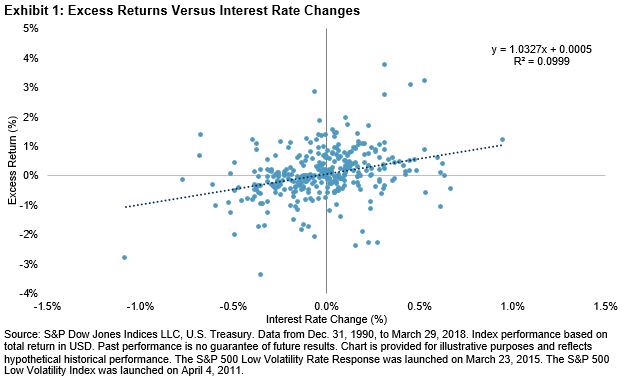
In the second blog of this series, we saw that the S&P 500® Low Volatility Rate Response generally achieved similar levels of volatility reduction as the S&P 500 Low Volatility Index. In our paper Inside Low Volatility Indices (published in 2016), the low volatility index historically outperformed the S&P 500 during severe market downturns (Exhibit 5 in the paper) due to lower beta to market and lower realized portfolio volatility. In this final blog, we examine if the rate response strategy achieves a similar level of volatility reduction as the low volatility strategy in those down-market periods.

We first looked at monthly up-market and down-market hit rates, along with the average excess monthly returns (see Exhibit 1).

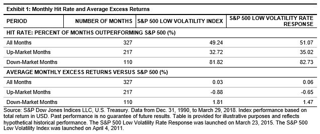
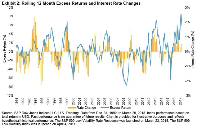
For all periods, the two strategies had similar hit rates of about 50%, with the rate response index having a slightly higher hit rate (51% to 49%). While these two indices underperformed the S&P 500 half of the time, the returns seen in the first blog show that the rate response and low volatility indices outperformed the S&P 500 on a cumulative basis over the long-term investment horizon. What could be the cause of this? We investigated by looking at the monthly returns broken down between up markets and down markets.

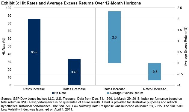
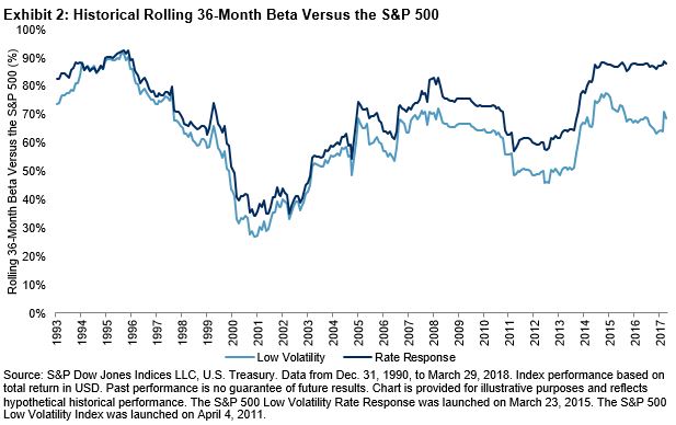
In up markets, the low volatility and rate response indices underperformed the S&P 500 the majority of the time. This is not surprising, given their beta to market—Exhibit 2 shows the historical rolling 36-month betas of the two low volatility strategies compared with the S&P 500. The average 36-month beta for the rate response index was 69.9%, compared with 62.2% for the low volatility index. Nevertheless, the higher beta exhibited by the rate response index means upside participation of the strategy could be higher than that of the low volatility index. In fact, the average monthly underperformance for the low volatility index was 0.88% and 0.65% for the rate response index.

In down markets however, both indices outperformed the S&P 500 more than 80% of the time. The average excess return in down markets for the rate response index was 1.47%, slightly lower than the low volatility index (1.81%). Therefore, the relative outperformance of both indices versus the S&P 500 in down-market periods was markedly higher than the underperformance in up markets.

In addition, a simple compounding mathematical rule requires that for a given percentage portfolio decline, a higher percentage gain is required to get back to even. This compounding effect also helps explain the cumulative positive excess returns. Next, to study extreme bear markets, we looked at the three largest drawdown periods for the S&P 500 since 1991.

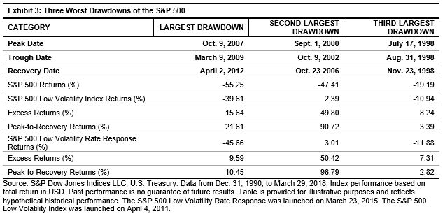
The rate response strategy performed similarly to the low volatility index—outperforming the S&P 500 in all three periods. The largest performance difference came during the tech bust in the early 2000s. While the S&P 500 dropped by over 47%, the rate response and low volatility indices had positive absolute returns. The cumulative outperformance impact relative to the S&P 500 can been understood by calculating the peak-to-recovery period return. For this date range, the low volatility index outperformed the S&P 500 by 91%, while the rate response index outperformed by 97%.

The analysis in this post shows that the rate response index was able to deliver similar historical performance as the low volatility index—more importantly, their down-market returns were similar. Along with the analysis shown in prior posts in this series, the S&P 500 Low Volatility Rate Response is a variation of the S&P 500 Low Volatility Index, designed for rising interest rate environments. The index reduces rising interest rate risk, while still delivering lower realized portfolio volatility—a salient characteristic of low volatility investing.

The posts on this blog are opinions, not advice. Please read our Disclaimers.

A Smarter Way to Rebalance with the BuyWrite Index (BXM)

Contributor Image
Dave Donnelly

Managing Director

SpiderRock Advisors

As advisors begin mid-year rebalancing of client portfolios, they face a dilemma.

While investors have enjoyed a 9-year Bull Market—including a 21.14% total return by the S&P 500 in 2017—their investment portfolios have built up more equity risk. Absent rebalancing, a standard 60/40 equity/bond portfolio might now resemble a riskier 75/25 allocation.

Given these sizable gains, many clients are reluctant to rebalance portfolios for fear of paying a big tax bill.

So how can advisors and their clients rebalance portfolios without incurring capital gains? Some are turning to a Buy-Write options strategy. The “Buy” part of the phrase includes stocks that an investor already owns, while “Write” refers to using options to rebalance the risk of client portfolios in a more tax-efficient manner.

Buy-Write in Four Steps

According to the CBOE, a Buy-Write strategy is “an investment strategy in which an investor buys a stock or a basket of stocks, and also writes covered call options that correspond to the stock or basket of stocks. Buy-Write strategies have an added attraction to some investors in that Buy-Writes can help lessen the overall volatility in many portfolios.”

Many investors execute this strategy around the CBOE S&P 500 Buy-Write Index (BXM), a benchmark index designed to track the performance of a hypothetical  Buy-Write strategy on the S&P 500 Index (SPX).

Here are some steps advisors consider when setting up a Buy-Write strategy for a client:

  1. Determine equity beta for all holdings in a portfolio: This includes calculating the amount of equity market exposure inherent in their client’s underlying portfolio.
  2. Calculate the difference between current and target exposure: This number will determine the magnitude of the overlay strategy that will run in tandem with the client’s portfolio.
  3. Implement option overlay: Sell call options on the S&P 500 in the appropriate amount to bring current exposures in line with a client’s risk tolerance.
  4. Monitor: Manage the option component in the existing account and make adjustments as markets move.

An illustrative example

The following scenario is familiar to many advisors: a client who just a few years ago had a $700,000 taxable account with a 60/40 equity/bond allocation now has a $1,000,000 nest egg. But outsized gains in the S&P 500 and other stock indices have pushed the portfolio to 75 percent equities and 25 percent bonds.

To rebalance back to 60/40, an advisor would need to reduce the portfolio’s equity exposure by $150,000, or 15 percent of the total portfolio value. Selling could mean a big tax hit and clients are often wired to avoid such actions.

Assuming the equity portion of the sample portfolio above is similar to the S&P 500, executing the buy-write strategy with S&P 500 call options can be a relatively simple and tax-efficient way to bring a portfolio back in line with client objectives.

To do so, an advisor could write, or sell, a call option on the S&P 500 Index (SPX) in relation to the client’s equity allocation that is overweight. In this case, implementing a 30 percent overlay of at-the-money calls would bring the portfolio’s risk profile back to its original 60/40 mandate.

The posts on this blog are opinions, not advice. Please read our Disclaimers.

Monitoring Progress Toward an Income Goal

Contributor Image
Philip Murphy

Former Managing Director, Global Head of Index Governance

S&P Dow Jones Indices

In a previous blog post, I described some benefits of having an income goal and a method of estimating one’s retirement income liability. I reviewed a hypothetical example to illustrate steps 1-2 from the list of benefits below, and I calculated a net estimated retirement liability (the portion of retirement income one must fund with personal savings). This post will focus on the remaining steps, 3-5.

  1. Income levels are intuitive because they provide built-in budgeting guidelines.
  2. Estimating required future income can be tailored to individual circumstances and does not require specialized financial knowledge.
  3. Estimating a future income level (that would be attained upon conversion of one’s savings into income risk hedging assets) does not require guesstimating future market returns the way that estimating one’s future wealth level would.
  4. As a result of step 3, there can be more certainty about one’s future income than about one’s future wealth as long as some of one’s assets are managed to hedge income risk and more savings are devoted to those assets over time.
  5. Once a desired future income level has been attained through the allocation to income risk hedging assets (essentially locking in future income), if other capital is available it can remain invested for long-term growth without great risk of income impairment during market downturns.

The reason step 3 is true is that a future income level is a future stream of cash flows, and we can find the present value of future cash flows with certainty by using the current, observable yield curve. Related to its S&P STRIDE Indices, each month, S&P DJI publishes the present value of specific inflation-adjusted cash flows (called “Income Cost”), commencing at particular points in the future. The cash flows begin at target years spaced over five-year increments from 2005 to 2060, and each one lasts 25 years from its respective target year. For example, the 2035 cash flow starts in January 2035 and continues until 2060. These hypothetical cash flow streams are designed to represent inflation-adjusted retirement income.

Using the Income Cost for 2035 (assuming that is when I want to retire), and continuing the example from my last post, if I have to fund $58,000 in annual spending, then I can measure the current value of income-hedging assets that would be required to lock in that cash flow in real terms, beginning in January 2035:

$58,000 X $19.29 (cost of 2035 income as of April 2018) = $1,118,670

If I invested $1.12 million in a portfolio of income-hedging assets, I would essentially lock in my inflation-adjusted retirement cash flow over a period of 25 years – which is the reason step 4 is true. The more of my assets that I dedicate to income-hedging assets, the more certain I can be of my future cash flows. The opportunity cost of doing so is that those assets cannot be invested for growth. However, the benefit is lowering risk to future income.

Finally, step 5 flows from step 4. Once I have an amount invested in income-hedging assets that, given the current income cost, secures future cash flows sufficient to meet my net estimated retirement liability, then any remaining assets can be invested for growth without risk to income. In other words, I can sleep soundly without worrying about market risk. Where does one find income-hedging assets? S&P STRIDE Indices incorporate income-hedging into their framework by allocating index weight to S&P U.S. TIPS sub-indices designed to hedge income risk.

Putting steps 1-5 into practice allows one to periodically check progress toward an income goal. In other words, you can measure your funded status, the currently funded portion of your net estimated retirement liability. A funded ratio, expressed as a percentage, assuming you have $500,000 of income-hedging assets, would be calculated as:

$500,000 ÷ $1,118,670 = 44.7%

Now that you can measure your funded status, it can be utilized to adjust current spending, saving, and portfolio allocations in order to manage future income risk. If you periodically add income-hedging assets, your funded ratio will grow over time. When it gets close to 100%, you have effectively hedged income risk over a period of 25 years, commencing at retirement.

The posts on this blog are opinions, not advice. Please read our Disclaimers.

Low Volatility Rate Response – Interest Rate Changes and Relative Performance

Contributor Image
Phillip Brzenk

Managing Director, Global Head of Multi-Asset Indices

S&P Dow Jones Indices

In a prior post, we saw that during sharp rising interest rate periods, the S&P 500® Low Volatility Rate Response fared better than the S&P 500 Low Volatility Index, even though both indices generally underperformed the S&P 500. In this post, we examine if there is a relationship between the magnitude of interest rate changes (positive and negative) and the relative performance between the two indices. We first plot the historical monthly excess returns of the rate response index over the low volatility index against monthly changes in interest rates (see Exhibit 1).

Exhibit 1 shows a clear trend in performance differential for 1) the direction and 2) the magnitude of interest rate changes. The linear regression trend line (the dotted line going across the chart) has a coefficient of 1.03 to interest rate changes. With a coefficient t-stat of 6.01, the results are statistically significant at the 99% confidence interval.

The coefficient approximates that for every 1% change in interest rates, the excess returns over the low volatility index is to change by roughly 1.03%. Given the positive slope coefficient, the rate response index generally outperformed the low volatility index when interest rates rose and underperformed when rates declined. Moreover, as shown by the upward-sloping regression line, the larger the increase in interest rates, the higher the excess return for the rate response index was compared with the low volatility index.

We also checked to see if the results held true for interest rate changes that were longer than one month. Exhibit 2 charts the rolling 12-month excess returns of the rate response index versus the low volatility index on the primary axis and the 12-month change in interest rates on the secondary axis.

Exhibit 2 shows that the relationship between relative excess returns and changes in interest rates persisted for longer time horizons. As interest rates increased, the rate response index outperformed, and when rates declined, the low volatility index outperformed. Since the comparison goes back to 1991, the relationship can be observed throughout multiple market cycles. Exhibit 3 shows the hit rate and average excess returns for the rolling 12-month periods.

For the 12-month time horizons, when rates increased, the rate response index outperformed the low volatility index during nearly 86% of the periods, with an average outperformance of about 2.3%. When rates decreased, the low volatility index outperformed the majority of the time, with an average outperformance of 0.8%.

While the rate response index generally underperformed the S&P 500 in rising interest rate periods, it fared better than the low volatility index in the short-term (one month) and long-term (12 months). The results in this blog further confirm initial findings from the first blog that the rate response strategy reduces interest rate risk of a low volatility portfolio. In the final post of this series, we will investigate the performance of the two indices in down markets.

The posts on this blog are opinions, not advice. Please read our Disclaimers.

Women May Nurse This Old Stock Market Bull

Contributor Image
Jodie Gunzberg

Former Managing Director, Head of U.S. Equities

S&P Dow Jones Indices

“Not enough progress has been made in closing the gender gap, and in fact, in some countries, you have seen gender inequality increasing…” – Ángel Gurría, secretary-general of the Organization for Economic Cooperation and Development (OECD).

This was the opening of a recent speech at #WomenRule by Politico on a paper newly published by S&P Global.  Unfortunately, one of those countries is the United States as evidenced by  the decline of women’s participation to just 57%, from roughly 60% in 2000, according to the Bureau of Labor Statistics.  Also, as stated by the OECD, as recently as 1990, labor force participation rate (LFPR) among prime-age American women was near the top of advanced economies in the OECD. In 1990, LFPR for women of prime working age in the U.S. reached 74%. Since then, that rate has stayed roughly stable while increasing steadily elsewhere, pushing the U.S. down to 20th place among 22 advanced OECD economies by 2016.

In a prior paper by S&P Global, there was an economic scenario that showed the potential to add 5%-10% to nominal GDP.  If women entered, and stayed, in the workforce at a pace in line with, say, Norway, the U.S. economy would be $1.6 trillion larger than it is today.  However, the U.S. women’s LFPR has fallen from a key reason that the U.S. is the only country in the OECD that doesn’t provide income support during maternity or parental leave by law.  As one possible solution, S&P Global suggests a Congressional Budget Office (CBO)-like “score” could assess the impact legislation would have on the economic feasibility and accessibility to the workforce for women.

If the U.S. were to increase women’s LFPR to that of other advanced countries, S&P Global Ratings estimates an addition $455 billion output could be added to its baseline forecast for growth, or alternatively could add 0.2 percentage point per year on average for the next ten years.  That additional U.S. GDP growth could propel not just the U.S. stock market but the global markets as well, potentially adding an extra $2.87 trillion to the S&P 500 market value and $5.87 trillion to the S&P Global Broad Market Index over the next decade.

For every 1% of GDP growth, historically the S&P 500 has gained 3.4% on average, so based on that sensitivity, all else equal, the extra 0.2 percentage point may add another 0.7% of total return on average annually.  The information technology sector is the most sensitive with an average total return of 5.6% for every 1% of GDP growth historically.  If there were a higher female labor force participation rate, there could be an extra 1.1% total return annualized on average based on the historical sensitivity. 

U.S. GDP growth impacts not just the U.S. stock market, but markets globally since the U.S. economy is largely driven by consumer spending.  Generally, the more a country exports as a percentage of its output to the U.S., the greater the stock market sensitivity is to the U.S. growth. The mechanism for this is fairly simple: Because the U.S.’s “trade elasticity” is such that the country’s imports tend to increase at a faster pace than GDP growth during expansionary periods (while shrinking at closer to a 1-to-1 rate during times of economic contraction), manufacturers and other exporters to the U.S. enjoy outsized benefits when the American economy expands.

Since China exports almost four times as much to the U.S. as it imports in American goods and services in dollar terms, with exports to the U.S. accounting for 4.2% of the Chinese economy, its sensitivity to 1% of U.S. growth is 6.2% historically. For Japan, exports to the U.S. are roughly only twice its American imports, and exports to the U.S. account for just 2.8% of Japanese economic output, lowering its sensitivity to 1% of U.S. growth to just 2% total return on average.

Further evidence that this dynamic is at least partly responsible for the disparity includes the fact that South Korea—the U.S.’s sixth-biggest trade partner and No. 11 on the list of national economies—sends just about a third more to the U.S. than it receives, but those goods and services make up a substantial 4.6% of Korea’s GDP.  This has driven its stock market total return up 9.3% on average per 1% of U.S. GDP growth historically.

Most notably from its sensitivity to U.S. growth, Korea, which currently has the smallest market value of the major countries in the S&P Global Broad Market Index, could benefit so extraordinarily from U.S. GDP enhanced by increased female LFPR that it would jump to No. 3, just behind Japan and the U.S. in the 10 years examined, surpassing China.  

As this bull market, the second oldest one on record, continues to age, perhaps women are the key to unlocking the growth to give it a longer life.

The posts on this blog are opinions, not advice. Please read our Disclaimers.