Get Indexology® Blog updates via email.

In This List

Asian Fixed Income: Indonesian Sovereign Bonds Were the Big Winners in 2017

A Quick Look at Chilean Sovereign Bonds and Indices

Vanishing Stocks

What is VIX Predicting about Future Volatility?

Considering Factor Rotation Within the S&P 500 Universe

Asian Fixed Income: Indonesian Sovereign Bonds Were the Big Winners in 2017

Contributor Image
Michele Leung

Former Director, Fixed Income Indices

S&P Dow Jones Indices

With the growing appetite for emerging market debt and in the hunt for better yields, Indonesian sovereign bonds have been popular this year. The strong rally has continued since the first quarter (see a previous piece here). The S&P Indonesia Sovereign Bond Index, which seeks to track the local currency denominated sovereign bonds, jumped 15.24% YTD as of Dec. 7, 2017.

There were three new issuances added to the S&P Indonesia Sovereign Bond Index this year, with a total of INR 39 trillion. The total local currency new issuances in the index was only around one-third of last year’s rate, as Indonesian sovereigns continued to tap into different foreign currency markets; for example, they raised USD 4 billion from its global bond issuance in the first week of December. Meanwhile, the new issuances also extended Indonesia’s yield curve to 30 years.

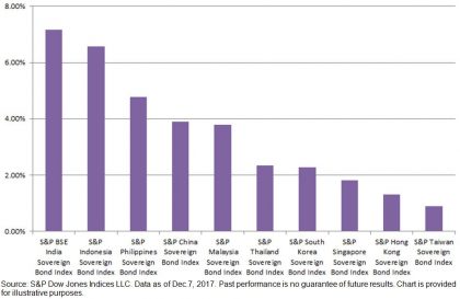
The yield-to-maturity of Indonesian sovereign bonds continued to trend lower. Throughout the year, it has tightened 131 bps to 6.57% (see Exhibit 1). It also represented a 312 bps plunge from the recent high, which was 9.69% on Sept. 30, 2015. Nevertheless, the yield is still competitive with its investment-grade rating of ‘BBB-’/‘Baa3’ and particularly compared to other Asian countries like India (at 7.17%, as represented by the S&P BSE India Bond Index with a rating of ‘BBB-’/‘Baa2’; see Exhibit 2).

The overall local currency bond market in Indonesia, as represented by the S&P Indonesia Bond Index, rose 14.05% YTD, and it was the best-performing country within Pan Asian bond universe.

Exhibit 1: Yield-to-Maturity of the S&P Indonesia Sovereign Bond Index

Exhibit 2: Yield-to-Maturity Comparison of the S&P Pan Asia Sovereign Bond Subindices

The posts on this blog are opinions, not advice. Please read our Disclaimers.

A Quick Look at Chilean Sovereign Bonds and Indices

Contributor Image
Jaime Merino

Former Director, Asset Owners Channel

S&P Dow Jones Indices

The Public Debt Office is the cornerstone of debt strategies for the Ministry of Finance in Chile. It supports liquidity and ensures stability in the local financial market through issuance and placement of treasury bonds. In this context, the Public Debt Office establishes referential interest rates in order to facilitate access to capital markets for Chilean businesses.

To accomplish its objective, the bureau, as part of the International Finance Unit, acts in coordination with the Treasury of the Republic, the Budget Office, and with the Central Bank in its role as fiscal agent in the placement and administration of bonds. It also monitors the investment of temporary surpluses resulting from the administration of the budget, and it proposes capital market reforms to promote the integration of domestic and international financial markets.

The Treasury issues in the local bond market in Chilean pesos and inflation-linked foment units (UF) contribute to the construction of the reference rate nominal and real curves. In 2008, the BTP-10 bonds were issued, which are the 10-year nominal bonds; for UF bonds, Chile issued the BTU-20 and BTU-30, which are 20- and 30-year bonds, respectively. During 2009, new bonds for the real curve were issued, BTU-5 and BTU-10, and for the nominal side, the BTP-5 was issued. As for the Central Bank, similar to the Treasury, they issue the BCP and BCU instruments, fixed-rate nominal bonds and inflation-linked foment unit bonds, respectively, with the objective of executing the monetary policy. Maturities for BCP bonds are 5 and 10 years (no issuance of 2-year reference after September 2012), while BCU have maturities of 5, 10, 20, and 30 years. The coupons of both are paid biannually.

In partnership with Bolsa de Comercio de Santiago (BCS, the local stock exchange), S&P Dow Jones Indices launched a series of sovereign bond indices and sovereign inflation-linked bond indices as a reference to the local market using the bonds described before. This series is categorized by maturity (see Exhibit 1).

As seen, buckets help asset managers benchmark their portfolios in case they need specific maturities. Also, the complete curve indices are calculated in USD for international investors. Exhibit 2 shows inflation, the reference rate from the Central Bank, and the local currency (Chilean peso) over the past 10 years—components that influence in the movements of the indices.

Finally, Exhibit 3 shows the annual returns of some these indices.[1]

[1]   For more information on these indices, see here:

http://spindices.com/indices/fixed-income/sp-clx-chile-sovereign-bond-index

http://spindices.com/indices/fixed-income/sp-clx-chile-sovereign-bond-1-5-year-index

http://spindices.com/indices/fixed-income/sp-clx-chile-sovereign-bond-5-10-year-index

http://spindices.com/indices/fixed-income/sp-clx-chile-sovereign-bond-10-year-index

http://spindices.com/indices/fixed-income/sp-clx-chile-sovereign-bond-index-usd

https://spindices.com/indices/fixed-income/sp-chile-sovereign-inflation-linked-bond-index

http://spindices.com/indices/fixed-income/sp-clx-chile-sovereign-inflation-linked-bond-1-5-year-index

http://spindices.com/indices/fixed-income/sp-clx-chile-sovereign-inflation-linked-bond-5-10-year-index

http://spindices.com/indices/fixed-income/sp-clx-chile-sovereign-inflation-linked-bond-10-year-index


The posts on this blog are opinions, not advice. Please read our Disclaimers.

Vanishing Stocks

Contributor Image
David Blitzer

Former Managing Director and Chairman of the Index Committee

S&P Dow Jones Indices

The number of stocks listed in the US is falling. Currently there are 3,758 listed stocks, ten years ago there were 4,500 and 20 years ago the number topped 7,400. The total value of the market, as measured by the total market capitalization of the S&P Total Market Index, continues to rise. As of yesterday it was $27.3 trillion, up 20% from a year earlier.  However, this gain was largely due to increasing stock prices, not to new capital coming into the market.  Not only are there fewer stocks today than earlier, but capital is flowing out of the market.  Two leading reasons for the declining number of stocks are fewer IPOs and more mergers. The explanation for the capital outflows are dividends and buybacks, plus acquisitions by foreign or private companies.

The annual pace of initial public offerings (IPOs) collapsed after the tech bust in 2000. In the 1990s, IPOs averaged 400 per year; dropped to about 150 in 2000-2006 and then to 100 per year in 2007-2016. In the last four years since the financial crisis the number showed little improvement, only reaching 140 per year. Analysts suggest various reasons for the drop: regulatory costs of being a public company, fear of activist investors and, most of all, the ease of raising capital in the private markets.

The stars in the private markets are the unicorns – private companies with valuations over a billion dollars.  Uber, worth about $60 billion is the most famous unicorn, but certainly not the only one. Other household names include AirBnb, Dropbox and WeWork. There are over 100 unicorns in the US and a roughly equal number outside the US. China is second in terms of both the number and the total value.  When a company can reach a valuation of a billion, or ten billion or possibly $60 billion in the private market, it is no surprise that IPOs are slowing down. While some private companies do eventually become public they are older and larger than they were in the 1990s, and may have a better chance of surviving. Moreover, not all the unicorns become IPOs and some that do vanish shortly thereafter. Since 2009, 110 companies left the unicorns list – 61 IPO-ed including Facebook, Tesla and Pandora but 49 were acquired including BATS, LinkedIn and Zappos. Some promising companies like WhatsApp are acquired before they have a chance to go public.

Mergers and acquisitions are another drain on the number of public companies. Bloomberg data shows an average of 7,700 transactions annually since 2005 totaling about $980 billion each year. Similar data from the Institute for Mergers, Acquisitions and Alliances (IMAA) shows that mergers climbed steadily from 1985 to the mid-1990s when the number of listed stocks peaked. Since there the pace has varied somewhat, but the annual number of mergers never dropped below what was seen in 1995.  Anti-trust efforts faded as mergers rose.

While the number of companies was dropping, capital was also leaving the markets. The drain was not due to mergers which only drain capital when the acquirer is a foreign company or private equity. Rather, stock buybacks and dividends together drain about 5% a year out of the US markets. The Federal Reserve’s Flow of Funds data show that from 2012 to 2016, there was negative net issuance of corporate equity of $2.2 trillion. If one examines the S&P Total Market Index divisor it fell 12% from 2005 to 2016 indicating that capital flowed out of the index and the market over that time period.

The posts on this blog are opinions, not advice. Please read our Disclaimers.

What is VIX Predicting about Future Volatility?

Contributor Image
Hamish Preston

Head of U.S. Equities

S&P Dow Jones Indices

VIX® closed last night at 11.33.  What, if anything, does that mean?

We recently published a research paper, together with a more digestible practitioner’s guide, that provides a method for converting a given VIX level into an expectation for S&P 500® volatility over the next 30 days.  Exhibit 1 shows that these estimates have provided a reasonable, but imperfect, guide for what was observed.

Exhibit 1: VIX-based Prediction Versus Actual Change in S&P 500 Volatility

Source: “A Practitioner’s Guide to Reading VIX”. Past performance is no guarantee of future results.  Chart is provided for illustrative purposes.

The first ingredient in the expected VIX is the present (or recent) volatility environment; expectations for the future are necessarily grounded in the recent past.  Over the past month, S&P 500 volatility ran at an annualized 6.58%.  The next key step is to account for the fact that we expect volatility to mean revert.  The long-term average volatility for the S&P 500 is around 15%, and history shows that in a given month volatility tends to move about 30% of the distance between its current level and that long-term average.  All else equal, this would lead to a realized volatility on January 4, 2018 of 9.10%.  This mean-reverted level is called “MR volatility” in our paper.

The second ingredient is a relationship between MR volatility and the expected VIX; this essentially accounts for the fact that VIX typically reflects a premium that purchasers of options pay for their insurance-like characteristics.  This relationship, for the S&P 500, looks like:

Substituting MR volatility = 9.10 gives expected VIX = 12.56. Last night’s closing VIX level of 11.33 is 1.23 percentage points lower than the expected VIX. But what does this mean?  One explanation is that when VIX is less than expected VIX, market participants are more relaxed than usual about the anticipated impact of upcoming news flow on the S&P 500.  However, a slight subtlety is required before we can say that the market is predicting a decline in realized volatility.

When VIX is different from expected, this indicates an anticipated change in realized volatility that is different from usual.  But mean reversion in realized volatility is usual.   (In the current example, mean reversion is expected to cause a rise in realized volatility from 6.58% to 9.10 %).  Adding the difference between VIX and expected VIX to the MR volatility level gives the resulting “prediction”; realized volatility is expected to rise from 6.58% to 7.87% over the next 30 days (9.10% MR volatility minus 1.23%) – a gain that is less than would be anticipated under mean reversion alone.

Of course, the observed change in realized volatility is extremely unlikely to be exactly 1.29%; Exhibit 1 demonstrates that it might be lower, and it could be much higher.  Nevertheless, and although it is imperfect, our approach allows for a “reading” of VIX that accounts for its major relationships, and offers a practical interpretation of what VIX is telling us. 

The posts on this blog are opinions, not advice. Please read our Disclaimers.

Considering Factor Rotation Within the S&P 500 Universe

Contributor Image
Derek Babb

Senior Portfolio Manager

Elkhorn Capital Group, LLC

While 2017 is winding down with volatility levels at historical lows, a calmness has remained in the market for quite some time. According to Fei Mei Chan, Director of Index Investment Strategy at S&P Dow Jones Indices, the S&P 500 is on track for its least volatile year in 22 years.

With volatility (or lack thereof) being a favorite discussion topic of market participants, now is a good time to brush up on S&P 500 based factor indices which provide pure exposure to opposing sides of the volatility trade: the S&P 500 Low Volatility Index and the S&P 500 High Beta Index.

Methodology Overview

According to S&P, the S&P 500 Low Volatility Index measures performance of the 100 least volatile stocks in the S&P 500. The index benchmarks low volatility or low variance strategies for the U.S. stock market. Constituents are weighted relative to the inverse of their corresponding volatility, with the least volatile stocks receiving the highest weights.

Its counterpart, the S&P 500 High Beta Index, measures the performance of 100 constituents in the S&P 500 that are most sensitive to changes in market returns. The index is designed for investors initiating a bullish strategy or making a directional bet on current markets.

Bull and Bear Markets

Since the methodologies behind both the S&P 500 Low Volatility Index and the S&P 500 High Beta Index do not have any sector restraints or requirements, sectors weightings may shift over time. This can be positive or negative, as the Low Volatility Index may avoid high beta sectors during bear markets, yet may under-allocate to those same sectors during bull markets.

The opposite may be true of the S&P 500 High Beta Index. The High Beta Index may play the risk-on trade more effectively, perhaps posting higher than market returns during bull markets. Yet, during bear markets, this index may find itself more concentrated in highly sensitive sectors, which may amplify the pain an investor may experience in a bear market.

Considering a Factor Rotation Strategy

Over the last decade, more and more single factor, multi-factor, and factor blending strategies have come to the marketplace. While certain factors, such as low volatility, have consistently exhibited outperformance over long time frames, there are certainly seasons where a given factor will underperform its benchmark. The S&P 500 Low Volatility Index and the S&P 500 High Beta Index are two opposing factors which exhibit periods of high dispersion with one another. While the low volatility factor has proven to generate market-beating returns across multiple business cycles, investors may want to consider a factor rotation strategy between the S&P 500 High Beta Index and the S&P 500 Low Volatility Index to capitalize on the relatively large performance disparity that exists between the two factors during certain periods.

The posts on this blog are opinions, not advice. Please read our Disclaimers.