Get Indexology® Blog updates via email.

In This List

How Low Can Volatility Go?

Performance of Capital Markets in India Since Demonetization

Asian Fixed Income: China Was the Worst-Performing Country in the Pan Asian Bond Market

Carbon Footprint Reporting in Mexico

The Trump Rally – A Macroeconomic Perspective

How Low Can Volatility Go?

Contributor Image
Fei Mei Chan

Former Director, Core Product Management

S&P Dow Jones Indices

There’s still some time remaining in 2017, but if it goes the way the year has thus far, this will be the least volatile year for the S&P 500 in 22 years. Given this context, selection to the S&P 500® Low Volatility Index (an index of the 100 least volatile stocks in the S&P 500) recently has mostly been about which stocks have declined in volatility the most. In each of the last four rebalances, average realized volatility for the stocks in Low Vol has declined compared to the previous rebalance.

In the latest rebalance, Utilities regained its usual prominence, adding 5%; at 22% of Low Vol, it is currently the biggest sector in the index. This came mostly at the expense of Consumer Staples, whose weight declined to 9% from 13%. Real Estate’s weight doubled to 6%.  Curiously, although underweighted compared to the S&P 500, Technology maintains a significant weight in Low Vol (the sector’s standing ballooned in the rebalance in May 2017.)


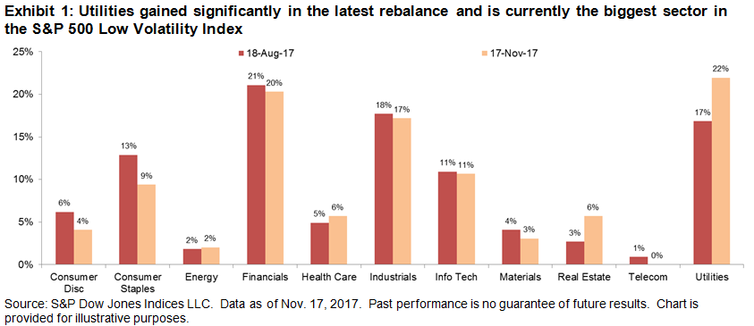
As a rule of thumb, sector level volatility usually provides good insight into the S&P 500 Low Volatility Index, even though the index’s methodology is entirely focused at the stock level. For the latest rebalance, however, sectoral volatility was only part of the picture. For the year ended October 31, 2017, all sectors declined in volatility with the exception of Technology and Telecom. Unsurprisingly, Telecom has left Low Vol altogether.

Volatility at the sector level declined the most for Energy, but there was little change in Energy’s weight in Low Vol from the previous rebalance. Meanwhile, volatility at the sector level rose for Technology, yet there was also little change in its weight in Low Vol. This would suggest that there was a wide range of volatility within both sectors, and that stock selection was more meaningful than the sectoral effect.

The posts on this blog are opinions, not advice. Please read our Disclaimers.

Performance of Capital Markets in India Since Demonetization

Contributor Image
Ved Malla

Associate Director, Client Coverage

S&P Dow Jones Indices

On Nov. 8, 2016, Mr. Narendra Modi came on national television and announced that at the stroke of midnight, 500 and 1,000 rupee notes would no longer be legal tender.  These notes constituted 86% of the total currency in circulation.  This announcement was by far one of the boldest economic decisions taken in recent years.  The rationale for this unexpected decision was to remove counterfeit currency notes from the system, end the parallel black market economy, and digitize the Indian economy.

One year later, the topic of demonetization is still being discussed and debated across the length and breadth of India.  While many support this bold move, there are others who criticize it.  Wherever this debate goes, it’s easy to see that capital markets in India have been on a roll over the past year and have given exponential returns across size, segments, and sectors.

In this blog, we will analyze how capital markets in India have performed since the demonetization announcement was made in November 2016.

Exhibit 1 and Exhibit 2 showcase the one–year, post-demonetization returns for the four leading size indices in India.

Exhibit 1: One-Year Absolute Returns of Size Indices
INDEX INDEX VALUE ON NOV. 08, 2016 INDEX VALUE ON NOV. 08, 2017 ONE-YEAR ABSOLUTE RETURN (%)
S&P BSE SENSEX 38829 47355 21.96
S&P BSE Large Cap 3875 4773 23.19
S&P BSE Mid Cap 15010 19239 28.17
S&P BSE Small Cap 15093 20384 35.05

Source: S&P Dow Jones Indices LLC.  Data from Nov. 8, 2016, to Nov. 8, 2017.  Past performance is no guarantee of future results.  Table is provided for illustrative purposes.

Exhibit 2: Index Total Returns

Source: S&P Dow Jones Indices LLC.  Data from Nov. 8, 2016, to Nov. 8, 2017.  Index performance based on total return in INR.  Past performance is no guarantee of future results.  Chart is provided for illustrative purposes.

From Exhibits 1 and 2, we can see that all four indices have given high returns.  Returns have been promising for large-, mid-, and small-cap segments.  The returns of the small- and mid-cap segments have been better than the large-cap segment.  The S&P BSE SmallCap and S&P BSE MidCap gave one-year absolute returns of 35.05% and 28.17%, respectively, while the S&P BSE LargeCap and S&P BSE SENSEX gave returns of 23.19% and 21.96%, respectively.

Exhibits 3 and 4 showcase the one-year, post-demonetization returns for the 11 leading sector indices in India.

Exhibit 3: One-Year Absolute Returns in Sector Indices
INDEX INDEX VALUE ON NOV. 08, 2016 INDEX VALUE ON NOV. 08, 2017 ONE- YEAR ABSOLUTE RETURN (%)
S&P BSE Realty 1,585.00 2,489.31 57.05
S&P BSE Energy 3,566.92 5,208.17 46.01
S&P BSE Telecom 1,204.51 1,721.65 42.93
S&P BSE Basic Materials 2,983.78 4,118.34 38.02
S&P BSE Finance 5,213.94 6,828.34 30.96
S&P BSE Utilities 2,070.98 2,653.96 28.15
S&P BSE Consumer Discretionary 3,624.96 4,605.44 27.05
S&P BSE Industrials 3,423.10 4,187.83 22.34
S&P BSE Fast Moving Consumer Goods 10,524.51 12,784.46 21.47
S&P BSE Information Technology 11,837.65 13,186.50 11.39
S&P BSE Healthcare 16,696.51 15,454.32 -7.44

Source: S&P Dow Jones Indices LLC.  Data from Nov. 8, 2016, to Nov. 8, 2017.  Past performance is no guarantee of future results.  Table is provided for illustrative purposes.

Exhibit 4: Index Total Returns

Source: S&P Dow Jones Indices LLC.  Data from Nov. 8, 2016, to Nov. 8, 2017.  Index performance based on total return in INR.  Past performance is no guarantee of future results.  Chart is provided for illustrative purposes.

From Exhibits 3 and 4, we can see that barring one index, all sector indices have given positive returns. The S&P BSE Realty gave the best one-year absolute return of 57.05%, followed by the S&P BSE Energy and S&P BSE Telecom, which had one-year absolute returns of 46.01% and 42.93%, respectively.  The S&P BSE Healthcare was the worst-performing index, with a return of -7.44%.

To summarize, we can say that the bulls have had their way during the 12-year period since the announcement of demonetization was made, and indices across various size segments and sectors have given exponential returns.

The posts on this blog are opinions, not advice. Please read our Disclaimers.

Asian Fixed Income: China Was the Worst-Performing Country in the Pan Asian Bond Market

Contributor Image
Michele Leung

Former Director, Fixed Income Indices

S&P Dow Jones Indices

China’s lackluster performance has made it the worst-performing country in the Pan Asian bond market this year.  While China has been among the top three outperforming regions in the past few years, it has significantly lagged its peers in 2017.  Indonesia, as represented by the S&P Indonesia Bond Index, rose 12.6% YTD as of Nov. 10, 2017, while India (represented by the S&P BSE India Bond Index) gained 4.8% in the same period (see Exhibit 1).

The widening access that Bond Connect announced in July brought positive momentum to the market and helped recover the losses from May.  However, onshore bonds are still in the negative territory compared with this time in 2016.

In fact, sell-offs in China onshore bonds continued to make to the headlines as the deleveraging campaign and liquidity concern lingered.  As represented by the S&P China Bond Index, the one-year total return was down 1.75% (see Exhibit 2).

The S&P China Government Bond Index dropped 2.35% during the same period, underperforming the S&P China Corporate Bond Index.  According to the S&P China Bond Index, government bonds represented 68% of the overall market.  There are reports that market participants are switching to short-term bank debts, as they tend to offer better yields and liquidity.

Despite its performance, China bond yield is attractive, considering its relatively short duration.  As of Nov. 10, 2017, the yield-to-worst of the S&P China Bond Index was 4.5%, which widened 150 bps over the 12-month period, with a modified duration of 3.86.

Exhibit 1: Total Return of the S&P Pan Asia Bond Indices in 2017

Exhibit 2: Total Return of the S&P China Bond Index

Exhibit 3: Yield-to-Worst of the S&P China Bond Index

The posts on this blog are opinions, not advice. Please read our Disclaimers.

Carbon Footprint Reporting in Mexico

Contributor Image
Maria Sanchez

Director, Sustainability Index Product Management, U.S. Equity Indices

S&P Dow Jones Indices

At the most recent National AFORES convention, held jointly with FIAP International in Mexico City at the end of October 2017, Latin American institutional investors continued to show increasing interest in ESG-related topics and this was evident in the conference agenda.  In particular, the participants spoke about the following topics.

  • Impact reporting: The ability to measure and quantify the sustainability of their current investment portfolios.
  • Relevant benchmarking: Incorporating relevant benchmark indices for comparison.
  • ESG implementation: Ensuring ESG implementation into the multi-step investment process and quantifying the benefits of doing so.

As highlighted in a recent research paper, Stepping Up to Carbon Transparency, S&P Dow Jones Indices has been at the forefront of sustainability-related educational efforts.  We have recently started to report sustainability metrics as part of an index’s characteristics to support and promote ESG transparency.

In this blog, we use the “carbon footprint”[1] measurement provided by Trucost to understand how much carbon reporting has evolved in Mexico, using the country’s headline equity index, the S&P/BMV IPC, as an example.  Trucost measures the carbon footprint as the aggregation of operational and first-tier supply chain carbon footprints of index constituents per USD 1 million invested.

In 2007, there were only six IPC companies with information on their carbon footprint, of which 100% was estimated by Trucost using sector-related information.  Reflecting the growing market’s needs and interest, the carbon footprint reporting of this local index has increased from 17% in 2007 to nearly 100% in September 2017.  It is important to note that the coverage has not only increased, but the method of obtaining the carbon data has also evolved (see Exhibit 1).

At the start of 2007, 100% of the carbon data was estimated, whereas after 10 years, by September 2017, 14.7% of the companies were fully disclosing their carbon information.  More specifically, 38.24% was estimated from companies’ partial environmental and financial disclosures, 8.82% of the companies in the index were estimated using previous disclosures, and 38.24% was estimated using the sector breakdown.  This is a clear indication that Mexican companies are recognizing the importance of environmental data disclosure in financial reporting.

Currently, carbon data is available for 34 of the 35 companies in the S&P/BMV IPC.  When the data is broken down by sectors, we can see that some sectors, due to the nature of their businesses, have substantial carbon footprints compared to others.  As a comparison, we stack up the relative carbon intensity of the sectors in Mexico to those of the U.S., as measured by the S&P 500® (see Exhibit 2).

The top three carbon-intensive sectors in Mexico, on average, are utilities, materials, and industrials.  Utilities comes in first place with 2,394 tons of CO2e emissions per USD 1million invested, even though the sector only represents less than 2% of the S&P/BMV IPC.  Materials comes in second, with roughly 1,329 of CO2 emissions per USD 1 million invested on average, while accounting for roughly 17.52% of its benchmark as of Sept. 29, 2017.  Industrials has about 613 tons of CO2 emissions per USD 1 million invested, on average, with the sector representing about 11.359% of its benchmark.

In a follow-up blog, we will provide a time-series analysis of the carbon footprint of companies that are part of the S&P/BMV IPC to highlight how the Mexican market has evolved.

[1]   Operational and first-tier supply chain greenhouse gas emissions.  For more information, please visit: www.spdji.com/esg-metrics.

The posts on this blog are opinions, not advice. Please read our Disclaimers.

The Trump Rally – A Macroeconomic Perspective

Contributor Image
Phillip Brzenk

Managing Director, Global Head of Multi-Asset Indices

S&P Dow Jones Indices

As noted in a previous blog, The Trump Rally – One Year Later, the Domestic Revenue Portfolio underperformed the foreign revenue portfolio during the one-year period since the 2016 U.S election.  We showed that currency movements may have negatively impacted the performance of the Domestic Revenue Portfolio.

To better understand the currency risk of the portfolios beyond tracking relative performance and currency movements, we use the Northfield U.S. Macroeconomic Equity Risk Model to breakdown total portfolio risk.  This model gives us the ability to understand the macroeconomic risk exposures, including changes in the value of the U.S. dollar, of a portfolio.  Exhibit 1 breaks down the total risk (in variance terms) of the two portfolios between stock specific risk and systematic/factor risk.

The Foreign Revenue Portfolio had significantly higher stock specific risk than the Domestic Revenue Portfolio, which means the percentage of total risk that can be explained by U.S. macroeconomic factors present in the model is lower.

The highlighted factor in Exhibit 1, Exchange Rate USD, indicates how much of the total risk is caused by changes in USD value relative to other major trade currencies.  We can see that the currency risk of the Foreign Revenue Portfolio (7.58%) was much higher than the Domestic Revenue Portfolio (1.26%), which indicates that changes in USD will have a higher impact on the foreign portfolio than the domestic portfolio.  In other words, the Foreign Revenue Portfolio is more sensitive to weakening and strengthening of the U.S. dollar than the Domestic Portfolio.

As such, we look at the factor exposures and how those exposures in turn have affected the portfolios.  These figures show how the individual factors have performed over the 12-month period, as well as if the active factor exposures of the portfolios have contributed positively, or negatively, to total return.

For the 12-month period, the average monthly return for the Exchange Rate USD factor was -0.44%, meaning that holding the U.S. dollar versus holding other major trade currencies would negatively contribute to total return.  Relative to the S&P 500, the Foreign Revenue Portfolio is observed to have negative active exposure to the currency factor, while the Domestic Portfolio has positive active exposure.  The active exposures of the portfolios show that relative to the S&P 500, 1) the foreign portfolio is negatively related to changes in the USD value, and 2) the domestic portfolio is positively related to the USD value.  These results confirm the potential relationship we saw in the previous blog post.  The compounded factor impact shows the result of the active portfolio exposures to total return.

In a forthcoming blog, we will look beyond macroeconomic risk to sector-level performance attribution analysis of the portfolios.


[1]   The model provides a monthly-based analysis; therefore the start date is Oct. 31, 2016, as opposed to Nov. 8, 2016.

[2]   The model provides a monthly-based analysis; therefore the start date is Oct. 31, 2016, as opposed to Nov. 8, 2016.

The posts on this blog are opinions, not advice. Please read our Disclaimers.