Get Indexology® Blog updates via email.

In This List

Understanding the Value Spectrum

How the Liquidity of S&P 500 Investment-Grade Bonds Compares Against Non-S&P 500 Bonds

When Market Timing Is Unusually Pointless

How to Address Retirement Income in Investment Policy Statements

VIX Hit Below 10 in Q2: What Do We Know From the Past?

Understanding the Value Spectrum

Contributor Image
Aye Soe

Former Managing Director, Global Head of Core and Multi-Asset Product Management

S&P Dow Jones Indices

Value investing, made famous by Benjamin Graham in his book Intelligent Investor nearly 70 years ago, is possibly the most well-known investment strategy.  Although the strategy may appear simple at first glance—buying securities with prices that are trading at discount multiples than their fundamental values—it can be tricky to implement.  For example, value can be captured via different metrics including, but not limited to, book-to-price ratio, earnings yield, dividend yield, and cash flow-to-price ratio.[1]  Market participants must decide which value metrics closely align with their investment view.  In addition, returns from value strategies can differ meaningfully, depending on the stock selection process and portfolio construction.

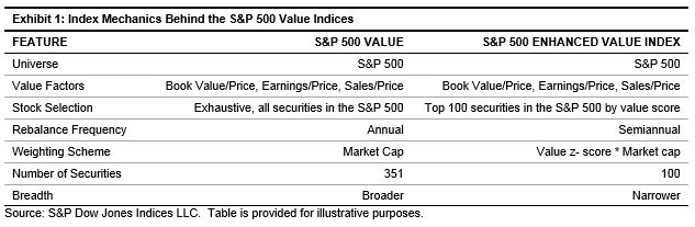
We can highlight the last point using two value indices formed from the same underlying domestic large-cap universe, the S&P 500 Value and S&P 500 Enhanced Value Index.  The index mechanics of both indices are outlined in Exhibit 1.  Also important to note is the weighting mechanism employed by the two indices.  The S&P 500 Value simply weights securities by market cap, whereas the selection process and the weighting scheme of the S&P 500 Enhanced Value Index assigns higher weights to those securities with bigger value attributes.

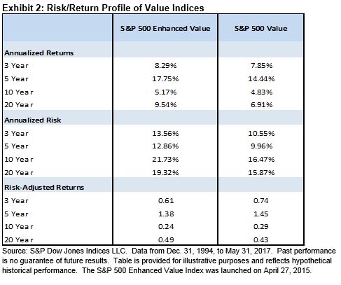
Since the metrics used to capture value premium are identical for both indices, our analysis evaluates the impact of security selection and weighting mechanism.  In Exhibit 2, we show the annualized risk/return profiles of the two value strategies since Dec. 31, 1994.  In this period, the S&P 500 Enhanced Value Index delivered higher returns but with higher volatility than its broader, market-cap-weighted counterpart.

Based on the index construction and the risk/return profiles, we can conclude that the two value indices serve different purposes for the investment community.  The S&P 500 Value can be viewed as a broad-based value benchmark, representing an entire opportunity set and returns of value style investing.  On the other hand, the S&P 500 Enhanced Value Index is more representative of a high conviction, more concentrated value strategy.  In that light, it is worthwhile to compare the returns of the value indices to those of actively managed large-cap value managers.  Exhibit 3 compares the returns of actively managed large-cap value mutual funds to the two value indices.[1]

Across all measurement horizons, more than half of the active large-cap value funds have trailed the two value indices.  It comes as no surprise that the percentage of active value funds underperforming the S&P 500 Enhanced Value Index tends to exceed those underperforming the broad-based S&P 500 Value across all time periods,[2] given that the former has outperformed the latter across all measurement periods.

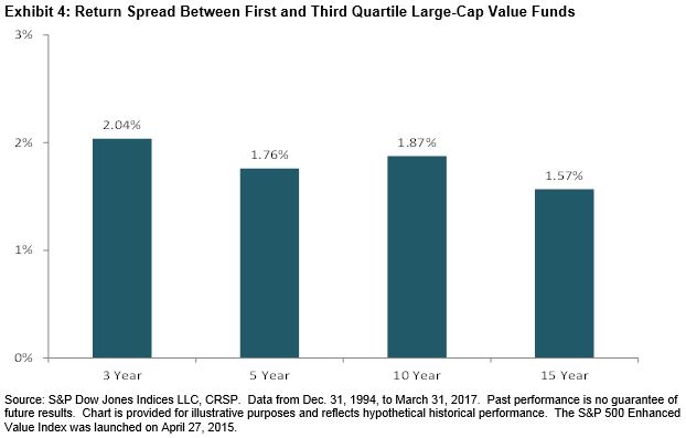
Exhibit 4 highlights the return dispersion among large-cap value managers from year-end 1994 through May 2017.  Returns among active value strategies vary quite meaningfully, reflecting the differences in managers’ approaches to value definition, stock selection, and portfolio construction.  For example, the return spread per year on an annualized basis over the 15-year period amounted to 1.57%.

Value investing, although considered a timeless investment strategy, may not be as straightforward as it seems.  Market participants aiming to implement the strategy should carefully consider the metrics used to capture the factor, constituent selection process, and strategy construction.


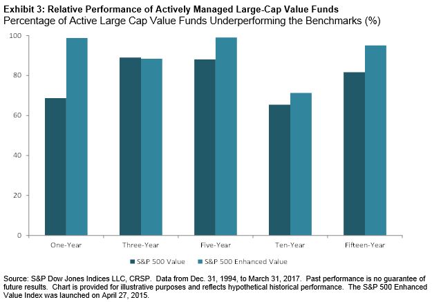
[1] We use the Center for Research and Security Prices (CSRP) mutual fund database as the underlying data source for actively managed large-cap value managers’ returns.

[2] The three-year figure is the only exception but the difference in the percentage of managers underperforming the benchmark amounts to only 0.63%.

[1] Depending on the type of metrics used, value portfolios can potentially have different performance.

The posts on this blog are opinions, not advice. Please read our Disclaimers.

How the Liquidity of S&P 500 Investment-Grade Bonds Compares Against Non-S&P 500 Bonds

Contributor Image
Dennis Badlyans

Former Associate Director, Global Research & Design

S&P Dow Jones Indices

Liquidity may be defined as the ability to buy or sell a bond within a reasonable period of time and at a reasonable price.  A simple way to compare two bonds is through the use of Trade Reporting and Compliance Engine (TRACE) daily volume data.  The data represents the daily aggregation of each reported trade throughout the day.  The existence of reported volume data can be indicative of the frequency of trading.  For example, if a bond has volume data for 20 of the last 22 trading days, then it trades relatively frequently—nearly every day.  The volume data itself can also indicate the size in which it trades daily.  For two bonds, we can compare the turnover rate, defined as the total volume traded in 22 days as a percentage of the amount outstanding.  For example, a bond may be considered more liquid relative to another one if a larger portion of its total outstanding is traded over a one-month period.

In addition to considering volume and frequency, the daily price change or bid-offer spreads can be key indicators, particularly over periods of acute stress.  If a large holding of an asset is sold quickly but at a significant loss, it may not be liquid.  More granular data, such as intraday trade details (size and bid-offer spread), could help improve the analysis of relative bond liquidity.

In this post, we focus on the simpler approach of comparing frequency and turnover to assess relative liquidity.  We compare the S&P® 500 Investment Grade Corporate Bond Index to U.S. investment-grade (IG) corporate bonds excluding the S&P 500 issues.

The constituents in the S&P 500 Investment Grade Corporate Bond Index trade more frequently than the U.S. IG corporate bonds ex-S&P 500.  Over the past two years, on average, 64% of the bonds in the S&P 500 Investment Grade Corporate Bond Index traded every day versus 39% in the U.S. IG corporate bonds ex-S&P 500 (see Exhibit 1).  Over the same period, 96% of the bonds in the index traded at least once each month versus the U.S. IG corporate bonds excluding the S&P 500 at 88% (see Exhibit 2).

The constituents of the S&P 500 Investment Grade Corporate Bond Index turn over about 30% faster than other U.S. IG corporate bonds.  Despite an improvement in trading volume for the non-S&P 500 bonds since 2008, turnover still lagged the S&P 500 bonds.  Exhibit 3 shows the trend in volume as a percentage of amount outstanding (turnover rate).  Most recently, it would take about 22 months (4.5% per month) to turn over the entire USD 3.8 trillion S&P 500 Investment Grade Corporate Bond Index universe, while it would take eight months longer (2.7% per month) to turn over the USD 0.89 trillion that makes up the U.S. IG corporate bonds excluding the S&P 500.

The posts on this blog are opinions, not advice. Please read our Disclaimers.

When Market Timing Is Unusually Pointless

Contributor Image
Hamish Preston

Head of U.S. Equities

S&P Dow Jones Indices

Among the many themes to have emerged in U.S. markets during the first six months of 2017, low volatility in equities and changes in the global interest rate environment—some realized and some anticipated—were particularly important drivers.  In a similar vein to our summary on Europe, here are some thoughts on these trends.

The potential rewards from market timing were extremely low.

When the market swings wildly from one day to another, the rewards available from successful market timing can be significant.  But when volatility is low and the market grinds upward, it is difficult to beat a strategy that remains fully invested and minimizes trading costs.  In the first half of 2017, equity markets across the world were characterized by low volatility, both in realized terms and in implied measures such as VIX®.

The trend for lower volatility was exemplified by the U.S., where the standard deviation of daily price movements in the S&P 500® was a measly 0.44% between January and June 2017.  In fact, only 1963 and 1964 saw lower numbers at the end of June in a record stretching back to 1929 (see Exhibit 1).

Low correlations between S&P 500 constituents go a long way in explaining the near historic lows in daily volatility over the first half of this year.  In any case, the relatively tight range of daily returns of the S&P 500 over the first six months of 2017 meant that market timing strategies would have found it even more difficult than usual to deliver excess returns.

Central bankers’ speeches weighed on dividend strategies.

The U.S. Federal Reserve’s decisions to increase interest rates and speeches from Mark Carney and Mario Draghi that suggested the possibility of sooner-than-expected rate increases at the Bank of England and the European Central Bank, respectively, appeared to weigh on the performance of dividend strategies.  None of our U.S. dividend strategy indices managed to beat the S&P 500’s 9.3% year-to-date total return for the period ending on the June 30, 2017, and the S&P 500 High Dividend Index underperformed by 6.11%.

As Exhibit 2 shows, dividends seemed to explain much of this relative performance.  Year-to-date returns of strategies with higher yielding stocks performed worse than their lower yielding counterparts, although the S&P Dow Jones U.S. Select Dividend Index proved to be the slight exception.

The posts on this blog are opinions, not advice. Please read our Disclaimers.

How to Address Retirement Income in Investment Policy Statements

Contributor Image
Carlos Panksep

General Manager

Centre for Fiduciary Excellence

Recently, the US Department of Labor (DOL) turned its attention to the adequacy of a retirement plan participant’s account balance, stimulating two debates about how to improve participant outcomes.[1] The first debate concerns how to help participants measure their “retirement readiness” in terms of income replacement at retirement. The second centers on whether there are retirement income-oriented investment strategies that can serve participants better than traditional strategies, which typically focus on capital accumulation.

How Did We Get Here?

In 2010, the DOL noted that defined contribution (DC) plan sponsors offer no promise about the adequacy of a participant’s account balance at retirement or of the available income stream, and that DC plans typically only make lump sum distributions available. Then, in 2013, the DOL expressed its intention to pass regulations that would require DC plans to describe participants’ total benefits accrued, including a projected account balance at their normal retirement age and a lifetime income stream illustration. The proposed regulations would also require DC plans to provide methodologies for calculating these benefits.

With respect to the first debate, a variety of tools and services are currently available to measure retirement readiness at the plan level. Some also allow measurement of individual participant retirement readiness, requiring advisors to work one-on-one with participants to evaluate their retirement income needs, projected retirement income based on current resources and contribution rate, and any increase in plan contributions necessary to address any shortfall.

Regarding the second debate, plan sponsors and their advisors should consider measures to address participant retirement readiness and investment options that provide some measure of guaranteed retirement income. Nothing requires plan sponsors to adopt any of these concepts, but from a best practice perspective, these opportunities bear consideration.

Making IPS Changes

For fiduciaries, care should be taken to ensure conformity with relevant prudent practices. Specifically, advisors and plan sponsors should consider evaluating what changes are required to the Investment Policy Statement (IPS) whenever making changes to the nature of services or investment vehicles that will be used by a plan sponsor or offered to participants. The advisor and plan sponsor client should consider adopting IPS provisions appropriate to the new products and services and income-focused investment options to be included in the investment menu.

Benchmarking Progress

The S&P Shift to Retirement Income and Decumulation (STRIDE) Indices combine a target date glide path with a new risk management framework to serve as a benchmark for investors saving to fund consumption in retirement, reflecting a transition from wealth creation to inflation-adjusted retirement income. As such, they can be used to evaluate target date retirement income strategies that follow a liability-driven investing philosophy. The S&P STRIDE Indices also include a monthly cost of retirement income for each retirement cohort, which can be used to translate account balances to estimated retirement income. By using the S&P STRIDE indices as a benchmark, those who adopt retirement income provisions into an IPS receive an appropriate yardstick against which they can gauge their progress.

The challenges facing a DC plan participant are complex, dynamic, and multi-faceted. Solving these challenges begins with plan sponsors, consultants, and advisors who must develop a sound IPS and enable a framework that manages the risks participants face.

[1] See the DOL’s advanced notice of proposed rulemaking (ANPRM) on lifetime income illustrations: Pension Benefit Statements, 78 Fed. Reg. 26727 (proposed May 8, 2013)

Disclosures

The S&P STRIDE INDEX is a product of S&P Dow Jones Indices LLC or its affiliates (“SPDJI”) and has been licensed for use by Dimensional Fund Advisors LP (“Dimensional”). Standard & Poor’s® and S&P® are registered trademarks of Standard & Poor’s Financial Services LLC (“S&P”); Dow Jones® is a registered trademark of Dow Jones Trademark Holdings LLC (“Dow Jones”); these trademarks have been licensed for use by SPDJI and sublicensed for certain purposes by Dimensional. Dimensional’s Products, as defined by Dimensional from time to time, are not sponsored, endorsed, sold, or promoted by SPDJI, S&P, Dow Jones, or their respective affiliates, and none of such parties make any representation regarding the advisability of investing in such products nor do they have any liability for any errors, omissions, or interruptions of the S&P STRIDE Index.
Dimensional Fund Advisors LP receives compensation from S&P Dow Jones Indices in connection with licensing rights to the S&P STRIDE Indices. It is not possible to invest in an index.


The posts on this blog are opinions, not advice. Please read our Disclaimers.

VIX Hit Below 10 in Q2: What Do We Know From the Past?

Contributor Image
Berlinda Liu

Former Director, Multi-Asset Indices

S&P Dow Jones Indices

With the French election ending in the defeat of Le Pen, one more risk factor has been removed from the table and low volatility has returned.  In Q2, the CBOE Volatility Index (VIX®) fell below 10 seven times, and the closing level of 9.75 on June 2, 2017, was the lowest since 1993.  Do these low VIX levels predict a rising stock market?  Is it time to long VIX derivatives?

VIX measures the expected volatility of the S&P 500® over the next 30 days using S&P 500 (SPX) options.  Since stocks tend to fall much faster than they rise, a high VIX level, or a high implied volatility of SPX options, tends to indicate falling stock prices.  However, the opposite does not always hold true in a low volatility environment, as stocks may either rise or fall.  Low VIX levels only indicate that the market is quiet and that people are not willing to pay a lot for short-dated protection.

Although VIX is just one year older than Justin Bieber and we don’t have enough data points to draw any conclusion that is statistically significant, we can still take a look at the 16 days during which VIX went below 10.  Our observations are:

  • Falling VIX does not necessarily lead to rising equity markets;
  • VIX spot tends to rise due to its mean reverting property; and
  • With the VIX futures curve in contango, market participants can incur losses if they have a long position in VIX futures when VIX levels are extremely low.

Exhibit 1 shows the 16 days in history during which VIX hit below 10, along with the subsequent returns of the S&P 500 over near-, mid-, and long-term periods following the drops.  The immediate performance of the equity market is mixed; the S&P 500 had about a 50/50 chance of going up and down—in other words, it’s a random coin toss.  The 1-, 3-, 6-, and 12-month returns are also not convincing for a strong bull market.  In fact, we noticed that the 9.89 reading on Jan. 24, 2007, was followed by the 2008 financial crisis only ~18 months later.  Overall, one can argue that low VIX levels have told us virtually nothing about stock market returns in the past.

Low VIX levels are usually followed by a positive VIX return, because VIX usually fluctuates around its local mean (see Exhibit 2).  As long as sub-10 does not become the new normal, VIX will most likely pull itself back into the double-digit region.

However, a low VIX level is not a sign of taking a long position in VIX derivatives.

Given that VIX is not tradable, market participants might consider using derivatives such as VIX futures to access volatility.  In the past, when VIX had hit below 10, VIX futures were always in contango, with the futures contracts more expensive than the spot.  That means market participants with a long position in VIX futures incurred losses.  Imagine a market participant holding a long futures position when VIX goes under 10.  Upon the expiration of the current futures, he/she may choose either to let the futures expire or roll to the next contract.  In the former case, the futures price drops as it converges to the spot; in the latter case, he/she has to pay the price difference in roll to the next futures contract.

Exhibit 3 shows the same 16 days during which VIX hit below 10, along with the subsequent returns of the S&P 500 VIX Short-Term Futures Index, which simulates a hypothetical rolling position from first-month VIX futures to second-month futures to maintain a long VIX futures of one-month constant maturity.  Because VIX futures were not available in 1993 and 1994, we do not report the hypothetical returns.  For all of the other 11 occurrences, the futures curves were all in contango.  Although one-week performance was mixed, in the subsequent month following VIX dropping below 10, the S&P 500 VIX Short-Term Futures Index posted negative returns.

Volatility in the U.S. equities market has dissipated, as market participants brushed aside unknowns from healthcare bills, tax reform, and financial regulation.  Low VIX numbers witnessed in Q2 indicate that financial markets may be settling into a low volatility region.  However, history has shown that low VIX levels are not necessarily followed by a rising market in the near future.  More importantly, although VIX spot tends to rise due to its mean reverting property, volatility investors should consider the deep contango associated with low VIX spot, which, contrary to the “buy the dip” principle, may suggest selling VIX derivatives rather than buying.

The posts on this blog are opinions, not advice. Please read our Disclaimers.