Get Indexology® Blog updates via email.

In This List

A Tale of Two Benchmarks: S&P SmallCap 600® vs. Russell 2000®

SmallCap Dividends: We all laughed at technology dividends a dozen years ago

Comparing Apples to Apples: Suitability of Benchmarks

Not All Bonds Are A Sell, Even High Yield Is Split

Consistency is Bliss

A Tale of Two Benchmarks: S&P SmallCap 600® vs. Russell 2000®

Contributor Image
Aye Soe

Former Managing Director, Global Head of Core and Multi-Asset Product Management

S&P Dow Jones Indices

This is a series of blog posts relating to the in depth analysis of performance differential between the S&P SmallCap 600 and the Russell 2000.

Benchmarks are designed to represent a passive strategy in a given universe. Given that purpose, the risk/return profiles among various benchmarks in the same universe should be relatively similar in nature. This similarity appears to be borne out in the U.S. large-cap equity universe when comparing the returns of the Russell 1000® and the S&P 500®. Using monthly total returns from 1994 to 2014, Exhibit 1 charts the growth of a hypothetical investment of USD 1.00 in the S&P 500 and the Russell 1000, as well as in the S&P SmallCap 600 and the Russell 2000. In the U.S. large-cap universe, USD 1.00 invested in the S&P 500 and the Russell 1000 from January 1994 through December 2014 would have returned USD 6.63 and USD 6.80, respectively. However, in the small-cap universe, the returns of the Russell 2000 and the S&P SmallCap 600 are considerably different. An investment of USD 1.00 in the S&P SmallCap 600 over the same time period would have returned USD 8.59, while it would have returned USD 6.18 if invested in the Russell 2000.

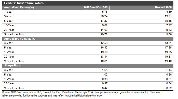
Since its launch in 1994, the S&P SmallCap 600 has outperformed the Russell 2000 in 14 of 21 calendar years. From January 1994 through December 2014, the returns of the S&P SmallCap 600 exceeded those of the Russell 2000 by 1.72% on an annualized basis. It is also important to note that the S&P SmallCap 600 has exhibited lower volatility than the Russell 2000 historically, leading to a higher Sharpe Ratio. These results are similar to what was seen in the previous research paper on this topic (2%), when the time range reviewed was from 1994 to 2009. Exhibit 2 highlights the risk/return profiles of the two indices.

The continued return differential between the two small-cap indices merits further study, and an understanding of the factors contributing to the divergence. We will be covering those in detail in upcoming blog posts!

Capture

Capture


The posts on this blog are opinions, not advice. Please read our Disclaimers.

SmallCap Dividends: We all laughed at technology dividends a dozen years ago

Contributor Image
Howard Silverblatt

Senior Index Analyst, Product Management

S&P Dow Jones Indices

From the end of 2013 there has been a 10.2% increase in the number of issues paying a dividend in the S&P SmallCap 600. Initiating a dividend represents a broad commitment of future earnings, to which companies need to be very sure of their future cash-flow.  On an index market-size level, SmallCap yields remains at the lower end of the spectrum, as the traditional growth characteristics (and priority) plays out more than the income component.  However, comparisons on an issue level within the size classifications show a much closer relationship of yields, with size not being a significant differentiator.  Starting with recent growth in SmallCap payers, and the history of payers to continue to pay and increase, SmallCaps issues appear to be trending up, and if the trend continues, eventually, the index level characterizes will change.

S&P SmallCap600 dividend stats:

  • 324 of the 600 pay a regular cash dividends
  • The weighted index yield is 1.34%, with the 324 payers yielding 2.24%
  • The average market value is $1.24 billion, with the average market value of dividend payers being $1.37 billion
  • 182 payers have a dividend rate less than 50% of their 12 month net GAAP income, with 235 being less than 75%
  • 18 issues have increased their cash dividend payment for at least 20 consecutive years, with 19 more increasing it for at least 10 years
  • 176 have paid cash dividends for at least 10 consecutive years, with 231 paying for at least 5 consecutive years
  • Based on the current dividend rate, 202 issues will pay more than they paid in 2014; 255 paid more in 2014 than 2013 and 139 paid more in 2013 than 2012

More Small-caps are paying, with their yields higher

20-year-look

Who pays what in the SmallCap

Cross-indices yields

Long-term SmallCap payers

Four SmallCaps in the S&P High Yield Dividend Aristocrats

S&P 1500 breakdown

SmallCaps have underperformed, which also has helped yields

Long-term total returns

The posts on this blog are opinions, not advice. Please read our Disclaimers.

Comparing Apples to Apples: Suitability of Benchmarks

Contributor Image
Koel Ghosh

Former Head of South Asia

S&P Dow Jones Indices

It can be interesting to try and explain the world of indices and benchmarks to people from non-financial backgrounds because, at times, it can pose a bit of a challenge.  For me, it is a revelation to find out that what I consider as generic information and common knowledge is not quite as simple for many.  The general questions being: “What is a benchmark?” Why do you need it?”, and “How do you choose the correct one?”

I thought I would try and simplify this for common understanding.  A benchmark is an ideal comparative measure that forms a standard or norm and can be used to gain an understanding of a relative market area or segment.  For example, the S&P BSE SENSEX is considered the barometer of Indian markets.  Hence, one can understand whether Indian markets have fared well or not based on the index’s movements.  The S&P BSE SENSEX’s growth percentage provides periodical statistics on the performance of Indian equity markets.

S&P BSE SENSEX – Price Returns

sensex

Source: Asia Index Pvt. Ltd.  Data as of Feb. 28, 2015.  Charts and tables are provided for illustrative purposes only.  Past performance is no guarantee of future results.

But would this index fit all comparative analysis?  The answer is no.  If one wants to merely check on how the infrastructure companies are faring in the Indian market, the S&P BSE SENSEX would not be the ideal measure, as it is a generic, overall market indicator.  One would have to review an index that would be a representation of all infrastructure companies, like the S&P BSE India Infrastructure Index.

S&P BSE India Infrastructure Index – Price Returns

infra

Source: Asia Index Pvt. Ltd. Data as of Feb. 28, 2015.  Charts and tables are provided for illustrative purposes only.  Past performance is no guarantee of future results.

So how are such benchmarks or indices crafted to be able to provide ideal measuring tools within the segment they represent?  Indices are all created based on strict rules.  These rules take into account market dynamics and suitability for the region it will represent.  For example, rules that work in the U.S. may not necessarily be applicable to the South Asia region.  This is true within regions, too: if we were to look at South Asia, the markets in Sri Lanka are largely different than those in Bangladesh, for example.  Hence, when rules are crafted, we need to see the maturity and depth of the markets.  Furthermore, market consultation also proves to be very beneficial in ensuring that benchmarks are suitable for market participants.

It is important to ensure comparisons are made among suitable benchmarks.  As the saying goes, we must compare “apples to apples” in order to understand which is better.  Similarly, for investments, the comparison should be made with the similar index benchmark, in order for investors to understand the performance of their portfolios or investments in comparison to the market standards.  So if I am investing in an infrastructure fund, it would be most ideal to compare the fund with the market benchmark, meaning, an infrastructure index rather than a generic market index.


The posts on this blog are opinions, not advice. Please read our Disclaimers.

Not All Bonds Are A Sell, Even High Yield Is Split

Contributor Image
Kevin Horan

Former Director, Fixed Income Indices

S&P Dow Jones Indices

The yield of the S&P/BGCantor Current 10 Year U.S. Treasury Bond Index started the week of March 9, 2015, at 2.20% and continued lower, closing the week at a 2.12%.  The majority of this move is credited to the European Central Bank’s (ECB) purchasing of debt to support its economy.  The ECB’s U.S. Federal Reserve-style purchasing drove yields lower globally, along with moving the euro currency from 1.08 to an almost-parity with the U.S. dollar of 1.04.  European investor demand for the higher yields of U.S. Treasuries led to the successful auctioning of 3-, 10-, and 30-year Treasuries totaling USD 58 billion in par amount.

Riding the line between investment grade and high yield, the S&P Crossover Rated Corporate Bond Index, which seeks to measure the performance of U.S. corporate bonds rated from “BBB+” down to “BB-“, has returned -0.66% MTD and 1.40% YTD, as of March 13, 2015.

The S&P U.S. Investment Grade Corporate Bond Index is down 0.61% MTD and has returned 1.10% YTD, as of March 13, 2015.  The past week saw new issuance of at least USD 42 billion, as deals across all maturities came to market.  Zimmer Holdings, along with financial firms such as Toronto Dominion, Barclays Plc, ING Bank N.V., and Lloyds Bank, all contributed to the amount of investment-grade outstanding debt.

Issuance is not unique to the investment-grade sector, as U.S. municipal bonds have also experienced a surge of new issuance by cities, states, and government entities.  According to Aaron Kuriloff’s article,[1] USD 68.5 billion of municipal bonds have been sold this year.  The S&P National AMT-Free Municipal Bond Index is down 0.38% MTD and is returning 0.28% YTD.

The high-yield bond market, as measured by the S&P U.S. Issued High Yield Corporate Bond Index, had recently been clawing its way up in performance for 2015.  January’s mild return of 0.80%, coupled with a February return of 2.25%, was heading in the right direction, but March has been fatal so far.  The index has returned -1.01% MTD, bringing its YTD return to 2.03% as of March 13, 2015.

Tom Lydon’s recent article[2] discusses the pull back in the high-yield market and mentions new issuance as a factor.  Additional supply has had an effect on pricing, though the effect of oil prices and the size of the energy sector within this market should not be forgotten.  Exhibit 1 shows the energy sector (14%) of the S&P U.S. Issued High Yield Corporate Bond Index in comparison with movements in oil prices.

Investors’ need for yield may have enticed them back into high yield bonds at the end of January, as oil moved from USD 45 to USD 53 a little too early.  Even as the news reports increases in retail gasoline prices, the USD 54 price of oil in mid-February has slowly moved down to a price of USD 44 on the NYMEX WTI crude future contract in mid-March.

As mentioned in the Lydon article, the SPDR Barclays Short Term High Yield Bond ETF has attracted USD 96.5 million in assets.  Shorter duration, high-yield bonds, such as those captured in the S&P 0-3 Year High Yield Corporate Bond Index, are up 0.09% MTD and 1.85% YTD (as of March 13, 2015), as investors move down the curve in order to reduce rate volatility and term risk exposure.

Exhibit 1: The S&P U.S. Issued High Yield Corporate Bond Index Energy Sector Versus the NYMEX Crude Oil Future
S&P U.S. Issued High Yield Corporate Bond Index (Energy Sector by GIC code)

Source; S&P Dow Jones Indices LLC, NYMEX. Data as of March 13, 2015.  Charts and tables are provided for illustrative purposes.  Past performance is no guarantee of future results. 


[1]   Aaron Kuriloff.Muni Bonds Headed for a Rough Patch, Higher Interest Rates, Surge in Issuance Pressure Prices.” The Wall Street Journal, http://www.wsj.com/articles/muni-bonds-headed-for-a-rough-patch-1425838695

[2]   Tom Lydon. “Investors Grow Wary of High-Yield, Junk Bond ETFs.” ETF Trends. March 16, 2015: http://www.etftrends.com/2015/03/investors-grow-wary-of-high-yield-junk-bond-etfs/?utm_source=iContact&utm_medium=email&utm_campaign=ETF%20Trends&utm_content=


The posts on this blog are opinions, not advice. Please read our Disclaimers.

Consistency is Bliss

Contributor Image
Chris Bennett

Former Director, Index Investment Strategy

S&P Dow Jones Indices

Following three consecutive weeks of declines for the S&P 500®, pundits are asserting that investors have more to fear than simply the Ides of March.  As of the market close on Friday the 13th, the S&P 500 had declined 3% in March on a total return basis.

Defensive strategies can provide some protection from market fluctuations.  Specifically, low volatility strategies thrive in volatile markets.  The concept is fairly simple: select stocks that have been historically less risky in an attempt to capture some market upside, while limiting the potential downside.

Capture

We refer to these as upside and downside captures.  The S&P 500 Low Volatility Index, for example, has managed to capture 72% of the upside of the S&P 500 while only capturing 48% of the downside since 1991.  This means that in a period when the S&P 500 gains 10%, the S&P 500 Low Volatility Index may gain about 7%, while in a period when the S&P 500 is down by 10%, the S&P 500 Low Volatility Index would typically decline about 5%.  As of the close on March 13, 2015, the S&P 500 Low Volatility Index was down 2% MTD.

While it seems counterintuitive, lower volatility strategies have actually outperformed the market over the long term.  This is often referred to as the “low volatility anomaly”, and it may be due to downside protection: Investors win by playing defense, or simply by not losing.

Capture

Low-risk approaches are not as exciting as their high-risk counterparts.  They certainly do not enjoy the full rush of market gyrations.   When it comes to results, however, consistency is bliss.

The posts on this blog are opinions, not advice. Please read our Disclaimers.