Get Indexology® Blog updates via email.

In This List

A Year of Two Halves for Australian Large-Cap Equity Managers

Measuring Home Prices

Indexing Bond and Commodity Markets in the World of the Upside Down

What’s in a U.S. Equity Index?

2023 Has Already Been Trepidatious

A Year of Two Halves for Australian Large-Cap Equity Managers

Contributor Image
Benedek Vörös

Director, Index Investment Strategy

S&P Dow Jones Indices

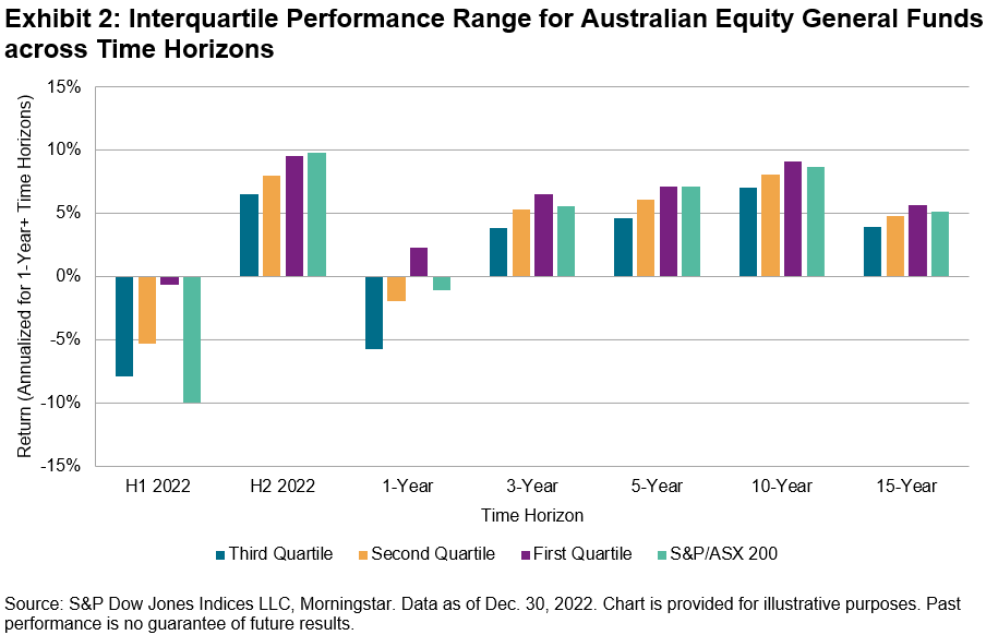
The first half of 2022 brought steep and broad-based losses for Australian equity indices of all stripes. On a relative basis, however, active Australian Equity General funds had a decent start to 2022; as our SPIVA® Australia Mid-Year 2022 Scorecard reported, a (slim) majority of active managers in this category outperformed the S&P/ASX 200. Unfortunately for their investors, good times for active domestic large-cap funds didn’t continue into the second half of the year. While the recovery in Australian equities in H2 2022 ensured a positive return for Australian Equity General funds across all quartiles on an absolute basis, over three-quarters of them failed to beat the S&P/ASX 200, bringing the full-year underperformance rate to 58%.

One of the challenges faced by active managers in H2 was the nearly identical performance of the major equity segments: while equal weight, value, growth, mid caps, small caps and the largest of blue chips all had distinct return patterns in H1, their gains were almost indistinguishable in H2.

As Exhibit 2 shows, the near uniformity of equity returns in H2 was reflected in the relatively narrow range over which active Australian Equity General returns were scattered: their interquartile range was just 3%, less than half the 7% seen in H1. It is also noteworthy that, in H2 2022, even funds in the top quartile would have lagged the benchmark. Given the changing market environment over the year, it might be no surprise that few active managers were able to adapt and navigate the churning winds: historical evidence suggests that it is hard to find active managers who are able to beat the market persistently

Overall, the market conditions of 2022 offered a particularly interesting test for the proponents of active management. A global equity downturn gave those who could play “defense” a chance to shine, while the relative performances of different market segments offered plenty of opportunity for outperformance. While it cannot hope to settle the debate, the SPIVA Australia Scorecard brings transparent and objective assessments of active fund performance, using industry-standard benchmarks to better inform investors about where active management has been “working” over short- and long-term periods. Overall, the year-end 2022 scorecard showed a “game of two halves” for active managers in broad Australian equities—with a good H1 followed by a challenging H2—and emphasized the challenge of persistent outperformance in rapidly evolving market environments.

The posts on this blog are opinions, not advice. Please read our Disclaimers.

Measuring Home Prices

Contributor Image
Craig Lazzara

Former Managing Director, Index Investment Strategy

S&P Dow Jones Indices

Compared to stock and bond markets, where prices update continuously throughout the trading day, the value of residential real estate is hard to observe; and while one buyer’s shares of stock XYZ are interchangeable with another’s, houses are not similarly fungible. Yet the value of an investor’s house is often a significant component of his net worth, and the aggregate value of real estate is an important indicator of the health of the economy. It’s for these reasons that S&P Dow Jones Indices publishes monthly updates of the S&P CoreLogic Case-Shiller Home Price Indices. We recently published our update for December 2022, which enables us to make some observations about calendar 2022 as a whole.

First, U.S. home prices continued to rise in 2022. Our National Composite Index gained 5.8%, which is its 15th highest reading in 35 years of data. That said, 2022’s price gains were significantly lower than those of 2020 and (especially) 2021’s record-setting pace.

Positive gains at a lower rate are evidence of deceleration. Housing is seasonal (with stronger demand in the spring and summer than in the winter), so it’s analytically convenient to look at 12-month price changes, as Exhibit 2 does. The exhibit shows that year-over-year price gains peaked in March 2022 at 20.8%, and began to decline thereafter (with deceleration becoming much more noticeable after the index peaked in June).

Exhibit 2 also reminds us of the remarkable surge in home prices that occurred beginning in 2020. Year-over-year price changes rose steadily from 4.4% in May 2020 until reaching their peak 22 months later. It’s arguable that the growth of remote work fueled at least some of this price move, as larger homes at a distance from urban centers became more attractive in the aftermath of COVID-19-induced shutdowns.

Some urban centers, of course, are more equal than others. In addition to our composite indices, the S&P CoreLogic Case-Shiller family includes data on 20 metropolitan areas, whose 2022 performance is graphed in Exhibit 3. There was an above-average spread between the year’s best performer (Miami, +15.9%) and its worst (San Francisco, -4.2%).

Finally, it’s interesting to observe how some broad social trends are reflected in our housing data. A number of commentators have noted that relatively expensive, high-tax states are losing population to more affordable areas. Exhibit 4 compares average 12-month price changes for the South (Miami, Tampa, Atlanta, Charlotte, and Dallas) and the West Coast (Los Angeles, San Diego, San Francisco, Portland, and Seattle). Over the long run, the relative advantage passes from one series to the other. The West Coast, for example, did much better as housing prices recovered in 2012-2014.

Recently, however, the South has been dominant. Starting in August 2021, the South began to pull ahead, and remained ahead through the end of 2022, consistent with the population trends seen elsewhere.

The posts on this blog are opinions, not advice. Please read our Disclaimers.

Indexing Bond and Commodity Markets in the World of the Upside Down

Contributor Image
Brian Luke

Senior Director, Head of Commodities, Real & Digital Assets

S&P Dow Jones Indices

In the 80s nostalgia Netflix hit series “Stranger Things,” the town of Hawkins is haunted by an alternate world beneath. The protagonists battle monsters in what they call the upside down. For the first few seasons, the upside down wreaks havoc on just a few residents of Hawkins. By the last season, no one is safe from the destruction, despite all the local and federal support to stop it. A similar theme is developing in bond and commodity markets. We are seeing “upside down” or inverted yield curves and commodity markets in backwardation, or prices higher today than they will be in the future. Like the Netflix series, this has started by only affecting certain fixed income and commodity traders, leaving the broader economy out of recession for now (more on that later). As in the show, it takes a tremendous amount of government intervention (which can be partly blamed in both the show and reality) to cull the beast and bring back stability. In this blog post, we will examine various markets that are upside down, or inverted. Starting with the yield curve, we then highlight some lesser-known financial markets that are also in the upside down.

The inverted yield curve has widely been pronounced as a terrific measure of recessions. We are now in the deepest inversion in over 40 years, and the Fed continues to deliberate on the amount of rate increases, not cuts, to bring the shape back to normal. On average, the U.S. economy dips into recession 11 months after the three-month yield eclipses the 10-year yield. For those counting at home, the current inversion began in August 2022, or eight months ago.

Another more morbid measure that’s currently inverted is the market for U.S. Credit Default Swaps (CDS). These are contracts that pay out in the event of a U.S. government default. As unlikely as that may seem, the cost to protect against such a calamitous event has risen significantly. One-year U.S. CDS protection now costs 88 bp. Concerns about U.S. solvency are not as well bid further out the curve. From the inverted shape of that market, it would imply concern about a government shutdown and failure to pay treasury debt in the short term.

A third inverted market is select commodity futures, many of which have been inverted since 2020. Currently, 74% of the index weight of S&P GSCI components are trading at higher prices for one-month delivery than one year.  Brent Crude and West Texas Intermediate one-month futures are about USD 4 higher than the 12-month futures price, while unleaded gas is 28 cents cheaper for one year out than one month (see Exhibit 3). Energy isn’t the only market that exhibits backwardation (lower prices in the future). Corn, soybeans, sugar and Kansas wheat are all showing the same phenomena.

What can market participants make of all these negative signs? All tend to point to short-term dislocation and long-term normalization, as the front end of each curve exhibits the greatest deviation from past measures. Futures prices for interest rates and commodities markets are indicating lower rates in the future than what the spot market trades at now. This could indicate one of two things: expectations of current supply and demand constraints will be alleviated in the future, or a significant decline in risk assets resulting from economic slowdown. The Fed’s efforts to curb inflation and create price stability in the short term has resulted in many market inversions. This has led to short-term yields exceeding 5% for one-year debt.  Monitoring longer-term interest rates and commodities prices helps measure how effective that goal is and if it’s hurting the broader economy. For now, it’s enough to keep the upside down under wraps to the broader economy. How many seasons this series will go on before recession remains to be seen.

The posts on this blog are opinions, not advice. Please read our Disclaimers.

What’s in a U.S. Equity Index?

Contributor Image
Sherifa Issifu

Senior Analyst, U.S. Equity Indices

S&P Dow Jones Indices

2022 was the worst year for U.S. equity indices since 2008’s Global Financial Crisis, with the S&P 500® entering a bear market and declining 18% in 2022. Despite the market blues, there were some relative winners: the S&P DJI U.S. Core Indices beat their MSCI counterparts last year, driven by differences in their methodologies. Below we examine the impact of index construction on performance, factor exposure and sector weights of the two index series.

Exhibit 1 highlights that the S&P Composite 1500®’s outperformance was both consistent and widespread in 2022, with S&P DJI U.S. Core Indices outperforming MSCI ACWI USA Indexes across all market capitalization segments on average for three out of every four months in 2022. The outperformance ranged from 1% to 5%, with mid caps hosting the biggest performance differential—the S&P MidCap 400® beat the MSCI USA Mid Cap by 5%, its largest calendar year margin since 2016. Since Dec. 31, 1994, S&P DJI U.S. Core Indices beat MSCI ACWI Index in most cap-ranges.

Differences in index construction have meant that S&P DJI indices have historically had a higher exposure to the quality factor than their MSCI counterparts. For example, the S&P Composite 1500 requires, among other criteria, potential new index additions to have four consecutive quarters of positive earnings to be considered for eligibility. The MSCI ACWI USA Indexes have no such requirements. This difference helps to explain why S&P DJI indices have a significant exposure to the quality factor, as shown in Exhibit 2.

Quality was a big differentiator in mid and small caps, with the widest spread between S&P DJI and MSCI quality scores in these size ranges. This difference is particularly acute in mid and small caps because firms are at an earlier stage in their lifecycle than large caps. It is typically harder for firms to reach the capitalization of “large caps” without being profitable. The S&P Composite 1500 filters out lower quality stocks which has given the S&P SmallCap 600 and S&P MidCap 400 a quality premium compared to the MSCI USA SmallCap and MSCI USA MidCap, respectively. A robust earning screen has helped S&P DJI U.S. Core Indices outperform when quality is in favor and “junk” falls out of favor.

Sectors were also a major driver of performance in 2022, as the spread between best- and worst-performing sectors in the S&P 500 closed the year at 106%. The S&P 500 and S&P MidCap 400 both had a lower sector weight to Communication Services and Information Technology than their MSCI counterparts, explaining part of the recent outperformance given the material underperformance of technology-related sectors. The S&P 500 and MSCI USA Large Cap had a 26% and 28% weight to Information Technology, respectively. While I.T.’s mid-cap sector weight is about half of its large-cap weight, the spread in its weighting between benchmarks can vary more, with the MSCI USA Mid Cap having a 4% overweight versus the S&P MidCap 400, as shown in Exhibit 3.

While indices designed to measure the performance of U.S. equity market may look similar on the surface, especially in the short run, when you look more closely, differences in index construction can have a significant influence on performance, factor exposure and sector weights. It’s important to remember that it is often in the long run when quality shines through.

For more on index construction, visit https://www.indexologyblog.com/tag/index-construction/.

The posts on this blog are opinions, not advice. Please read our Disclaimers.

2023 Has Already Been Trepidatious

Contributor Image
Fei Mei Chan

Former Director, Core Product Management

S&P Dow Jones Indices

A sizzling start for Canadian equities in 2023 found itself fizzling as March began. Despite having a return of as much as 7% in late January/early February, through March 17, 2023, the S&P/TSX Composite Index was up 0.7% YTD. In line with historical trends, the S&P/TSX Composite Low Volatility Index underperformed, declining 0.1%.

Volatility rose for every sector of the S&P/TSX Composite Index except for Information Technology, which, nonetheless, remains the second most volatile sector, preceded only by Health Care.

The latest rebalance for the S&P/TSX Composite Low Volatility Index, effective after market close on March 17, 2023, wrought minor shifts. Notably, the Materials sector made a reappearance after more than a year’s absence, holding 2% of the low volatility index. Financials added to its already dominant position (up 3%), which came mostly from Real Estate. The remaining sectors all experienced minor shuffles.

The posts on this blog are opinions, not advice. Please read our Disclaimers.