In our two previous blogs on risk parity 2.0 (see here and here), we covered the philosophy and methodological differences between the original S&P Risk Parity Indices and the newly launched S&P Risk Parity 2.0 Indices. This third and final installment of this series now looks at the performance and attribution statistics of the S&P Risk Parity 2.0 Indices, specifically the S&P Risk Parity 2.0 Index – 10% Target Volatility.
As Exhibits 1 and 2 show, the performance of the S&P Risk Parity 2.0 methodology compares favorably to that of the original risk parity indices and significantly outperformed actively managed funds, as measured by the HFR Risk Parity Vol 10 Institutional Index.


The last decade and a half have had no shortage of interesting market events, as the 36-month realized volatility graph in Exhibit 3 underscores. The onset of the Global Financial Crisis in September-October 2008 showed a spike in volatility initially, but then largely flattened out (dropping closer to the “target” as the 36-month window rolls off). Realized volatility stayed in a downtrend for much of the ensuing decade, before once again moving higher during the pandemic.

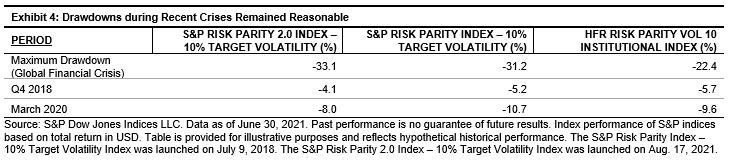
Drawdown periods and performance were similar across the indices. While the S&P Risk Parity 2.0 Index performed better in Q4 2018 and March 2020 than the other indices, it lagged slightly during the Global Financial Crisis.
As expected, leverage for the S&P Risk Parity 2.0 Index dropped during these periods of volatility. Leverage reached the life-to-date max of 263.9% in November 2007, before falling to the lifetime low of 228.7% in August 2009. After slowly growing over the next decade, it reached a high of 257.5% before the start of the COVID-19 pandemic, and subsequently retreated ~10% over the next few months.
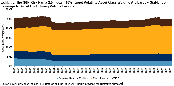
Exhibit 5 shows these leverage drops and the allocated asset class weights over time. The relative commodities and Treasury inflation-protected securities (TIPS) notional allocation have slightly but steadily decreased since inception, with that weight largely being reallocated to fixed income.
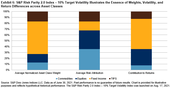
Finally, the core of risk parity is neatly displayed in Exhibit 6. While the notional asset allocation is dominated by fixed income, the lower volatility of that asset class translates into a far smaller risk attribution. On the other hand, commodities necessitate a far smaller notional share to satisfy its allocated risk budget. Following the largely downward trend of interest rates globally during this period, fixed income provided the lion’s share of returns, with equities in second place. TIPS, by nature a hybrid instrument that reflects interest rates and inflation/growth expectations, were largely stable across all three metrics.