Get Indexology® Blog updates via email.

In This List

Protection and Participation

Brent versus WTI Crude

Unusual, but Not Unprecedented

S&P Composite 1500®: Providing Higher Quality U.S. Equity Exposure

The Case for Information Technology Dividend Growers

Protection and Participation

Contributor Image
Fei Mei Chan

Former Director, Core Product Management

S&P Dow Jones Indices

Through Feb. 20, 2020, the S&P 500 Low Volatility Index® is up 5.9% compared to a gain of 4.7% for the S&P 500. Equities roared out of the gate in 2020 but a hiccup in late January allowed Low Vol to catch up and eventually overtake the S&P 500. Those who are familiar with low volatility strategies are not surprised. The strategy’s explicit goal is to muffle the magnitude of movements—in both directions.

By design, Low Vol aims at protection and participation.  A well-designed low volatility index should go down less when the market is down but also go up less when the market is up. Strong markets are the worst environments for low volatility indices, which generally underperform by the largest margin then. But the trajectory of strong markets also play a role in Low Vol’s performance. Choppiness tends to be Low Vol’s best friend. (Relatedly, the S&P 500 High Beta Index usually does well in strong markets but in this choppy environment, the index is up only 2.2% through Feb. 20, 2020.) Strong markets are generally not times for Low Vol to shine but choppiness often allows Low Vol to close the lag (and occasionally even overtake the lead).

Following the market’s strong finish at the end of 2019, it’s not surprising to see that volatility declined across all eleven S&P 500 sectors.

The latest rebalance for the S&P 500 Low Volatility Index is effective after market close Feb. 21, 2020. Industrials had the biggest increase in weight which came largely at the expense of Real Estate.  Consumer Discretionary and Technology experienced the largest reduction in volatility at the sector level but Low Vol only added an extra percent to its Technology holdings while Consumer Discretionary actually experienced a reduction in weight, pointing to higher relative volatility at the stock level.


The posts on this blog are opinions, not advice. Please read our Disclaimers.

Brent versus WTI Crude

Contributor Image
Jim Wiederhold

Former Director, Commodities and Real Assets

S&P Dow Jones Indices

Crude oil is the most abundant and most traded commodity in the world, and it is one of the first places market participants look when seeking commodity exposure. Crude oil prices are also closely watched as investors try to glean clues about global economic growth; even after the collapse of oil prices in 2014, the commodity remains a bellwether for economic activity and market sentiment.

However, it is important to distinguish between the two most commonly traded contracts of crude oil in the markets: Brent and West Texas Intermediate (WTI). Brent refers to oil that is produced in the Brent oil fields and other sites in the North Sea. Brent is the benchmark for African, European, and Middle Eastern crude oil and is often considered the benchmark targeted by OPEC. WTI crude is sourced from the U.S. and is seen as the benchmark in the Western Hemisphere. Both are light, sweet crude oils, although WTI is generally sweeter and lighter than its European counterpart.

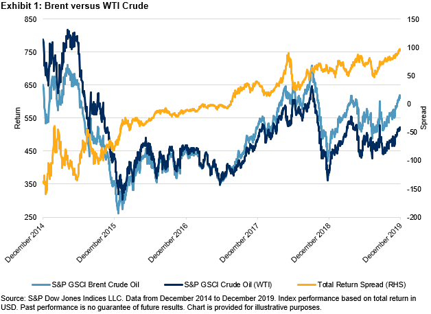
Exhibit 1 shows the performance of the S&P GSCI Brent Crude Oil versus the S&P GSCI Crude Oil (the measure for WTI) over the past five years. Since the lows in early 2016, the S&P GSCI Brent Crude Oil overtook the S&P GSCI Crude Oil and the spread between the two total returns steadily moved higher.

As the American shale revolution has taken hold, cheaper production has led to lower breakeven costs for U.S. producers of WTI crude oil. In 2019, daily U.S. crude production surpassed Russia and Saudi Arabia to rank the country as the world’s largest oil producer. This helped to keep a lid on WTI prices.

Combining to account for about a third of world oil consumption, China and the U.S. are the world’s largest importing countries. The start of the U.S.-China trade war in the summer of 2018 caused large oscillations in the spread between the S&P GSCI Brent Crude Oil and the S&P GSCI Crude Oil (see Exhibit 2). The trade war coincided with sanctions on Iran and Venezuela and a change in OPEC production targets.

The correlation between Brent and WTI prices is close to one, but there are idiosyncratic factors driving the performance of each. Historically, Brent crude oil was more affected by geopolitics than was WTI crude oil. Currently, geopolitical tensions are markedly high in the Eastern Hemisphere, where most of Brent production and distribution takes place. Flare-ups have led to higher beta moves by Brent crude oil during price spikes in comparison with WTI crude oil. A blog by Fiona Boal, Head of Commodities and Real Assets at S&P DJI, details the market reaction to the escalated tensions in January 2020 between Iran and the U.S. and discusses structural changes in the oil markets. OPEC+ has attempted to affect Brent crude oil prices specifically as the oligopoly collectively has acted to maintain certain levels of production in an attempt to manage prices.

WTI crude oil has historically been less sensitive to geopolitics, and short-term price moves have often closely tracked U.S. crude inventories. The largest customers of WTI crude oil differ from those of Brent crude oil. Before the lifting of the 40-year-old export ban by the U.S. in 2015, 94% of WTI was imported by Canada. However, this reliance on one export market has fallen considerably, and the U.S. is now a key exporter to Asia and Europe.

Our colleagues at S&P Global Platts constructed an interactive periodic table of oil illustrating the differences in crude oil grades in more detail.

S&P DJI offers a robust menu of crude oil futures-based indices tracking Brent and WTI crude oil. Variations of each, including leveraged and inverse versions, can be found through the Index Finder on the S&P DJI Index website.

The posts on this blog are opinions, not advice. Please read our Disclaimers.

Unusual, but Not Unprecedented

Contributor Image
Anu Ganti

U.S. Head of Index Investment Strategy

S&P Dow Jones Indices

Since its inception, the S&P 500® Equal Weight Index has outperformed the S&P 500 by 1.4% annually. Year-over-year performance margins, however, are anything but steady. Exhibit 1 shows that the S&P 500 Equal Weight Index and its cap-weight counterpart have gone through many performance cycles over the past 30 years.

Mega caps experienced record performance during the past year, especially in the Information Technology sector, which is up a remarkable 46% over the past 12 months (Apple, Microsoft, Alphabet, Amazon, and Facebook account for 18% of the S&P 500’s weight).

As a result, the performance of the S&P 500 Equal Weight Index, which has a small-cap bias, suffered, lagging the S&P 500 by 6.2% over the past 12 months. Exhibit 2 demonstrates that larger-cap stocks dominated within most sectors of the S&P 500, particularly in Information Technology. Of the 11 equal weight sectors, 9 underperformed their cap-weighted counterparts. Intra-sector weighting in Information Technology and its underweight to the sector were responsible for more than half of Equal Weight’s shortfall.

It is important to understand the historical context of Equal Weight’s recent underperformance. We can look to its history to put the current 6.2% loss in perspective. In August 2000, for example, the S&P 500 Equal Weight Index had underperformed by 5.9% over the trailing 12-month period. Exhibit 3 shows that this underperformance reversed itself in two months, followed by peak outperformance of 29.2% six months later in February 2001.

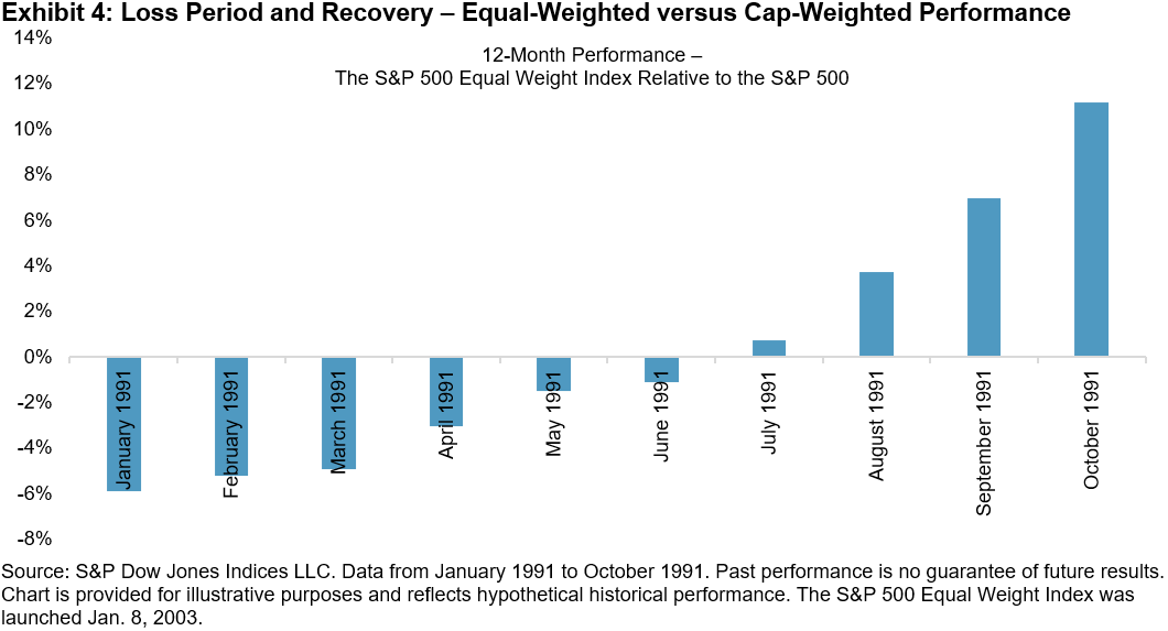
A similar occurrence took place in January 1991, when the Equal Weight underperformed by 5.9% over the trailing 12-month period. Exhibit 4 illustrates that, again, this underperformance reversed itself in the subsequent months with outperformance of 11.2% in October 1991.

We obviously can’t know in advance what the future relative returns of the S&P 500 Equal Weight Index will be. What history teaches us, however, is that Equal Weight’s recent underperformance is unusual, but not unprecedented.

The posts on this blog are opinions, not advice. Please read our Disclaimers.

S&P Composite 1500®: Providing Higher Quality U.S. Equity Exposure

Contributor Image
Hamish Preston

Head of U.S. Equities

S&P Dow Jones Indices

Over the last few years, mega-cap companies have played an increasingly important role in driving U.S. equity market returns. Indeed, the five largest names in the S&P 500® accounted for 16.8% of the index at the end of last year, the highest year-end weight since 1982 and higher than the 16.6% reached at the end of 1999 during the Tech Bubble.

The sizeable representation of mega-cap companies in the U.S. equity market means that indices seeking to measure the performance of the market – such as the S&P Composite 1500 and the Russell 3000 – often have similar weights in these companies.  Perhaps unsurprisingly, the two indices exhibited similar risk/return characteristics, historically.

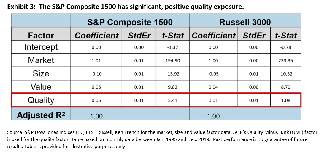
However, it is important to remember that not all indices are created in the same way.  For example, unlike the Russell 3000, the S&P Composite 1500 focuses on profitable U.S. companies by incorporating earnings criteria.  Exhibit 3 shows that this focus meant the S&P 1500 has significant, positive quality exposure, which was also observed for each of the S&P 500, S&P MidCap 400® and the S&P SmallCap 600®.

Differences in index construction, especially the S&P 1500’s earnings screen, may also be relevant given the proportion of IPOs with negative earnings:  2019 saw 74% of IPOs with negative 12-month trailing earnings per share, following 2018’s record-equaling figure (81%).  To the extent that these companies are expected to out- or underperform, differences in index methodologies may help to explain any divergence in index performance.

As a result, the sizeable representation of large-cap stocks means indices designed to track the U.S. equity market often have similar weights in these companies, resulting in similar risk/return profiles.  However, understanding the different factor exposures of the S&P Composite 1500 and its competitors may be useful for assessing the impact of various market drivers on index returns.


The posts on this blog are opinions, not advice. Please read our Disclaimers.

The Case for Information Technology Dividend Growers

Contributor Image
Karina Tjin

Former Analyst, Strategy Indices

S&P Dow Jones Indices

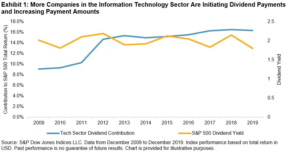
One of the common misconceptions in finance is that companies from the Information Technology (Tech) sector do not pay dividends. While this may have been the trend a long time ago, this has certainly not been the trend over the past 10 years. Over the past 10 years, within the Tech sector of the S&P 500®, 26 companies initiated dividend payments and 59 companies increased their dividends at various points throughout those years, for a total of 376 dividend increases in the sector.

During the same period, with an increasing number of Tech companies paying dividends, the contribution to S&P 500 total return by these companies rose from 9.07% in 2009 to 16.33% in 2019 (see Exhibit 1).

With the changing characteristics of the Tech sector, there is a need to measure the performance of dividend growers in this sector. Responding to market needs, S&P Dow Jones Indices recently launched the S&P Technology Dividend Aristocrats® Index, which seeks to track the performance of Tech companies that have a history of consistently increasing dividends.

Exhibit 2 shows the potential benefit of focusing on these companies: the S&P Technology Dividend Aristocrats Index provided similar risk-adjusted returns to the companies from the S&P TMI that are classified in the Tech sector over three- and five-year horizons, with lower volatility and higher dividend yield. The risk/return profile also compared favorably to the widely followed S&P 500 Dividend Aristocrats Index.

Given the results in Exhibit 2, it is perhaps unsurprising that the S&P Technology Dividend Aristocrats Index experienced lower volatility and lower drawdowns during a recent period of market turbulence. For example, the maximum drawdown for the S&P Technology Dividend Aristocrats Index (-19.5%) during Q4 2018 was less than that for the S&P TMI Information Technology (-23.6%). Exhibit 3 provides us with a more detailed view of the daily drawdown for this period.

The S&P Technology Dividend Aristocrats Index can be complementary to the S&P 500 Dividend Aristocrats, as the latter tends to be underweight in the Tech sector relative to the S&P 500—as of Dec. 31, 2019, the S&P 500 Dividend Aristocrats was 20% underweight in Tech. Given the growing importance of Tech companies in driving S&P 500 returns, the S&P Technology Dividend Aristocrats Index ensures relevant allocation to the sector.

Incorporating the S&P Technology Dividend Aristocrats Index in a portfolio with an existing allocation to the S&P 500 Dividend Aristocrats could provide greater diversification benefits. Exhibit 3 shows the back-tested returns of a hypothetical portfolio that allocates 80% to the S&P 500 Dividend Aristocrats and 20% to the S&P Technology Dividend Aristocrats Index. These weights were chosen to ensure a 20% weight in the Tech sector for the portfolio. We can see that combining the two Dividend Aristocrats indices in a single index resulted in a better risk/return profile than either individual index in the long-term.

The S&P Technology Dividend Aristocrats Index is designed to measure the performance of Tech companies with a history of raising dividends. The performance of the index has shown that it has a similar risk/return profile to the broader sector, with lower volatility and higher dividend yield. Ultimately, the index enables dividend-focused market participants to gain exposure to the Tech sector while maintaining growth and value characteristics.

The posts on this blog are opinions, not advice. Please read our Disclaimers.