Get Indexology® Blog updates via email.

In This List

Measuring Earnings Quality – Balance Sheet Accruals Ratio Versus Earnings Variability

Combining the Quality Factor With Carbon-Efficient Portfolios – A Higher Quality Tilt With a Lower Carbon Footprint

Hurricanes, Housing and the Fed

Higher Concentrations in the S&P 500 could lead to Equal Weight Outperformance

Does Performance Persistence of Active Managers Vary Over Time?

Measuring Earnings Quality – Balance Sheet Accruals Ratio Versus Earnings Variability

Contributor Image
Wenli Bill Hao

Director, Factors and Dividends Indices, Product Management and Development

S&P Dow Jones Indices

The balance sheet accruals ratio (BSA)[1] is widely used in the investment community to measure earnings quality.[2] This is in part due to accruals being perceived as transient and subject to considerable estimations, manipulations, and potential misrepresentations.[3]

BSA is one of the three quality metrics used in the S&P Quality Index Series. We define BSA as the change of a company’s net operating assets over the previous year, divided by its average net operating assets over the last two years. All else equal, the higher the BSA, the lower the company’s earnings quality.

Similarly, some market participants use historical earnings variability (EV) to measure the stability of earning. EV is usually calculated as the standard deviation of year-over-year earnings per share growth over (n-) number of previous fiscal years. The higher the EV, the less stable the earnings growth.

Given that there are various ways of defining and capturing earnings, it is worthwhile to dive deeper into the long-term performance of BSA and EV to understand their return patterns. Using the S&P 500® as our underlying universe, we rank securities in an ascending order based on BSA and EV separately, and divide them into quintiles.

We then select the top quintile (Q1) of each factor to form a cap-weighted hypothetical portfolio. For consistency purposes, we follow the S&P 500 Quality Index rebalancing frequency and rebalance the hypothetical quintile portfolios on a semiannual basis. Thus, the performance of these two factors is based on six-month forward returns.

To avoid survivorship bias, we include companies that currently are and historically have been in the benchmark in an attempt to ensure that the back-tested results will not suffer from survivorship bias. Compustat is the main data source for company-level fundamental data. To prevent look-ahead bias, the fundamental data is lagged by 45 days. We use the S&P DJI stock-level total return data (including both dividend and price return) from May 31, 1995, to May 31, 2018.

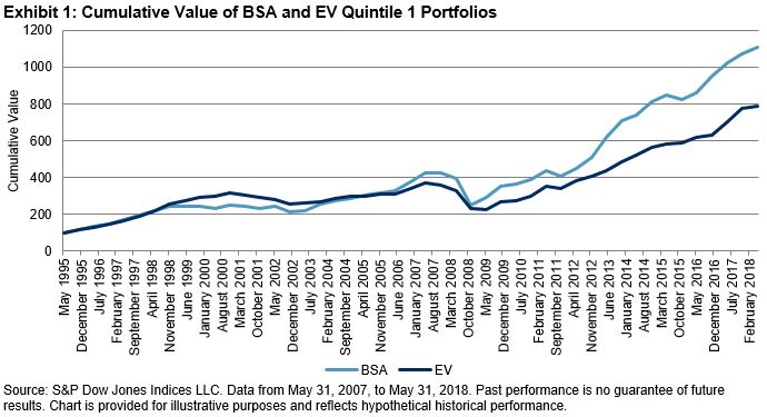
Exhibit 1 shows the cumulative values of the BSA and the EV quintile 1 portfolios over the whole back-tested period, assuming starting value of 100 on May 31, 1995. From May 31, 1995, to May 31, 2018, the cumulative returns of the BSA Q1 portfolio exceeded that of the EV Q1 portfolio. However, we can also see that there are periods when the BSA Q1 portfolio underperformed the EV Q1 portfolio.

Exhibit 2 shows the ratio of BSA quintile 1 portfolio to EV quintile 1 portfolio values. The ratio below 1 indicates that BSA underperformed during the period.

The BSA Q1 portfolio noticeably underperformed the EV Q1 portfolio during the tech bubble period, starting from the second half of 1999 to early 2000, with the BSA to EV performance ratio dipping from 1 to 0.79. The findings are not surprising, given that investors blindly chased earnings growth and ignored earnings quality during that period. The tech bubble burst made market participants consider the importance of earnings quality. The BSA Q1 portfolio started to outperform afterward.

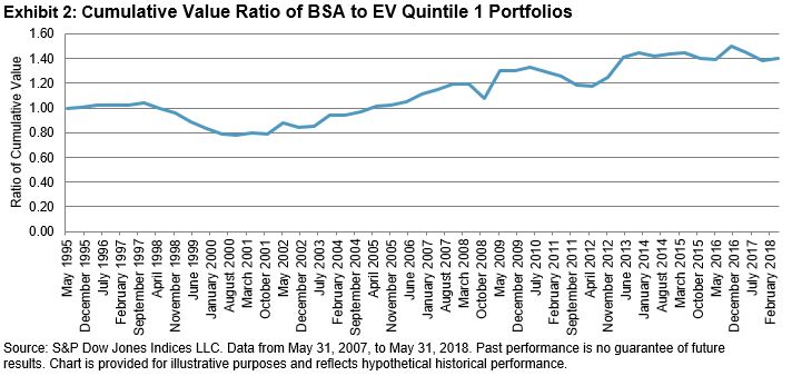
After BSA’s extended outperformance over EV, BSA began to underperform in 2017, as markets focused more on earnings growth. However, if history is any indication, when there is an earnings quality event, market participants should consider turning their attention toward factors that aim to capture earnings quality.

[1]   Sloan, Do Stock Prices Fully Reflect Information in Accruals and Cash Flows About Future Earnings? The Accounting Review, Vol. 71, No. 3, 1996.

[2]   Richardson, Sloan, Soliman and Tuna, Accrual Reliability, Earnings Persistence and Stock Prices, Journal of Accounting & Economics, Vol. 39, No. 3, 2005.

[3]   Ung, Luk and Kang, Quality: A Distinct Equity Factor? S&P Dow Jones Indices Research Report, 2014.

The posts on this blog are opinions, not advice. Please read our Disclaimers.

Combining the Quality Factor With Carbon-Efficient Portfolios – A Higher Quality Tilt With a Lower Carbon Footprint

Contributor Image
Wenli Bill Hao

Director, Factors and Dividends Indices, Product Management and Development

S&P Dow Jones Indices

In a previous blog, we highlighted that carbon-efficient firms tended to be high-quality companies. Moreover, integrated quality + carbon-efficiency hypothetical portfolios tended to have higher risk-adjusted returns and were more carbon efficient than the underlying benchmark. In this blog, we look into the risk and return characteristics of those hypothetical portfolios. This exercise helps us to better understand the sector composition of those integrated portfolios and their return drivers, risk factor exposures, and risk decompositions.

Sector Compositions of Quality + Carbon-Efficiency Portfolios

The sector compositions of quality + carbon-efficiency portfolios were computed as the monthly average of historic sector weights over the whole back-tested period (see Exhibit 1).

We can see that the unconstrained quality + carbon efficiency portfolio has an overweight of 9.77% in Information Technology, an overweight of 8.05% in Consumer Discretionary, and an underweight of 10.24% in Energy in comparison with the underlying benchmark. Sector bets on other sectors are below 5%. On the other hand, the quality + carbon efficiency (SR) portfolio has sector bets less than 3%.

Sector Return Contributions of Quality + Carbon-Efficiency Portfolios

Next, we explore the return drivers behind the sector bets in quality + carbon-efficiency portfolios. Exhibit 2 shows the contribution to returns by sector, calculated as the monthly average of historic sector contributions over the whole back-tested period.

Exhibit 2 demonstrates that larger overweight and underweight in the quality + carbon efficiency portfolio had a positive contribution to active returns, with 1.27% in Information Technology, 0.62% in Consumer Discretionary, and 0.03% in Energy. All three active returns were higher than those in the quality + carbon efficiency (SR) portfolio.

Risk Exposures in Quality + Carbon-Efficiency Portfolios

With respect to active factor bets,[1] compared to the S&P United States LargeMidCap universe, the quality + carbon efficiency portfolios had lower exposures to beta, book-to-price ratio, price volatility, leverage, earning variability, and market cap (see Exhibit 3). On the other hand, quality + carbon efficiency portfolios had higher exposures to earnings-to-price ratio and EPS growth rate.

The results from Exhibits 1, 2, and 3 show that quality + carbon-efficiency portfolios have the desirable characteristics of having limited sector bets and positive return contribution. The risk attribution and decomposition figures also show that quality + carbon-efficiency portfolios have higher quality exposures and lower volatility than the underlying universe.

[1]   Active factor bets are calculated using the commercially available risk model. In this paper, we use the Northfield US Fundamental Risk Model.

The posts on this blog are opinions, not advice. Please read our Disclaimers.

Hurricanes, Housing and the Fed

Contributor Image
David Blitzer

Former Managing Director and Chairman of the Index Committee

S&P Dow Jones Indices

With this morning’s S&P Corelogic Case-Shiller Home Price Indices report that house prices continue to rise even as existing home sales flatten out, analysts are debating if the hoped-for recovery from Hurricane Florence could reignite home sales or simply mean upward price pressure on housing and construction.

Current damage estimates for Florence are close to $20 billion and could rise as flood waters recede and more accurate accounting is possible. This compares to figures of $125 billion for Katrina in 2005 or Harvey last year. Immediate losses in retail sales and production by businesses in the affected area will not be recovered. Some portion of the losses due to damaged and flooded homes will be offset by insurance money. Looking farther ahead, there should be increased economic activity including new jobs from repair and rebuilding efforts focused on housing and infrastructure. Housing demand is anticipated to rise and will probably be met more by new construction than repair of existing homes. The speed and intensity of this activity depends on funding from government programs and insurance. The economic impact of the Florence on the Carolinas is large; however, the national economy will continue growing and hurricane damage will be absorbed over time.

Any increase in inflation should be short lived and modest. As transportation in the affected region returns to normal, supplies of food, building materials and other essentials are not likely to be limited. Expectations of future inflation – a key factor keeping inflation low – will not change. Short-term price jumps will be limited.

Neither the hurricane, rising home prices, nor flattening home sales will change the Fed’s course to another quarter-point increase in the Fed funds rate to be announced on Wednesday afternoon. The central bank’s efforts to normalize monetary policy and shrink its balance sheet will continue into 2019; an unforeseen event that could disrupt the Fed’s plan would have to be far larger than Hurricane Florence.

The posts on this blog are opinions, not advice. Please read our Disclaimers.

Higher Concentrations in the S&P 500 could lead to Equal Weight Outperformance

Contributor Image
Tim Edwards

Managing Director, Index Investment Strategy

S&P Dow Jones Indices

At last Friday’s close, S&P Dow Jones assigned a number of technology and consumer discretionary names into a new “Communication Services” sector classification.  Relative to the old Telecommunication Services definitions, the sector has grown from 3 to 22 companies (not counting dual share listings) and is less concentrated in absolute terms.  However, Communications Services remains a relatively concentrated sector; its top five largest companies account for nearly three quarters of the sector’s capitalisation.

And although the departure of Alphabet and Facebook has slightly reduced the concentration of the top-heavy IT sector, Amazon’s dominance of the Consumer Discretionary sector has been increased by the departure of names such as Netflix and Disney.  In fact, the top 5 names in each sector currently account for more than 50% of capitalisation in 5 out of 11 sectors.

It’s not just sectors that have increased in concentration recently; the overall market has too.  At 15.3% of total market capitalisation, the largest five companies (currently Apple, Microsoft, Amazon, Alphabet and Berkshire Hathaway) represent a larger share of the S&P 500 today than at any year-end since the turn of the century.

Changes in market concentration levels have a natural impact on the performance of equal-weight indices.  As the largest stocks outperform, the market becomes more concentrated in those names and (all else being equal), cap-weighted indices will outperform equal-weight indices.  And as we have previously examined in some detail, the overall performance of equal weight indices seems to be closely tied to trends in concentration, particularly at the sector level.

The present market circumstances, therefore, could present an opportunity for investors to reevaluate equal weight approaches in U.S. equities.  If the risks of the market are concentrated into a select few, high-momentum mega-cap names, one way to manage that risk is to de-allocate from the very largest stocks, and rebalance away from recently outperforming constituents.   And if the current low-correlation environment continues, equal weight indices may also offer an effective way to benefit from the greater diversification potential of putting fewer large eggs in your U.S. equity basket.


The posts on this blog are opinions, not advice. Please read our Disclaimers.

Does Performance Persistence of Active Managers Vary Over Time?

Contributor Image
Berlinda Liu

Former Director, Multi-Asset Indices

S&P Dow Jones Indices

Our most recent Persistence Scorecard shows that relatively few funds can consistently stay at the top. Out of the 557 domestic equity funds that were in the top quartile as of March 2016, only 2.33% managed to stay in the top quartile at the end of March 2018. That means out of the 2,228 domestic equity funds that were in the opportunity set at the start of March 2015, 557 made it to the top quartile by the end of March 2016. Out of those 557, 45 (8.08%) remained in the top quartile at the end of March 2017. By March 2018, only 13 (2.33%) of those 45 funds managed to stay in the top at the end of March 2018.

One inquiry we often receive from readers is regarding the degree of performance persistence throughout time and whether it varies over time. In other words, how do the current report’s findings compare to previous reports? Are the current persistent scores better or worse than the historical figures?

To answer these questions, we take a step back through time to revisit historical reports and summarize the results. Exhibits 1 and 2 show the percentage of funds that managed to remain in the top quartile for three consecutive one-year periods. For example, among all the large-cap funds, 16.36% managed to stay in the top quartile for three straight years starting in March 2003 and ending in March 2005, respectively, while only 6.67% managed to do so in the three years starting in March 2004 and ending in March 2006.

The data show a few interesting findings. The performance persistence of large-cap and mid-cap funds show a long-term downward trend. For example, at the end of March 2003, based on the three prior consecutive years, 16.36% of large-cap funds and 7.69% of mid-cap funds remained in the top quartile. We find that those were the highest performance persistence figures.

We also find that among the domestic equity categories, for funds that were in the top quartile as of March 2016, the percentage that managed to stay in the top quartile in the next two consecutive years is lower than its historical mean and median. The data indicate that persistence scores for March 2018 are significantly lower than those from six months prior for all of the fund categories.

This decline in performance persistence could be partially explained by the volatility and the market shocks experienced in Q1 2018. Funds that had been outperforming in the past might not be able to adjust quickly enough, or the investment style might not be suitable for the new market conditions.

In conclusion, a review of the performance persistence figures over time shows a downward trend over the longer-term horizon for equity funds, indicating an increasing difficulty to stay at the top.

The posts on this blog are opinions, not advice. Please read our Disclaimers.