Get Indexology® Blog updates via email.

In This List

How Will It End?

What do inventories tell us about the economy?

Crude Oil: On Production, Performance, and Roll Yield

How Do Single Factors Perform in Different Market Regimes in India?

With all the News of Higher Interest Rates, Don’t Forget About Floating-Rate Debt

How Will It End?

Contributor Image
David Blitzer

Former Managing Director and Chairman of the Index Committee

S&P Dow Jones Indices

The Fed is raising interest rates, the yields on Treasury notes are climbing, the stock market just had a hyper-speed correct, VIX spiked and the inflation numbers are worrying.  Is there a message buried in all these data?

Maybe not a clear message, but one sure thing and some hints.  The sure thing is that there will be another recession.  Despite the hints, we don’t know when.

Which indicators are more useful?

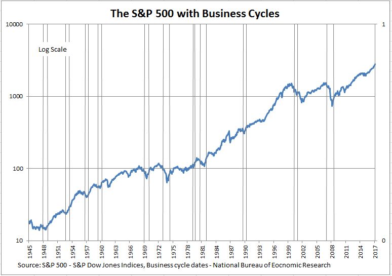
Not the stock market until it is almost too late.  Paul Samuelson noted that the market “predicted nine of the last five recessions.” The chart shows the market with recessions marked – if there were any early warnings, they weren’t very early. A more accurate view might be that the market falls with the economy; it may turn upward slightly ahead of other things.

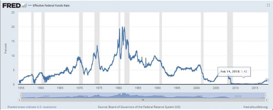
Interest rates, especially the Fed funds rate, are better signals than the stock market. The chart shows that since the 1950’s, the fed funds rate rose to a peak before each recession. In 1990-91, the Fed realized the economy was slipping and switched its policy before the fall. In 1975 the central bank mistakenly thought the recession would be mild and started increasing rates too soon and sent the economy into a tail spin. Even with varying time lags, the Fed funds rate is worth watching.

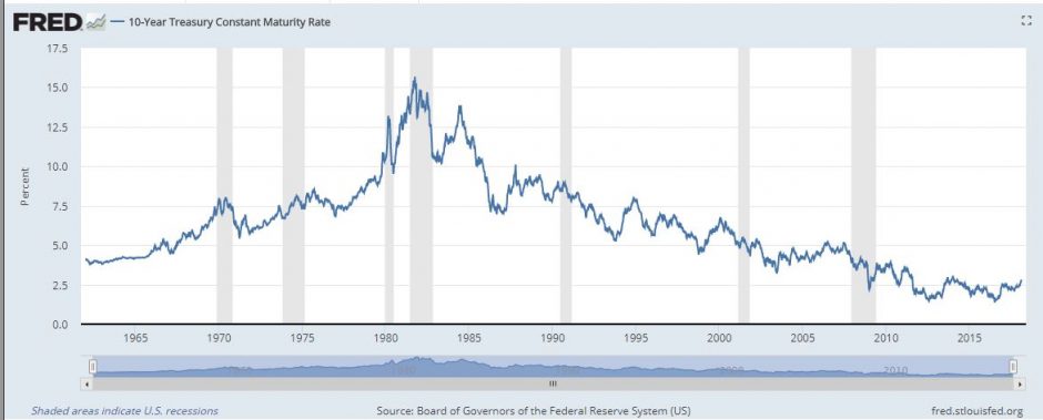
Longer term interest rates, like the ten year T-note, are less useful predictors.  The Fed has direct control of the Fed funds rate but much less ability to control or set the yield on longer term notes or bonds. Moreover, other factors such as the supply and demand for capital drive longer term interest rates. The ten–year Treasury note doesn’t reliably lead the economy.

Despite worry over inflation, it doesn’t tell us much about where the economy is headed. Recessions lower inflation, but inflation doesn’t warn of recessions.

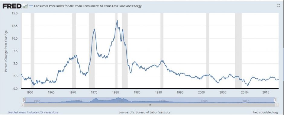
We can extract some useful hints from these figures, if we realize that the last recession-financial crisis combination was not a typical recession. Fortunately was an extremely rare event.  The more typical lead-in to a recession is when rising inflation inspires the Fed to boost interest rates in order to dampen price gains. The push for higher rates is either too fast or lasts too long, and the economy stumbles.  Most recession, when examined carefully, were brought to us when the Federal Reserve System did its job.  Most likely the next recession will follow the pattern.

The Fed seems to have two worries: First, when the next recession comes they will need to dramatically lower interest rates; second, as the economy expands and the unemployment rate falls, inflation will eventually rise.  The solution to both of these is to raise the fed funds rate, as they are doing.  We will have to wait, and see.

The posts on this blog are opinions, not advice. Please read our Disclaimers.

What do inventories tell us about the economy?

Contributor Image
Nick Kalivas

Senior Equity Product Strategist

Invesco

Declining inventories and rising industrial production may create a strong backdrop for value and momentum strategies

  • Falling business inventory ratios have often been a positive economic indicator.
  • With business inventory levels on the decline, value and momentum strategies could be poised to outperform.
  • A strategy that combines value and momentum could serve as a useful way to position portfolios for economic expansion.

One benefit of factor investing lies in the cyclical nature of factors. Because various factors tend to perform differently depending on economic conditions, investors can harness these attributes to their advantage.

For example, value and momentum stocks have often been better-suited for periods of expansion. This is because value strategies tend to invest in cyclical stocks that may benefit from faster economic growth, while momentum strategies operate under the premise that stocks with strong recent performance may continue to outperform over the near term.

It’s my view that the current inventory cycle provides a favorable backdrop for equity prices and makes a compelling case for both value and momentum strategies.

Inventories as a gauge of economic expansion

In recent weeks, the year-over-year growth rates for two inventory-focused ratios have declined — the inventories-to-sales ratio and the durable goods inventories-to-shipments ratio. In my view, these declining ratios could point to an economic backdrop that supports profit growth.

Historically, a declining growth rate in the inventories-to-sales ratio has coincided with increased economic output, as we see in the chart below. Declining inventories relative to sales indicate that demand is outstripping supply — signaling companies to boost production. The opposite is also true. Rising inventories relative to sales can be interpreted as a sign that demand is weak — potentially signaling the need for companies to reduce production.

The chart below illustrates this relationship. I’ve inverted the inventory curve to highlight the close relationship between the two metrics, so what you’re seeing is an inverse relationship between growth in the inventories-to-shipments ratio (blue) and economic output (red), as defined by non-defense durable good shipments, excluding aircraft. 

The following chart shows a similar inverse relationship between growth in the inventory-to-sales ratio and economic output, as defined by industrial production. Here, I’ve also inverted the inventory-to-sales curve to highlight the relationship between the two metrics.

The takeaway from both graphs is that inventory levels and industrial production are closely tied. Thus, factors that perform well during periods of economic expansion could potentially outperform when inventories are falling.

Value or momentum? Why not both?

Despite recent signs of trade tensions with China and uncertainty over NAFTA negotiations, a potential elongation in the economic cycle could provide reason for economic growth. And a strategy that combines both momentum and value may provide a compelling means of positioning portfolios for these conditions.

Consider, for example, the S&P 500 High Momentum Value, which picks the 100 stocks within the S&P 500 with the strongest recent value and price momentum scores. The momentum overlay seeks to avoid value traps by gaining exposure to value stocks that are displaying relative price strength. (A value trap is a stock that appears to be cheap by traditional valuation metrics, such as price-to-book. The trap springs when investors buy into the company at low prices and the stock never improves.)

The posts on this blog are opinions, not advice. Please read our Disclaimers.

Crude Oil: On Production, Performance, and Roll Yield

Contributor Image
Marya Alsati

Former Product Manager, Commodities, Home Prices, and Real Assets

S&P Dow Jones Indices

In November 2017, according to the Energy Information Administration, U.S. crude oil production surpassed 10 million barrels per day for the first time since November 1970. After 1970, it began to decline, dropping bellow 7 million barrels per day in February 1993, below 6 million barrels in March 1999, and then remaining at that level until November 2011, when it began steadily increasing.

How has the performance of crude oil futures contracts fared in comparison to crude oil production? The S&P GSCI Crude Oil was launched on May 1, 1991—with history dating back to 1987—to provide market participants with a reliable and publicly available benchmark for investment performance in the crude oil market.

Exhibit 1 depicts the performance of the S&P GSCI Crude Oil and the daily barrel production of U.S. crude oil from January 1987 until November 2017.

The two series had a negative correlation of 0.23 for the period studied and low or negative annual correlation, which implies that as overproduction and -supply occur in the market, futures prices tend to decline, a pattern that can be more clearly seen after September 2011.

Can increases or decreases in production be seen in the roll yield? The answer is yes and no. The roll yield or roll return, as measured by the excess return of the index minus the spot return, is the difference in the price of the expiring contract and the next eligible contract. Futures contracts expire on a regular basis, and futures-based indices must roll their positions into the next contract to maintain their exposure.

If a commodity’s forward price curve is downward sloping (in backwardation), then the roll process involves rolling into (buying) a futures contract that is trading cheaper than the current futures contract, hence a positive roll yield. However, if the commodity’s forward price curve is upward sloping (in contango), then the roll process would involve rolling into a futures contract that is trading at a higher price than the current futures contract, which results in a negative roll yield.

If the futures in the index are in backwardation regularly over time, and if the incidence of backwardation is higher relative to the degree of contango, then market participants tracking the indices will tend to profit from the roll process.

Analyzing the S&P GSCI Crude Oil roll return for the period between January 1987 and November 2017 (a total of 370 observations) showed that during this period, daily oil production increased or decreased relatively equally. The roll yield appeared more sensitive to declines in production, resulting in a negative yield almost 60% of the time, while an increase in production only resulted in a positive roll yield 43% of the time, implying that shortages or undersupply in the market was more likely to drive up prices than oversupply to weigh down on futures prices. That is likely because crude oil prices are sensitive to factors other than production, such as geopolitical risk and inventory levels.

The posts on this blog are opinions, not advice. Please read our Disclaimers.

How Do Single Factors Perform in Different Market Regimes in India?

Contributor Image
Akash Jain

Director, Global Research & Design

S&P BSE Indices

In continuation to our previous blog titled “Factor Investing 101,” this blog investigates the performance of single factor indices in the Indian equity market. Over the period from October 2005 to June 2017, portfolios for all risk factors we examined—low volatility, momentum, value, quality, dividend, and size (small cap)—outperformed the S&P BSE LargeMidCap (see Appendix A for methodology of factor portfolios). However, only low volatility, quality, and momentum delivered better risk-adjusted return (return per unit of risk) than the S&P BSE LargeMidCap. Among the six factors, low volatility and quality recorded lower return volatility than the benchmark and had the highest risk-adjusted return, while value, dividend, and size displayed much more volatile return than the benchmark (see Exhibit 1).

Macroeconomic and market events affected each factor portfolio in different ways. Factor returns tended to exhibit cyclicality with periods of outperformance and underperformance in different phases of the cycles. In our report, we also examined how various risk factors performed in the Indian equity market across different macroeconomic regimes between October 2005 and June 2017.

Based on our factor performance analysis across business cycles,[1] we observed that value, dividend, and size exhibited strong pro-cyclical characteristics and tended to outperform the benchmark when business activities expanded. In contrast, low volatility, quality, and momentum outperformed the benchmark in both cycle phases but with a higher tendency to outperform the benchmark during business cycle contraction (see Exhibit 2). 

Apart from business cycles, factors also displayed different cyclical behavior across market cycles[2] that we divided into bearish, recovery, and bullish phases based on historical price trends of the S&P BSE SENSEX. Quality and low volatility tended to perform the best in bearish markets. Conversely, value, dividend, and size gained the highest excess returns when the market recovered from equity market troughs. In bullish markets, momentum had the strongest performance among all factors see Exhibit 3).

In addition, we also studied factor performance over investor sentiment regimes, which changed more frequently than market and business cycle phases. We used the rolling 22-day realized return volatility of the S&P BSE SENSEX Price Return as a proxy to measure investor sentiment in the Indian equity market. We divided the examined period into three sentiment regimes: bullish, neutral, and bearish. Bearish investor sentiment is signaled by high levels of realized volatility (values in the bottom decile), whereas bullish investor sentiment is represented by low realized volatility values (values in the top decile), and neutral investor sentiment makes up the periods when the realized volatility values lie between the top and bottom deciles. When market participants were bullish, results showed that value delivered the most excess return, while low volatility had the worst performance. In contrast, momentum and size underperformed, and high-quality stocks were favored by market participants when they were bearish. 

Appendix A: Overview of the S&P BSE Single-Factor Indices and Hypothetical Portfolios
FACTOR INDEX DESCRIPTION
Low Volatility S&P BSE Low Volatility Index The 30 least volatile companies from the S&P BSE LargeMidCap, weighted by inverse proportion to their volatility and subject to a stock capping of 5%.  Volatility is defined as the standard deviation of a security’s daily price return over the one-year period.
Momentum S&P BSE Momentum Index The 30 companies from the S&P BSE LargeMidCap with the highest momentum scores.  Constituents are weighted by the product of momentum score and float-adjusted market capitalization (FMC) and subject to stock capping of a minimum of 5% or three times the FMC weight in the eligible index universe.  Momentum score is computed as 12-month price change, excluding the most recent month, divided by standard deviation of price return for the same period.
Value S&P BSE Enhanced Value Index The 30 companies from the S&P BSE LargeMidCap with the highest value scores, weighted by the product of value score and FMC and subject to sector capping of 30% and stock capping of a minimum of 5% or 20 times the FMC weight in the eligible index universe.  Value score is calculated based on book-to-price, earnings-to-price, and sales-to-price ratios.
Quality S&P BSE Quality Index The 30 companies from the S&P BSE LargeMidCap with the highest quality scores, weighted by the product of quality score and FMC and subject to sector capping of 30% and stock capping of a minimum of 5% or 20 times the FMC weight in the eligible index universe.  Quality score is calculated based on return on equity, accruals ratio, and financial leverage ratio.
Dividend[3] S&P BSE Dividend Portfolio The 30 companies from S&P BSE LargeMidCap with the highest dividend yield, weighted in relative proportions to their dividend yields subject to sector capping of 30% and stock capping of 5%.
Size S&P BSE Equal-Weighted Portfolio All constituents from S&P BSE LargeMidCap weighted equally constitute the portfolio.

Source: S&P Dow Jones Indices LLC. The S&P BSE Dividend Portfolio and S&P BSE Equal-Weighted Portfolio are hypothetical portfolios. Data as of October 2017. Table is provided for illustrative purposes.

Please refer to Factor Performance Across Different Macroeconomic Regimes in India for more information on this research paper.

[1]   A business cycle is defined by the monthly movement of the Organisation for Economic Co-operation and Development (OECD) Composite Leading Indicator (CLI) for India. A rising CLI signals business cycle expansion and a falling CLI signals business cycle contraction (see Appendix A in report for the OECD Composite Indicator business cycles).

[2]   A bearish phase is defined as a period during which the S&P BSE SENSEX goes from peak to trough.  A recovery phase is defined as the 12-month period after the S&P BSE SENSEX trough.  A bullish phase is defined as a period from the end of the recovery phase to the next S&P BSE SENSEX peak (see Appendix B in report for Illustrative Market Cycles).

[3]   The eligibility criteria for the dividend portfolio require that each eligible stock maintains a ratio of dividend-per-share to par value-per-share above 10% for two consecutive years.

The posts on this blog are opinions, not advice. Please read our Disclaimers.

With all the News of Higher Interest Rates, Don’t Forget About Floating-Rate Debt

Contributor Image
Kevin Horan

Former Director, Fixed Income Indices

S&P Dow Jones Indices

The story line for a number of years now has been the “search for yield” and how the recent low-interest-rate environment has been forcing investors down in credit or out the maturity curve in an effort to maintain income though adding risk. Now that interest rates have begun reversing the low-rate environment, fixed-coupon securities may experience downward price pressure to varying degrees depending on the terms of each bond. But for floating-rate securities, the story could be different. As rates have started to increase, income investors are getting the opportunity to earn higher returns on their investments when considering their options.

The U.S. Treasury began issuing floating rate notes (FRNs) in January 2014. To date, these notes have been issued for a term of two years. The FRNs pay varying amounts of interest quarterly until maturity. Interest payments rise and fall based on discount rates in auctions of 13-week Treasury bills. The S&P U.S. Treasury Bond Floating Rate Index and the S&P U.S. Treasury Bond Floating Rate Current 2-Year Index seek to measure the performance of current and previously issued U.S. Treasury floating-rate issuance representing the U.S. Treasury floating-rate market or the most recent 2-year issuance.

Exhibit 1 shows how the yield of these indices had been relatively flat since their inception, which starts with the U.S. Treasury’s inaugural issuance. From October, 2015 to Feb. 13, 2018, the index yields increased from 0.09% and 0.13%, respectively, to their current levels of 1.55% and 1.58%, respectively.

Total rate of returns, of floating-rate indices, have outperformed the similar duration  S&P U.S. Treasury Bill 3-6 Month Index, which has returned 0.01% for the month and 0.13% YTD as of Feb. 13, 2018 (see Exhibit 2).
Exhibit 1: Historic Yield-to-Worst

Source: S&P Dow Jones Indices, LLC. Data as of Feb. 13, 2018. Past performance is no guarantee of future results. Chart is provided for illustrative purposes.


Exhibit 2: Total Rate of Returns

Source: S&P Dow Jones Indices, LLC. Data as of Feb. 13, 2018. Past performance is no guarantee of future results. Chart is provided for illustrative purposes.

As anticipation continues for future rate hikes, FRN performance could further benefit from the interest rate changes. There are strategies designed to meet the needs of those looking to gain income as rates rise.


The posts on this blog are opinions, not advice. Please read our Disclaimers.