Get Indexology® Blog updates via email.

In This List

Most S&P and Dow Jones Islamic Indices Outperform Conventional Benchmarks in 2017

Avoid Unintended Stock Market Bets by Understanding Benchmarks

Don't Shoot the Messenger

Why Did the Majority of A-REIT Funds Outperform in the Past 12 Months?

Impact of Term Structure on VIX® Futures Correlation with Bond Sectors

Most S&P and Dow Jones Islamic Indices Outperform Conventional Benchmarks in 2017

Contributor Image
Michael Orzano

Head of Global Exchanges Product Management

S&P Dow Jones Indices

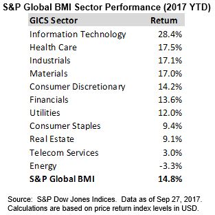
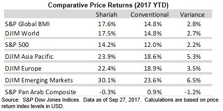
Most S&P and Dow Jones Shariah-compliant benchmarks outperformed their conventional counterparts year-to-date through September 27, 2017 as Information Technology and Health Care – which tend to be overweight in Islamic Indices – have been sector leaders, and Financials – which are underrepresented in Islamic indices – have experienced some weakness.  One notable exception has been in the Middle-East where equity markets have very little exposure to Information Technology and Health Care, so Shariah-compliant indices have not benefited from the strength in these sectors.

Global Equities Power Higher in Q3 Led by Emerging Markets

Global equity markets powered higher in the third quarter adding to strong first half gains.  As of September 27, 2017, the Dow Jones Islamic Market World and S&P Global BMI Shariah Indices each gained more than 17%, respectively, for the year, outperforming the conventional S&P Global BMI by nearly 300 basis points.  Outside of the Middle-east, where the S&P Pan Arab Composite Shariah has underperformed the conventional S&P Pan Arab Composite, all other major regional Shariah-compliant indices remain well ahead of their conventional counterparts through late September.

The S&P 500 notched several new all-time highs in Q3.  However, non-U.S. equity markets have posted the strongest year-to-date returns.  Emerging markets sustained momentum in Q3 as improved economic sentiment and weakness in the dollar boosted interest in the asset class.  The Dow Jones Islamic Market Emerging Markets Index has jumped over 30% for the year through September 27.

MENA Equity Markets Continue to Lag

Despite a rebound in oil prices during Q3, MENA equities continue to lag broader global equity markets as sustained geopolitical concerns have weighed on sentiment and the regional equity market has seen little benefit from the soft dollar and boom in technology stocks that has powered emerging markets more broadly.  The S&P Pan Arab Composite Shariah declined 1.3% in the 3rd quarter through September 27, bringing the year-to-date return slightly into negative territory.  The S&P Qatar BMI has experienced the steepest losses, falling 17.7% year-to-date, while Kuwait has been one of the few bright spots as the S&P Kuwait BMI has gained more than 20% on the year.

The posts on this blog are opinions, not advice. Please read our Disclaimers.

Avoid Unintended Stock Market Bets by Understanding Benchmarks

Contributor Image
Philip Murphy

Former Managing Director, Global Head of Index Governance

S&P Dow Jones Indices

In a recent Financial Planning article,[1] Craig Israelsen advocated using stock market size segments to construct portfolios rather than a total market approach.  His conclusion may be perfectly valid for market participants willing and able to bear greater small-stock exposure, but his analysis fails to adequately take account of this source of risk.  He compared returns of several index funds and reviewed results of combining them in a couple of different ways.  The sample period was from 1999 through 2016, and the funds used in his analysis were:

  • Vanguard Total Stock Market Index Investor (VTSMX);
  • Vanguard 500 Index Investor (VFINX);
  • Vanguard Mid-Cap Index Investor (VIMSX); and
  • Vanguard Small-Cap Index Investor (NAESX).

The results over this 18-year period are summarized in Exhibits 1 and 2.

One of the article’s conclusions is that the Vanguard Total Stock Market Index Investor fund failed to meaningfully capture mid- and small-cap returns within its portfolio, because it is dominated by large-cap stocks and experienced historical returns pretty close to those of the large-cap Vanguard 500 Index Investor fund.  One can debate what is or is not a meaningful difference in performance, but the Vanguard Total Stock Market Index Investor fund returned 63 bps more per year on average than the large-cap fund. That does not seem insignificant and is slightly greater than the performance pick-up of 62 bps per year that Israelsen found over the Vanguard Total Stock Market Index Investor by approximating its market cap weights with individual size segments, which is the 70/20/10 strategy.  This performance enhancement, however, has some dubious underpinnings.

For all of the analysis, including the 70/20/10 strategy, the underlying benchmarks are not all published by the same provider.  This has downstream impacts on performance that are not examined in the article. The underlying benchmarks tracked by each index fund are not obvious from the fund names, with the possible exception of the Vanguard 500 Index Investor, which tracks the S&P 500®.  This is the only index fund in the list that tracks an S&P DJI index; the others track indices published by the University of Chicago’s Center for Research and Security Prices (CRSP).  Combining index funds referencing benchmarks from different index providers often leads to unintended consequences.  According to Morningstar, as of June 2017, 240 stocks were held in both the Vanguard 500 Index Investor and the Vanguard Mid-Cap Index Investor.  These positions accounted for about 14.2% of the former fund and 78.3% of the mid-cap fund.  The overlap is a result of differences in index methodology between S&P DJI and CRSP.  Market participants implementing Craig Israelsen’s portfolio recommendations could potentially make unintended bets if they do not realize incompatibilities between underlying benchmarks. With respect to the 33/33/33 strategy, it bears emphasis that the overlap of stocks in the underlying benchmarks skew what looks like equal weighting on the surface.

In addition to benchmark incompatibility, the mid-cap, small-cap, and total market index funds did not track the same benchmark for the entire sample period.  Prior to April 1, 2011, they tracked different indices. Exhibit 3 shows each fund’s inception date, current benchmark, and when they switched to their current benchmark.

Since all of these index funds seek to replicate the returns of their respective benchmarks (before expenses), changing benchmarks midstream affects the meaningfulness of the analysis.  We don’t know how the index composition of previous benchmarks compares or aligns with composition of current benchmarks.  Therefore, we should not assume any kind of relational consistency between observed historical index fund performance and unknown future performance.  As a workaround, it may be more useful to do similar analysis using back-tested index returns, if they are available going as far back as 1999, rather than the Vanguard index fund returns.

There is certainly nothing wrong with using size segments to overweight or underweight parts of the stock market, but one does not get a free lunch by doing so.  In order to accurately implement a view regarding size or factor tilts, it is beneficial to understand the underlying benchmark methodology and use index funds tracking benchmarks from a single index provider.  When there seems to be value added without explanation, look deeper for its reasons.  Outsize gains from unexplained sources could imply flawed analysis.

[1] https://www.financial-planning.com/news/three-against-one-a-battle-of-index-funds

The posts on this blog are opinions, not advice. Please read our Disclaimers.

Don't Shoot the Messenger

Contributor Image
Anu Ganti

U.S. Head of Index Investment Strategy

S&P Dow Jones Indices

Here are some recent headlines about the consequences of passive investing:

Japan Central Bank’s ETF Shopping Spree Is Becoming a Worry

Passive Market Share to Overtake Active in the US No Later than 2024

Passive investing boom is creating a ‘frightening’ risk for markets

ETFs are taking over the world, and there’s nothing anyone can do to stop them

Let’s Prevent ETFs from Eating the Economy

What all these headlines have in common is that they are inherently misleading.  For instance, the first statement reflects a common misconception that the Bank of Japan (BoJ) owns more than two-thirds of the Japanese stock market.  In fact, the BoJ owns 70% of listed ETFs, and only 2.5% of the capitalization of the market—not exactly an eye-catching headline.  Understanding the importance of passive investing requires us to get both the numerator (passive AUM) and denominator (total market capitalization) correct, and much press commentary is mistaken about one or both.

Calculated properly, how large is passive investing?  S&P DJI’s annual asset survey shows that 15% of the S&P 500®’s capitalization is held in S&P 500 index-based funds.  Expanding these numbers to cover mid- and small-caps as well as other index providers, we estimate that 20% of total U.S. market capitalization is held by passive trackers.  This estimate excludes the factor indices that underlie “smart beta” ETFs.  Factor strategies are not price takers—they trade on fundamental metrics like value or momentum, in much the same way (although at different frequencies) as active managers.

So what does 20% passive market share imply for market efficiency?  Not much.  It is trading, not asset ownership per se, that sets prices, and passive funds’ share of trading is much less than their share of AUM.  Under reasonable assumptions, if index funds’ share of AUM is 20%, their share of total trading would be approximately 5%.  Even if index assets rose to 50% of AUM, which is a commonly expressed fear from the active side, the passive share of trading would still be less than 20%.  Passive price takers are a long way from controlling the market and causing inefficiencies.

Fifty years ago, 100% of market capitalization was actively managed; the shift to 20% passive, with more possibly to come, surely is one of the most important developments in modern financial history.  But it’s important not to confuse means and ends.  The shift to passive management has been, and continues to be, driven by the persistent underperformance of active managersPassive growth is the consequence, not the cause, of active underperformance.  To argue otherwise is to misunderstand the most important thing about it.

The posts on this blog are opinions, not advice. Please read our Disclaimers.

Why Did the Majority of A-REIT Funds Outperform in the Past 12 Months?

Contributor Image
Priscilla Luk

Managing Director, Global Research & Design, APAC

S&P Dow Jones Indices

In the mid-year 2017 SPIVA® Australia Scorecard, the majority of Australian funds underperformed their respective benchmarks across most categories, similar to previous scorecards.  More than 80% of Australian Mid- and Small-Cap funds underperformed the S&P/ASX Mid-Small over the past 12 months.  In contrast, A-REIT funds stood out as the best-performing category versus their benchmark, the S&P/ASX 200 A-REIT, with 87.5% of funds outperforming over the past 12 months (see Exhibit 1).

With falling bond prices and rising bond yields, the S&P/ASX 200 A-REIT declined 11.1% from July 2016 to June 2017, while A-REIT funds suffered less, with losses of 8.6% and 8.3% on an equal- and asset-weighted basis, respectively.  Historically, the most significant benchmark-relative outperformance of A-REIT funds was seen during the global financial crisis in 2008 (see Exhibit 2).

Evidently, the vast majority of A-REIT funds tended to be more defensive than their benchmark over the past five years, as most of them recorded less volatile returns over the one-, three-, and five-year periods.  This characteristic seems to be unique to funds in the A-REIT category and has not been observed in other Australian fund categories (see Exhibit 3).

As Australian A-REIT funds have experienced an extended bull market after the global financial crisis, the majority of the defensive A-REIT funds delivered less pronounced returns than the S&P/ASX 200 A-REIT for most of the time during this period, until the A-REIT sector began to decline in late 2016.  Due to the significant difference in return volatility of A-REIT funds versus their benchmark, measuring A-REIT funds’ performance on a risk-adjusted basis (amount of return divided by amount of risk over the same period) compared with the benchmark is important supplementary information, in particular to A-REIT investors.

The posts on this blog are opinions, not advice. Please read our Disclaimers.

Impact of Term Structure on VIX® Futures Correlation with Bond Sectors

Contributor Image
Berlinda Liu

Former Director, Multi-Asset Indices

S&P Dow Jones Indices

Recently my colleague wrote about the correlation between VIX (spot and futures) and two credit sectors (high-yield and emerging market bonds).  The blog shows that VIX futures exhibit stronger negative correlation than VIX spot and that this stronger negative correlation of bonds to VIX futures than to VIX spot comes mostly from down markets.  In this blog, we further explore the asymmetric correlation between VIX futures and those two credit sectors.

Not limited to VIX, futures markets in general do not tend to move with the spot in the same magnitude.  On rare occasions, the two may even move in opposite directions.  When trading futures, market participants need to take into account an additional cost, the so-called “cost of carry,” of maintaining or holding a position in the market.  The cost of carry can appear in different ways, including interest on bonds, storage cost of commodities, and, in the VIX futures market, roll cost of futures contracts.

The stronger negative correlation of credit bonds to VIX futures than to VIX spot could be explained largely by the change in the futures curve when VIX spikes.  In other words, when the high-yield and emerging bond market is in distress, VIX goes up and the VIX futures curve flips from contango to backwardation, which causes VIX futures to move even further in the opposite direction of the high-yield and emerging market bonds.

To verify this conjecture, we calculated the monthly average roll cost of the S&P 500® VIX Short-Term Futures Index as the monthly average slope between the first-month futures and the second-month futures.  A positive roll cost indicates cost while a negative roll cost indicates yield.

Exhibits 1a and 1b show the monthly roll cost of the S&P 500 VIX Short-Term Futures Index in the months when high-yield and emerging market bonds posted losses between February 2006 and April 2007.  When high-yield bonds were down, the correlation between their monthly return and the monthly roll cost of VIX futures was 75%, indicating that the VIX futures curve was more likely to be in backwardation.  When emerging market bonds were down, the correlation between their monthly return and the monthly roll cost of VIX futures was 56%, also an indicator of backwardation in the VIX futures curve.

Exhibits 1a and 1b also show that larger loss in high-yield and emerging market bonds was usually associated with higher roll yield from VIX futures backwardation.  This is further illustrated in Exhibits 2a and 2b; in the months that high-yield and emerging market bonds posted a loss of more than 3%, VIX futures ten   ded to rise, sometimes even more than the VIX spot, due to the backwardation in the VIX futures curve (or, in other worlds, the yield from the roll of a long VIX futures position).

From the above observation, we conclude that backwardation in the futures term structure explains the stronger correlation between VIX futures and these two bond sectors in down markets.

The posts on this blog are opinions, not advice. Please read our Disclaimers.