Get Indexology® Blog updates via email.

In This List

60% of Japanese Sovereign Bonds Are Experiencing Negative Yields

Capital Market Performance during Three Years of Narendra Modi Government

The Much-Maligned Market Portfolio

Commodities Ex-Energy Are Fine Despite Contango

The Growth of Small Caps in India

60% of Japanese Sovereign Bonds Are Experiencing Negative Yields

Contributor Image
Michele Leung

Former Director, Fixed Income Indices

S&P Dow Jones Indices

In our last piece, we discussed the Bank of Japan’s (BoJ) monetary policy and how the yields of Japanese sovereign bonds have responded since 2016. The latest BoJ minutes released on June 26, 2017, reiterated that it “should continue with the current monetary policy,” while it also stated that it is “necessary to reduce the pace of purchases… in order to secure the stability and sustainability of JGB purchases.”[1]

Now that we understanding that the BoJ currently controls the yield curve by keeping the short-term policy rate at -0.1% and targets the long-term rate at around 0.0%, let’s take a closer look at how it has affected sovereign bonds and the yield curve.

As of June 21, 2017, the S&P Japan Sovereign Bond Index tracks 302 bonds with a total market value of JPY 922 trillion, while the S&P Japan Government Bill Index measures the performance of 24 treasury bills with a market value of JPY 83 trillion. Among these bonds, JPY 607 trillion, or 60% of the overall exposure, have yield-to-maturity in the negative territory.  These sovereign bills and bonds have maturities ranging from 2017 to 2025, with one-half maturing in the next three years (see Exhibit 1).

The  yield curve is demonstrated in Exhibit 2. The 10-year period is the breakeven point where yield hovered around 0.06%, in-line with the BoJ’s target.  The 15-year period had active issuances and the yield was about 0.28%, compared with the 20-year period at approximately 0.50%.  The yield curve became flatter toward longer maturities, i.e. the 30- and 40-year period yields, which were around 0.80% and 1.0%, respectively.

Exhibit 1: Total Market Value in Negative Yields Versus Maturity Year

Exhibit 2: Yield-to-Maturity Versus Maturity

[1]   Source: Bank of Japan.  Data as of June 26, 2017.  https://www.boj.or.jp/en/mopo/mpmsche_minu/minu_2016/index.htm/

The posts on this blog are opinions, not advice. Please read our Disclaimers.

Capital Market Performance during Three Years of Narendra Modi Government

Contributor Image
Ved Malla

Associate Director, Client Coverage

S&P Dow Jones Indices

On May 16, 2014, Lok Sabha election results were announced and India gave a clear mandate to Narendra Modi’s Bharatiya Janata Party to form the government.  Narendra Modi was sworn in as the 14th Prime Minister of India on May 26, 2014, and his government recently completed three years of being in power.  In these three years, the government has made several landmark policy decisions, initiatives that have the potential to affect the Indian economy in a big way.  Some of these initiatives are listed below.

  1. GST – The Goods and Services Tax is the biggest tax reform since independence.
  2. Make in India – Aimed at making India a global manufacturing hub.
  3. Demonetization – Aimed at cracking down on black money.
  4. Skill India – Aimed at providing skill development training to youth.
  5. Digital India – Aimed at digitizing India and moving to cashless transactions.
  6. Start-up India – Aimed at promoting entrepreneurship.
  7. Jan-Dhan Yojana – Aimed at bringing banking services to every household in India.

Capital Market Performances Over the Past Three Years

The S&P BSE SENSEX (TR) value moved from 32,735.68 on May 31, 2014, to 43,944.23 on May 31, 2017; that is a three-year absolute return of 34.24%.  The price return version of the S&P BSE SENSEX closed above the 30,000 mark for the first time on April 26, 2017, at 31,145.80.  The S&P BSE AllCap, a broad benchmark index with over 900 constituents, had a three-year absolute return of 49.90%; Exhibit 1 depicts the total returns of the S&P BSE SENSEX and S&P BSE AllCap for the three-year period ending May 31, 2017.

Exhibit 1: Total Returns of the S&P BSE SENSEX and S&P BSE AllCap 

Source: S&P Dow Jones Indices LLC.  Data from May 31, 2014, to May 31, 2017.  Chart is provided for illustrative purposes.  Past performance is no guarantee of future results.

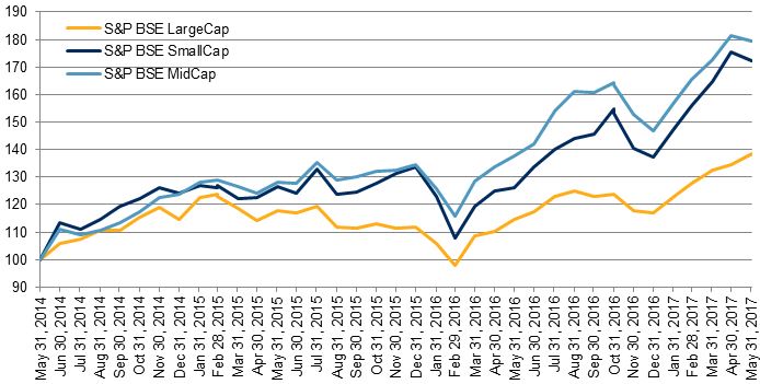
Among the size indices, the three-year absolute return of the S&P BSE MidCap was the highest, at 79.52%, followed by the S&P BSE SmallCap, at 72.11%, while the S&P BSE LargeCap was at 38.56%.  Exhibit 2 depicts the total returns of the S&P BSE LargeCap, S&P BSE MidCap, and S&P BSE SmallCap for the three-year period ending May 31, 2017.

Exhibit 2: Total Returns of the S&P BSE Size Indices

Source: S&P Dow Jones Indices LLC.  Data from May 31, 2014, to May 31, 2017.  Chart is provided for illustrative purposes.  Past performance is no guarantee of future results.

Exhibit 3 below provides the three-year absolute returns of the S&P BSE AllCap series.  We can see that among the sub-sector indices in the S&P BSE AllCap, the S&P BSE Consumer Discretionary Goods and Services and the S&P BSE Finance posted the best three-year absolute returns of 86.99% and 68.45%, respectively, while the S&P BSE Telecom had the worst return of -1.09%.

Exhibit 3: Three-Year Absolute Returns of the S&P BSE AllCap Series
INDEX INDEX VALUE ON MAY 31, 2014 INDEX VALUE ON MAY 31, 2017 3-YEAR ABSOLUTE RETURN
S&P BSE AllCap 2,964.50 4,443.89 49.90%
S&P BSE LargeCap 3,169.73 4,392.10 38.56%
S&P BSE MidCap 9,486.29 17,029.70 79.52%
S&P BSE SmallCap 10,151.26 17,471.09 72.11%
S&P BSE Consumer Discretionary Goods & Services 2,221.81 4,154.63 86.99%
S&P BSE Finance 3,685.57 6,208.31 68.45%
S&P BSE Basic Materials 2,244.72 3,460.52 54.16%
S&P BSE Fast Moving Consumer Goods 8,059.50 12,402.82 53.89%
S&P BSE Healthcare 11,138.54 14,868.22 33.48%
S&P BSE Energy 3,247.41 4,334.31 33.47%
S&P BSE Industrials 2,898.42 3,854.31 32.98%
S&P BSE Information Technology 9,615.65 12,340.20 28.33%
S&P BSE Utilities 1,971.70 2,389.95 21.21%
S&P BSE Telecom 1,364.29 1,349.36 -1.09%

Source: S&P Dow Jones Indices LLC.  Data from May 31, 2014, to May 31, 2017.  Table is provided for illustrative purposes.  Past performance is no guarantee of future results.

The posts on this blog are opinions, not advice. Please read our Disclaimers.

The Much-Maligned Market Portfolio

Contributor Image
Philip Murphy

Former Managing Director, Global Head of Index Governance

S&P Dow Jones Indices

It seems generally acknowledged that no investment strategy should be expected to offer an optimal trade-off between return and risk in all periods.  Yet I often hear criticism of market-cap weighting, presumably because modern portfolio theory (MPT) postulates a hypothetical market portfolio as efficient in the mean-variance sense.  Financial engineers, product developers, and asset managers point to a growing range of alternatively weighted strategies designed to capture various risk premia or market anomalies.  In other words, they seek to harvest greater mean-variance efficiency than cap weighting.  While we all want more return per unit of risk, it is nevertheless worth remembering a few salient characteristics and benefits of cap weighting.

First off, all non-market-cap-weighted strategies aggregate into the market portfolio, which by definition is a cap-weighted portfolio.  Therefore, cap-weighting is the only approach that provides a model of the market.  If one seeks equity returns but has no basis upon which to develop security or factor-level return expectations, buying a model of the market avoids guesswork.

Secondly, market-cap weighting is transactionally efficient and tax efficient, requiring only minimal rebalancing to account for changes in shares outstanding.  I have heard it stated that as companies become larger, there is forced buying of their shares in index funds, but that is not the case.  When a company’s market cap grows, existing shareholders only need to continue holding their shares.  Only net new cash flows into index-based funds (or active funds) produce buying to the extent that asset managers wish to avoid cash drag.  There are also highly liquid exchange-traded derivatives that, in addition to cash market share purchases, offer efficient means of cash equitization.

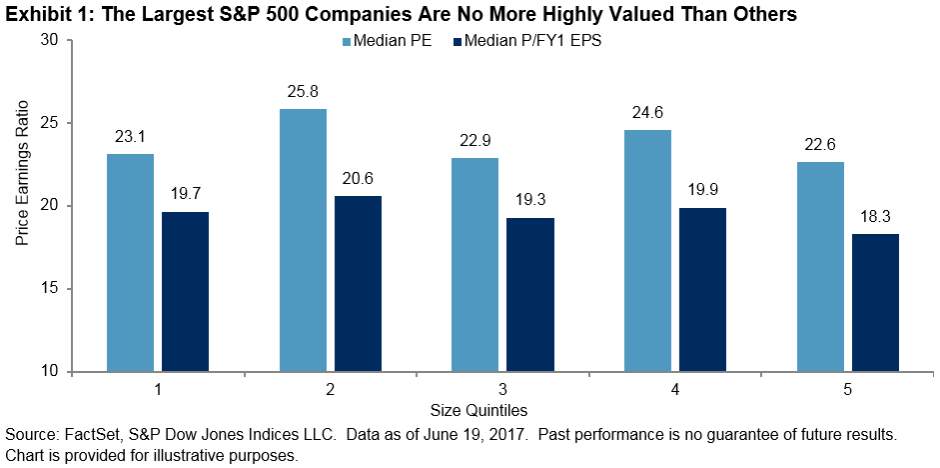
Lastly, and perhaps related to the forced buying theory above, market-cap weighting is criticized for promoting overvaluation and enabling stock price bubbles.  The premise here seems to be that the largest stocks are the most expensive.  There may be historical examples of such conditions, like the bubble in information technology shares in the late 1990s, but these periods are much more the exception than the rule.  As of mid-June 2017, the largest companies in the S&P 500 (those making up Quintile 1 in Exhibit 1) were no more highly valued relative to past earnings—or expected future earnings—than others.

Factors such as value, momentum, and quality, as well as other alternatively weighted investment approaches, may offer enhanced mean-variance efficiency in particular periods, but it is a Herculean task to identify risk premium leadership period to period and year to year.  Many investors would be better off in the long run choosing a model of the market, trying to save more, and identifying an appropriate level of overall equity exposure that considers their circumstances and risk tolerance.  It’s all about blocking and tackling for a lifetime.

The posts on this blog are opinions, not advice. Please read our Disclaimers.

Commodities Ex-Energy Are Fine Despite Contango

Contributor Image
Jodie Gunzberg

Former Managing Director, Head of U.S. Equities

S&P Dow Jones Indices

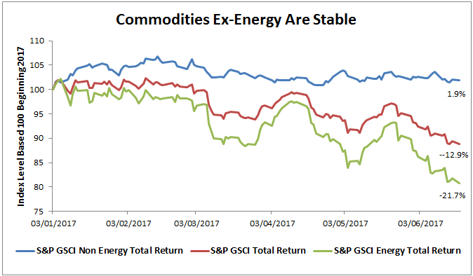
Energy is back in a bear market now led by oil’s slide mainly due to rising output from Libya and Nigeria, two OPEC members exempt from cutting supply.  The S&P GSCI Energy Total Return is on pace for its worst quarter since the fourth quarter of 2015 losing -13.4% quarter-to-date (through June 19, 2017.) This is driven by the Brent crude and (WTI) crude oil in the index that are also having their worst total returns since Q4 2015, losing 13.7% and 13.9%, respectively.  In turn the S&P GSCI Total Return is also suffering with a loss of -8.3% in the quarter thus far, on pace to be its worst quarter since Q4 2015.  However, ex-energy, commodities are doing fine.

Source: S&P Dow Jones Indices. Data ending June 19, 2017.

Though energy’s impact on the broad commodity index is weighing the S&P GSCI Total Return down 12.9% year-to-date, investors are highly interested as commodities have rebounded more than 13% off their bottom on Jan. 20, 2016. Also, ex-energy commodities are up slightly this year with some like wheat (+8.6%,) cattle(+15%,) aluminum (+10.3%) and gold (+7.7%) up substantially.  Now many investors fear political risk, weakness in the financial sector and uncertainty about global economic growth, so turn to gold as a safe haven.  Others seem to like trading around the volatility in oil despite the drop, and the rest of the demand is mainly from the chance to enter the asset class at attractive levels for the longer-term benefits of inflation protection and diversification.

With the renewed interest in commodities as an asset class has also come more concern about contango, a term-structure condition where futures contracts with nearby expiration dates are cheaper than contracts with later-dated expiration dates.  The result of contango is a roll return loss from selling the cheaper, expiring contracts to buy more expensive later-dated ones.  (There is also an opposite condition called backwardation that is profitable to investors.)  Contango happens when there are high storage costs from excess inventories, which has been the case as commodities have been substantially oversupplied.

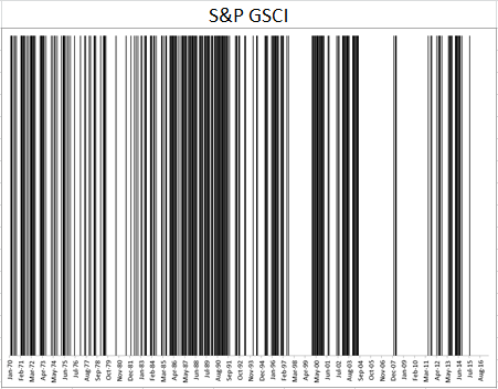
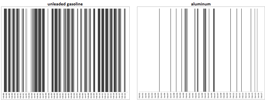
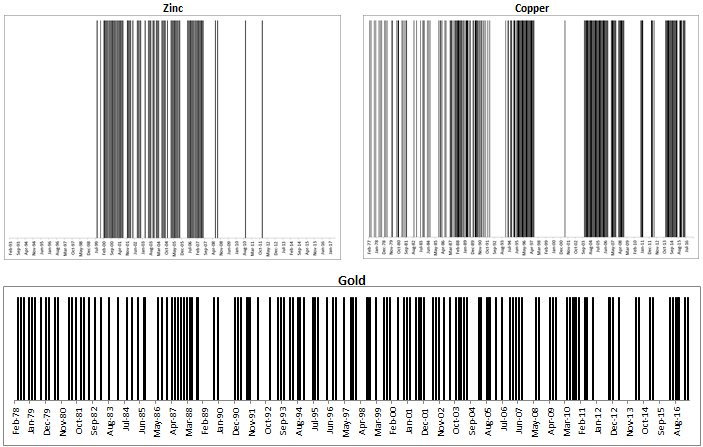
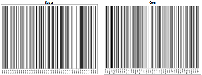
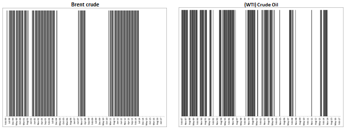
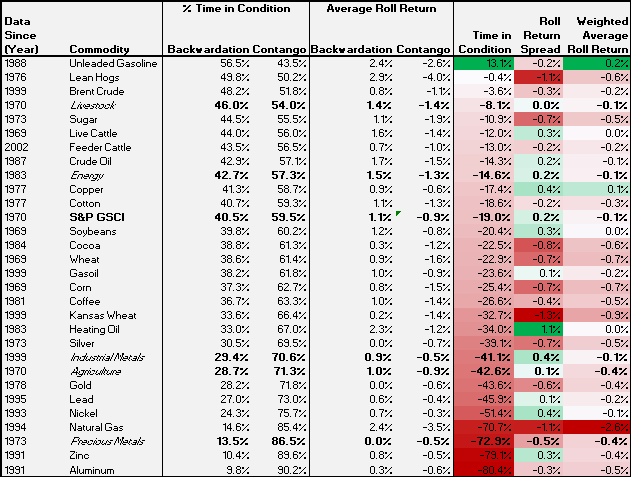
Since commodities have been in contango since Aug. 2015 as measured by the roll yield (excess return – spot return of the S&P GSCI,) many investor think commodities are always in contango.  However, this is certainly not the case, so below are some charts to demonstrate exactly how much time commodities spend in each condition of backwardation and contango.  The black lines represent months in backwardation and the white lines represent months in contango.  Overall, the commodities have spent about 60% of months in contango and 40% in backwardation.  On average the roll return gain from backwardation is 1.1% in a month and the roll loss from contango is -0.9% from contango in a month, yielding a weighted average of about -0.1% in a month over time.

Source: S&P Dow Jones Indices

Unleaded gasoline spends 57% of months in backwardation, the most time of all the commodities. On the other hand, aluminum spends just 10% of its months in backwardation, the least of all the commodities.  On average in a month, the roll return gain from unleaded gasoline is 20 basis points and the loss from aluminum is about 50 basis points.  Note the difference in the pattern of the two term structure charts.

Source: S&P Dow Jones Indices


Most metals (except copper) are oversupplied like aluminum but the pattern of inventory is different.  For example gold is almost always in contango, about 80% of months, loses only about 40 basis points on average since it is relatively cheap and easy to store.  Zinc is almost 90% in contango and loses about the same on average as gold, but again, notice the inventory pattern is quite different with the big block of backwardation shown in black from a shortage. On the other hand, copper is much less oversupplied and is difficult to store so has a more persistent term structure commanding higher premiums, gaining 0.9% on average in backwardated months versus losses of 0.6% during months in contango to average a total monthly gain of 0.1%.

Source: S&P Dow Jones Indices

For perishable commodities in agriculture like sugar and corn, notice how frequently their term structures change as suppliers try to adjust though weather can interfere with decisions.  The inventories are also relatively difficult to store so, the weighted loss on average is -0.7% for corn and -0.5% for sugar.

Source: S&P Dow Jones Indices

Lastly, the most popular commodities, Brent crude and (WTI) Crude oil that are so oversupplied right now, are not always in contango, although they have been in the condition since July (for Brent) and Dec. (for WTI) 2014. For Brent, the 35 months is a new record, following its longest prior streak of 32 months ending in Dec. 2010.  However, (WTI) Crude oil now in its 30th consecutive month in contango has had one longer bout of contango that lasted 36 months ending Oct. 2011.  While they are concurrently in contango, they are not always moving together and the premiums from WTI are greater.  On average WTI gains 1.7% in a month in contango while losing 1.5% during a backwardated month, though Brent loses 1.1% versus a gain of just 0.9%.  These differences drive one of the most popular spread trades and continue to present opportunities that the market has been interested in to trade the volatility.

Source: S&P Dow Jones Indices

Please click on the link here to read about how long the oil contango might last, and to see more detail about the history of backwardation and contango per commodity, please reference the table below.

Source: S&P Dow Jones Indices


The posts on this blog are opinions, not advice. Please read our Disclaimers.

The Growth of Small Caps in India

Contributor Image
Ved Malla

Associate Director, Client Coverage

S&P Dow Jones Indices

Over the past few decades, Indian capital markets have matured, and a large number of Indian market participants are now looking at capital markets as an investment avenue.  Investment in capital markets has grown substantially among all types of market participants—retail, institutional, and even government institutions, where recently the Employee Provident Fund Organization has started to invest in capital markets via exchange-traded funds.

Traditionally, the tendency of market participants has been to buy large-cap, blue-chip companies that form part of large-cap indices like the S&P BSE SENSEX.  However, there has been a paradigm shift in investment patterns—market participants are now going beyond traditional large-cap companies and venturing into companies in the mid-cap and small-cap segments.  This changing investment pattern has been reflected in equity volumes and performance of stocks in these segments.

Small-cap stocks outperformed large-cap stocks by significant margins in the three-year period ending May 31, 2017.  This significant outperformance by small-cap stocks has resulted in more market participants looking at the small-cap segment.

The S&P BSE Indices include two indices in the small-cap space—the S&P BSE SmallCap and the S&P BSE SmallCap Select.

The S&P BSE SmallCap is designed to represent the small-cap segment of India’s stock market; it seeks to track the bottom 15% of the total market cap of the S&P BSE AllCap.  The S&P BSE AllCap consists of over 900 stocks, and around 750 of those are the constituents of the S&P BSE SmallCap.

The S&P BSE SmallCap Select is designed to measure the performance of the 60 largest and most liquid companies in the S&P BSE SmallCap.

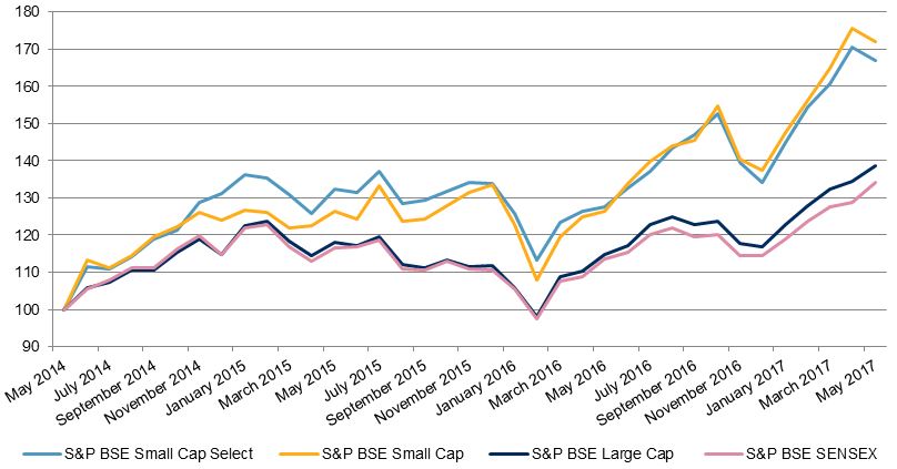
Let us now compare the returns of S&P BSE SmallCap and the S&P BSE SmallCap Select with the returns of large-cap indices like the S&P BSE LargeCap and the S&P BSE SENSEX.

Exhibit 1: Returns
PERIOD S&P BSE SMALLCAP SELECT (%) S&P BSE SMALLCAP (%) S&P BSE LARGECAP (%) S&P BSE SENSEX (%)
1-Year 30.89 36.22 20.78 18.22
2-Year 26.03 36.10 17.51 15.14
3-Year 66.86 72.11 38.56 34.24

Source: S&P Dow Jones Indices LLC.  Data from May 31, 2014, to May 31, 2017.  Past performance is no guarantee of future results.  Table is provided for illustrative purposes and reflects hypothetical historical performance.

In Exhibit 1, we see that in the three-year period ending May 31, 2017, the absolute returns of the S&P BSE SmallCap and S&P BSE SmallCap Select were significantly higher than those of the S&P BSE LargeCap and S&P BSE SENSEX.

Exhibit 2: Index Total Returns

Source: S&P Dow Jones Indices LLC.  Data from May 31, 2014, to May 31, 2017.  Chart is provided for illustrative purposes.  Past performance is no guarantee of future results.

In Exhibit 2, we see that the S&P BSE SmallCap and S&P BSE SmallCap Select consistently outperformed the S&P BSE LargeCap and S&P BSE SENSEX during the three-year period studied.

The significant outperformance by the small-cap segment over the large-cap segment has resulted in an increase in interest in the small-cap segment.

The posts on this blog are opinions, not advice. Please read our Disclaimers.