Get Indexology® Blog updates via email.

In This List

100 Days Later in Mexico

Debt Rising

Three Takeaways From the SPIVA U.S. Year-End 2016 Scorecard

Regime Change? Not according to the VIX term structure…

MidCap: A Sweet Spot in the Indian Equity Market

100 Days Later in Mexico

Contributor Image
Jaime Merino

Former Director, Asset Owners Channel

S&P Dow Jones Indices

100 days…is it a milestone?  Is it a key number?  I’m not sure, but everybody looks like they love to write about it, so I will too.  What I know is in Mexico we have a saying that goes, “If the U.S. sneezes, Mexico gets a cold.”  Following Dennis Badlyans’s post “Does the Outperformance of UDIbonos to MBonos Have Legs?” from January, let’s see how Mexico’s fixed income indices have performed after 100 days with Donald Trump as President of the U.S., as well as how they had performed 100 days before the election when the polls were in the other direction.  Furthermore, how had they performed in the days from the election until he began his presidency?  Eight years ago we were living in different times but, how did the indices perform when Barack Obama began his administration?

First, let’s start by taking a look at Exhibit 1, which shows the overnight reference rate, published by Mexico’s Central Bank (Banxico) and year-over-year inflation over the past 10 years.

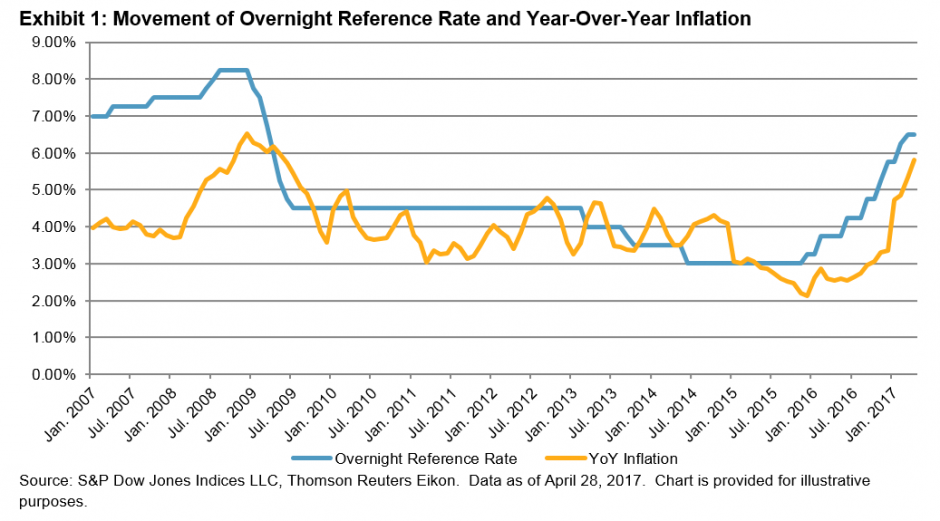
We can see for the overnight reference rate that recent rates are at the same levels as eight years ago, but the trend is the other way around from December 2015 until now, as interest rates have risen 350 bps, following or anticipating U.S. Fed movements.  As for inflation, Mexico is hitting the same numbers as it was eight or nine years ago, after closing December 2015 with a historical minimum of 2.13% and closing April 2017 with 5.82%, far from Banxico’s objective of 3%.  One key component to this movement has been the country’s currency—from December 2015 until now, the Mexican peso has depreciated more than 20% (see Exhibit 2).

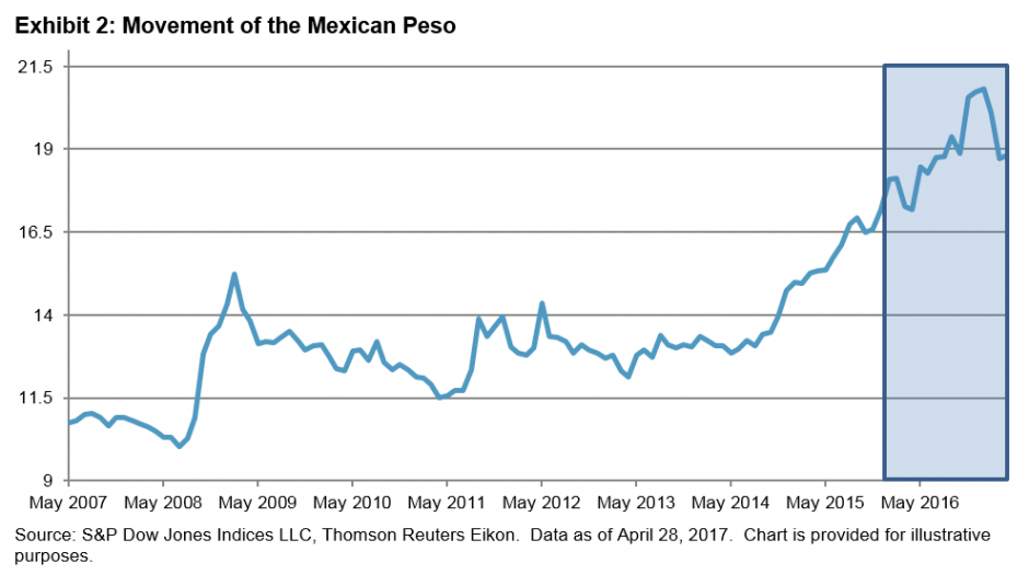
Exhibit 3 shows that 100 days before the election day in 2016, the Mexican peso gained 3% against the U.S. dollar, which could be attributed to the polls at the time.  On the other hand, 100 days after Trump started his administration, the currency appreciated more than 14%.  However, if we look at the period between Nov. 8, 2016 and Jan., 18, 2017, we can see a depreciation of 10.5%, with a historical EOD close for the Mexican peso on Jan. 10, 2017 of MXN 21.95 per dollar.  For Obama’s administration, in the same three windows, we can see a depreciation of 24% 100 days prior election, almost 9% between election day and the start of his administration, and only a 2% appreciation in his first 100 days.  The most relevant part of inflation for both is in the term of 100 days after, where during the Obama period, inflation came down 7.5% and during Trump’s period, it went up 73%.

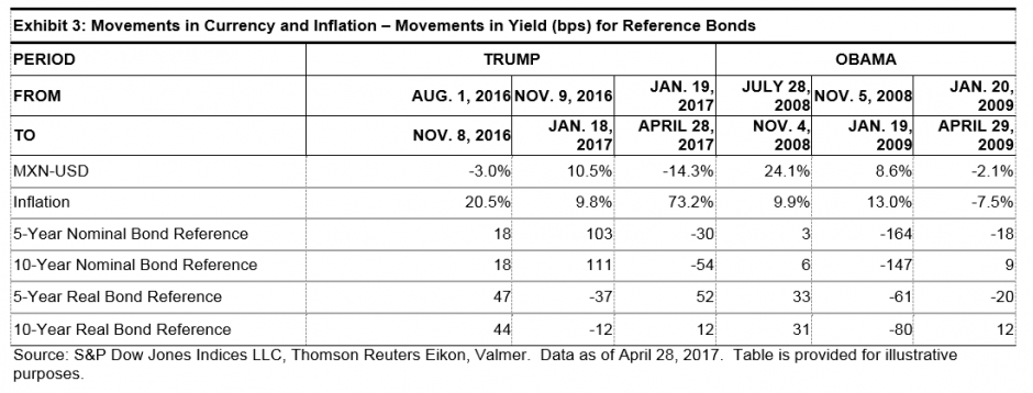
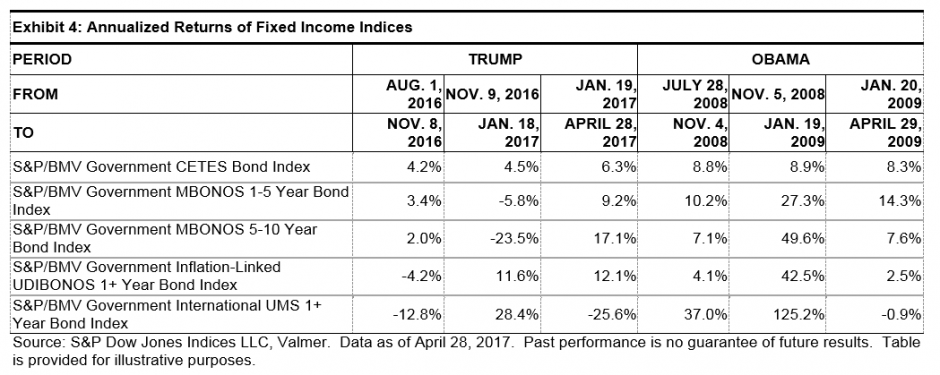
With all these movements, Exhibit 4 shows the annualized returns of five of Mexico’s fixed income indices.[1]  It is interesting that for Obama almost every index, in every window, had positive returns except for the S&P/BMV Government International UMS 1+ Year Bond Index 100 days after, where it was down almost 1%, due to an appreciation of the currency.  For Trump, most of the indices have been outperforming except for the 100 days after period, even with the hikes in the interest rates from Banxico.  Exhibit 3 shows the yield for 5- and 10-year nominal bonds went down 30 bps and 54 bps, respectively, but we can see positive returns in the local indices.  Also with Obama, due to the appreciation of the Mexican peso, the UMS index delivered negative returns.

See you at the next milestone.

[1] More information about these indices can be found here: S&P/BMV Government CETES Bond Index, S&P/BMV Government MBONOS 1-5 Year Bond Index, S&P/BMV Government MBONOS 5-10 Year Bond Index, S&P/BMV Government Inflation-Linked UDIBONOS 1+ Year Bond Index, S&P/BMV Government International UMS 1+ Year Bond Index.


The posts on this blog are opinions, not advice. Please read our Disclaimers.

Debt Rising

Contributor Image
David Blitzer

Former Managing Director and Chairman of the Index Committee

S&P Dow Jones Indices

Outstanding household debt reached a new high in the 2017 first quarter, surpassing the level set in the 2008 third quarter when Lehman Brothers failed and the financial crisis arose.

Despite worrisome comments in the press, there is no cause for concern.  First, default rates on mortgages, auto loans and revolving credit are as low or lower than before the financial crisis. Second, the debt service ratio – the proportion of disposable income needed for the average household to service its debts — is 9.98%, close to its all-time low of 9.92%. Third, increases in consumer credit were responsible for setting a new high but mortgage debt is 10% below its 2008 peak.  Add to this the growth in employment and there are no economic reasons for consumer spending to falter. The charts below provide further insight into household debt.

Default rates for mortgages and autos are both low and stable. “Bank cards” are credit cards like VISA, Mastercard or private label credit cards. These are revolving credit where an outstanding balance can be paid off at any time instead of a fixed payment schedule. The bank card default pattern is less stable and might be creeping up.  The Federal Reserve’s recent survey of Senior Bank Lending Officers revealed that a small portion of banks were tightening credit standards for consumer borrowing.

The second chart shows consumer credit outstanding for both revolving and non-revolving loans. Non-revolving loans include auto loans and are larger than revolving credit. They were less affected by the financial crisis.  The green line is total consumer credit (revolving and non-revolving) as a percentage of personal income. This shows that the use of consumer credit expanded substantially after about 1996, leveled off between 2004 and 2008 and then recovered and continued to rise after the financial crisis. Whether attitudes about using credit shifted or wage gains had difficulty keeping up with spending isn’t clear from these data.

Student loan growth is significantly higher than other segments of consumer credit. In the last ten years, student loan debt grew at a 10% annual rate compared auto loan growth of 4.4% annually and little net gain in revolving credit.

Total mortgage debt for one to four-family homes is rising again and housing is recovering as shown by the red line. More interesting is the blue line which shows that household mortgage debt as a proportion of personal income peaked at over 90% then fell sharply as mortgages were paid off or written off as the economy expanded after the 2007-9 recession ended. Since mortgage debt was one of the problems leading the economy into the financial crisis, this suggests that there may be a cushion should another downturn loom up in the near future.

Debt tends to have a bad reputation in both history and literature. In economics it is worth noting that without debt and borrowing we wouldn’t have a capitalist economy or financial markets.

The posts on this blog are opinions, not advice. Please read our Disclaimers.

Three Takeaways From the SPIVA U.S. Year-End 2016 Scorecard

Contributor Image
Ryan Poirier

Former Senior Analyst, Global Research & Design

S&P Dow Jones Indices

S&P Dow Jones has been reporting the SPIVA® U.S. Scorecard for 15 years now.  Over the years, it has helped contribute to the active versus passive debate in a systematic and objective manner.  While some market segments or styles of active management can be cyclical in their ability to outperform, the secular trends in reported long-term SPIVA numbers remain fairly consistent.  Beginning with the year-end 2016 report, we have a 15-year comparison, which captures a full market cycle.

There are three key observations we can make from the SPIVA U.S. Year-End 2016 Scorecard: (1) the majority of active managers across major equity and fixed income categories, on average, underperformed their benchmarks over the medium- to long-term horizon, (2) the secular bull market since the 2008 financial crisis has been a difficult hurdle for managers to overcome, and (3) most domestic equity managers failed to navigate effectively during volatile periods in the marketplace (one-year period).

Exhibit 1 addresses the first observation for the various asset classes reported in SPIVA.  The scorecard shows that 92.15% of large-cap, 95.40% of mid-cap, and 93.21% of small-cap Funds underperformed their benchmarks, respectively.  This lag in performance is a result of approximately 50% of funds surviving the whole period.  Market participants seek managers that will outperform, but simply having a fund that will survive may be the first checkpoint.

It has also proven difficult for active managers to outperform passive indices during the secular (eight-year) bull market.  U.S. equity managers fared marginally better on a percentage basis over the five-year period; nevertheless, the majority of managers still underperformed the benchmark (see Exhibit 1).  Exhibit 2 shows the yearly performance of the S&P 500 on a total return basis.  Wrong security selection, insufficient market beta exposure, or having a large allocation to cash could possibly result in underperformance, given the strength of the market.

One proposed benefit of active management is that managers have the ability to make tactical asset allocation decisions depending on the market environment, while passive indices cannot do so, as they tend to be structurally constrained by an index rebalancing schedule as laid out in the methodology.  The past one-year period encapsulated three market events that could have been the catalyst for such a tactical strategy: China’s economic concerns (Q1), Brexit (Q2), and perhaps a “risk off” environment in anticipation for an uncertain election result (Q4).  Exhibit 3 shows the performance of the S&P 500 along with the drawdowns from previous highs for each event.  Even amid these market events, 66% of large-cap, 89.37% of mid-cap, and 85.54% of small-cap fund managers underperformed (see Exhibit 4).

The SPIVA Scorecard can act as the starting point for market participants to understand more about the effectiveness of passive investing across major core equity and fixed income categories.  The year-end 2016 report in particular is noteworthy in that it addresses key areas of active management: long-term performance, the impact of secular bull markets on managers’ performance, and managers’ ability to navigate market volatility.

Based on the SPIVA findings, core passive indices can potentially be used in the investment process and portfolio construction.  To learn more about passively implemented core asset allocation strategies, please join us for our webinar In With the Old and the New: Why Core Strategies Are Still Essential.

The posts on this blog are opinions, not advice. Please read our Disclaimers.

Regime Change? Not according to the VIX term structure…

Contributor Image
Tim Edwards

Managing Director, Index Investment Strategy

S&P Dow Jones Indices

Since the U.S. election, a degree of optimism over potential business-friendly legislation – ranging from tax reform to infrastructure spending – has played a significant part in sending benchmarks such as the S&P 500 to new all-time highs.  Whether this optimism will be justified by actual legislation, of course, is a different issue.

At a minimum, recent political developments have the potential to distract the attention of the Trump administration and U.S. Congress, at least in the near term.   But their greater consequence is uncertain.  For example, how should we interpret the fact British bookmakers are offering better-than-even odds on Trump failing to complete a full first term, when the same sources told us Trump had an 80% chance of not being President in the first place?

Both equity and volatility markets provide an inconclusive verdict.  The S&P 500 fell by 1.8% yesterday: this was the biggest daily move since November, but definitely “small potatoes” within a broader historical context.  Far more dramatically, the VIX soared by over 46% yesterday: a huge swing and among the largest daily changes so far this decade.  Yet the gain was only large in percentage terms; VIX remains well below its long-run average, having risen from near-record lows.

In fact, things are looking a little nervous in U.S. equities … but not yet anywhere near panic.  The VIX futures curve gives a broader perspective:

The VIX futures curve is typically upward sloping in the shorter maturities, i.e. VIX futures normally trade at a higher price than the underlying index, especially when the VIX is low.  Indeed, at no point since 2007 has there been a VIX below 16 accompanied by a front VIX future more than a whole point below it – until yesterday, when the VIX closed at 15.59, while the June future closed at 14.23.

This rare occurrence suggests that the current volatility spike is being treated by market participants as a temporary repricing, instead of a structural regime change. 


The posts on this blog are opinions, not advice. Please read our Disclaimers.

MidCap: A Sweet Spot in the Indian Equity Market

Contributor Image
Mahavir Kaswa

Former Associate Director, Product Management

S&P BSE Indices

The mid-cap space has often been described as the “sweet spot” of equity investing—and with good reason.  Mid-cap companies tend to offer a balance between the high growth (and high risk) offered by small caps and the stability (but relatively slower growth) of large caps.  Additionally, Indian mid-caps have a more diverse sector representation than large caps, which have a relatively higher weight in the BSE sector of finance (32%), while small caps have a relatively lower weight in energy.  Over the long term, these unique characteristics have helped India’s mid-cap segment outperform all other size categories on an absolute and risk-adjusted basis (see Exhibits 1, 2, and 3).

Exhibit 1: Index Performance Since Inception

Source: Asia Index Pvt. Ltd.  Data from Sept. 16, 2005, to April 28, 2017.  Index performance based on total return in INR.  Past performance is no guarantee of future results.  Charts are provided for illustrative purposes and reflects hypothetical historical performance.  The S&P BSE LargeCap, S&P BSE Midcap, and S&P BSE SmallCap were launched on April 15, 2015.  The S&P BSE MidCap Select and S&P SmallCap Select were launched on June 15, 2015.

Exhibit 2: BSE Sector Weights
BSE SECTORS BENCHMARK SIZE INDICES INVESTABLE SIZE INDICES
S&P BSE LARGECAP S&P BSE MIDCAP S&P BSE SMALLCAP S&P BSE SENSEX S&P BSE MIDCAP SELECT S&P BSE SMALLCAP SELECT
Basic Materials (%) 6.4 11.5 13.3 1.1 13.7 12.2
Consumer Discretionary (%) 11.0 14.5 24.1 10.2 11.5 19.7
Energy (%) 10.8 7.4 1.3 11.5 9.6 0.0
Finance (%) 32.2 24.1 18.1 32.7 23.2 29.7
FMCG (%) 10.3 8.8 5.2 11.1 6.8 0.0
Healthcare (%) 5.1 10.9 7.3 5.9 11.6 10.1
Industrials (%) 8.1 13.7 22.3 9.4 16.7 17.3
Information Technology (%) 10.9 1.7 4.2 12.3 1.8 4.9
Telecom (%) 2.0 1.2 0.8 1.7 0.0 0.0
Utilities (%) 3.2 6.3 3.4 4.1 5.3 6.0
Total (%) 100.0 100.0 100.0 100.0 100.0 100.0

Source: Asia Index Pvt. Ltd.  Data as of April 28, 2017.  Table is provided for illustrative purposes.

As of April 28, 2017, mid-cap stocks comprised 85 companies and approximately INR 18,61,340 crores (USD 11,416 billion) in total market cap, as measured by S&P BSE MidCap, representing nearly 16% of the broad market S&P BSE AllCap.

As of June 15, 2015, Asia Index Pvt. Ltd launched some investable size indices—the S&P BSE MidCap Select and S&P BSE SmallCap Select, which include the top 30 and 60 stocks, respectively, after relatively stringent liquidity filters.

Exhibit 3 demonstrates that for the 10-year period ending April 28, 2017, the S&P BSE MidCap and S&P BSE MidCap Select consistently outperformed their peer size indices.  Unsurprisingly, Indian mid-cap companies experienced higher volatility than large-cap companies but lower volatility than small-cap companies.  However, market participants were more than compensated for the higher risk, as the S&P BSE MidCap and S&P BSE MidCap Select recorded higher risk-adjusted returns.

Source: Asia Index Pvt. Ltd.  Data from Sept. 16, 2005, to April 28, 2017.  Index performance based on total return in INR.  Table is provided for illustrative purposes and reflects hypothetical historical performance.

A unique combination of potential for higher growth than large caps and relatively better stability (lower volatility) than small cap, along with diversification across BSE sectors, has led the S&P BSE MidCap and S&P BSE MidCap Select to outperform their large- and small-cap counterparts over the long term.

ICICI Prudential Asset Management Company last year launched an ETF that tracks the S&P BSE MidCap Select.

The posts on this blog are opinions, not advice. Please read our Disclaimers.