Get Indexology® Blog updates via email.

In This List

Index Basics: Calculating an Index’s Total Return

Real Estate and Financials Sectors Strike Divergent Paths Following GICS® Restructure

How Did Indian Equities and Fixed Income Fare in 2016?

Will The U.S. Oil Bath Wipe Industrial Gains Clean?

Impact of Rising Interest Rates on Small-Cap Indices

Index Basics: Calculating an Index’s Total Return

Contributor Image
Reid Steadman

Former Managing Director, Global Head of ESG & Innovation

S&P Dow Jones Indices

Total return indices deserve more attention.  They more closely represent what an investor actually takes home: the return of an index, plus dividends paid and reinvested in the index.  Their better-known counterparts, which only track price changes in securities—often called “price return indices”1—get all the fanfare (see “Dow Hits 20,000 for the First Time”).  Total return indices, on the other hand, are often quietly downloaded and placed in a chart halfway through a financial advisor’s presentation.

Though I doubt people will ever stop looking at price return indices first, a step in the right direction is for investors to develop a better understanding of how total return indices work so they will use them more often.

How Total Return Indices Are Calculated

The aim of a total return index is to reflect the full benefit of holding an index’s constituents over a given time.  This means reinvesting dividends into the index by adding them, period by period, to the price changes of the index portfolio.  But how do you add dividends—which are valued in dollars, euros, and other currencies—to an index, which is expressed in points?

The trick is one you learned in fifth grade, to establish a common denominator.  This is done by dividing the dividends paid over a period by the same divisor used to calculate the index.  This gives you “dividends paid out per index point.”  The equation is as follows.

Formula 1 Total Return Post

The next step is to adjust the price return index value for the day, not the total return index, using the following formula, which combines the dividends and index price change.

Formula 2 Total Return Post

Finally, to apply this adjustment to the total return index series, which accounts for a full history of dividend payments, this value is multiplied by the previous day’s total return index level.

Formula 3 Total Return Post

Again, the process is to (1) find the dividends per index point, (2) adjust the price return index, and then (3) apply this adjustment to the previous day’s total return index value.

The Power of the Total Return

Market participants often underestimate the power of dividends.  Exhibits 1 and 2 show the price and total return indices for the S&P 500® and the Dow Jones Industrial Average®.

Total_Returns_Ex1 Total_Returns_Ex2

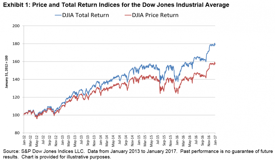
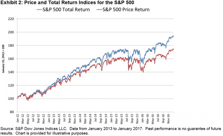
These charts show five years of index values, ending in January 2017.  By the end of this period, the total return indices for the Dow Jones Industrial Average and S&P 500 were ahead of their price return counterparts by 13.5% and 11.3%, respectively.

The next time an index—likely a price return index—hits a major milestone and is noted in the media, take the time to go to the S&P Dow Jones Indices website to see how the total return version of this same index performed.  With dividends included, the index will have done even better than journalists and the talking heads on television are acknowledging.

1   “Price return indices” should not be confused with “price-weighted indices.”  In price-weighted indices, the most famous of which is the Dow Jones Industrial Average, components are assigned weights according to the level of their individual prices.  A “price return index” is any index with any weighting scheme that only accounts for price changes in the underlying securities.  The DJIA is a price return index and a price-weighted index.  The S&P 500 is a price return index, but market-cap weighted, not price weighted.

The posts on this blog are opinions, not advice. Please read our Disclaimers.

Real Estate and Financials Sectors Strike Divergent Paths Following GICS® Restructure

Contributor Image
Michael Orzano

Head of Global Exchanges Product Management

S&P Dow Jones Indices

The past few months have served as a timely example of why it is beneficial for real estate to stand alone as its own equity sector.

Between Sept. 16, 2016, when real estate was carved out of financials as its own GICS sector, and the end of January 2017, the S&P 500® Financials gained 22%, leading all 11 sectors.  Meanwhile, the S&P 500 Real Estate declined 2%—the worst-performing sector (see Exhibit 1).

Exhibit 1: Financials Sector Has Vastly Outperformed Real Estate Since the GICS Structure Change

Exhibit 1 Sectors Diverge

Why has this happened?   In short, financials has been buoyed by prospects for higher interest rates and expectations of reduced regulation from the new Trump administration.  On the other hand, rising interest rates have weighed on the real estate sector, which had benefited from the low interest rate environment of the past several years.  This divergence is not all that surprising given the fundamental differences between real estate and financials businesses and the macroeconomic drivers that affect these industries.

The recent separation of real estate from financials facilitates greater transparency into sector performance trends and allows market participants to have greater precision in asset allocation decisions.  The past few months have been a clear sign of why it was time for a change.

The posts on this blog are opinions, not advice. Please read our Disclaimers.

How Did Indian Equities and Fixed Income Fare in 2016?

Contributor Image
Mahavir Kaswa

Former Associate Director, Product Management

S&P BSE Indices

What a year 2016 was—from concerns about slowing down of the Chinese economy and a surprise vote by the UK to exit the EU to a continued trend of low-to-negative interest rates among major economies globally, demonetization in India, the shocking victory of Donald Trump in the U.S. presidential election, and finally, the U.S. Federal Reserve ending the year with a hike of 25 bps in short-term interest rates. Throughout the year, market participants kept asking “what next?”

While global markets, as measured by the S&P Global BMI, were up 8.84% for the year, if U.S. equities’ 12.61% return is excluded, the gain was 4.95%.  The S&P Developed BMI and S&P Emerging BMI posted positive total returns of 8.6% and 11.30%, respectively.

Backed by a rally in crude oil and metal prices globally, the S&P GSCI (the first major investable commodity index) gained 11.37% in 2016.

Indian Equities

Despite various negative events, Indian equities gained in 2016.  Backed by a normal monsoon, low inflation, falling key lending rates, an under-control fiscal deficit, and a relatively stable currency, India’s bellwether index, the S&P BSE SENSEX, and the S&P BSE AllCap (India’s benchmark index) ended the year with total returns of 3.5% and 5.1%, respectively.  The majority of their gains for the year were achieved during the second and third quarters, as most of the key benchmark indices ended positive during those two quarters (see Exhibit 1).India 2016 Exhibit 1

The S&P BSE MidCap was the best-performing size index, with a total return of 9.3%, while the S&P BSE SmallCap continued to be worst-performing size index, with a total return of 2.7% in 2016.

Among key BSE sector indices, the S&P BSE Basic Materials posted the highest total return for the year, with 33.5%, due to increase in global commodity prices.  A cash crunch caused by demonetization hurt the S&P BSE Consumer Discretionary Goods & Services the most, as during Q4 2016 it posted the worst total return of -9.9%.  2016 was one of the worst years for the S&P BSE Telecom since the financial crisis, with a total return of -20.9%.

Indian Fixed Income

Compared to calendar year 2015, Indian bond market posted higher returns in 2016 due to falling interest rates. The S&P BSE India Government Bond Index and the S&P BSE India Corporate Bond Index posted positive returns of 13.5% and 11.1%, respectively.  The S&P BSE India 10 Year Sovereign Bond Index posted an impressive total return of 14.2%, outperforming the S&P BSE SENSEX by more than 10.7% in 2016.India 2016 Exhibit 2

Outlook

Among other things, market participants may want to keep an eye on the upcoming budget, the Goods and Services Tax implementation, the Reserve Bank of India’s view of future interest rate movements and inflation, global commodity prices, and the U.S. Federal Reserve’s potential decision to further increase interest rates.  Although demonetization is expected to have a short-term negative impact on the GDP growth rate, it is expected to help expand the formal economy, due to a push for digitization.

The posts on this blog are opinions, not advice. Please read our Disclaimers.

Will The U.S. Oil Bath Wipe Industrial Gains Clean?

Contributor Image
Jodie Gunzberg

Former Managing Director, Head of U.S. Equities

S&P Dow Jones Indices

U.S. home prices hit a new record high as measured by the S&P CoreLogic Case-Shiller U.S. National Home Price NSA Index setting an all-time high in three consecutive months (with data ending in Nov.) It’s not the only indicator showing signs of growth and inflation as U.S. consumer spending accelerated in December as households bought motor vehicles and cold weather boosted demand for utilities amid a rise in wages, pointing to sustained domestic demand that could spur economic growth in early 2017.

January was an eventful month with President Trump’s inauguration, and with his new administration promising to cut taxes, it could accelerate consumer spending. Although Trump’s economic policy is still unfolding, consumer confidence has surged and commodities ex-energy are having their strongest start since 2012, up 4.4% in Jan., the 9th strongest in history since 1970.

However, energy, the worst performing sector in Jan., detracted from both the S&P GSCI Total Return and DJCI (Dow Jones Commodity Index). Energy lost 4.7% in the S&P GSCI Total Return for an overall monthly loss of 1.4%, while energy lost 5.1% in the DJCI limiting its gain to 0.7% in Jan. The bigger energy sector loss in the DJCI comes from its heavier liquidity-based weight to natural gas, the worst performing commodity in Jan. with a total return loss of 16.1%, but the greater energy sector impact on the S&P GSCI is attributed to the heavier weight in the sector from the index’s world-production weight.

Two forces weighing on petroleum now are production decisions from OPEC and the U.S., and the tax policy that will potentially create a disparity between incentives of producers and processors by encouraging producers to export, but processors to buy domestically.  If this promotes more domestic oil production, holding WTI crude oil will likely continue to be more expensive than holding brent.  Jan. marked the second consecutive month the negative roll yield on WTI was bigger than for brent, diluting an extra 62 basis points for the month – after losing an extra 67 basis points last month for the biggest combined loss since Aug.-Sep. 2016.  If this U.S. production continues to rise, it could take another 2 years to reach equilibrium before setting a record long stretch of contango.  Additionally, the gas price will need to rise more (from the tax) than the oil prices falls in order to keep inflation up.  In Jan. unleaded gasoline lost about 5.5% more than oil, which is pretty significant, but once the tax kicks in, that might change.

Despite losses in all 6 commodities in the energy sector, 13 of 24 commodities were still positive in Jan.  Livestock was the other losing sector, down 1.1% for the month. Agriculture and precious metals gained 3.5% and 5.5%, respectively for the month.  Industrial metals gained 5.4%, making it the best performing sector in Jan.

It’s difficult to attribute any commodity performance to Trump yet since he only took office on Jan 20, but it looks like oil fundamentals are holding based on production while aggregate demand hopes are driving industrial metals.  The S&P GSCI Industrial Metals average rolling correlation is increasing significantly since the election with the average rolling 30-day correlation rising to 0.60 from 0.37 while the 90-day that is smoother is rising from 0.38 to 0.50.

Source: S&P Dow Jones Indices

While industrial metals are sensitive to their unique supply issues, the higher correlation does show strength from aggregate demand.  4/5 industrial metals were positive in Jan. (nickel slightly lost,) which shows strength. Historically, this many industrial metals only rise together about 1/3 of the time, and all 5 rise together only about 1/5 times.

Inside the S&P GSCI Industrial Metals Total Return sector, lead performed particularly well gaining 17.9%, delivering its best month since July 2010 and 11th best ever on record (since Jan. 1995.)

Source: S&P Dow Jones Indices

Last, the weaker dollar from the year’s beginning may have also significantly boosted industrial metals, especially lead, that typically gains most from a weaker dollar, gaining on average over 7% for every 1% the dollar falls.


The posts on this blog are opinions, not advice. Please read our Disclaimers.

Impact of Rising Interest Rates on Small-Cap Indices

Contributor Image
Aye Soe

Former Managing Director, Global Head of Core and Multi-Asset Product Management

S&P Dow Jones Indices

Rising interest rates certainly has become a central investment theme going into 2017.  The 10-Year Treasury yield closed at 2.48% on Jan. 27, 2017, representing an increase of nearly 103 bps from six months ago.  Research has shown that equities tend to perform better following a rate hike, if inflation levels are moderate.  However, return expectations on small-cap securities are mixed, as conventional wisdom dictates that small-cap securities require more capital, and therefore higher borrowing costs, for growth.  It is therefore important to examine the potential performance behavior of small-cap indices in a rising rate environment.

To understand the sensitivity of small-cap securities to changes in interest rates, we performed a linear regression using the monthly returns of two headline small-cap indices, the S&P SmallCap 600 and the Russell 2000, against monthly changes in the 10-Year U.S. Treasury rates.  The regression equation is estimated on a rolling 36-month basis, and the average estimated beta coefficients for the two indices are shown in Exhibit 1.1

SmallCap Rising Rate Exhibit 1

We can see that, on average, both small-cap indices have positive exposure to rate increases.  In particular, the Russell 2000 exhibited slightly higher positive sensitivity to changes in rates.  For every 1% positive change in 10-Year yield, the returns of S&P SmallCap 600 increase by 5.6% on average, whereas the returns of Russell 2000 increase by 6%.  However, the difference in coefficients (sensitivities) of the two indices is not statistically significant at the 95% confidence level.

Against that backdrop, we used observable returns of the two indices and interest rate changes to analyze further.  We divided the test period into three interest rate regimes—decreasing, neutral, and increasing—based on rolling quarterly changes in 10-Year U.S. Treasury yields computed on a monthly basis, and we compared the average performance of the two small-cap indices during those periods (see Exhibit 2).

SmallCap Rising Rate Exhibit 2

The data shows that during those periods in which the 10-Year U.S. Treasury yields rose by more 50 bps, both small-cap indices delivered returns north of 7% on average.  Similarly, during those periods in which 10-Year yields remained neutral or rose less than 50 bps, both indices still delivered positive returns of 4% or more.  Therefore, we can observe that neutral or rising rate environments can favor smaller-cap names.  Conversely, during those periods in which yields decline by more than 50 bps, both small-cap indices posted negative returns, with the Russell 2000 losing more than the S&P SmallCap 600.  The finding is not surprising, given that the Russell 2000 historically has higher sensitivity to rate changes than the S&P SmallCap 600.

Lastly, we went back and examined periods over the past 22 years2 during which the 10-Year U.S. Treasury yields rose meaningfully, defined as rate increases of 100 bps or more from trough to peak, and we computed the corresponding cumulative returns of the two small-cap indices as well as the S&P 500 (see Exhibit 3).  The data supports that equities in both large-and small-cap segments stand to gain in rising rate environments.  The data, however, refutes conventional wisdom that small-cap securities are disadvantaged by rate hikes.  It is possible that there are macroeconomic and fundamental factors, such as economic growth and valuations that are driving the performance of small-cap names during periods of rising rates.  We intend to explore this deeper in a follow up blog post.

Based on observable realized returns and yield changes, our analysis shows that small-cap securities outperform on an absolute basis as well as on a relative basis when compared to their large-cap counterparts.

Exhibit 3: Period Analysis of 10 Year Rate Changes and Performance of Broad Market Equity Indices

SmallCap Rising Rate Exhibit 3

The equation is estimated as follows: SmallCap Rising Rate Formula

Based on the earliest available data for the two small-cap indices.

The posts on this blog are opinions, not advice. Please read our Disclaimers.