Get Indexology® Blog updates via email.

In This List

Real Estate and Financials Sectors Strike Divergent Paths Following GICS® Restructure

How Did Indian Equities and Fixed Income Fare in 2016?

Will The U.S. Oil Bath Wipe Industrial Gains Clean?

Impact of Rising Interest Rates on Small-Cap Indices

Using Factor Analysis to Explain the Performance of Dividend Strategies

Real Estate and Financials Sectors Strike Divergent Paths Following GICS® Restructure

Contributor Image
Michael Orzano

Head of Global Exchanges Product Management

S&P Dow Jones Indices

The past few months have served as a timely example of why it is beneficial for real estate to stand alone as its own equity sector.

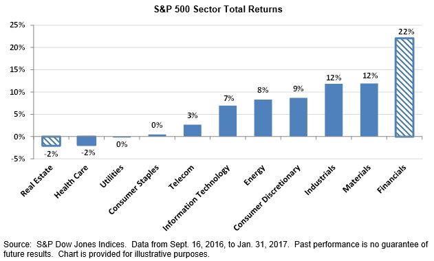
Between Sept. 16, 2016, when real estate was carved out of financials as its own GICS sector, and the end of January 2017, the S&P 500® Financials gained 22%, leading all 11 sectors.  Meanwhile, the S&P 500 Real Estate declined 2%—the worst-performing sector (see Exhibit 1).

Exhibit 1: Financials Sector Has Vastly Outperformed Real Estate Since the GICS Structure Change

Exhibit 1 Sectors Diverge

Why has this happened?   In short, financials has been buoyed by prospects for higher interest rates and expectations of reduced regulation from the new Trump administration.  On the other hand, rising interest rates have weighed on the real estate sector, which had benefited from the low interest rate environment of the past several years.  This divergence is not all that surprising given the fundamental differences between real estate and financials businesses and the macroeconomic drivers that affect these industries.

The recent separation of real estate from financials facilitates greater transparency into sector performance trends and allows market participants to have greater precision in asset allocation decisions.  The past few months have been a clear sign of why it was time for a change.

The posts on this blog are opinions, not advice. Please read our Disclaimers.

How Did Indian Equities and Fixed Income Fare in 2016?

Contributor Image
Mahavir Kaswa

Former Associate Director, Product Management

S&P BSE Indices

What a year 2016 was—from concerns about slowing down of the Chinese economy and a surprise vote by the UK to exit the EU to a continued trend of low-to-negative interest rates among major economies globally, demonetization in India, the shocking victory of Donald Trump in the U.S. presidential election, and finally, the U.S. Federal Reserve ending the year with a hike of 25 bps in short-term interest rates. Throughout the year, market participants kept asking “what next?”

While global markets, as measured by the S&P Global BMI, were up 8.84% for the year, if U.S. equities’ 12.61% return is excluded, the gain was 4.95%.  The S&P Developed BMI and S&P Emerging BMI posted positive total returns of 8.6% and 11.30%, respectively.

Backed by a rally in crude oil and metal prices globally, the S&P GSCI (the first major investable commodity index) gained 11.37% in 2016.

Indian Equities

Despite various negative events, Indian equities gained in 2016.  Backed by a normal monsoon, low inflation, falling key lending rates, an under-control fiscal deficit, and a relatively stable currency, India’s bellwether index, the S&P BSE SENSEX, and the S&P BSE AllCap (India’s benchmark index) ended the year with total returns of 3.5% and 5.1%, respectively.  The majority of their gains for the year were achieved during the second and third quarters, as most of the key benchmark indices ended positive during those two quarters (see Exhibit 1).India 2016 Exhibit 1

The S&P BSE MidCap was the best-performing size index, with a total return of 9.3%, while the S&P BSE SmallCap continued to be worst-performing size index, with a total return of 2.7% in 2016.

Among key BSE sector indices, the S&P BSE Basic Materials posted the highest total return for the year, with 33.5%, due to increase in global commodity prices.  A cash crunch caused by demonetization hurt the S&P BSE Consumer Discretionary Goods & Services the most, as during Q4 2016 it posted the worst total return of -9.9%.  2016 was one of the worst years for the S&P BSE Telecom since the financial crisis, with a total return of -20.9%.

Indian Fixed Income

Compared to calendar year 2015, Indian bond market posted higher returns in 2016 due to falling interest rates. The S&P BSE India Government Bond Index and the S&P BSE India Corporate Bond Index posted positive returns of 13.5% and 11.1%, respectively.  The S&P BSE India 10 Year Sovereign Bond Index posted an impressive total return of 14.2%, outperforming the S&P BSE SENSEX by more than 10.7% in 2016.India 2016 Exhibit 2

Outlook

Among other things, market participants may want to keep an eye on the upcoming budget, the Goods and Services Tax implementation, the Reserve Bank of India’s view of future interest rate movements and inflation, global commodity prices, and the U.S. Federal Reserve’s potential decision to further increase interest rates.  Although demonetization is expected to have a short-term negative impact on the GDP growth rate, it is expected to help expand the formal economy, due to a push for digitization.

The posts on this blog are opinions, not advice. Please read our Disclaimers.

Will The U.S. Oil Bath Wipe Industrial Gains Clean?

Contributor Image
Jodie Gunzberg

Former Managing Director, Head of U.S. Equities

S&P Dow Jones Indices

U.S. home prices hit a new record high as measured by the S&P CoreLogic Case-Shiller U.S. National Home Price NSA Index setting an all-time high in three consecutive months (with data ending in Nov.) It’s not the only indicator showing signs of growth and inflation as U.S. consumer spending accelerated in December as households bought motor vehicles and cold weather boosted demand for utilities amid a rise in wages, pointing to sustained domestic demand that could spur economic growth in early 2017.

January was an eventful month with President Trump’s inauguration, and with his new administration promising to cut taxes, it could accelerate consumer spending. Although Trump’s economic policy is still unfolding, consumer confidence has surged and commodities ex-energy are having their strongest start since 2012, up 4.4% in Jan., the 9th strongest in history since 1970.

However, energy, the worst performing sector in Jan., detracted from both the S&P GSCI Total Return and DJCI (Dow Jones Commodity Index). Energy lost 4.7% in the S&P GSCI Total Return for an overall monthly loss of 1.4%, while energy lost 5.1% in the DJCI limiting its gain to 0.7% in Jan. The bigger energy sector loss in the DJCI comes from its heavier liquidity-based weight to natural gas, the worst performing commodity in Jan. with a total return loss of 16.1%, but the greater energy sector impact on the S&P GSCI is attributed to the heavier weight in the sector from the index’s world-production weight.

Two forces weighing on petroleum now are production decisions from OPEC and the U.S., and the tax policy that will potentially create a disparity between incentives of producers and processors by encouraging producers to export, but processors to buy domestically.  If this promotes more domestic oil production, holding WTI crude oil will likely continue to be more expensive than holding brent.  Jan. marked the second consecutive month the negative roll yield on WTI was bigger than for brent, diluting an extra 62 basis points for the month – after losing an extra 67 basis points last month for the biggest combined loss since Aug.-Sep. 2016.  If this U.S. production continues to rise, it could take another 2 years to reach equilibrium before setting a record long stretch of contango.  Additionally, the gas price will need to rise more (from the tax) than the oil prices falls in order to keep inflation up.  In Jan. unleaded gasoline lost about 5.5% more than oil, which is pretty significant, but once the tax kicks in, that might change.

Despite losses in all 6 commodities in the energy sector, 13 of 24 commodities were still positive in Jan.  Livestock was the other losing sector, down 1.1% for the month. Agriculture and precious metals gained 3.5% and 5.5%, respectively for the month.  Industrial metals gained 5.4%, making it the best performing sector in Jan.

It’s difficult to attribute any commodity performance to Trump yet since he only took office on Jan 20, but it looks like oil fundamentals are holding based on production while aggregate demand hopes are driving industrial metals.  The S&P GSCI Industrial Metals average rolling correlation is increasing significantly since the election with the average rolling 30-day correlation rising to 0.60 from 0.37 while the 90-day that is smoother is rising from 0.38 to 0.50.

Source: S&P Dow Jones Indices

While industrial metals are sensitive to their unique supply issues, the higher correlation does show strength from aggregate demand.  4/5 industrial metals were positive in Jan. (nickel slightly lost,) which shows strength. Historically, this many industrial metals only rise together about 1/3 of the time, and all 5 rise together only about 1/5 times.

Inside the S&P GSCI Industrial Metals Total Return sector, lead performed particularly well gaining 17.9%, delivering its best month since July 2010 and 11th best ever on record (since Jan. 1995.)

Source: S&P Dow Jones Indices

Last, the weaker dollar from the year’s beginning may have also significantly boosted industrial metals, especially lead, that typically gains most from a weaker dollar, gaining on average over 7% for every 1% the dollar falls.


The posts on this blog are opinions, not advice. Please read our Disclaimers.

Impact of Rising Interest Rates on Small-Cap Indices

Contributor Image
Aye Soe

Former Managing Director, Global Head of Core and Multi-Asset Product Management

S&P Dow Jones Indices

Rising interest rates certainly has become a central investment theme going into 2017.  The 10-Year Treasury yield closed at 2.48% on Jan. 27, 2017, representing an increase of nearly 103 bps from six months ago.  Research has shown that equities tend to perform better following a rate hike, if inflation levels are moderate.  However, return expectations on small-cap securities are mixed, as conventional wisdom dictates that small-cap securities require more capital, and therefore higher borrowing costs, for growth.  It is therefore important to examine the potential performance behavior of small-cap indices in a rising rate environment.

To understand the sensitivity of small-cap securities to changes in interest rates, we performed a linear regression using the monthly returns of two headline small-cap indices, the S&P SmallCap 600 and the Russell 2000, against monthly changes in the 10-Year U.S. Treasury rates.  The regression equation is estimated on a rolling 36-month basis, and the average estimated beta coefficients for the two indices are shown in Exhibit 1.1

SmallCap Rising Rate Exhibit 1

We can see that, on average, both small-cap indices have positive exposure to rate increases.  In particular, the Russell 2000 exhibited slightly higher positive sensitivity to changes in rates.  For every 1% positive change in 10-Year yield, the returns of S&P SmallCap 600 increase by 5.6% on average, whereas the returns of Russell 2000 increase by 6%.  However, the difference in coefficients (sensitivities) of the two indices is not statistically significant at the 95% confidence level.

Against that backdrop, we used observable returns of the two indices and interest rate changes to analyze further.  We divided the test period into three interest rate regimes—decreasing, neutral, and increasing—based on rolling quarterly changes in 10-Year U.S. Treasury yields computed on a monthly basis, and we compared the average performance of the two small-cap indices during those periods (see Exhibit 2).

SmallCap Rising Rate Exhibit 2

The data shows that during those periods in which the 10-Year U.S. Treasury yields rose by more 50 bps, both small-cap indices delivered returns north of 7% on average.  Similarly, during those periods in which 10-Year yields remained neutral or rose less than 50 bps, both indices still delivered positive returns of 4% or more.  Therefore, we can observe that neutral or rising rate environments can favor smaller-cap names.  Conversely, during those periods in which yields decline by more than 50 bps, both small-cap indices posted negative returns, with the Russell 2000 losing more than the S&P SmallCap 600.  The finding is not surprising, given that the Russell 2000 historically has higher sensitivity to rate changes than the S&P SmallCap 600.

Lastly, we went back and examined periods over the past 22 years2 during which the 10-Year U.S. Treasury yields rose meaningfully, defined as rate increases of 100 bps or more from trough to peak, and we computed the corresponding cumulative returns of the two small-cap indices as well as the S&P 500 (see Exhibit 3).  The data supports that equities in both large-and small-cap segments stand to gain in rising rate environments.  The data, however, refutes conventional wisdom that small-cap securities are disadvantaged by rate hikes.  It is possible that there are macroeconomic and fundamental factors, such as economic growth and valuations that are driving the performance of small-cap names during periods of rising rates.  We intend to explore this deeper in a follow up blog post.

Based on observable realized returns and yield changes, our analysis shows that small-cap securities outperform on an absolute basis as well as on a relative basis when compared to their large-cap counterparts.

Exhibit 3: Period Analysis of 10 Year Rate Changes and Performance of Broad Market Equity Indices

SmallCap Rising Rate Exhibit 3

The equation is estimated as follows: SmallCap Rising Rate Formula

Based on the earliest available data for the two small-cap indices.

The posts on this blog are opinions, not advice. Please read our Disclaimers.

Using Factor Analysis to Explain the Performance of Dividend Strategies

Contributor Image
Nick Kalivas

Senior Equity Product Strategist

Invesco

Factor tilts have resulted in divergent dividend strategy performance following the November elections

November’s US elections have buoyed investor optimism about the potential for tax reform, increased infrastructure spending, reduced regulation and accelerating economic growth. These expectations led to a 0.75% spike in the 10-year Treasury yield between Nov. 8 and Dec. 16, and a 5.2% increase in the US dollar, as measured by the US Dollar Index.1

Still, by historical standards, interest rates remain low. Nearly a decade ago, the 10-year Treasury yield finished 2007 at 4.02%; it now stands near 2.50%.1 When adjusted for inflation, even the 0.75% bump in the 10-year Treasury yield amounts to a modest 0.40% increase. Compare that with the average annual real (inflation-adjusted) increase in the 10-year Treasury yield between January 1962 and November 2016 of 2.40%.1

Shouldn’t dividend stocks be underperforming?
Global demand for dividend-paying exchange-traded funds (ETFs) is strong, as evidenced by robust flows of over $20 billion in 2016; US-based ETFs accounted for more than half of that amount.1 The appeal of dividend-paying stocks is clear, as dividends can help provide a nice offset to rising inflation, while most fixed-coupon debt cannot hedge against rising prices.

Nonetheless, the timing of recent gains is counterintuitive; typically, rising interest rates cause dividend-paying shares to lag. This is because yield-seeking investors tend to trade out of dividend stocks and into bonds when interest rates rise. This can be seen in the chart below, which depicts the relationship between the excess monthly return of dividend-paying stocks (represented by the S&P 500 Low Volatility High Dividend Index relative to the S&P 500 Index) to the monthly change in the 10-year Treasury yield. Note the inverse relationship, with higher yields creating a drag on the excess returns of dividend payers.

Capture

Dividend stock performance running contrary to long-term trends
With yields rising, dividend stocks are bucking this long-term trend, although performance has varied by index. Following the Nov. 8 election through Dec. 16, the S&P 500 Low Volatility High Dividend Index lagged the S&P 500 Index by only five basis points, returning 5.76%, while the NASDAQ US Dividend Achievers 50 Index outpaced the S&P 500 Index by 3.20%, returning 9.01%.1 These counterintuitive returns may have investors wondering about the reasons behind the results.

One way to analyze portfolio returns is through factor exposure. Both the S&P 500 Low Volatility High Dividend Index and the NASDAQ US Dividend Achievers 50 Index are dividend-based indexes, but each has different factor tilts beyond just dividends, which can affect performance.

Let’s take a closer look:

  • The S&P 500 Low Volatility High Dividend Index has a value factor load of 0.51 and a growth factor load2 of -0.60, meaning that it is more of a value-oriented index than a growth index.1 Keep in mind that value stocks outperformed growth stocks following the election. From Nov. 8 through Dec. 16, the S&P 500 Value Index rose 8.66%, compared with 5.81% for the S&P 500 Index and just 3.07% for the S&P 500 Growth Index, which helps explain the strong performance of the S&P 500 Low Volatility High Dividend Index.1 Put another way, meaningful value exposure and negative growth exposure helped to mute the impact of rising rates – boosting index performance.
  • By contrast, the NASDAQ Dividend Achievers 50 Index did not have material value exposure, but did have negative exposure to the growth factor (-0.43). More importantly, the index had a negative factor load (-0.90) to large-cap stocks, with 44% of its holdings in smaller-cap stocks.1 Thus, with the S&P SmallCap 600 Index outpacing the large-company S&P 500 Index by 10.35% from Nov. 8 through Dec. 16, the  strong performance of the NASDAQ Dividend Achievers 50 Index is no great mystery.1

Factor exposure matters
To reiterate: While dividend-paying stocks may have surprised investors with their robust performance in the face of rising interest rates following the Nov. 8 election, much of this performance can be explained by factor tilts. In this case, exposure to value and smaller-cap stocks helped mitigate the impact of rising interest rates. As you can see, factors are not only valuable building blocks for constructing portfolios, but also useful tools for gauging portfolio performance.

The posts on this blog are opinions, not advice. Please read our Disclaimers.