Get Indexology® Blog updates via email.

In This List

Growth, Value and Apple

How Active Should Active Management Be?

Asian Fixed Income: A Quest for High-Quality Chinese Corporate Bonds

Rieger Report: Consumer Driven Economy? Uh Oh

Rieger Report: Oil State Municipal Bonds Doing Fine

Growth, Value and Apple

Contributor Image
David Blitzer

Former Managing Director and Chairman of the Index Committee

S&P Dow Jones Indices

The news that Berkshire Hathaway purchased a billion dollars of Apple stock sparked questions – Will S&P DJI re-classify Apple as a value stock? How are stocks divided between growth and value? Among growth and value, which is ahead year-to-date?

Currently S&P DJI classifies Apple as a growth stock. Growth-value classifications are reviewed annually in December based on a quantitative analysis of financial factors. Whether Apple’s classification is changed depends on the how the numbers add up when the next review is done.

Each stock is assigned a value score and a growth score. The value score is based on the book-to-price, earnings-to-price and sales-to-price ratios. The growth score is based on momentum over 12 months; the changes in earnings per share and the growth of sales per share, each over the last three years.  Scores are normalized to make the numbers comparable. Then the stocks in the S&P 500 are ranked by the ratio of their growth score to their value score. The first third of the rankings – highest ratio of growth to value – are growth stocks, the last third – lowest ratio of growth to value – are value stocks and the middle third are apportioned between growth and value based on their scores.

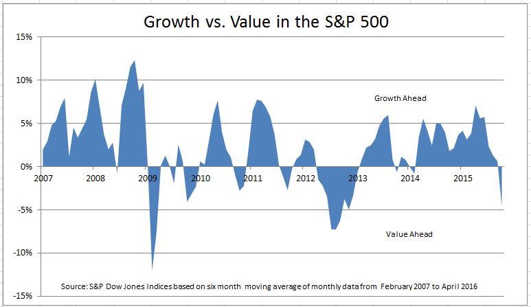
The result is the S&P 500 Growth index and the S&P 500 Value index. These can be used to tell which style lead, or lagged, during past market moves.  The chart compares the performance of the growth and value indices since early 2007 when Apple announced the first iPhone.  The shaded area shows the percentage change in the growth index over the last six months less the percentage change in the value index over the same six month period.  Above the horizontal axis growth is winning, below the axis value is winning.

The indices also let analysts benchmark a stock against other stocks with similar characteristics.  The second chart compares Apple to both the S&P 500 Growth and S&P 500 Value. The data are re-based to a common starting point of 100 in February 2007. The chart uses a logarithmic scale so that both Apple (which rose by 10 times) and the indices (which rose by a lot less) can be shown on the same page.  Apple outpaced both growth and value. Of course, past performance is no guarantee of the future and whether Apple is growth or value at the next review remains to be seen.

A detailed description of the growth and value indices is in S&P U.S. Style Indices Methodology available on www.spdji.com

The posts on this blog are opinions, not advice. Please read our Disclaimers.

How Active Should Active Management Be?

Contributor Image
Craig Lazzara

Former Managing Director, Index Investment Strategy

S&P Dow Jones Indices

Most active managers fail most of the time, at least if we take their underperformance of passive benchmarks as evidence of failure.  The evidence of this failure is so widespread, and so consistent, that even dyed-in-the-wool active managers no longer deny it.

Instead, we often hear that the cause of unsuccessful active management is that it isn’t active enough.  Active managers, it’s said, knowing that their performance will be compared to a passive benchmark, are reluctant to deviate too much from that standard.  They therefore hold too many positions they don’t find especially attractive, simply because these stocks provide diversification and reduced tracking error relative to their benchmark index.  The proposed remedy is for active managers to use only their “best ideas,” or to invest with a greater degree of conviction.  Today’s Financial Times offered a prominent active manager a chance to argue that such “closet benchmarking” was the reason for active managers’ underperformance.

Obviously, if a manager holds 100 stocks now, and is inspired to concentrate only on his 10 “best ideas,” the new portfolio will be less index-like and less diversified than its starting point.  Is that a good thing?  Only if the manager’s a priori identification of his “best ideas” is accurate.  Why should we assume that the same manager who produces an unsuccessful 100 stock portfolio can come up with 10 outperforming ideas?

There is one point, however, on which advocates of both passive and active management can agree.  As today’s FT article put it “[F]or an individual just beginning to save for retirement…one percentage point of annual outperformance achieved by active management could translate into about 20 per cent more wealth at retirement 30 years from now, or the equivalent of more than 15 years of incremental retirement savings.”  The same one percent incremental return, however, might also be achieved, and with far higher reliability, by discarding high-fee active funds in favor of passive indices.

The posts on this blog are opinions, not advice. Please read our Disclaimers.

Asian Fixed Income: A Quest for High-Quality Chinese Corporate Bonds

Contributor Image
Michele Leung

Former Director, Fixed Income Indices

S&P Dow Jones Indices

In a previous piece, we highlighted the emerging credit risk in Chinese corporates. Nevertheless, a recent survey reinforced the belief in the long-term future of China’s onshore bond market and pointed to an expected increase in exposure to Chinese bonds.[1]  As China’s bond market continues to grow, it may be important for market participants to identify high-quality corporate bonds.

Traditionally, market participants have used credit ratings to assess the creditworthiness of the borrower and as consistent standards so they could make comparisons across geographies and sectors. However, Chinese onshore corporate bonds are not typically rated by international rating agencies at the bond level; only selective issuer-level ratings are available.

Using the S&P China Industrials Bond Index as an example, around 30% of the bonds that the index seeks to track is rated ‘AAA’ by one of the domestic rating agencies, and among those, only 22% are rated by international rating agencies on the issuer level.  Looking at the industrial bonds that got both ‘AAA’ domestic ratings (bond level) and international ratings (issuer level), the credit quality observed varies largely; i.e., the international ratings ranges from ‘B+’/‘B1’ to ‘AA-’/‘Aa3.’  Exhibit 1 shows the range of option-adjusted spreads (OAS) across the international ratings (issuer level) for those industrial bonds, which further illustrates the broad diversity within the ‘AAA’ domestic rating band.  In comparison, while Yanzhou Coal and China Shenhua both have ‘AAA’ domestic ratings and from the energy sector, Yanzhou Coal is rated ‘BB-’ by an international rating agency (issuer level) with an OAS around 250, and China Shenhua has an international rating (issuer level) of ‘AA-’/‘Aa3’ with an OAS of 70.

In response to concern related to the discrepancies between Chinese domestic and international ratings, we launched the S&P China High Quality Corporate Bond 3-7 Year Index, which is designed to measure higher-quality corporate bonds.  In search of higher quality, we adopted a two-tier screening approach in our index design.  First, issuers must be rated investment grade by at least one of the international rating agencies, and second, securities must be rated ‘AAA’ by at least one of the local Chinese rating agencies.  Interestingly, the one-year total return of the S&P China High Quality Corporate Bond 3-7 Year Index was 6.61% as of May 16, 2016, outperforming its benchmark, the S&P China Corporate Bond Index, which returned 6.18% over the same period.

[1]   Asian Bond Investor Survey from Finance Asia, June 2016.

Exhibit 1: S&P China Industrials Bond Index–International Rating (Issuer Level) Profile for ‘AAA’ Domestic Rating (Bond Level)20160516

The posts on this blog are opinions, not advice. Please read our Disclaimers.

Rieger Report: Consumer Driven Economy? Uh Oh

Contributor Image
J.R. Rieger

Former Head of Fixed Income Indices

S&P Dow Jones Indices

The credit default swap (CDS) market is beginning to show spreads widening for consumer discretionary entities which is a bad signal for the economy.  Credit spreads between the consumer discretionary sector and high grade bonds have jumped wider in recent weeks to end last week at 84bps.  The bonds of these entities haven’t reacted too much as they closely match the performance of the high grade corporate bond market tracked by the S&P 500 Bond Index.  This could in part be driven by the demand for investment grade bonds.  Consumer discretionary equities have seen a negative 1% quarter to date return.

Table 1: Select indices and quarter to date returns:

Source: S&P Dow Jones Indices, LLC. Data as of May 13th 2016. Chart is provided for illustrative purposes. It is not possible to invest directly in an index. Past performance is no guarantee of future results.

Why watch credit default spreads?  They can be an early warning sign of trouble ahead.  As recently as mid March the spread differential between the S&P/ISDA CDS U.S. Consumer Discretionary Select 20 Index and the S&P/ISDA U.S. 150 Credit Spread Index was only 29bps.  That spread has widened to 84bps is a few short weeks.  The S&P/ISDA U.S. 150 Credit Spread Index tracks the CDS of the largest borrowers in the S&P 500 Index.

Chart 1: Select Credit Default Swap indices and their spreads:

Source: S&P Dow Jones Indices, LLC. Data as of May 13th 2016. Chart is provided for illustrative purposes. It is not possible to invest directly in an index. Past performance is no guarantee of future results.

Table 2: Constituents of the S&P/ISDA CDS U.S. Consumer Discretionary Select 20 Index:

Source: S&P Dow Jones Indices, LLC. Data as of May 13th 2016. Table is provided for illustrative purposes. It is not possible to invest directly in an index.

The posts on this blog are opinions, not advice. Please read our Disclaimers.

Rieger Report: Oil State Municipal Bonds Doing Fine

Contributor Image
J.R. Rieger

Former Head of Fixed Income Indices

S&P Dow Jones Indices

The municipal bond market has been buffeted by pension shortfalls, Puerto Rico, Chicago, Detroit and other news worthy events.  Oil, however, is not yet one of the major forces impacting the municipal bond market.  In February 2016 oil dependent states and their municipal bonds were showing signs of weakening as the price of oil continued its plummet.  (February 2016 post can be found here) Now, nearly three months later those bonds with the exception of North Dakota have shown resilience and have performed similarly to the overall municipal bond market.

Table 1: Select municipal bond indices, their yields and total returns year-to-date:

Source: S&P Dow Jones Indices, LLC.  Data as of May 13th 2016. Chart is provided for illustrative purposes and reflects hypothetical historical performance. It is not possible to invest directly in an index. Past performance is no guarantee of future results.
Source: S&P Dow Jones Indices, LLC. Data as of May 13th 2016. Table is provided for illustrative purposes. It is not possible to invest directly in an index. Past performance is no guarantee of future results.

The posts on this blog are opinions, not advice. Please read our Disclaimers.