Get Indexology® Blog updates via email.

In This List

What Is Driving the Mexican Peso?

Who Fuelled the Oil Bonds Bubble?

Active Versus Passive Funds in Latin America

Growth and Surging Popularity of Unconstrained Bond Funds

Expect more starting and stopping at the Fed on Interest rates.

What Is Driving the Mexican Peso?

Contributor Image
Jaime Merino

Former Director, Asset Owners Channel

S&P Dow Jones Indices

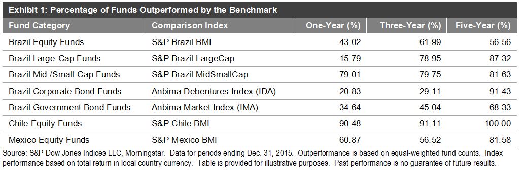
A few weeks ago, Dennis Badlyans wrote about Mexico’s Fixed Income Markets and made a performance comparison of the different currencies of emerging markets, which illustrated how the Mexican peso has been the worst performer among its peers in 2016.  The question is, what is driving the depreciation of the currency?

The answer in the short term, or on a daily basis, could vary from announcements of monetary policy in the U.S. and in Mexico, announcements of relevant economic data in the U.S., such as non-farm payroll, GDP estimates, or any emerging market news that could make the U.S. dollar stronger against other currencies.

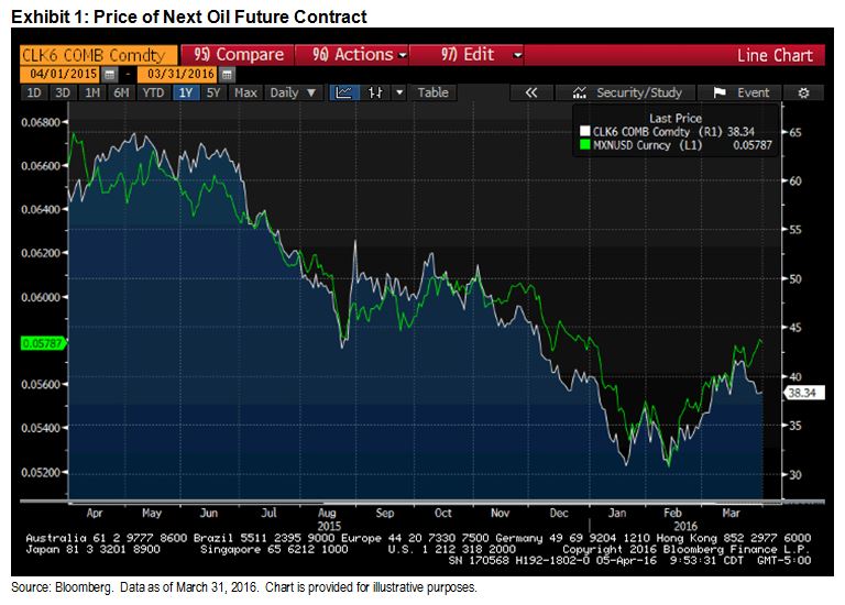
We could list a lot of examples trying to explain why the currency has fallen 14.1% over the past 12-month period ending March 31, 2016, or 32.1% in the previous two-year period, but Exhibit 1 shows how the price of oil has been one reason for this depreciation.  The graph shows the price of the next oil future to mature, WTI May 2016, and on the left axis shows the inverse of the U.S. dollar to Mexican peso currency (pesos per dollar).

Capture

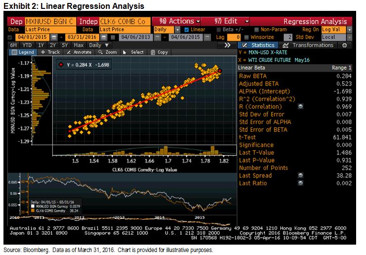
Doing a linear regression analysis of the log value using 252 of these two variables, where the variable “y” is the currency, we can see how dependent the currency is on movements in oil prices, with a correlation of 0.939 and an equation of y=0.284x – 1.698 (see Exhibit 2).

Capture

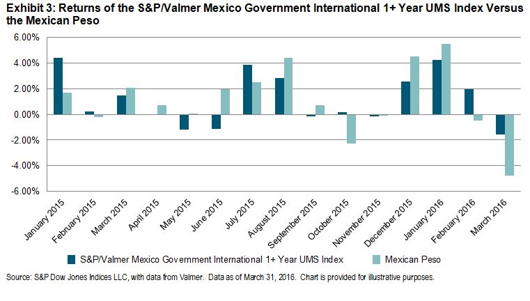
Given that the currency is a component of the performance of the S&P/Valmer Mexico Government International 1+ Year UMS index, Exhibit 3 shows the monthly returns of the index, with the performance of the Mexican peso making a considerable contribution to its performance.

Capture

The posts on this blog are opinions, not advice. Please read our Disclaimers.

Who Fuelled the Oil Bonds Bubble?

Contributor Image
Tim Edwards

Managing Director, Index Investment Strategy

S&P Dow Jones Indices

It has become popular to blame passive investors and index funds for the recent rise (and fall) in prices for U.S. high yield bonds.  The thesis – placing passive investors as the culprit – goes as follows:

  • There have been material, positive flows into passive bond funds, at the expense of active funds.
  • Passive bond funds typically track indices that are market-cap weighted, that is, with a higher weight in issuers that have a greater value of outstanding debt.
  • Such trends have rewarded the most-indebted companies with an “irrational” demand for their bonds.
  • Energy companies in particular have been able to ramp-up a debt-fuelled binge, the eventual popping of which we experienced earlier this year.

We cannot fault anyone for nodding in agreement; the reasoning is certainly seductive. And its variants have found support.  Certainly, large flows of capital into (and out of) an asset class have the ability to create, and pop, bubbles within that market segment.  But the argument – assigning importance to the relative popularity of passive funds – is fatally flawed.

Imagine, for a moment, that we could split the U.S. high yield bond market into two categories: those securities owned by the passive investors, and everything else, which is owned by the active investors.  Each passive investor – new or existing – is required to hold bonds issued by energy companies in proportion to their overall market capitalization, while we suppose that each active investor may individually choose their preferred allocation.

Now, here’s the logical trick: since the sum-total of active and passive investments matches the market, the proportion allocated to any market segment by active managers must, in aggregate, equal the allocation made by passive investors.  This is just arithmetic, based on the fact of both passive investors and the overall market having the same weights in each segment. To emphasize: 

The proportion of capital allocated by active investors, in aggregate, to high yield energy bonds was, is and forever shall be precisely in proportion to market capitalization.

At the point when a new passive investor entered the market (or an existing passive investor increased their allocation), he or she bought high yield energy bonds in the same proportion as the active investors, and maintained their allocations similarly.

Given this fact, one might be wondering, at this point: what it is that active investors in aggregate do exactly? Here’s the rub:

Active investors set prices.

The weighting of each security in a market-cap bond index depends on both the issuance amount and the price of the security.  If an energy company is viewed as a poor prospect to repay their debt, active investors – if they are paying attention – will only buy their bonds at a lower price, and will sell them if the price is unduly high.  In this way, active investors determine the market capitalization of any individual company’s bonds.

This applies to the primary (issuance) market, just as much as the secondary market.  It also applies to investors deciding whether or how much to invest in the U.S. high yield market in the first place, which similarly occupies a proportion of the overall U.S. bond market that is determined by the activities of active investors.

Thus understood, the “bubble” in high yield energy debt was not created by the simple issuing of debt by oil companies.  Nor was it created by passive investors, or a shift from active to passive bond funds.  Instead, as was the case with every bubble before and since, it arose through ACTIVE decisions to purchase securities – or market segments – whose price in hindsight seems unjustified.

The posts on this blog are opinions, not advice. Please read our Disclaimers.

Active Versus Passive Funds in Latin America

Contributor Image
Phillip Brzenk

Managing Director, Global Head of Multi-Asset Indices

S&P Dow Jones Indices

The S&P Indices Versus Active (SPIVA®) Latin America Scorecard is a semi-annual report that compares the performance of active mutual funds in Latin America against passive benchmarks.  The SPIVA Latin America Year-End 2015 Scorecard covers the equity and fixed income markets in Brazil, as well as the equity markets in Chile and Mexico.

In 2015, outperformance by active managers was only seen in Brazil.  Over the long-term (five years), which gives a clearer picture of fund managers’ abilities to provide above-average returns on a consistent basis, all fund categories in the scorecard underperformed their respective category benchmarks.  As seen in our SPIVA: A Cross-Country Comparison report, the average expense ratios of active funds are significantly higher than those of passive products in both Chile and Mexico.[1]  Given the long-term underperformance, it calls into question why active funds charge such high fees relative to their passive fund counterparts.

Brazil
The Brazilian equity market declined sharply in the second half of 2015, leading to a -13.87% total return for the S&P Brazil BMI for the year.  Fixed income investors fared better in 2015, as the corporate bond market[2] returned 13.53%, and the government bond market[3] returned 9.32%.  The majority of managers outperformed their benchmarks in Brazil Equity, Brazil Large-Cap Equity, Brazil Corporate Bond, and Brazil Government Bond fund categories during 2015.  Brazil Mid-/Small-Cap was the only category where managers underperformed for the year, with 79% underperforming.

Chile

In Chile, the equity market struggled to show positive gains in both the short and long term, as the one-year total return was -3.04% for the S&P Chile BMI (CLP), as its five-year total return was off 4.43%.  Equity fund managers in Chile have consistently underperformed their benchmark in both the short and long term.  Over 90% of active equity fund managers underperformed the category benchmark in 2015, and over a five-year time horizon, all managers (44 funds) underperformed.

Mexico
Mexico is the only country to have positive equity market gains in the short- and long-term, with a one-year total return of 1.53% and five-year annualized total return of 4.68% in the S&P Mexico BMI (MXN).  Equity fund managers were unsuccessful in beating the benchmark in 2015, with close to 61% underperforming.  An even higher portion of managers failed to beat the benchmark over the long term.

Capture

[1]   Expense ratio data unavailable for Brazil.

[2]   Represented by the Anbima Debentures Index.

[3]   Represented by the Anbima Market Index.

The posts on this blog are opinions, not advice. Please read our Disclaimers.

Growth and Surging Popularity of Unconstrained Bond Funds

Contributor Image
Hong Xie

Former Senior Director, Global Research & Design

S&P Dow Jones Indices

In the aftermath of the global financial crisis of 2007-2008, one noticeable trend in fixed income investment is the growth and popularity of unconstrained bond funds.  They have generated strong interest in the investment industry due to the flexibility they offer in duration management and the broader investment universe.  Because they are not managed against a specific benchmark, unconstrained bond funds may also pose challenges for investors in understanding and measuring their performance.

The global financial crisis of 2007-2008 and the economic recession that followed prompted unprecedented quantitative easing monetary policies across many countries.  Not only were short-term interest rates lowered to either zero or close to zero, but quantitative easing was also adopted in places such as the U.S., the U.K., the eurozone, and Japan to flatten the yield curve and keep long-term interest rates low.  As the U.S. economy continues to recover and the Fed starts to increase interest rates, many investors have concerns about holding core fixed income products with high interest-rate risk in a rising-rate environment.  It is this widespread market sentiment that has driven the surging popularity of unconstrained bond funds, which offer wide latitude to fund managers on duration management and investment selection.

We use fund data from Morningstar to gauge the size and growth of unconstrained bond funds.  In particular, we screen for funds categorized as “U.S. OE Nontraditional Bonds” by Morningstar, while excluding those with mandates in specific sectors or with duration constraints.

As of November 2015, there were 122 open-ended mutual funds with total assets under management (AUM) of USD 140 billion in our data set, in comparison with 19 funds with AUM of USD 9 billion at the end of 2008 (see Exhibit 1).  Even though the first fund started in 1969, it wasn’t until after the global financial crisis of 2007-2008 that unconstrained bond funds started gaining traction among investors.  Exhibits 1 and 2 show the rapid growth of unconstrained bond funds since 2008 in terms of both AUM and number of funds.

CaptureCapture

The posts on this blog are opinions, not advice. Please read our Disclaimers.

Expect more starting and stopping at the Fed on Interest rates.

Contributor Image
David Blitzer

Former Managing Director and Chairman of the Index Committee

S&P Dow Jones Indices

Given the FOMC minutes released yesterday we expect to see two rate increases in 2016. The next move is likely to be in June, not at the April 27th meeting. Some analysts blame disagreements within the Fed for what they see as inconsistent and changing policy.  While it is difficult to anticipate short term market volatility, not paying attention to those market gyrations would be a mistake.  This year began with sharp drops in the S&P 500 and Treasury notes and a spike in VIX (see chart).  Had the Fed stuck to the plan it hinted at in December and pushed rates up in late January, it would have put stocks into a correction and spooked the economy. Instead it changed its mind when the data changed.

Unexpected bouts of market turmoil aren’t likely to end anytime soon. Moreover, few investors would want the Fed to ignore market events and steam-roller through rates hikes on a pre-set schedule.  Whether the FOMC raises interest rates at its meeting in June, or later in the year, depends on the Fed’s view of the economy and how volatile the markets are at that moment.

We can look past the uncertainty of short term volatility and examine the Fed’s longer term outlook to discern the likely path of interest rates. The Fed expects the US economy to continue growing with real GDP growth of 2.25% in 2016 and 2017, slowing slightly to about 2% in 2018. The unemployment rate is anticipated to drop from the current 5.0% rate to about 4.65% in 2016 and 2017.  Inflation projections show some changes. The core PCE inflation rate is expected to rise from 1.5% this year to about 1.8% in 2017 and 1.95% in 2018.  The increase in the overall PCE rate – including volatile food and energy components  — is from about 1.4% in 2016 to 1.9% or 2.0% in 2017 and 2018.  The inflation numbers tell the story – the Fed is expecting inflation to rise to its 2% target over the next year or two. Given the associated drop in the unemployment rate, there will be a gradual increase in the Fed funds rate.  The FOMC’s own projection for the Fed funds rate is to pass 2% in 2017, pass 3% in 2018 and settle at 3.5% in the long run.  Given 2% inflation in the long run, the real rate of interest would be about 1.5%.

Looking forward, interest rates will rise over the next year and a half. Progress could be slowed if the market gyrations that opened the year repeat; or the rise could come sooner if growth picks up and stock prices climb without interruption.  Of course, smooth sailing is not guaranteed.  What could go wrong?  For the rest of 2016 the risks are focused on the down-side: weakness in China, volatility in financial markets, fallout from Europe or Brexit or something unexpected that would slow US growth and push up unemployment. There is always some risk of recession. If the economy turns seriously down, the Fed is likely to respond by cutting interest rates back to zero, considering a return to QE or possibly joining the negative interest rate club.  The recession risk is also a motivating factor behind the Fed’s efforts to raise interest rates: today rates are one step from the bottom so any rate cut to support the economy would be small. Were the interest rates at 2%, the Fed could cut rates farther is necessary.

If the economy develops as the Fed expects the risk of higher inflation will increase over time. Given the difference between core PCE and total PCE, the Fed is expecting oil prices to rise in the next 12 months.  Add the momentum from rising oil prices to the decline in the unemployment rate and there is some probability that inflation could move over the 2% target to 3% or 4%.  Were that to happen, the Fed would likely move aggressively to raise interest rates and dampen inflation

The posts on this blog are opinions, not advice. Please read our Disclaimers.