Get Indexology® Blog updates via email.

In This List

Does it Have to Be Active OR Passive? Why Not the Best of Both Worlds?

Homes In These Two Cities May Shelter Better Than Gold

Volatility Rides Again

Is Oil’s Spill Turning the Credit Cycle?

Better Than the Headline

Does it Have to Be Active OR Passive? Why Not the Best of Both Worlds?

Contributor Image
Koel Ghosh

Former Head of South Asia

S&P Dow Jones Indices

The debate on active versus passive investing is endless, and there are strong arguments on both sides. The active side argues on the advantages of alpha, star fund managers’ year-over-year record performances, better market timing, and better stock picking backed by thorough research.

On the other side, there is a strong passive argument for capturing market beta at significantly lower costs due to lower investment management fees, as passive investing does not require fund manager expertise or expensive research costs. Further contesting the benefits of active management, passive investing has the argument that a fund manager’s consistent performance can be debated and that the continuity of the fund manager’s association with an investment plan or fund is not guaranteed.

Passive, or index-based, investing is investing in products linked to underlying indices. Indices have transparent methodologies, thereby providing rules that ensure that the key criteria to good representation are captured. The index can be a plain vanilla market benchmark like the S&P BSE SENSEX or a broader index, like the S&P BSE LargeMidCap, the S&P BSE 100, etc. The variety of indices is exhaustive, cutting across sectors, geographies, strategies, themes, and factors. Factor-based, or smart beta indices have increased in popularity in recent years. But what, exactly, do smart beta indices do? They capture factors which vary between fundamental and other risk factors to formulate rules that provide variable performance (see Smart Beta on the Rise in India).

Passive investing also offers the advantage of diversification. The comparison of a select few indices effectively demonstrates the advantages of diversification, which can be achieved via exposure to different broad and factor indices (see Exhibit 1).

Exhibit 1: Index Returns 

Index Returns
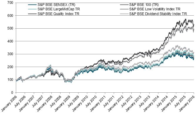
Source: Asia Index Private Limited. Data from Jan. 31, 2006, to Feb. 1, 2016. Past performance is no guarantee of future results. Chart is provided for illustrative purposes and reflects hypothetical historical performance. 

Annualized Index Returns
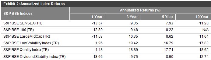
Source: Asia Index Private Limited. Data as of Jan. 29, 2016. Table is provided for illustrative purposes and reflects hypothetical historical performance. TR refers to Total Return and includes dividends. 

However, why not get the best of both worlds?

Portfolio managers employ various asset allocation strategies that span styles like conservative, moderate, aggressive, or alternatively strategic or tactical allocations. A familiar strategy often spoken about is core-satellite investing, which is a hybrid of both strategic and tactical allocation. The main objective of investors or portfolio managers is to adopt a strategy that will ensure they achieve their specific goals. If this entails using two strategies and they achieve the same goal, so be it! The core-satellite approach is used to combine active strategies with passive. Hence, those who favor passive investing can use that as their core strategy through index funds and ETFs, and they can support it with active management, and vice versa, to potentially meet their goals and thereby use both active and passive styles to their benefit.

Exhibit 3: Core-Satellite Investment Strategy 

Index ETF
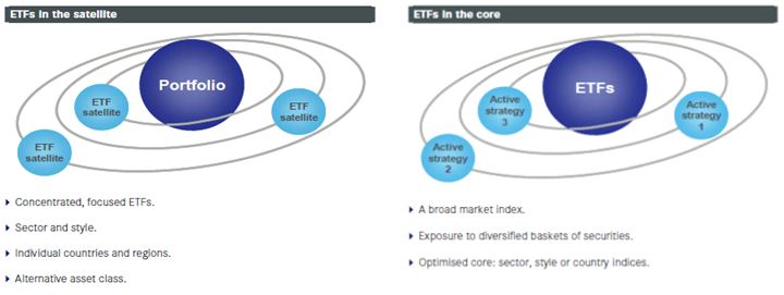
Source: S&P Dow Jones Indices LLC. Charts are provided for illustrative purposes. 

The posts on this blog are opinions, not advice. Please read our Disclaimers.

Homes In These Two Cities May Shelter Better Than Gold

Contributor Image
Jodie Gunzberg

Former Managing Director, Head of U.S. Equities

S&P Dow Jones Indices

Gold is on the rise this year as investors seek shelter from the volatility in the stock and oil markets. While 90-day annualized volatility of oil, around 50%, is the highest since April last year, and is near its 2001 peak, it’s not near the high levels of 2008 or 1991. Also, the open interest that usually collapses near peak volatility and oil bottoms continues to be high.

Source: S&P Dow Jones Indices. Bloomberg.

This may indicate there will be further trouble in the oil market so is bad news. It’s not only bad news for oil but as commodities and stocks have become more correlated, the fear is spreading across all risky assets. Many times when this happens, investors turn to gold, as they are now. Just as stocks and commodities are each on the brink of a 10% loss year-to-date, gold is up 13% in 2016.

Source: S&P Dow Jones Indices.

Given the near zero correlation of gold to the S&P 500, it makes sense to use gold for diversification, but given its near 30% loss in 2013, viewing it as a safe haven is arguable. However, when the S&P 500 loses more than 10% over 12 months, gold has returned positive 62% of the time with an average of 2.7%.

Another asset class with near zero correlation to stocks is real estate. In particular, the S&P/Case-Shiller 20-City Composite Home Price Index that measures the value of residential real estate in 20 major cities in the U.S., has 0.08 correlation to the S&P 500 using monthly data since Jan. 2000.

So, can your home price protect as well as gold in a stock market crash?

It depends where you live, but seven of the twenty cities gain on average during stock declines bigger than 10%. The cities include Boston, Dallas, Denver, Minneapolis, New York, San Diego and Washington, D.C. The home prices gain on average 6.0% in Boston and 4.7% in New York that far exceed the 2.7% gold offers. Washington D.C. and Denver are close seconds to gold, gaining 2.4% and 2.3% on average when the S&P 500 loses more than 10% in 12 months.

If you are in Las Vegas, you may be better off betting on gold for safety as their local housing market loses 7.4% on average, only behind Phoenix that loses 8.8% on average when stocks lose.


The posts on this blog are opinions, not advice. Please read our Disclaimers.

Volatility Rides Again

Contributor Image
Chris Bennett

Former Director, Index Investment Strategy

S&P Dow Jones Indices

Global equity markets stumbled out of the gate in 2016, and still haven’t found their stride. Markets are experiencing an intense case of risk off sentiment, as investors flee from riskier assets in pursuit of safe havens. The yield of 10 year US Treasury Notes is down to less than 1.8%, while oft-maligned gold is coming back into favor. The VIX is also up above 26, which is over 50% higher than it was at the same time last year.

The S&P 500 remains in correction mode, as safety seems to be the name of the game. The Utilities Sector of the S&P 500 has surged in 2016, following a weak 2015. Through Friday’s close, the Utilities sector was up 8% on the year, while the broader S&P 500 was down 8% (both on a total return basis). The Consumer Discretionary sector was the strongest sectoral performer in 2015. Thus far in 2016, it had been one of the weakest, declining 12%.

This is driven in no small part by fears of slowdown in global growth, specifically in China. According to the Wall Street Journal, data out of China over the weekend showed that China’s foreign exchange reserves fell nearly 100 billion USD last month as Beijing defends the value of the Yuan in the face of growing short interests and following a 108 Billion USD decline in December. Granted, China still has over 3 trillion USD in foreign exchange reserves to work with, so this may not be as bad as it seems. Following the unexpected devaluation of the Yuan in August of last year, however, market participants are undoubtedly a little on edge.

It comes as no surprise that low volatility strategies have outperformed in this environment. The S&P 500 Low Volatility High Dividend Index was up nearly 1% through close Friday. Typically these strategies outperform in choppy markets as they decrease downside exposure. In other words, low volatility strategies provide some protection when volatility rides again.

The posts on this blog are opinions, not advice. Please read our Disclaimers.

Is Oil’s Spill Turning the Credit Cycle?

Contributor Image
Jason Giordano

Director, Fixed Income, Product Management

S&P Dow Jones Indices

While the slumping price of oil is bearing the brunt of the current volatility in the markets these days, there are other signs that indicate more widespread shifts in the credit cycle.  High-yield credit default spreads have widened, as shown by both the S&P/ISDA CDS U.S. High Yield BB and the S&P/ISDA CDS U.S. High Yield B and Below.  The indices are up 183 and 197 bps, respectively, over the past year (see Exhibit 1).  The turmoil in the energy sector has had an impact; however, the widening also represents the overall discomfort with the amount of leverage companies have on their balance sheets within the broader high-yield market.

Capture

Further evidence is shown by the S&P U.S. Distressed High Yield Corporate Bond Index.  The index is a market-weighted index comprising securities with an option-adjusted spread greater than or equal to 1,000 bps.  The number of qualifying constituents (see Exhibit 2) has increased dramatically since August 2014, with 89 new issuers entering the index just this month.  Again, the increase is not limited to only the Energy sector as new constituents represent Telecom, Financial, Consumer Discretionary and Materials sectors.

Capture


bondsSource: S&P Dow Jones Indices LLC.  Data from February 2016.  Chart is provided for illustrative purposes.

The posts on this blog are opinions, not advice. Please read our Disclaimers.

Better Than the Headline

Contributor Image
David Blitzer

Former Managing Director and Chairman of the Index Committee

S&P Dow Jones Indices

The smaller than expected rise in payrolls in this morning’s January Employment Report disappointed people, but the details were far better than the 151,000 gain in payrolls.  Even though to total of new jobs was about 40,000 lower than the consensus forecast, some details in the number were surprisingly good: manufacturing employment jumped by 29,000.  Hours and earnings also improved. Average weekly hours were 34.6, a new post-recession high and average hourly earnings were 2.5% higher than January 2015.

The more impressive figures were in the other part of the report, the Household Survey.  The unemployment rate dipped to 4.9%, the lowest since the end of the Great Recession.  In some past months the drop in the unemployment rate resulted from people leaving the labor force – people giving up hope of finding a job and dropping out.  Not in these data: the labor force rose faster than the population rose, the employment population gained and the number of unemployed fell.  The number working part time for economic reasons crept down slightly.

The Employment Report is actually two separate surveys combined.  Most securities analysts and economists focus on the number of people working based on company payrolls –the payroll survey.  The total figure was 143,288,000; its monthly increase of 151,000 was weaker than the average of 228,000 per month during 2015.  The chart shows the monthly changes in payrolls since the start of the last recession at the end of 2007.  This report was on the low side, but shouldn’t be seen as a sign of an immediate downturn.  Those who want to watch developments weekly can follow the initial unemployment claims series reported each Thursday morning.  As long as the weekly number is under 300,000, there is not much cause for concern.  The other portion of the Employment Report is based on surveying households and asking people if they’re working. There are some differences in the two surveys – someone who has two jobs will be counted twice in the payrolls numbers but only once in the household data.

The posts on this blog are opinions, not advice. Please read our Disclaimers.