Get Indexology® Blog updates via email.

In This List

The Rieger Report: Municipal Bond Market Winners and Losers Through Dec. 17 2015

Floating Securities in Advance of Rising Rates

COP21 and Beyond

The Rieger Report: "Belly" of the Curve Rewards Municipal Bond Market

New Risk-Off: More Fear Today Than Tomorrow

The Rieger Report: Municipal Bond Market Winners and Losers Through Dec. 17 2015

Contributor Image
J.R. Rieger

Former Head of Fixed Income Indices

S&P Dow Jones Indices

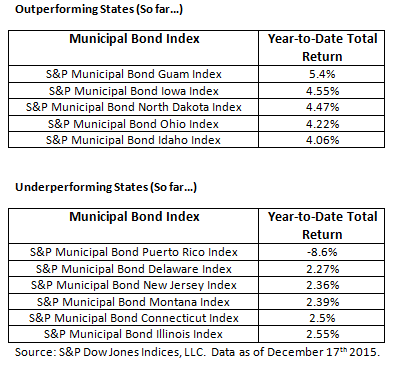
Some parts of the U.S. municipal bond market is doing well in 2015 but others are struggling.  Let’s start with which states are hot and which are not.   Guam is the leader but that tiny issuer is really not a far measure.  Smaller issuers like municipalities in Iowa, North Dakota have done well and supply may play a factor.  Underperformers have been led by Puerto Rico.  The S&P Municipal Bond Puerto Rico Index is down 8.6% year-to-date.  Despite the negative headlines about pension shortfalls Illinois and New Jersey bonds are both are underperforming the overall bond market but not by all that much.   By comparison the investment grade tax-free muni market tracked in the S&P National AMT-Free Municipal Bond Index is up 2.98%.

State Performance 12 17 2015

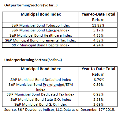
Sectors of the municipal bond market outperforming include the much tobacco settlement bond sector up 11.8% year-to-date.  These bonds have huge obligations in the future but they often are long dated so the short term risks are very different then the long term prospects of repayment.  Healthcare related sectors of the bond market have outperformed the rest of the market as well.  Underperforming is the defaulted sector down nearly 3.8% but what is extremely telling is the performance of the U.S. Government Bond backed Prerefunded and Escrowed to Maturity sector.  These bonds have done little in 2015 due to the low yields of these high quality and often short term bonds.

Sector Performance 12 17 2015


The posts on this blog are opinions, not advice. Please read our Disclaimers.

Floating Securities in Advance of Rising Rates

Contributor Image
Lucas Chiang

Associate, Product Management

S&P Dow Jones Indices

This Wednesday, the Fed announced that they would begin raising rates, a decision that has left many investors with questions about how they will fare in this changing environment.  Knowing that conventional, fixed-rate securities sometimes lose value when interest rates increase has some investors looking to floating-rate securities instead.  Floating-rate securities are designed to mitigate interest rate risk by regularly adjusting to keep pace with the movements of short-term rates.  In short, that means floating-rate securities should exhibit minimal price sensitivity to changes in interest rate levels.  To see how floating-rate securities have performed in anticipation of this announcement, we will take a look at examples in the preferred stock and senior loan markets over the last year.

Preferred stock is a class of capital stock that generally pays dividends determined by a fixed rate, variable rate, or a floating rate.  The S&P U.S. Preferred Stock Index comprises preferred shares of each dividend payment type.  When comparing the S&P U.S. Preferred Stock Index to the S&P U.S. Floating Rate Preferred Stock Index, we can observe that while both have positive returns, floating-rate stocks have outperformed stocks that are more interest rate sensitive by 2.71% in the past one-year period (see Exhibit 1).

Capture

The preferred stock example helps us understand why there is an expectation for floating-rate securities to perform well given this environment.  However, the senior loan market’s underperformance this year has shown that floating rates act as protection from only one of many confluent pressures.  Senior loans have felt the detrimental effects of supply outpacing demand most months this year.  New issuances have expanded the overall size of the market, while retail investors continue to be net sellers of loans on the year.  According to S&P Capital IQ LCD, institutional and retail allocations alike have stalled in response to volatility in the broader markets and are likely refraining from shifting capital back in until it is clear the Fed intends to consistently raise rates through 2016.  Consequently, the S&P/LSTA Leveraged Loan 100 Index has taken a -1.55% hit YTD, demonstrating that floating-rate securities can actually sink in a rising rate environment and even underperform fixed-rate securities.

Capture

Capture

The posts on this blog are opinions, not advice. Please read our Disclaimers.

COP21 and Beyond

Contributor Image
Julia Kochetygova

Former Head of Sustainability Indices

S&P Dow Jones Indices

 Climate change talks dominated sustainability discussion in 2015 as COP21 approached
As we approached COP21 in Paris this year, the core of sustainability discussion was increasingly centered on climate change, which has received a consensus priority status as both the most important and the most pressing subject. The Montreal Carbon Pledge that was adopted in September 2014, whereby signatories agree to measure and publicly disclose the carbon footprint of investment portfolios annually, has reached $10 trillion of assets by the time of COP21, and the Portfolio Decarbonization Coalition whereby members will drive GHG emissions reductions on the ground by decarbonizing their portfolios has accumulated $600 billion. The Mercer report “Investing in the time of Climate Change” presented a very solid and quantified investment case, with Coal and Oil industries being the biggest losers under various climate scenarios and Renewable Energy being the only winner.

The impact of COP21 and beyond
COP21 brought a ray of hope to those who have been keen to minimize the carbon-related risks.  Supported by the initiatives of public climate leaders, particularly the President of France, Francois Hollande, 195 nations’ delegations have been able to reach a legally binding and universal agreement targeting to get the climate change constrained within 2 degrees beyond the pre-industrial level and aiming to explore the possibility of 1.5 degrees.  The agreement sets a coordination framework for individual governments, government and supranational agencies and NGOs in road mapping and implementing a transition to low carbon economy. This will require approximately $1 trillion dollars to be invested annually in low-carbon technologies and continued technological innovations, shift of funds from developed countries to developing countries.  Part of the solution is in activating long-term and low cost financial solutions for public and private sector. Low carbon indices are clearly important part of this toolkit, as it helps the industry measure the performance of the low carbon market.

The posts on this blog are opinions, not advice. Please read our Disclaimers.

The Rieger Report: "Belly" of the Curve Rewards Municipal Bond Market

Contributor Image
J.R. Rieger

Former Head of Fixed Income Indices

S&P Dow Jones Indices

The ‘belly’ of the municipal bond curve or the 5 – 10 year maturity range has done well this year, almost as well as the longer maturity range.   Returns for non-callable investment grade municipal bonds tracked in the 5, 7 and 9 year range all have demonstrated good returns in this low rate environment.

The S&P AMT-Free Municipal Series 2024 Index shows non-callable municipal bonds maturing in 2024 have an average yield of 2.16% and have returned 3.5% year-to-date.   This range has outperformed the composite S&P National AMT-Free Municipal Bond Index and has nearly kept pace with longer bonds tracked in the S&P Municipal Bond 20+ Year Index.

Table 1: Select Municipal Bond Indices Yields and Returns:Muni Belly 12 16 2015

The posts on this blog are opinions, not advice. Please read our Disclaimers.

New Risk-Off: More Fear Today Than Tomorrow

Contributor Image
Jodie Gunzberg

Former Managing Director, Head of U.S. Equities

S&P Dow Jones Indices

It has been over nine years since the Fed raised interest rates, but today, the Fed raised rates just as expected. While the Fed actions have been well telegraphed, and interest rates are probably the least of worries for commodities, there is one measure that might be worrisome.

Although since 1991, rising rates seem not to have been a decisive factor in equity performance, and have clearly not been a negative force (as shown in the chart below from this paper,) there is more uncertainty about the stock market today than tomorrow. 

Rising rates Stocks

One indicator of extreme market stress can be seen when the price of futures contract on the CBOE Volatility Index® (VIX) with a nearby expiration is more expensive than one later dated. This condition is called backwardation (it sounds like a bad diagnosis and usually is) but it is relatively rare, happening in only 17% of days since Mar. 29, 2004.

The futures contracts are now reflecting this condition for five days straight. This has happened a number of times before but one of the interesting things about today is that the market seems not only uncertain but downright jittery. It looks a bit like in 2007, soon after the Fed starting raising rates, when the market felt noticeable fear by the measured backwardation. It’s not the fear alone but the persistence. Just a few months ago, from Aug. 20 – Oct. 7, the Chinese stock market crash sent chills through the market. Backwardation appeared again from Nov. 13 – 16 with one of the biggest weekly stock market drops in months that crashed the S&P 500’s 200-day moving average, a bearish signal for many investors. Again, ahead of the Fed decision – which should not have been surprising – backwardation appeared and is present. The chart below shows the history of VIX backwardation with the S&P 500 index levels. The green triangles represent when the Fed raised rates in 2006 and when they started quantitative easing in 2008.

Source: S&P Dow Jones Indices

While the interest rates alone have not influenced stock prices, the unprecedented quantitative easing started a vicious cycle of risk-on/risk-off (RORO) that was the result of a binary outcome for risky assets – either the easing works OR it doesn’t. Since commodities are a risky asset, they are a class where the returns are noticeably impacted by fear before the financial crisis and after, when quantitative easing began. Pre-crisis, there was no relationship between a high VIX and commodities, but the relationship turned negative post-crisis.

Source: S&P Dow Jones Indices. Data from Jan 1990 to July 2013. Past performance is not an indication of future results. This chart reflects hypothetical historical performance. Please see the Performance Disclosure at the end of this document for more information regarding the inherent limitations associated with backtested performance
Source: S&P Dow Jones Indices. Data from Jan 1990 to July 2013. Past performance is not an indication of future results. This chart reflects hypothetical historical performance. Please see the Performance Disclosure at the end of this document for more information regarding the inherent limitations associated with backtested performance.

The RORO environment meant investors either felt they were, or were not getting paid for taking the risk to invest in risky assets. This drove up the correlation of commodities with stocks to unprecedented levels, just over 0.7. By 2013, the Fed started to taper and the correlation fell back to zero, and stayed below its average of 0.26 until Aug., 2015, precisely when VIX backwardation appeared. In just slightly more than one month, the correlation doubled from 0.22 (Aug. 20, 2015) to 0.44 (Sep. 28, 2015). Since then, it has increased slightly more to 0.46, its highest level in over two years, since Aug. 20, 2013.

The one thing to worry about is the combination of higher than average VIX backwardation with high risky-asset (stock/commodity) correlation. This only happened three times before now. Once in the financial crisis, once in 2011 just following the debt ceiling crisis and U.S. downgrade, and for a very short time in the 2010 flash crash. This is illustrated in the chart below where the S&P 500 represents stocks and the S&P GSCI represents commodities.

Source: S&P Dow Jones Indices


The posts on this blog are opinions, not advice. Please read our Disclaimers.