Get Indexology® Blog updates via email.

In This List

Sustainability Indices: Investment Solutions For Future Generations

Fed's Playing "Whac-A-Risk"

Uncertainty, a Four Letter Word for the Municipal Bond Market

Observations on January Release of S&P Claims Based Indices (Allowed Charge Trends): Part 4

Treasury Rates Are Up, But For How Long?

Sustainability Indices: Investment Solutions For Future Generations

Contributor Image
Daniel Ung

Former Director

Global Research & Design

Ever since the launch of the first ethical investment fund by Friends Provident in 1984, socially responsible investing has continued to grow. Global assets under management reached EUR 13.6 trillion in 2012, and mutual fund assets in Europe increased by 19% over just two years, from EUR 199.9 billion in 2010 to EUR 237.9 billion in 2012.

The increasing popularity of sustainability investing can be ascribed to the fact that investors are increasingly aware of the impact of their actions on their surrounding environment and also to the findings of recent academic research which showed that socially responsible companies tend to outperform on a variety of financial metrics in the long term. For instance, Statman (2005) concluded that returns of socially responsible indices were generally higher than those of the S&P 500®. More recent research, written by Eccles et al. (2011), showed that high-sustainability firms dramatically outperformed low-sustainability firms in terms of both the stock market and accounting measures.

Dow Jones Sustainability Indices: An Overview 

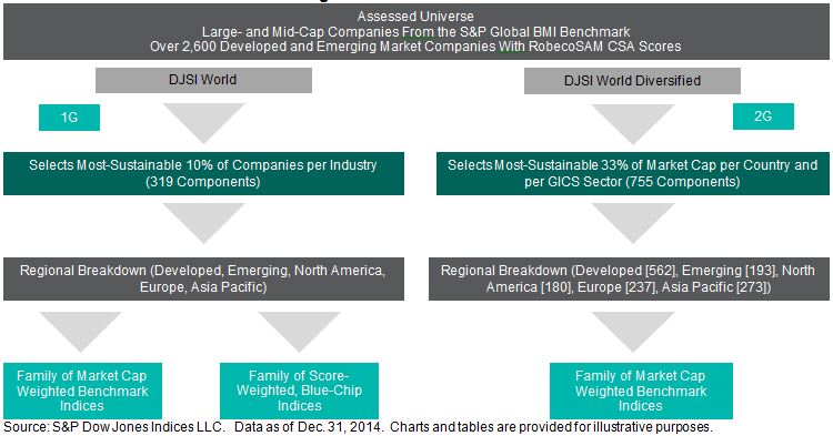
Launched in 1999, the Dow Jones Sustainability™ World Index (the DJSI World) was the first global sustainability index and is highly recognized within the investment community. One of the reasons why the DJSI series has gained widespread acceptance among practitioners lies in the reliability of the analytical inputs used to construct the index. These inputs are provided by RobecoSAM, a renowned investment specialist focused exclusively on sustainability investing. In addition to the DJSI, S&P Dow Jones Indices and RobecoSAM have developed the Dow Jones Sustainability Diversified Indices, which have a broader universe and a lower tracking error to the benchmarks.

Graph2

S&P Carbon Efficient Indices 

S&P Dow Jones Indices has also developed a series of carbon-efficient indices to address investor desire to support environmentally friendly companies and reduce carbon-related risks. The S&P Carbon Efficient Indices select the companies with the least carbon footprint per unit sales of each of the companies within the universe, based on the data compiled by Trucost, an independent specialist research provider.

Case Study: Applying Strategies to Sustainability Indices 

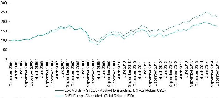
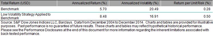
This case study examines whether low volatility strategies may apply to sustainability benchmarks and we have created a simulation that involves selecting the 100 least-volatile stocks from the DJSI Europe Diversified Index every 6 months. The results show that, compared to the benchmark, the annualised excess performance of the strategy is 2.8%, with a corresponding decrease in volatility of 17.5%. This suggests that traditional equity strategies may apply equally well to a sustainability benchmark as to a traditional benchmark.

Graph

Graph1

For more information about this, please read.

The posts on this blog are opinions, not advice. Please read our Disclaimers.

Fed's Playing "Whac-A-Risk"

Contributor Image
Jodie Gunzberg

Former Managing Director, Head of U.S. Equities

S&P Dow Jones Indices

Thanks to better risk controls from banks, the historical credit process is no longer directly related to what the central bank does. For example, if the Federal Reserve buys a trillion dollars’ worth of U.S. government bonds, it doesn’t mean that U.S. banks are going to lend any more money. They need to make their own decisions based on their own views, but given very tight capital ratios, it is easy to bump up against the limits, preventing a credit boom. According to Blu Putnam, Chief Economist at CME Group, “If you don’t have a credit boom, you don’t have inflation.”

One might think that after roughly $3 trillion of quantitative easing some inflation might appear. That hasn’t happened yet or really in the past 20 years when core inflation has been 1%-2%. The core inflation didn’t waver much through the tech boom and bust, the housing boom and big bust, and the economic recovery. So, the correlation between central banking activity and the economy and inflation is lost. Thanks to risk control that stopped the credit boom and inflation.

How has inflation been impacted by the Fed? Given the Fed targets a 2% core inflation rate, they expected to see much higher inflation by now given all of their accommodative easing and zero federal funds rate. The fact that inflation hasn’t occurred, not only in the U.S. but not in Europe nor Japan, shows it is not a problem around the world.  However, inflation is below its target rate so the Fed has to balance that against its desire to move interest policy up some because of the strong labor market.

Fed decision making has become much more complicated since past relationships don’t seem to hold. Tough decisions aren’t always bad decisions, especially with the strong dollar that also keeps inflation down. Low inflation and booming labor markets might make a good decision easier for the Fed, though that decision may have a bigger impact on the equity market than the credit market and inflation.

To hear a more in depth discussion on inflation, central banks and commodities, please watch our interview with Blu.

The posts on this blog are opinions, not advice. Please read our Disclaimers.

Uncertainty, a Four Letter Word for the Municipal Bond Market

Contributor Image
J.R. Rieger

Former Head of Fixed Income Indices

S&P Dow Jones Indices

The uncertainty of the future of Puerto Rico municipal bonds continues to weigh on the municipal bond market. Bonds in the S&P Municipal Bond Puerto Rico Index have settled into an average price of just over 50 cents on the dollar with the low point of 47.27 on July 8th 2014.   The index tracks over $73billion in par amount of bonds. Puerto Rico is an important segment of the municipal bond market as many of these federal and state tax-free bonds are held in State based mutual funds. While revenue bonds have held their own, year to date the S&P Municipal Bond Puerto Rico General Obligation Index has returned a negative 1.53%.

The uncertainty of how New Jersey will handle its financial future has resonated with the bond market. While Illinois gets a lot of press it is New Jersey general obligation bonds that are moving more like Puerto Rico bonds in 2015. The S&P Municipal Bond New Jersey General Obligation Index has seen its weighted average yield rise by 21bps in 2015 eerily similar to the rise of yields in the S&P Municipal Bond Puerto Rico General Obligation Index which have moved 22bps higher. The comparison is unfair of course. The weighted average yield of the S&P Municipal Bond New Jersey General Obligation Index ended at 1.73% up from 1.52%. The yields of bonds in the S&P Municipal Bond Puerto Rico General Obligation Index ended at 8.16%. Meanwhile, the yield of the S&P Municipal Bond New York General Obligation Index has dropped by 6bps to 1.43% and the yield of the S&P Municipal Bond Illinois General Obligation Index also has shown an improvement of 3bps to end at 2.74%.

Yields and Total Returns of Select State Municipal Bond Indices

Muni Index Yields 2 20 2015

Source: S&P Dow Jones Indices LLC.  Data as of February 20, 2015.

The posts on this blog are opinions, not advice. Please read our Disclaimers.

Observations on January Release of S&P Claims Based Indices (Allowed Charge Trends): Part 4

Contributor Image
John Cookson

Principal, Consulting Actuary

Milliman

The overall medical trend rates covering all services have continued to be modest in the S&P data through the 3rd quarter of 2014—increasing up to 3.5% on a 12-month moving average basis as of September[1].

But the winter of 2014 was particularly harsh in much of the country and likely dampened utilization.  Late fall 2014 weather was cold and snowy, and recent weather in early February 2015 has become more severe.  If the severe weather reaches the equivalent level of 2014, there will likely be minimal impact on trends, since the effect in two successive years is likely to balance out, although regional impacts can vary with the weather differences by region between the two years.

Influenza results for the 2014-2015 season appear to be similar but possibly slightly less than the 2012-2013 season and higher than the 2013-2014 season based on several measures.  During the 2012-2013 season overall trends remained in the low single digits.  Charts A and B below show several years of history for outpatient flu visits (Chart A) and pneumonia and influenza mortality (Chart B) from the Centers for Disease Control and Prevention.


[1] We track the LG/ASO trends as representative of underlying trends, since Individual and Small Group are impacted more significantly by the Affordable Care Act (ACA).  Keep in mind that actual trends experienced by plans are likely to be higher than as reported in S&P data.  Trends experienced by large employers on plans that have not changed in the previous year could be higher by as much as 2% or more on bronze level plans and higher by 1% or more on gold level plans due to the effects of deductible and copay leverage.  So risk takers need to take this into account.  In addition, the S&P Indices do not reflect the impact of benefit buy-downs by employers (i.e., higher deductibles, etc.), since the indices are based on full allowed charges.  As noted above, actual trends experienced by employers and insurers in the absence of benefit buy-downs can be expected to be higher than reported S&P trends due to plan design issues such as deductibles, copays, out-of-pocket maximums, etc.   Benefit buy-downs do not represent trend changes since they are benefit reductions in exchange for premium concessions, but they can have a dampening effect on utilization due to higher member copayments, and this can have a dampening effect on measured S&P trends compared to plans with no benefit changes, further pushing up experienced trends relative to those reported in the indices.

Capture

Capture

THE REPORT IS PROVIDED “AS-IS” AND, TO THE MAXIMUM EXTENT PERMITTED BY APPLICABLE LAW, MILLIMAN DISCLAIMS ALL GUARANTEES AND WARRANTIES, WHETHER EXPRESS, IMPLIED OR STATUTORY, REGARDING THE REPORT, INCLUDING ANY WARRANTY OF FITNESS FOR A PARTICULAR PURPOSE, TITLE, MERCHANTABILITY, AND NON-INFRINGEMENT.


The posts on this blog are opinions, not advice. Please read our Disclaimers.

Treasury Rates Are Up, But For How Long?

Contributor Image
Kevin Horan

Former Director, Fixed Income Indices

S&P Dow Jones Indices

Having touched a low of 1.66% as of mid-February 2015, the yield of the S&P/BGCantor Current 10 Year U.S. Treasury Index bounced up to close at 2.05% on Feb. 13, 2015. The move away from the safety of Treasuries came as an impasse occurred in the negotiations between Greece and their EMU partners. European officials continue to wrestle over terms for a plan to support Greece, which could run out of money as soon as the end of March. If a deal cannot be struck, then the fear of European contagion could cause a move back down in yield for U.S. Treasuries.
For now, the focus of the markets may be circling back to the Fed and the possibility of a rate increase as soon as this June. The improving U.S. economy should naturally lead to higher rates, in order to match the economic growth. Such a policy change would move rates higher to the front-end of the curve, leaving the longer-end to represent investor outlook and reactions. The open-ended question is what other political, market, or global forces could curtail rising rates.

The S&P U.S. Aggregate Bond Index is up 0.78% YTD, though the rise in yields for February has translated to a loss of -1.10% MTD. The investment-grade corporate component of the aggregate index, as measured by the S&P U.S. Investment Grade Corporate Bond Index, is 29% of the parent index, and has contributed 1.09% of total return YTD, while also providing -1.44% return MTD. The only larger component of the aggregate index is the S&P/BGCantor U.S. Treasury Bond Index (38% of the parent index), which has returned 0.62% YTD, while losing 1.43% MTD.
Lower-rated credit indices such as the S&P U.S. High Yield Corporate Bond Index and the S&P/LSTA U.S. Leveraged Loan 100 Index have not greatly outpaced investment grade corporates YTD, given the increase in risks. For the month of February, however, they have performed well, as Treasury rates have been increasing. The high-yield index has returned 1.70% YTD and 1.19% for February. Likewise, the S&P/LSTA U.S. Leveraged Loan 100 Index has returned 1.11% YTD and 0.91% MTD.
10yr Yield History of the S&P/BGCantor Current 10 Year U.S. Treasury Bond Index

The posts on this blog are opinions, not advice. Please read our Disclaimers.