Get Indexology® Blog updates via email.

In This List

In Preferred Index, High Yield Is Heavier But Investment Grade Outperforms

Rotating Australian Cyclical and Defensive Sectors Over Global Economic Cycles

Sukuk - Looking Behind the Numbers

A Renewed Interest in High Yield Bonds

S&P DJI July update provides insight into ACA impact on individual health policies

In Preferred Index, High Yield Is Heavier But Investment Grade Outperforms

Contributor Image
Kevin Horan

Former Director, Fixed Income Indices

S&P Dow Jones Indices

Preferred securities as measured by the S&P U.S. Preferred Stock Index have returned 12.08% year-to-date.  The performance of this index has outpaced both the S&P U.S. Issued Investment Grade Corporate Bond Index (6.49%YTD) and the S&P U.S. Issued High Yield Corporate Bond Index (5.5% YTD).

The recent development of three new sub-indices to the S&P U.S. Preferred Stock Index breaks out this index by credit rating.  Separating the index by the lowest of the three rating agencies creates the sub-indices of S&P U.S. Investment Grade Preferred Stock Index, S&P U.S. High Yield Preferred Stock Index and the S&P U.S. Not Rated Preferred Stock Index.  High yield represents 54% of the parent index while investment grade issuers are 38% and non-rated issuers are 8% by market weight.  Though all three sub-indices are performing well, the investment grade index is in the lead with a total return of 1.59% MTD and 13.83% YTD.
Preferred Returns_20140822


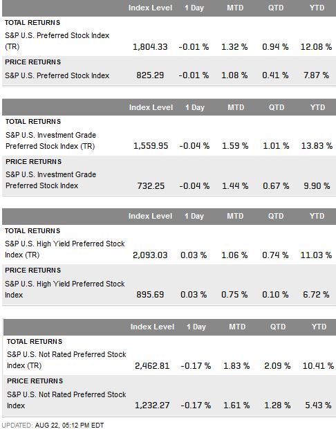
Source: S&P Dow Jones Indices, data as of 8/22/2014

The posts on this blog are opinions, not advice. Please read our Disclaimers.

Rotating Australian Cyclical and Defensive Sectors Over Global Economic Cycles

Contributor Image
Priscilla Luk

Managing Director, Global Research & Design, APAC

S&P Dow Jones Indices

Rotating between cyclical and defensive stocks across economic cycles is a common approach for investors to take advantage of different economic phases. Energy, materials, industrials, consumer discretionary, financials and information technology are traditionally considered cyclical sectors, as stocks in these sectors have tended to be highly correlated to economic cycles. In contrast, consumer staples, healthcare, telecom and utilities are generally thought to be defensive sectors, as their profits and prices have had very low correlation to economic activity.

In our study of Australian equity, we observed that Australian sectors demonstrated much stronger cyclical and defensive characteristics across the global economic cycles when compared with domestic economic cycles. Cyclical sectors broadly outperformed defensive sectors during global economic up cycles, and they underperformed defensive sectors when the global economy slowed. This suggests that the global economy could more strongly influence relative performance between these two types of sectors than the domestic Australian economy can.

Capture

Capture

Source: S&P Dow Jones Indices LLC. Sectors highlighted in teal and gray represent cyclical and defensive sectors, respectively. Data from December 1989 to June 2014. Data are based on the S&P/ASX 200 universe (between March 31, 2000, and June 2014) and the S&P Australia BMI universe (prior to March 31, 2000). Global economic up and down cycles are defined by monthly change of the OECD + Major Six NME CLI. Performance of cyclical sectors and defensive sectors is equal-weighted, and stocks within each sector are market cap-weighted. Performance is based on total return in AUD. Charts and tables are provided for illustrative purposes. Past performance is no guarantee of future results.

In Australia, cyclical sectors represent 80% of the total market, based on the S&P/ASX 200. However, cyclical sectors underperformed defensive sectors on average over the entire period between December 1989 and June 2014. They only outperformed defensive sectors on average in seven of the past 24 years. These results suggest that mimicking benchmark sector weighting may not be the most optimal way to maximize portfolio returns.

To exploit the cyclical and defensive nature of Australian sectors, we examined a strategy that alternately invested in cyclical and defensive sectors during global economic up and down cycles, based on the monthly change of the OECD global leading economic indicator. Results showed this simple strategy was profitable over the past two decades with an absolute annualized return of almost 15%, outperforming the benchmark by 5.4% per annum. As 80% of the Australian equity market is dominated by cyclical sectors, outperformance of this rotation strategy was mainly driven by turning to defensive sectors during global economic downturn.

Capture

Source: S&P Dow Jones Indices LLC. Data are based on the S&P/ASX 200 universe (between March 31, 2000, and June 2014) and the S&P Australia BMI universe (prior to March 31, 2000). Global economic up and down cycles are defined by monthly change of the OECD + Major Six NME CLI. Performance of cyclical sectors and defensive sectors is equal-weighted, and stocks within each sector are market cap-weighted. Performance is based on total return in AUD. Charts and tables are provided for illustrative purposes. Past performance is no guarantee of future results. These charts and graphs may reflect hypothetical historical performance.

The posts on this blog are opinions, not advice. Please read our Disclaimers.

Sukuk - Looking Behind the Numbers

Contributor Image
Michele Leung

Former Director, Fixed Income Indices

S&P Dow Jones Indices

The growing popularity of sukuk is reflected in the recent strong index performance.The Dow Jones Sukuk Index delivered a total return of 7.08% year-on-year (Y-o-Y) and 5.26% year-to-date (YTD), as of August 18, 2014. The index’s yield-to-maturity also tightened by 51bps YTD to 2.55%. Noticeably, the yield of the S&P MENA Sukuk Index dropped 55bps YTD to 2.33%, which is almost on par with the yield of Dow Jones Sukuk Higher Quality Investment Grade Index. Please see Exhibit 1 for the yield comparison.

Exhibit 1: The Yield-to-Maturity Comparison of the Dow Jones Sukuk Index 

Source: S&P Dow Jones Indices.  Data as of August 18, 2013.  Charts and graphs are provided for illustrative purposes.  Past performance is no guarantee of future results.
Source: S&P Dow Jones Indices. Data as of August 18, 2013. Charts and graphs are provided for illustrative purposes. Past performance is no guarantee of future results.

According to the rating based and maturity based sub-indices of the Dow Jones Sukuk Index family, the sukuk with longer maturities and lower ratings outperformed the market. The Dow Jones Sukuk 7-10 Year Index rose 11.1% Y-o-Y and 9.60% YTD, while the Dow Jones Sukuk BBB Rated Index gained 9.44% Y-o-Y and 7.03% YTD. In search of higher yields, investors tend to go further out on the risk spectrum, see Exhibit 2.

Exhibit 2: The Rating Based Sub-Indices of the Dow Jones Sukuk Index 

ource: S&P Dow Jones Indices.  Data as of August 18, 2013.  Charts and graphs are provided for illustrative purposes.  Past performance is no guarantee of future results
Source: S&P Dow Jones Indices. Data as of August 18, 2013. Charts and graphs are provided for illustrative purposes. Past performance is no guarantee of future results

The market size tracked by the Dow Jones Sukuk Index expanded 23% YTD to USD43 billion. The new names tapping into the market are Export-Import Bank of Malaysia and Emaar Malls from UAE, together with returning issuers such as Islamic Development Bank and Saudi Electricity. The continued growth is fueled by ongoing financing needs, solid investor demand and more importantly, the regulatory support.

The issuance pipeline remains robust; for example, Indonesia sovereign just released a preliminary OC on a USD Sukuk, which is rated “BB+” by S&P Ratings. The Malaysia Airports also announced a perpetual subordinated sukuk that is denominated in Malaysian Ringgit.

The posts on this blog are opinions, not advice. Please read our Disclaimers.

A Renewed Interest in High Yield Bonds

Contributor Image
Kevin Horan

Former Director, Fixed Income Indices

S&P Dow Jones Indices

High Yield Bond Market – Outlook has changed to the positive, away from the recent stories of overvaluation and fund withdrawals.

The S&P U.S. Issued High Yield Corporate Bond Index returned 1% last week and a 0.43% the week before to recover the loss incurred the last week of July (-1.38%).  Year-to-date the index is returning 5.10%.  As entitled in Katy Burne’s Wall Street Journal article, “Big Investors Snap Up Junk Bonds,” institutional investors have stepped up their buying, seeing value in current prices after the recent sell-off.

Investment Grade Market – Issuance has been heavy.

Names like American Express, American Water Capital, Burlington Northern, CBS Corp, Motorola, Prudential and UBS came to market.  The total market value of the S&P U.S. Issued Investment Grade Corporate Bond Index has increased by almost 10% since the beginning of the year.  The index has returned 1.10% month-to-date and 6.76% this year.

Treasury yields backed off this morning.

Yields rose 2.38% in response to the easing of geopolitical events after tightening all last week.  The yield of the S&P/BGCantor Current 10 Year U.S. Treasury Bond Index tightened from 2.42% to 2.33% last week.The index is now returning 8.34% year-to-date.

The Treasury auction calendar for this week contains the weekly Bill auctions along with $16 billion 5-year TIPS.  Next week’s calendar is full of auctions, as 2-year fixed and floating along with 5 and 7-year auctions are scheduled.

The economic calendar for the week ahead is loaded with significant indicators.  Today’s NAHB Housing Market Index for August reported a 55, stronger than the expected 53 which was the prior July number.  CPI for July is expected to be 0.1% tomorrow, after last month’s 0.26% broke a string of increasing values going back to March.  In addition to CPI, Housing starts are expected to rise to a 966k from the prior 893k, while an increase in the Building Permits release is expected to be 1,000k.  Wednesday is the focal point of the week as the Fed will release the meeting notes of the July 29th / 30th FOMC meeting.  On Thursday, the following releases will close out the week:  August 16th Initial Jobless (2520k exp.), the Philadelphia Fed Business Outlook (19.4 vs. the prior 23.9), Existing Home Sales (5.01m exp. vs. 5.04m prior) and the Conference Board U.S. Leading Indicator Index (0.6% exp.)

Source: S&P Dow Jones Indices, data as of 8/15/2014

The posts on this blog are opinions, not advice. Please read our Disclaimers.

S&P DJI July update provides insight into ACA impact on individual health policies

Contributor Image
Michael Taggart

Consultant, S&P Healthcare Indices

S&P Dow Jones Indices

One of the most significant changes made by the Affordable Care Act (ACA) was in the individual health insurance market, where the law eliminated the traditional medical underwriting processes and required health carriers to accept all applicants, regardless of their health conditions. The impact of these changes on the cost of individual health insurance has been hotly debated, but until now, the debate has been speculative due to the lack of actual claims data.  The July update on the S&P DJI Healthcare Claims indices provides the first credible claims based evidence showing the impact of the ACA changes on the cost of individual health insurance.

Since 2010, the annual rate of increase in health care claim costs (claim trend) has been steady at approximately 5% or less for group (employer) health coverage, while individual claim trends have been in the 5% to 10% range. For the first three months of 2014, the group trends have shown a slight decline, while the claim trend for individual coverage has increased to over 15% on an annualized basis. The increase in year over year claim costs for individual coverage is consistent when costs are broken down by type of service. For example, the S&P DJI July index trend for prescription drugs is over 30% for individual coverage (versus about 5% for group coverage) and the trend for professional services is above 10% (versus a 0% or negative trend for group coverage). This divergence in cost trends between group and individual health insurance has not been seen previously and is almost certainly due to the ACA changes.

The S&P DJI index trends are particularly timely, since the health insurance carriers are preparing to finalize their 2015 rates for individual coverage during August. The concern that the carriers must address as they prepare their 2015 premium rates for the public exchanges is at what level the emerging claim trends will stabilize and how those trends will impact their financial position.

Capture

Capture

The posts on this blog are opinions, not advice. Please read our Disclaimers.