Get Indexology® Blog updates via email.

In This List

High Yield Bonds: Can more juice get squeezed out of the junk bond sector?

Municipal bond market – Readily absorbs a bump up in new issue supply

The Effects of Interest Rates on Canadian Preferreds

Even Worse Than You Think

Inflationary Tales

High Yield Bonds: Can more juice get squeezed out of the junk bond sector?

Contributor Image
J.R. Rieger

Former Head of Fixed Income Indices

S&P Dow Jones Indices

Lipper reports high yield bond funds have seen the first cash outflow in 7 weeks which might be a sign that junk bonds could run out of gas.

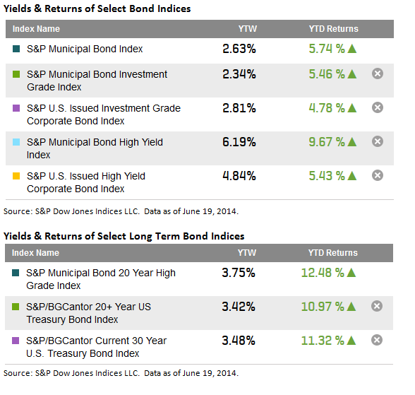
Over the last five years the S&P U.S. Issued High Yield Corporate Bond Index has seen annualized returns of over 13.6%. Year to date the index has returned 5.43% as yields have ended at 4.84% impacted by a 55bp drop since year end. By comparison, safer 10 year US Treasury bonds have seen yields drop by 40bps and have returned 5.17% year to date.

Can more juice get squeezed out of the junk bond sector? Looking at incremental yields of different asset classes can be revealing:

  • The yield of the S&P U.S. Issued High Yield Corporate Bond Index is 4.84% or 203bps higher yield than investment grade corporate bonds.
  • This is the lowest spread differential seen during the last two and half years of quantitative easing. During that time this spread has gotten as high as 317bps in June 2013.
  • High yield bonds are now only 221bps higher in yield than yield of the 10 year U.S. Treasury bonds.
  • High yield bonds are only 61bps higher in yield than the yield on senior loans tracked in the S&P/LSTA U.S. Leveraged Loan 100 Index.
  • High yield bonds are 135bps lower in yield than the yield of high yield municipal bonds tracked in the S&P Municipal Bond High Yield Index.

HY Bond Yields Returns 6 20 2014

The posts on this blog are opinions, not advice. Please read our Disclaimers.

Municipal bond market – Readily absorbs a bump up in new issue supply

Contributor Image
J.R. Rieger

Former Head of Fixed Income Indices

S&P Dow Jones Indices

The S&P Municipal Bond Index has returned 5.74% year to date as yields have remained relatively stable as the market absorbs new issue supply. High yield municipal bonds tracked in the S&P Municipal Bond High Yield Index have continued to outperform their corporate junk bond counterparts by returning 9.67% year to date. As the yields for U.S. corporate junk bonds has hit lows well below 5%, municipal high yield bonds in the S&P Municipal Bond High Yield Index have remained over 6%.

  • Longer dated municipal bonds have outpaced U.S. Treasuries with the S&P Municipal Bond 20 Year High Grade Index returning 12.48% year to date. The 3.75% tax-exempt yield of these bonds remains over 25bps cheaper than the 30 year U.S. Treasury Bond.
  • Tobacco settlement bonds have rallied all year as the S&P Municipal Bond Tobacco Index has returned over 13.2% as yields have fallen by over 100bps to end at 5.9%.
  • Yields Returns Munis 06 20 2014

The posts on this blog are opinions, not advice. Please read our Disclaimers.

The Effects of Interest Rates on Canadian Preferreds

Contributor Image
Phillip Brzenk

Managing Director, Global Head of Multi-Asset Indices

S&P Dow Jones Indices

A consideration to take into account when reviewing preferreds is the fact that they are sensitive to changes in interest rates.  The reasoning behind this is due to the structure of preferreds, as many issuances pay a relatively high dividend based on a percentage of par in perpetuity.  Like bonds, preferreds generally exhibit a negative relationship to interest rate changes.  When there is an increase in interest rates, the present value of future dividend payments decreases, and thus, the price of a preferred share would be expected to fall.

How can one estimate how sensitive preferreds are to interest rates? One way is to look at the effective duration of the asset class.  Duration is a tool that estimates price sensitivity to changes in interest rates; more specifically, it is the approximate percentage change in price resulting from a 100 basis point change in interest rates.

Using the empirical method by regressing historical portfolio returns of preferreds (represented by the S&P/TSX Preferred Share Index) to changes in interest rates, we found that preferreds in Canada have a historical duration estimate of -1.7.  This means that if interest rates were to rise by 1%, preferred prices would be expected to fall by 1.7%.  On the contrary, common stocks (represented by the S&P/TSX Composite Index) have a positive relationship with interest rate changes, with the historical duration estimated to be 15.5.

Using these duration estimates, we can look at how well interest rate changes have predicted the returns of the S&P/TSX Preferred Share Index during the time periods below.

Period Interest Rate Change Expected Return based on Duration Actual Return
2013 +0.88% -1.50% -7.16%
May 2013 – May 2014 +0.15% -0.26% -5.07%
YTD 2014 -0.46% +0.78% +1.80%

Sources: S&P Dow Jones Indices, Bank of Canada.  Duration estimate using data from Dec 2004 – Dec 2013 using monthly returns.  Portfolios are regressed against the 10-year Bank of Canada benchmark yield.

From the table above, we are able to see that the long-term historical duration estimate correctly projected the direction of the period return;but in all three time periods, the actual return was of greater magnitude than the expected return.  What is the reasoning for this?  Other factors besides interest rates also affect preferred prices. Some of these factors include company performance, call provisions of the specific share class, and the required credit spread of the preferred asset class above risk-free assets.  In 2013, the anticipation of future hikes to the target overnight rates in the U.S. and Canada also put negative pressure on the prices of preferreds.

Looking at the performance of each preferred share type in 2013 using the S&P/TSX Preferred Share Index, fixed rate preferreds performed the worst and floating rate preferreds performed the best.  Fixed perpetual preferreds carry the highest interest rate risk (i.e. duration), given that they have no set maturity date.  So it is no surprise that when interest rates rose in 2013, fixed preferreds had the lowest average price return.  The table below breaks down the average return for each preferred type for 2013.

Preferred Type Average Return
Fixed -7.0%
Floating -6.1%
Rate-Reset -6.5%

Source: S&P Dow Jones Indices.  Data from Jan 2013 – Dec 2013.

A preferred investor that seeks to mitigate the effects of increasing interest rates could look at shorter duration securities, such as floating-rate or rate-reset preferreds.  In 2013, where the markets saw increased rates, the S&P/TSX Preferred Share Laddered Index which is composed solely of rate-reset preferreds, had a total return of +0.88%.  The laddered index outperformed the S&P/TSX Preferred Share Index (total return of -2.64%) by 352 basis points.

The posts on this blog are opinions, not advice. Please read our Disclaimers.

Even Worse Than You Think

Contributor Image
Craig Lazzara

Former Managing Director, Index Investment Strategy

S&P Dow Jones Indices

It’s commonly recognized that the average active manager underperforms the market. There are good theoretical reasons why this should be true, and ample empirical evidence that it is true. On average during the last ten years, e.g., 59% of large-cap U.S. equity managers lagged the S&P 500, with comparably poor results for mid- and small-cap specialists.

Capitalization-weighted indices like the S&P 500 have a number of virtues, the most important of which for present purposes is that they tell us the return of the average dollar invested. Sharpe’s conclusion that “the average actively managed dollar must underperform the average passively managed dollar, net of costs” thus explains (among other things) the results of our SPIVA scorecards.

But cap-weighted indices do not tell us the return of the average stock. If we want to know the average stock’s performance, we can learn it by observing the return of an equal-weight index. Over time, equal-weight indices have outperformed their cap-weighted counterparts — an unsurprising result since equal-weight indices are mathematically certain to have a lower average capitalization, and there’s a well-known tendency for smaller stocks to outperform larger stocks.

Now, suppose we pick stocks at random, choosing from the constituents of the S&P 500. What return should we expect? With enough trials and enough time, random selection will produce the return of the average stock in the index. That means that the best estimate of the return of a randomly-selected portfolio is the return of an equal-weight index.

The dozen years since we began issuing SPIVA scorecards are a period in which the equal-weight S&P 500 decisively outperformed the cap-weighted index. The underperformance of the average active manager is therefore especially striking — since the average randomly-selected portfolio would have readily outperformed. This has two implications for those who employ and evaluate active managers:

  • Comparing active performance to an equal-weight benchmark can be a valuable complement to any portfolio review. Arguably, any alpha-generating process worth its salt should be able to outperform random selection — which is to say, should be able to outperform an equally-weighted index.
  • Since most active managers haven’t outperformed equal weight, it follows that, as a group, their performance is even worse than you think.

The posts on this blog are opinions, not advice. Please read our Disclaimers.

Inflationary Tales

Contributor Image
Tyler Cling

Senior Manager, Fixed Income Indices

S&P Dow Jones Indices

The market waits in anticipation this week as key economic indicators will be released to shed light on the health and direction of the financial world. The Department of Labor released Consumer Price Index (CPI) data for May showing consumer inflation ticking up 2.1% over the past twelve months.  The Federal Reserve has stated an inflation objective of 2.0% prior to raising rates.  The S&P/BGCantor Current 10 Year U.S. Treasury yields have remained relatively flat, 2.66 YTM with a YTD return of 4.94%.  Bond prices and yields have an inverse relationship.

% Change in CPI vs. Monthly YTM Current 10 Year Treasury

Returns

(Source: S&P Dow Jones Indices)

European Banks Back in Vogue

Conversely, across the pond, inflation has dropped to 0.6% in May, a 0.2% decrease from the EU’s April 0.8% inflation stat (Source: Eurostat).  With the EU reaching some of its lowest inflation since 2009, the European Central Bank cut rates in early June in an attempt to fuel growth.

In a lower rate environment, credit default insurance for the European financial sector is becoming cheaper.  Observed by the S&P/ISDA CDS European Banks Select 15, the notional amount has fallen 116 bps since this time last year to 73 bps.  Essentially, where the market required $2,323 to insure an underlying credit of $100,000 in this sector in June 2013, now only requires $726 or 69% less.  The reduction in cost of CDS insurance could be due to the three-year rally of the S&P Europe 350 which has a 1-year return of 18.49%.  This trend could also be systemic of investors willing to take on more risk in search of yields in the low rate environment.

CDS Spreads vs Euro 350

By examining the difference in spreads relative to the CDS European Banks to Eurozone sovereign bonds and financials in the U.S., we see that insurance across these sectors has not been this comparable in price for years. Default spreads between the S&P/ISDA CDS U.S. Financials Select 10 and European banks have not been this close since October 2011.  Similarly, one would have to look back to June of 2012 to find European bank default insurance priced as comparably to S&P/ISDA Eurozone Developed Nation Sovereign CDS OTR Index.  The difference today, however, is the dramatically lower cost against the notional debt of European bank credit default swaps.

Difference in CDS Spreads from European Banks Select 15

While the U.S. is finally hitting inflation targets and the E.U. is missing their own by over half, little has changed.  U.S. 10-year treasuries are still below 3% and the pricing of the default risk between the two indicates a similar outlook.  With the Fed cutting QE, reducing growth projections, and holding off to significantly raising rates until 2015; the outlook is uncertain.  For now, we will just have to wait and see how the tale of raising rates and inflation will play out.

The posts on this blog are opinions, not advice. Please read our Disclaimers.