Get Indexology® Blog updates via email.

In This List

The Importance of Sector Diversification in a Yield-Focused Strategy – Part I

ESG Strategies on the Rise

One Big Problem In July For One Small Cap Index

Leveraged Loans Over High-Yield Bonds

Risk-Adjusted SPIVA® Scorecard: The Evaluation of Active Managers’ Performance Through a Risk Lens

The Importance of Sector Diversification in a Yield-Focused Strategy – Part I

Contributor Image
Qing Li

Director, Global Research & Design

S&P Dow Jones Indices

Diversification is undoubtedly a central tenet of investing. Many studies[1] [2] [3] have shown that over the long-term investment horizon, maintaining a diversified portfolio can potentially reduce overall risk without compromising expected returns. As such, most market participants strive to form diversified portfolios in order to achieve their desired investment outcomes.

There are many ways to achieve diversification within a goal-based portfolio. For example, in a multi-asset portfolio, allocating across various asset classes helps to ensure that returns are uncorrelated and risk is spread across the underlying asset classes. Within the same asset class, diversification can be achieved by investing in various investment styles, investing in international markets, or through cross-sector allocation.

Income-focused strategies can be diversified across multiple fronts—their sources of income (i.e., asset classes and sub-asset classes) as well as sectors from which underlying securities are drawn from. In this series of blogs, we focus on the latter and will demonstrate that incorporating sector diversification in an equity-only, dividend-focused portfolio can help improve the overall risk-adjusted returns of the portfolio.

Using the S&P 500® stocks as the underlying universe, we constructed three hypothetical yield-focused, large-cap strategies with quarterly rebalancing.

  • Strategy 1 consisted of dividend-paying stocks;
  • Strategy 2 consisted of stocks generating positive free cash flows[4]; and
  • Strategy 3 consisted of stocks that exhibited both positive dividend yield and free cash flow yield characteristics.

For each strategy, we ranked securities by their respective characteristics, with the higher values ranking better, and divided them further into five quintiled portfolios. Therefore, the top quintiles of Strategies 1, 2, and 3 were composed of stocks with the highest value of each category. As shown in Exhibit 1, for any given strategy, the top quintile had higher excess returns than the bottom quintile based on quarterly rebalanced data.

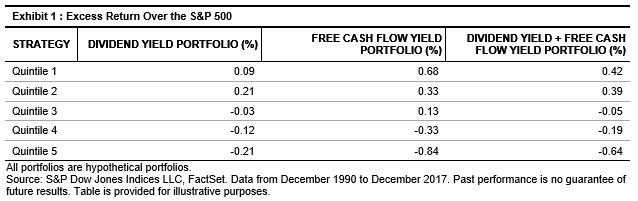
We see a clear linear relationship among all of the quintiles for the Free Cash Flow Yield and Dividend Yield + Free Cash Flow Yield strategies; that is, the first quintile portfolio (Q1) had higher excess returns than the second quintile (Q2), Q2 had better returns than the third quintile (Q3), and so on.

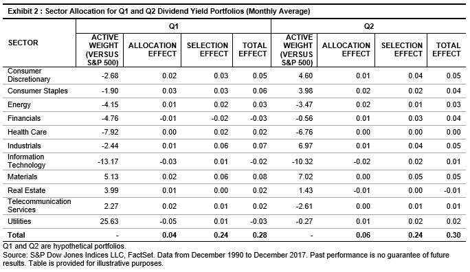
However, we did not observe the same pattern of returns for the Dividend Yield strategy.  Here, the Q2 portfolio fared better than Q1. Suspecting that sector bias could be the driving factor, we compared the sector allocation of these two quintiles versus the underlying universe (see Exhibit 2).

Historically, companies in the utilities sector typically pay out high dividends. Therefore, it is not surprising to see that the Q1 Dividend Yield portfolio had a 25% average overweight in the utilities sector relative to the S&P 500. However, this overweight brought a negative effect to the portfolio. Similarly, its average underweight in information technology and financials also detracted from the performance. We observed the opposite for the Q2 portfolio, where those sectors contributed positively.

The attribution analysis shows that sector bias could negatively affect active and overall returns. In part 2 of this blog, we will discuss potential approaches to resolve the undesired sector concentration.

[1]   A. Tabova, “Portfolio Diversification and the Cross-Sectional Distribution of Foreign Investment,” November 2013.

[2]   K. Phylaktis and L. Xia, “The Changing Roles of Industry and Country Effects in the Global Equity Markets,” February 2007.

[3]   S. Cavaglia, C. Brightman, and M. Aked, “On the Increasing Importance of Industry Factors: Implications for Global Portfolio Management,” March 2000.

[4]   Free cash flow is the excess cash that a business has after paying all of the operations and capital expenditures.

The posts on this blog are opinions, not advice. Please read our Disclaimers.

ESG Strategies on the Rise

Contributor Image
Alka Banerjee

Former Managing Director, Product Management

S&P Dow Jones Indices

Environmental, social, and governance (ESG) risks have taken a strong hold in the developed investing space. Previously, the concept had resided in the domain of “do gooders” and “tree huggers” seeking to make a better world. So what has changed so much that it is now taking root in mainstream investing? By and large, ESG has been able to make the move because of serious concerns backed by legitimate data around environmental degradation worldwide, its impact on humanity, communities, and countries, as well as its economic impact in the form of damage to properties and loss of man hours in the wake of environmental disasters that are coming at a pace not seen before. The damages extend to business activity, leading to loss of revenues and increasing the cost of insurance.

As the thesis around the reining in of environmental damages with a framework of a 2 degree Celsius alignment for climate change has spread, it has behooved large institutional asset owners with large monetary assets at their disposal to become part of the movement. Since no government can afford to finance this mammoth effort alone, it is increasingly apparent that private funding has to step up in innovative ways.

One way is to invest in the funds at their disposal in a manner that sends a message to the corporate world that companies that willfully pollute, feel no sense of corporate citizenship, and do not invest in clean power or processes, which in turn can cause severe environmental damage, will be overlooked when it comes to buying their stock. This process of under investing in or excluding certain types of stocks from investment portfolios has gained popularity in recent times.

Specialized data vendors, like Trucost, a part of S&P Global, measure the carbon footprint of a company to a fair degree of accuracy. This data is then used to create indices or investment portfolios that deliberately underweight polluters and overweight companies that are making an active effort to keep their pollution levels low. This process of penalizing in an investment framework, which keeps the risk/return tracking error for the investor fairly limited, has gained considerable popularity. It is like buying a free option on the carbon penalty. Indices like the S&P Fossil Fuel Free & Carbon Efficient Indices are designed to overweight cleaner companies at the expense of companies with higher emissions within each sector, which means that the risk/return profile of the company matches that of the underlying beta index. Yet, the asset owner is then able to engage companies and send a powerful message that this is an important aspect for them to address. Globally, billions of dollars of institutional asset owner money has moved to carbon efficient indices to indicate strong support for good environmental practices.

For more content related to ESG, dive into ESG on Indexology®.

The posts on this blog are opinions, not advice. Please read our Disclaimers.

One Big Problem In July For One Small Cap Index

Contributor Image
Jodie Gunzberg

Former Managing Director, Head of U.S. Equities

S&P Dow Jones Indices

Much attention has been drawn to small caps by top tier media since the small cap premium is now the biggest in eight years and the fifth biggest in history. The outperformance of the small cap stocks versus the large caps is being driven by the current economic environment of growth, rising interest rates, inflation and the dollar.  Also, Trump’s tax policy and news around rising tariffs and trade tensions are helping small caps as more of their revenue is generated domestically.

However, it’s not only where in the world small caps generate revenue from that matters, it is that the small caps have earnings.  Just as in the methodology of the S&P 500, the S&P SmallCap 600 has the same financial viability eligibility criteria that states the sum of the most recent four quarters’ as-reported earnings should be positive as should the most recent quarter.  This basic quality rule is vital to earning the small cap premium as discussed here in detail, and shown below where since inception of the S&P 600, only it has outperformed the large caps while the Russell 2000 has performed similarly to both the S&P 500 and Russell 1000:

Source: S&P Dow Jones Indices LLC. Data from June 1, 1995, to Sept. 29, 2017. Index performance
based on total return in USD. Past performance is no guarantee of future results. Chart is provided for
illustrative purposes.

As the media has highlighted small cap performance this year, they are asking more questions and doing deeper analysis on the available small cap indices.  Upon closer inspection of the small cap index choices, they are calling the Russell 2000, “the wrong small cap index.”

Here are two separate examples from articles where this has been published:

Barron’s
SIZING UP SMALL CAPS: A Tale of Two Indexes
Small-cap investors may be measuring their performance against the wrong benchmark
By Brett Arends –  January 27, 2018
Are investors following the wrong small-company stock index?
“The most commonly used benchmark is the Russell 2000, and over 90% of investment funds focusing on U.S. small-cap stocks use it to peg their performance. But for more than two decades, it consistently has done worse than the lesser-known S&P SmallCap 600 index…”

Financial Times
Are you following the wrong small-cap index?
Nicole Bullock in New York  – June 8, 2018
The widely-tracked Russell 2000 has done well, but not as well as a rival benchmark
“Small companies are setting a record pace on Wall Street this year, but many investors are missing out on the cream thanks to a divergence between the two main benchmarks that define the sector for fund managers…”

In addition to the basic earnings screen that has enabled the S&P 600 to deliver the small cap premium through time, there is one more reliable contributor to the S&P 600’s outperformance over the Russell 2000, and it happens in July.  

According to Big Things Come in Small Packages: Looking Into the S&P SmallCap 600 by Gunzberg and Glawe:

The other key methodology difference that drives the outperformance of the S&P SmallCap    600 versus the Russell 2000 is the annual reconstitution effect that dilutes Russell 2000            returns.  It, too, has been well documented, not only in a report by S&P Dow Jones Indices13
showing the significant t-stat of the return difference of the indices, but also by several other well-known 
researchers.

As winners from the Russell 2000 graduate to the Russell 1000, and losers from the Russell 1000 move down to the small-cap index, fund managers are forced to sell winners and buy losers, thereby creating a negative momentum portfolio.14   Jankovskis15 and Chen, Noronha, and Singal16 estimated that the predictable nature of the June Russell rebalancing process biases the return of the index downward by an average of approximately 2% per year. Similarly, Chen, Noronha, and Singal found the rebalancing impact to be 1.3% per year.

Source: S&P Dow Jones Indices LLC, Russell, FactSet. Data from 1994 through 2016. Past
performance is no guarantee of future results. Chart is provided for illustrative purposes and reflects
hypothetical historical performance. Please see the Performance Disclosure at the end of this
document for more information regarding the inherent limitations associated with back-tested
performance.

Together, quality and reconstitution account for most of the S&P SmallCap 600’s outperformance over the Russell 2000. Some of the return difference may also be associated with the liquidity criterion of the S&P SmallCap 600 that is not applied to the Russell 2000. Within the S&P SmallCap 600, a small percentage of stocks, roughly 3%, have a three-month average daily trading volume (ADVT) of less than USD 1 million, compared with about 15% of stocks in the Russell 2000 that have a three-month ADVT of less than USD 1 million. (2017, pp. 13-14)

Endotes:

13 Brzenk, P. and A. Soe, (2015), “A Tale of Two Benchmarks: Five Years Later,” S&P Dow Jones Indices.
14 Furey, James H., (2001), “Russell 2000 Bigger but not better benchmark.”
15 Jankovskis, Peter, (2002), “The Impact of Russell 2000 Rebalancing on Small-Cap Performance.”
16 Chen, Honghui, Greg Noronha, and Vijay Singal, (2006), “Index Changes and Losses to Investors in S&P 500 and Russell 2000 Index Funds.”

The posts on this blog are opinions, not advice. Please read our Disclaimers.

Leveraged Loans Over High-Yield Bonds

Contributor Image
Kevin Horan

Former Director, Fixed Income Indices

S&P Dow Jones Indices

As of July 5, 2018, the S&P/LSTA U.S. Leveraged Loan 100 Index returned 2% YTD, compared with the S&P U.S. High Yield Corporate Bond Index’s return of -0.29%. In 2018, U.S. high-yield performance has experienced two rather sizeable negative returns—back-to-back declines in February (-1.05%) and March (-0.45%)—followed by a turnaround in April (see Exhibit 1). Steady positive performance throughout has kept loans in the green for the year. In 2017, U.S. high yield prevailed in overall performance versus loans (with 2017 total returns of 7.2% and 3.3%, respectively), as more return is expected for the risk of being almost five years out in duration (4.87% as of July 5, 2018—see Exhibit 2).

Increased demand for bank loans this year has caused more loans to come to market, providing record-setting supply and increasing the amount outstanding of the S&P/LSTA U.S. Leveraged Loan 100 Index by 5% since the beginning of the year. Such large amounts of supply kept the average price and monthly performance flat for May and June. Concerns about the recent supply have centered on loan quality and the number of deals with fewer covenants and other protections for investors.

The floating rate, senior secured characteristics of this asset class provide some downside protection when compared with an unsecured high-yield bond. Loans provide some relative protection against duration risk in rising rate environments and structural protections as a senior secured instrument in periods of economic stress.

The posts on this blog are opinions, not advice. Please read our Disclaimers.

Risk-Adjusted SPIVA® Scorecard: The Evaluation of Active Managers’ Performance Through a Risk Lens

Contributor Image
Aye Soe

Former Managing Director, Global Head of Core and Multi-Asset Product Management

S&P Dow Jones Indices

Evaluating active managers’ performance through a risk lens is rooted in modern portfolio theory (MPT), which states that the expectation of returns must be accompanied by risk—the variation (or volatility) around the expected return. MPT assumes that higher risk should be compensated, on average, by higher returns.

Institutional investors tend to be interested in risk-adjusted returns. In addition to the performance of managers hired to manage their assets, institutional investors also look at the risks managers take to achieve those returns.

With that in mind, we initiated the first Risk-Adjusted SPIVA Scorecard, which seeks to establish whether actively managed funds are able to generate higher risk-adjusted returns than their corresponding benchmarks over a long-term investment horizon.

In our analysis, we used the standard deviation of monthly returns over a given period to define and measure risk. The monthly standard deviation was annualized by multiplying it by the square root of 12. The risk/return ratio looks at the relationship and the trade-off between risk and return. All else equal, a fund with a higher ratio is preferable since it delivers a higher return per unit of risk taken. To make our comparison relevant, we also adjusted the returns of the benchmarks used in our analysis by their volatility.

Given that indices do not incur costs, we also present gross of fees performance figures by adding the expense ratio back to net of fees returns. In this way, all else equal, higher risk taken by a manager should be compensated by higher returns.

Exhibits 1 and 2 look at the percentage of domestic and international managers outperformed by benchmarks, using risk-adjusted returns on gross of fees and net of fees bases over 5-, 10-, and 15-year investment horizons. We observe that large-cap value funds (over 10 years) and real estate funds (over 5 and 15 years) outperformed their respective benchmarks when using gross of fees risk-adjusted returns, indicating that fees played a major role in those categories.

Similarly, in international equities, we find that fees contributed meaningfully to the underperformance of international and international small-cap funds. For example, when using gross of fees returns in the risk-adjusted performance analysis, funds in those two categories outperformed the benchmarks over 5- and 10-year periods. When net of fees returns were used, the majority of managers across all categories underperformed the benchmarks.

The evaluation of active managers’ performance through a risk lens is an integral part of the investment decision-making process. However, as our study highlights, actively managed domestic and international equity funds across almost all categories did not outperform the benchmarks on a risk-adjusted basis. The figures improved for some categories when gross of fees returns were used. Therefore, we did not see evidence that actively managed funds were better risk managed than passive indices.

See the full report here: Risk-Adjusted SPIVA Scorecard.

The posts on this blog are opinions, not advice. Please read our Disclaimers.