Get Indexology® Blog updates via email.

In This List

Debt Rising

Three Takeaways From the SPIVA U.S. Year-End 2016 Scorecard

Regime Change? Not according to the VIX term structure…

MidCap: A Sweet Spot in the Indian Equity Market

Ingredients in a Multi-Factor Recipe

Debt Rising

Contributor Image
David Blitzer

Former Managing Director and Chairman of the Index Committee

S&P Dow Jones Indices

Outstanding household debt reached a new high in the 2017 first quarter, surpassing the level set in the 2008 third quarter when Lehman Brothers failed and the financial crisis arose.

Despite worrisome comments in the press, there is no cause for concern.  First, default rates on mortgages, auto loans and revolving credit are as low or lower than before the financial crisis. Second, the debt service ratio – the proportion of disposable income needed for the average household to service its debts — is 9.98%, close to its all-time low of 9.92%. Third, increases in consumer credit were responsible for setting a new high but mortgage debt is 10% below its 2008 peak.  Add to this the growth in employment and there are no economic reasons for consumer spending to falter. The charts below provide further insight into household debt.

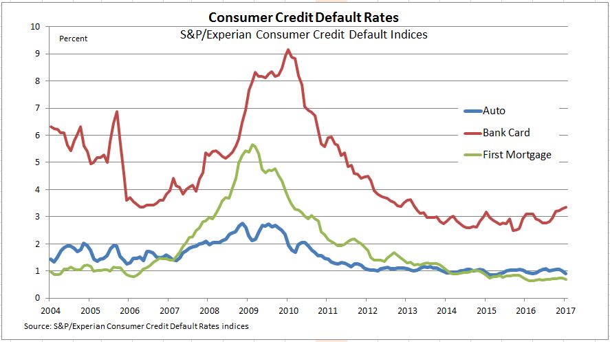
Default rates for mortgages and autos are both low and stable. “Bank cards” are credit cards like VISA, Mastercard or private label credit cards. These are revolving credit where an outstanding balance can be paid off at any time instead of a fixed payment schedule. The bank card default pattern is less stable and might be creeping up.  The Federal Reserve’s recent survey of Senior Bank Lending Officers revealed that a small portion of banks were tightening credit standards for consumer borrowing.

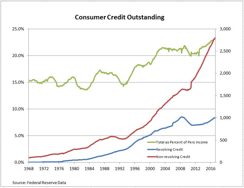
The second chart shows consumer credit outstanding for both revolving and non-revolving loans. Non-revolving loans include auto loans and are larger than revolving credit. They were less affected by the financial crisis.  The green line is total consumer credit (revolving and non-revolving) as a percentage of personal income. This shows that the use of consumer credit expanded substantially after about 1996, leveled off between 2004 and 2008 and then recovered and continued to rise after the financial crisis. Whether attitudes about using credit shifted or wage gains had difficulty keeping up with spending isn’t clear from these data.

Student loan growth is significantly higher than other segments of consumer credit. In the last ten years, student loan debt grew at a 10% annual rate compared auto loan growth of 4.4% annually and little net gain in revolving credit.

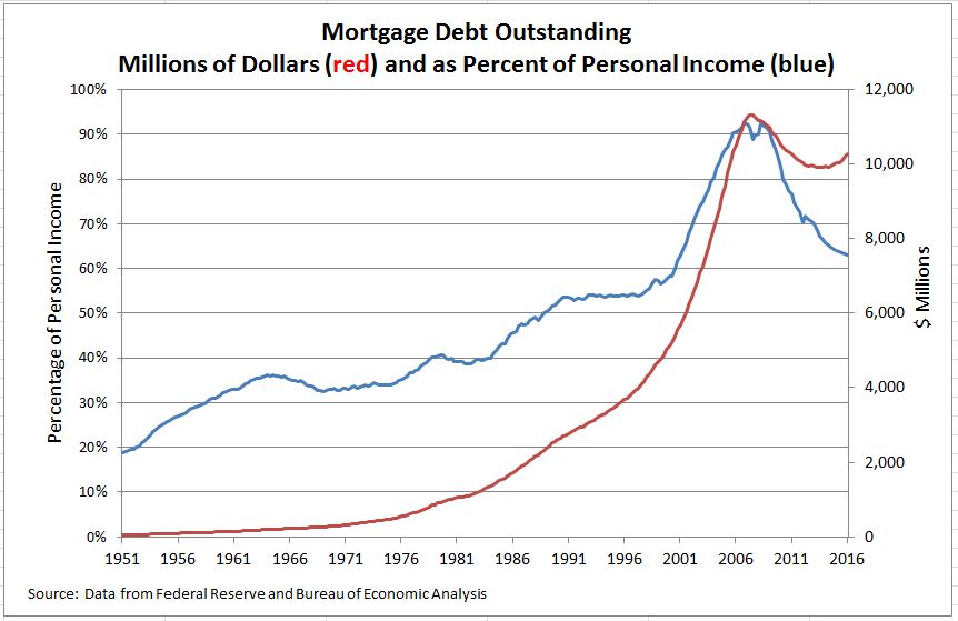
Total mortgage debt for one to four-family homes is rising again and housing is recovering as shown by the red line. More interesting is the blue line which shows that household mortgage debt as a proportion of personal income peaked at over 90% then fell sharply as mortgages were paid off or written off as the economy expanded after the 2007-9 recession ended. Since mortgage debt was one of the problems leading the economy into the financial crisis, this suggests that there may be a cushion should another downturn loom up in the near future.

Debt tends to have a bad reputation in both history and literature. In economics it is worth noting that without debt and borrowing we wouldn’t have a capitalist economy or financial markets.

The posts on this blog are opinions, not advice. Please read our Disclaimers.

Three Takeaways From the SPIVA U.S. Year-End 2016 Scorecard

Contributor Image
Ryan Poirier

Former Senior Analyst, Global Research & Design

S&P Dow Jones Indices

S&P Dow Jones has been reporting the SPIVA® U.S. Scorecard for 15 years now.  Over the years, it has helped contribute to the active versus passive debate in a systematic and objective manner.  While some market segments or styles of active management can be cyclical in their ability to outperform, the secular trends in reported long-term SPIVA numbers remain fairly consistent.  Beginning with the year-end 2016 report, we have a 15-year comparison, which captures a full market cycle.

There are three key observations we can make from the SPIVA U.S. Year-End 2016 Scorecard: (1) the majority of active managers across major equity and fixed income categories, on average, underperformed their benchmarks over the medium- to long-term horizon, (2) the secular bull market since the 2008 financial crisis has been a difficult hurdle for managers to overcome, and (3) most domestic equity managers failed to navigate effectively during volatile periods in the marketplace (one-year period).

Exhibit 1 addresses the first observation for the various asset classes reported in SPIVA.  The scorecard shows that 92.15% of large-cap, 95.40% of mid-cap, and 93.21% of small-cap Funds underperformed their benchmarks, respectively.  This lag in performance is a result of approximately 50% of funds surviving the whole period.  Market participants seek managers that will outperform, but simply having a fund that will survive may be the first checkpoint.

It has also proven difficult for active managers to outperform passive indices during the secular (eight-year) bull market.  U.S. equity managers fared marginally better on a percentage basis over the five-year period; nevertheless, the majority of managers still underperformed the benchmark (see Exhibit 1).  Exhibit 2 shows the yearly performance of the S&P 500 on a total return basis.  Wrong security selection, insufficient market beta exposure, or having a large allocation to cash could possibly result in underperformance, given the strength of the market.

One proposed benefit of active management is that managers have the ability to make tactical asset allocation decisions depending on the market environment, while passive indices cannot do so, as they tend to be structurally constrained by an index rebalancing schedule as laid out in the methodology.  The past one-year period encapsulated three market events that could have been the catalyst for such a tactical strategy: China’s economic concerns (Q1), Brexit (Q2), and perhaps a “risk off” environment in anticipation for an uncertain election result (Q4).  Exhibit 3 shows the performance of the S&P 500 along with the drawdowns from previous highs for each event.  Even amid these market events, 66% of large-cap, 89.37% of mid-cap, and 85.54% of small-cap fund managers underperformed (see Exhibit 4).

The SPIVA Scorecard can act as the starting point for market participants to understand more about the effectiveness of passive investing across major core equity and fixed income categories.  The year-end 2016 report in particular is noteworthy in that it addresses key areas of active management: long-term performance, the impact of secular bull markets on managers’ performance, and managers’ ability to navigate market volatility.

Based on the SPIVA findings, core passive indices can potentially be used in the investment process and portfolio construction.  To learn more about passively implemented core asset allocation strategies, please join us for our webinar In With the Old and the New: Why Core Strategies Are Still Essential.

The posts on this blog are opinions, not advice. Please read our Disclaimers.

Regime Change? Not according to the VIX term structure…

Contributor Image
Tim Edwards

Managing Director, Index Investment Strategy

S&P Dow Jones Indices

Since the U.S. election, a degree of optimism over potential business-friendly legislation – ranging from tax reform to infrastructure spending – has played a significant part in sending benchmarks such as the S&P 500 to new all-time highs.  Whether this optimism will be justified by actual legislation, of course, is a different issue.

At a minimum, recent political developments have the potential to distract the attention of the Trump administration and U.S. Congress, at least in the near term.   But their greater consequence is uncertain.  For example, how should we interpret the fact British bookmakers are offering better-than-even odds on Trump failing to complete a full first term, when the same sources told us Trump had an 80% chance of not being President in the first place?

Both equity and volatility markets provide an inconclusive verdict.  The S&P 500 fell by 1.8% yesterday: this was the biggest daily move since November, but definitely “small potatoes” within a broader historical context.  Far more dramatically, the VIX soared by over 46% yesterday: a huge swing and among the largest daily changes so far this decade.  Yet the gain was only large in percentage terms; VIX remains well below its long-run average, having risen from near-record lows.

In fact, things are looking a little nervous in U.S. equities … but not yet anywhere near panic.  The VIX futures curve gives a broader perspective:

The VIX futures curve is typically upward sloping in the shorter maturities, i.e. VIX futures normally trade at a higher price than the underlying index, especially when the VIX is low.  Indeed, at no point since 2007 has there been a VIX below 16 accompanied by a front VIX future more than a whole point below it – until yesterday, when the VIX closed at 15.59, while the June future closed at 14.23.

This rare occurrence suggests that the current volatility spike is being treated by market participants as a temporary repricing, instead of a structural regime change. 


The posts on this blog are opinions, not advice. Please read our Disclaimers.

MidCap: A Sweet Spot in the Indian Equity Market

Contributor Image
Mahavir Kaswa

Former Associate Director, Product Management

S&P BSE Indices

The mid-cap space has often been described as the “sweet spot” of equity investing—and with good reason.  Mid-cap companies tend to offer a balance between the high growth (and high risk) offered by small caps and the stability (but relatively slower growth) of large caps.  Additionally, Indian mid-caps have a more diverse sector representation than large caps, which have a relatively higher weight in the BSE sector of finance (32%), while small caps have a relatively lower weight in energy.  Over the long term, these unique characteristics have helped India’s mid-cap segment outperform all other size categories on an absolute and risk-adjusted basis (see Exhibits 1, 2, and 3).

Exhibit 1: Index Performance Since Inception

Source: Asia Index Pvt. Ltd.  Data from Sept. 16, 2005, to April 28, 2017.  Index performance based on total return in INR.  Past performance is no guarantee of future results.  Charts are provided for illustrative purposes and reflects hypothetical historical performance.  The S&P BSE LargeCap, S&P BSE Midcap, and S&P BSE SmallCap were launched on April 15, 2015.  The S&P BSE MidCap Select and S&P SmallCap Select were launched on June 15, 2015.

Exhibit 2: BSE Sector Weights
BSE SECTORS BENCHMARK SIZE INDICES INVESTABLE SIZE INDICES
S&P BSE LARGECAP S&P BSE MIDCAP S&P BSE SMALLCAP S&P BSE SENSEX S&P BSE MIDCAP SELECT S&P BSE SMALLCAP SELECT
Basic Materials (%) 6.4 11.5 13.3 1.1 13.7 12.2
Consumer Discretionary (%) 11.0 14.5 24.1 10.2 11.5 19.7
Energy (%) 10.8 7.4 1.3 11.5 9.6 0.0
Finance (%) 32.2 24.1 18.1 32.7 23.2 29.7
FMCG (%) 10.3 8.8 5.2 11.1 6.8 0.0
Healthcare (%) 5.1 10.9 7.3 5.9 11.6 10.1
Industrials (%) 8.1 13.7 22.3 9.4 16.7 17.3
Information Technology (%) 10.9 1.7 4.2 12.3 1.8 4.9
Telecom (%) 2.0 1.2 0.8 1.7 0.0 0.0
Utilities (%) 3.2 6.3 3.4 4.1 5.3 6.0
Total (%) 100.0 100.0 100.0 100.0 100.0 100.0

Source: Asia Index Pvt. Ltd.  Data as of April 28, 2017.  Table is provided for illustrative purposes.

As of April 28, 2017, mid-cap stocks comprised 85 companies and approximately INR 18,61,340 crores (USD 11,416 billion) in total market cap, as measured by S&P BSE MidCap, representing nearly 16% of the broad market S&P BSE AllCap.

As of June 15, 2015, Asia Index Pvt. Ltd launched some investable size indices—the S&P BSE MidCap Select and S&P BSE SmallCap Select, which include the top 30 and 60 stocks, respectively, after relatively stringent liquidity filters.

Exhibit 3 demonstrates that for the 10-year period ending April 28, 2017, the S&P BSE MidCap and S&P BSE MidCap Select consistently outperformed their peer size indices.  Unsurprisingly, Indian mid-cap companies experienced higher volatility than large-cap companies but lower volatility than small-cap companies.  However, market participants were more than compensated for the higher risk, as the S&P BSE MidCap and S&P BSE MidCap Select recorded higher risk-adjusted returns.

Source: Asia Index Pvt. Ltd.  Data from Sept. 16, 2005, to April 28, 2017.  Index performance based on total return in INR.  Table is provided for illustrative purposes and reflects hypothetical historical performance.

A unique combination of potential for higher growth than large caps and relatively better stability (lower volatility) than small cap, along with diversification across BSE sectors, has led the S&P BSE MidCap and S&P BSE MidCap Select to outperform their large- and small-cap counterparts over the long term.

ICICI Prudential Asset Management Company last year launched an ETF that tracks the S&P BSE MidCap Select.

The posts on this blog are opinions, not advice. Please read our Disclaimers.

Ingredients in a Multi-Factor Recipe

Contributor Image
Andrew Innes

Head of Global Research & Design

S&P Dow Jones Indices

In our previous blog on multi-factor merits, we discussed the diversification benefits of combining equity factors.  We highlighted how multi-factor indices may generate more stable excess returns, while avoiding the risks inherent in timing factors.  But to achieve this, can market participants just throw lots of factors into a pot and hope for the best?  Or should a little more care be taken in selecting a blend of ingredients?

The secret ingredients in S&P DJI’s latest multi-factor index are no secret at all; the S&P 500® Quality, Value & Momentum Multi-Factor Index uses just three key factors—and they are printed right on the label.

Determining whether this combination of factors (or any other) is sensible and likely to be effective requires following a simple checklist.

  1. Do each of the factors demonstrate a widely accepted, long-term risk premium or pricing anomaly?
  2. Do the active returns between factors exhibit negative or low correlations?
  3. Is there an economic rationale to explain why the combination has been chosen?
  4. Has the interaction between factors been considered and does the outcome generate the desired balance between factor returns?

In the case of quality, value, and momentum, not only are their risk premiums widely documented and accepted in academic research, but the correlations between their active returns are often low or negative.  To understand the economic rationale for this multi-factor combination, it may be helpful to think of the aggregate portfolio in terms of a single synthetic target stock.  This synthetic stock has the attributes of quality, value, and momentum simultaneously.

Inexpensive stocks are generally desirable, providing they do not represent value traps.  Requiring that the stock has momentum suggests that the market has become increasingly optimistic about the company’s prospects.  Therefore, the stock can possibly be picked up while it is still at a relatively low multiple.  Focusing the search on high-quality companies can further reduce the value trap risk.  High return on equity, a low accrual ratio, and a strong balance sheet with low leverage all indicate a company with an adequate margin of safety that is capable of meeting challenges in the market.

To complete the final step on our checklist, we shall look at the sources of the returns of the S&P 500 Quality, Value & Momentum Multi-Factor Index.  To do this, we have calculated the regression coefficients of the historical returns of the index against the active returns of several single-factors.  Orthogonal returns were generated for each factor by stripping out any correlations between their active return series.  This leaves us with entirely independent, systematic factor returns that explain the vast majority of the performance of our multi-factor index.

It is evident from Exhibit 1 that the multi-factor index demonstrates reasonably balanced exposure across the returns of the desired factors, in addition to significant market beta.  This balanced output is in part due to the equal-weighted approach used in creating each stock’s multi-factor score.  It is also an indication that the interactions between the various factor scores are not causing any particular factor to become overly dominant.  Changing or increasing the number of factors used in the selection process may have an unexpected impact on this balanced exposure.

Interestingly, but not surprisingly, the multi-factor index benefits from additional exposure to the low volatility and size factor returns.  Since the momentum scores used are risk adjusted, the low volatility factor gets in through the back door.  As for the index’s smaller-cap bias, the final weights are generally tilted away from the market-cap-weighted benchmark because the weighting method incorporates the multi-factor scores.

So although the recipe for the S&P 500 Quality, Value & Momentum Multi-Factor Index targets just three factors, it is evident the final returns benefit from a generous handful of the low volatility and size factors for good measure.

For a more detailed overview on S&P DJI’s approach to multi-factor indices, please see “The Merits and Methods of Multi-Factor Investing.”

The posts on this blog are opinions, not advice. Please read our Disclaimers.