Get Indexology® Blog updates via email.

In This List

Manager Outperformance: Is it Luck or Skill?

Rising Rates Environment Doesn’t Hurt All REITs

Monetary Cycles and the Fixed Income Market – What Can the Past Tell Us About the Current Cycle?

Avoiding Beta Pollution in the Search for Value

Futures Prices for Europe’s Fear Gauge Jump. U.S. Investors say, “Le Pen? Le Who?”

Manager Outperformance: Is it Luck or Skill?

Contributor Image
Aye Soe

Former Managing Director, Global Head of Core and Multi-Asset Product Management

S&P Dow Jones Indices

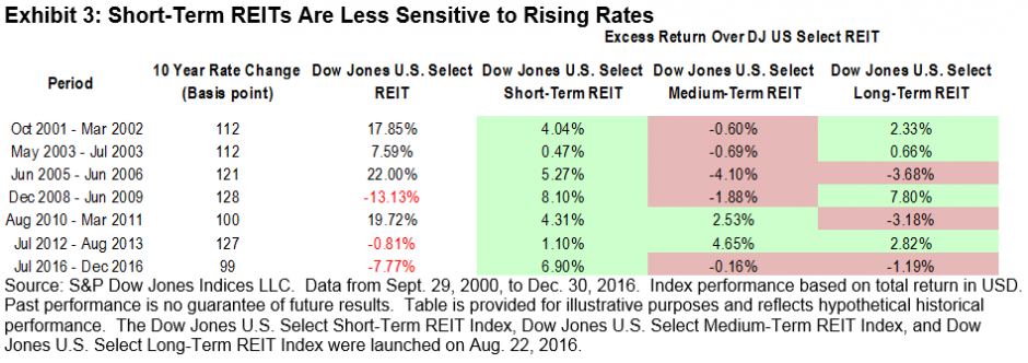
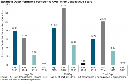
Over the years, we frequently hear from our SPIVA® and Persistence Scorecard readers that they have found their star manager or their own Warren Buffet—someone who can successfully beat the benchmark repeatedly.  Based on our 15 years of publishing the SPIVA U.S. Scorecard, we know that, on average, around 20% to 30% of domestic equity managers successfully outperform the benchmark in any given year.  We do not know, however, whether the same groups of managers outperform the benchmark over time.  At the same time, the Persistence Scorecard informs us that the likelihood of a top-quartile manager maintaining the same success over three consecutive years is less than a random coin toss.

In order to identify the likely persistence of a manager’s ability to generate positive alpha (whether due to luck or skill), we studied whether a group of funds that outperformed their benchmarks in one period could persist in delivering alpha in consecutive periods.  We measured this by tracking a group of funds that outperformed the benchmark on a rolling quarterly basis, based on three-year annualized returns.  We then examined whether these outperforming funds (the “winners”) continued to outperform during each of the three subsequent one-year periods.

The University of Chicago’s Center for Research and Security Prices (CRSP) Survivorship-Bias-Free US Mutual Fund Database served as the underlying data source for our study.  To avoid double counting multiple share classes, only the share class with the highest return in the previous period of each fund was used.  At each measurement period, the universe, on average, consisted of over 2,300 active equity funds.

The study period was from March 31, 2000, through Sept. 30, 2016, based on the earliest availability of Lipper style classifications.  On a quarterly basis, using three-year annualized returns for each of the funds in our universe as well as their corresponding benchmarks, we identified funds that beat their benchmarks.  We then tracked their relative performance for each of the following three years.

The results showed that, with the exception of large-cap value managers, there was negligible performance persistence across most domestic equity categories beyond a one-year horizon.  For example, out of 1,034 large-cap funds that existed in the universe as of Sept. 30, 2013, only 19.73%, or 204 funds, outperformed the S&P 500®.  In the following year, 15.69% of those 204 funds outperformed the benchmark.  By the end of the third year, none of those original 204 funds were able to outperform the S&P 500 on a consecutive basis (see Exhibit 1).

A point-in-time snapshot of the performance persistence figure can be unduly influenced by cyclical market conditions.  Therefore, we also computed the rolling quarterly average performance persistence figures from March 31, 2003, through Sept. 30, 2016.  For more detailed results, please see the research paper, Fleeting Alpha: Evidence From the SPIVA and Persistence Scorecard.

Taken together, the data indicate the difficulty that market participants face in finding a skillful manager that can offer consistent alpha on a near- to medium-term basis.  Therefore, market participants may not be best served by chasing hot hands or picking managers based solely on past performance.


The posts on this blog are opinions, not advice. Please read our Disclaimers.

Rising Rates Environment Doesn’t Hurt All REITs

Contributor Image
Qing Li

Director, Global Research & Design

S&P Dow Jones Indices

In a positive sign for the U.S. economy, the Federal Reserve raised the federal funds target rate in December 2016 and penciled in another three hikes in 2017.  While investors may welcome higher interest rates earned from their cash deposits, high-yielding instruments that carry debt can be adversely affected due to higher borrowing costs.  Conventional wisdom dictates that REITs fall into that category and are generally negatively affected by rising interest rates.

Using historical returns, we looked at how REITs performed in rising rates environments and whether REITs categorized by the duration of lease agreements reacted in the same manner.

Exhibits 1 and 2 show how the broad REIT market responded during past rate hikes.  During the 1994-1995 tightening cycle, when rate hikes were significant and frequent within a short period, the Dow Jones U.S. Select REIT Index posted negative returns (-5.81%).  However, the index had positive cumulative returns (2.64% and 63.66%) during the other two tightening cycles, during which rate increases were fairly steady over time.

It is important to remember that REITs can differ meaningfully in terms of average lease durations based on the underlying properties they own.  For example, Hotel REITs may invest in hotels and motels that have daily lease terms, but the lease life for Healthcare REITs can be 10 years, because these REITs invest in healthcare-related properties such as hospitals and senior housing.

Since longer-term interest rates are considered more representative of real estate financing costs, we compared how REITs with different lease durations performed in periods of increasing 10-year U.S. Treasury Bond yields, based on month-end data.  Exhibit 3 shows the seven periods during which 10-year U.S. Treasury Bond yields increased 100 bps or more.  The broad REITs market averaged a 6.5% return during these rising rate cycles.  REITs holding properties with short-term leases, as indicated by the Dow Jones U.S. Select Short-Term REIT Index, actually benefited from the rising rates, with returns exceeding the broad REITs market for all cycles analyzed.

This is easy to understand if we think of REITs as bond-like investments and the cash flows from rental payments as coupon payments.  The properties with shorter rental agreements are more flexible in terms of renegotiating rental rates; thus, REITs with shorter lease terms are less sensitive to rate increases and behave more like floating rate bonds.  For example, Hotel REITs typically have daily leases.  This characteristic makes Hotel REITs highly cyclical and able to quickly adjust rental prices.

Our analysis shows that a high interest rate environment does not necessarily have a negative impact on REIT performance.  REITs with short-term lease durations, on average, are less sensitive to interest rates and could benefit from rising rates.

The posts on this blog are opinions, not advice. Please read our Disclaimers.

Monetary Cycles and the Fixed Income Market – What Can the Past Tell Us About the Current Cycle?

Contributor Image
Dennis Badlyans

Former Associate Director, Global Research & Design

S&P Dow Jones Indices

Rising rates are generally seen as bad news by fixed income market participants.  As rates go up, prices of fixed income assets are expected to go down.  However, returns (or losses) can vary depending on characteristics of the cycle, as well as the amount of income or carry available to cushion the decline in price.

Historical analysis of previous policy cycles can help to better understand how fixed income assets may respond through the current cycle.  A change to the federal funds rate transmits to fixed income asset prices through the front end of the risk-free curve.  For example, over the two-year tightening cycle that ended in 2006, the Fed hiked policy rates by 425 bps, causing the One-Year U.S. Treasury Bond yield to increase by 316 bps (see Exhibit 1).  Longer-term rates, however, are heavily influenced by other macroeconomic factors and technical drivers, such as supply and demand of bonds.  Over the same tightening cycle that ended in 2006, the impact on the 10-Year U.S. Treasury Bond yield was 60 bps higher, driving the 1-Year/10-Year slope to flatten by 265 bps (see Exhibit 1).  As shown by the slope changes in the table, flatter curves have been characteristic of tightening cycles and steeper curves have resulted from easing cycles.

The main challenge the committee faces is normalizing from the unprecedented low levels that have been the norm for nearly a decade, while balancing negative effects to a jittery economic recovery.  In spirit, the current tightening cycle is no different from previous ones, in that the FOMC is balancing the tradeoff between inflation and growth.  In the easing cycle that began at the Sep. 18, 2007, FOMC meeting and lasted through the January 2009 meeting, the committee acted swiftly to cut the federal funds rate by 500 bps.  Less traditional policy tools (such as quantitative easing) were used to further augment the accommodative stance of the Fed.  Furthermore, the accommodative stance has been held for nearly a decade (see Exhibit 2).  With two hikes already behind us, FOMC members seem to be uniting around the message of three additional hikes in 2017, for a total of five rate hikes over 20 meetings (a two-year period—or, arguably, a five-year period since the announcement of tapering of quantitative easing in 2013).

In the current protracted tightening cycle, the Treasury yield curve has remained relatively steep.  The yield difference between the S&P U.S. Treasury Bond Current 10-Year Index and the S&P U.S. Treasury Bond Current 2-Year Index was 122 bps as of the close on Feb. 23, 2017, versus about 120 bps pre-taper tantrum (see Exhibit 3).  This may be partly due to technical pressures on the back end of the curve (see Exhibit 4).

In this blog post we provided a glimpse into the characteristics of monetary policy cycles and the impact on yields.  In follow-up posts, we will discuss the implications for total return of treasury portfolios and credit products.

The posts on this blog are opinions, not advice. Please read our Disclaimers.

Avoiding Beta Pollution in the Search for Value

Contributor Image
Shaun Wurzbach

Managing Director, Head of Commercial Group (North America)

S&P Dow Jones Indices

In our latest S&P 500® Factor Indices Dashboard, Tim Edwards wrote, “Value’s return to form came after a decade of meagre pickings.  In fact, value recorded in its best annual relative performance since 2000.”

Small wonder then that the S&P 500 Enhanced Value Index and S&P 500 Pure Value were popular topics of financial advisor discussion at the 2017 Inside ETFs Conference in January.

Mike Philbrick, President of ReSolve Asset Management, shared an interesting view: “I like S&P 500 Pure Value because the index isn’t ‘polluted’ with beta.”  I had to follow up on that to see what he meant.  Mike’s point is that since S&P 500 Pure Value’s methodology selects only one-quarter of the benchmark index’s market capitalization (the index has 116 constituents as of the last rebalancing) with the strongest value scores and excludes the rest, it is a better return-enhancing risk premia “mousetrap” than previous generations of value indices.

By taking a look at the factor scoring diagram below of the S&P 500 Value and comparing that to the factor scoring diagram of S&P 500 Pure Value, Mike’s point is made visually.  The S&P 500 Pure Value exhibits a much larger value factor rank than the S&P 500 Value.  In relative terms, the S&P 500 Value does not differ as much from the S&P 500 benchmark (beta) as the S&P 500 Pure Value does.

Speaking of the S&P 500 Pure Value, a question I hear frequently from financial advisors is whether an equal combination of the S&P 500 Pure Value and S&P 500 Pure Growth has outperformed our S&P 500.  Thanks to my friend, Sam Stovall, Chief Strategist at CFRA, one can see that the answer to that question is yes.  Sam calls this “barbell” approach the Mr. Universe Strategy.  Exhibit 3 shows his results after he applied an annual rebalance to the combination of S&P Pure Style Indices.  Based on Sam’s results, Mike Philbrick may have a good point about beta pollution.

At the Inside ETFs event, S&P DJI launched a factor allocator tool designed for us by Optimal Advisors, and we demonstrated that tool to financial advisors who visited our booth.  The tool visually and quantitatively shows how the S&P 500 Pure Value has performed.  Furthermore, the tool allows users to see the effects of combining the value factor with other factors such as quality and momentum.  Powered by more than 15 years of S&P DJI index data, this tool can be found here.  Financial advisors who saw this tool demonstrated at Inside ETFs said it answers some of their questions about how to implement value as a factor and combine value with other factors in a portfolio.  During our webinar for financial advisors on March 22, 2017, we will talk about factor case studies that make use of our factor dashboard and factor allocator.

The posts on this blog are opinions, not advice. Please read our Disclaimers.

Futures Prices for Europe’s Fear Gauge Jump. U.S. Investors say, “Le Pen? Le Who?”

Contributor Image
Reid Steadman

Former Managing Director, Global Head of ESG & Innovation

S&P Dow Jones Indices

Futures tied to VSTOXX, the Eurozone’s version of VIX, are signaling risk ahead. The French elections, which take place April 23 (first round) and May 7 (run-off election) and the possibility of Marine Le Pen leading France’s exit from the Eurozone appear to have spooked European options investors. They are now paying higher premiums for put options expiring near the election. As a result, the term structure for VSTOXX futures has assumed an unusual shape.

VSTOXX is usually higher than VIX (on average by 10.6 points over the past five years) but the two benchmarks tend to move in near lockstep.

Should U.S Investors Care?
Here’s a quick quiz for you. What percentage of S&P 500 company sales come from Europe? According to a report issued by S&P Dow Jones Indices last year, 7.8% of S&P 500 sales revenue in 2015 came from Europe.  If France were to leave the Eurozone, this could affect the U.S. in ways beyond those captured in direct sales figures. Still, 7.8% is a good statistic to keep in mind. Leading U.S. companies are less tied to the European economy than many investors would expect.

A Look Back at the Brexit Vote
Traders, policy experts, and journalists are comparing the French elections to the Brexit vote. It’s worth looking back to see how VSTOXX and VIX moved when British voters chose “Leave.”

VSTOXX and VIX are notoriously noisy signals – the “vol of vol” is high – but we can note the following:

  • Though most economists predicted “Remain” would win, VSTOXX traded at elevated levels before the election, indicating greater uncertainty in financial markets about the outcome.
  • When “Leave” prevailed, both VSTOXX and VIX jumped, but U.S. options investors were more surprised. One day after the Brexit vote, the VSTOXX closed only 8.7% higher than the day before (36.4 to 39.6). In comparison, VIX increased 49.3% between closings.
  • Options investors in both markets quickly focused forward and VSTOXX and VIX declined to normal levels in the course of a week.

The French election and Brexit are of course different, but VSTOXX and VIX look like they did leading up to the Brexit vote: VSTOXX is elevated and VIX is low. On April 23 and May 7, we will learn whether U.S. investors have been too complacent.


The posts on this blog are opinions, not advice. Please read our Disclaimers.