Get Indexology® Blog updates via email.

In This List

Metals Don't Reflect Chinese Demand Growth

Key Environmental Metrics for Investors: It’s not Just Carbon

Who’s Afraid of a Carbon Tax?

Unnaturally Negative Interest Rates

How Did South African Active Managers Perform in 2015?

Metals Don't Reflect Chinese Demand Growth

Contributor Image
Jodie Gunzberg

Former Managing Director, Head of U.S. Equities

S&P Dow Jones Indices

After China reported year-over-year first-quarter growth that showed signs of improvement, it overpowered negative news of the Doha oil production meeting failure and sent commodities rallying. Investors’ attention quickly shifted from oil to the other economically sensitive sector, industrial metals.

Many believe the uses for metals in construction and automobile manufacturing are the driving force behind the sector. Copper even earned its nickname “Dr. Copper” for its supposed ability to indicate the economic health of China. However, data shows Dr. Copper is not so smart and that this rally is from the weak dollar and supply shocks rather than Chinese GDP (gross domestic product) growth.

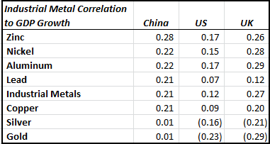
The first myth is that copper and industrial metals are correlated to economic growth, especially China’s. Using year-over-year data since 1978, the correlation of copper to Chinese GDP growth is only 0.21, and is actually the lowest of all the industrial metals. The most correlated metal is zinc but the relationship is still weak at only 0.28.

Source: S&P Dow Jones Indices and Bloomberg. Data year-over-year since 1978. Metals are lagged one year.

Even if Chinese demand might not be enough to boost the metals, there is still hope for the sector.  The correlation of metals to the US dollar has a higher (and inverse) relationship than to GDP growth, but the correlation is still only moderate.

Source: S&P Dow Jones Indices and Bloomberg. Data year-over-year since 1978.

However, the weakening dollar helps metals more than any other commodity sector. In the past 10 years, for every 1% move down in the US dollar, gains in lead, nickel, copper, zinc and aluminum have been 7.2%, 6.1%, 5.3%, 4.6% and 2.2%, respectively. Also, silver has gained 6.0% and gold has gained 3.5% for every 1% slip in the dollar.  The weak dollar helps far more than a strong one hurts.

Source: S&P Dow Jones Indices and Bloomberg.

Besides the tailwind of a weakening dollar, there are noticeable shortages that have appeared. March was the first month the industrial metals sector was in backwardation since September 2015 and marked the third time in 18 months – that hasn’t happened since 2007, before the financial crisis.  

Source: S&P Dow Jones Indices.

Within the sector, there have been recent shortages in industrial metals from lead, copper and aluminum. While copper has more shortages than excess inventories throughout history, its roll yield has grown (measuring a shortage) 60% in the first quarter. Also, lead showed a shortage in Feb for the first time since Nov. 2012, but now is a seasonally weak time for lead as the winter demand for replacement automobile batteries slows. However, the support for aluminum could be more persistent from stockpiling and tax policies. It is very rare to see shortages in aluminum. There have only been 10 months in 10 years with a positive roll and it seems to be driving the whole sector. 

Source: S&P Dow Jones Indices.

Notice the dramatic decline over the year in warehouse stock levels too.

Source: http://www.kitcometals.com/charts/aluminum_historical_large.html#lmestocks_1year Date April 20, 2016.
Source: http://www.kitcometals.com/charts/aluminum_historical_large.html#lmestocks_1year  Date April 20, 2016.

Zinc has gained more than gold this year and is the best performer in the sector, up 20.5% in 2016. Its excess is half of what it was in October.  Supply cuts and mine closures have boosted returns. “Zinc inventories dropped for a 28th straight session to 413,250 metric tons, the lowest since August 2009, as supply cuts and the closing last year of China’s MMG Ltd. Century mine and Vedanta Resources Plc’s Lisheen mine boosted the need for supplies on exchanges. Chinese new-home prices rose last month in 62 of 70 cities tracked, compared with 47 cities in February, helping boost the demand outlook for the metal.” –  According to Bloomberg, stockpiles are the lowest in more than six years.

Nickel hasn’t seen a shortage since 2011, despite its huge price spike in 2014 of more than 50%. The suppliers are producing relentlessly to try to squeeze out marginal producers for market share – much like what is happening in the oil market. Except the role of China is flipped. Nickel producers want to squeeze China out, yet China is the oil customer everyone wants.

So, the story isn’t as simple as “Chinese demand growth boosts copper (or industrial metals).” While the demand growth may help, the dollar and supply side are the more important factors for the sector. If the demand grows at the same time the supply is disrupted and the dollar is weak, it may be a best case scenario for the industrial metals.


The posts on this blog are opinions, not advice. Please read our Disclaimers.

Key Environmental Metrics for Investors: It’s not Just Carbon

Contributor Image
Neil McIndoe

Head of Environmental Finance

Trucost

Emissions of carbon dioxide and the other greenhouse gasses are often foremost in people’s minds when they consider environmental risk.  This is understandable as, if we continue on our current path, we are set for four degrees Celsius of warming by 2100, compared with pre-industrial levels.  Expected consequences include the flooding of coastal cities, irreversible loss of biodiversity, severe heat waves, and high-intensity tropical cyclones.  2016 has seen Arctic sea ice at its lowest seasonal maximum in satellite records, so warming is already having significant impacts.

Following COP 21 in Paris, we at Trucost have seen a significant uptick in interest from mainstream financial institutions, asset owners, and managers, and the vast majority of this increased attention is focused on carbon.  This is also reflected in recent legislation, such as the Energy Transition Law in France, which will quadruple the country’s carbon tax for fossil fuels by 2020, and the State Bill in California, which requires the California Public Employees’ Retirement System and the California State Teachers’ Retirement System to divest from companies that receive at least one-half of their revenues from coal mining.

However, investors may want to make sure that carbon is not the only environmental factor they consider.  It is clear, for example, that water is increasingly becoming an investment issue.

According to the World Meteorological Organization, global water consumption increased by six times between 1900 and 1995.  The UN Population Division predicts that water scarcity will increase to between 50% and 65% by 2025.  Insufficient access to clean water can significantly disrupt operations, increase costs, and curtail growth.  Despite increasing risks to businesses and communities, the cost of water today in many regions of the world remains relatively low.  Just as carbon emission costs are now increasing, one could expect water prices to follow suit.

It is possible that the correction of this price anomaly will have huge consequences for businesses.  Trucost has calculated that more than one-quarter of the profits of the world’s biggest companies would be wiped out if water were priced to reflect its value.  Exhibit 1 shows the impact on a per-sector basis.  Agriculture would be particularly affected, as it accounts for two-thirds of total freshwater withdrawals (Berggren, 2014).

Capture

In research on how this may already affect companies’ financial returns, Trucost undertook an analysis to compare the food and beverage companies in our database, based on the amount of water they used though their supply chains.  When we compared the top quintile (least water used) versus the sector average, we found the top quintile companies outperformed the average by 3%.

There are water risks and rewards to be discovered in investment portfolios, and now could be a good time to make sure they are measured correctly.

For additional information please see S&P DJI’s papers on Resource Efficiency: A Case Study in Carbon and Water Usage and the inaugural Carbon Emitter Scorecard, published in collaboration with Trucost and utilizing Trucost data.

The posts on this blog are opinions, not advice. Please read our Disclaimers.

Who’s Afraid of a Carbon Tax?

Contributor Image
Tim Edwards

Managing Director, Index Investment Strategy

S&P Dow Jones Indices

As far as equity investors might experience them, the risks of a potential “carbon tax” are more easily fathomed than the rewards.  Emissions data are available for most large companies and – taking basic assumptions on the likely form of taxation – we can easily examine which market segments face the greater risks.

Estimating The Impact of a Carbon Tax

In comparing tax sensitivity, the key comparison becomes one of efficiency. This is provided by a “revenue footprint”­, which is calculated for each company as the total emissions per U.S. $1 million dollars of revenue.  This, combined with an appropriate benchmark, allows for a revenue footprint to be calculated for overall markets, or segments, based on the characteristics of each component.

To provide an estimate of the tax liability, we assume a hypothetical flat rate of tax equal to $25 per tonne of carbon dioxide – a reasonable estimate if we rely on what has been proposed or implemented elsewhere in the world.  Combining this with the revenue footprint for the main regions and sectors composing the S&P Global 1200, we arrive at an estimated tax liability (per $1M of revenues) as follows:

Tax Liability S&P Global 1200 segments

There is not a great deal of distinction between the different geographies.  Our Latin American benchmark faces the largest tax bill in proportion to revenues, followed by Australia and then the United States, but the bulk of major indices face a tax bill roughly in the range of 0.5% to 1.0% of revenues.

The variation among global sectors is far more dramatic, with several orders of magnitude separating the best, from the worst.  It is perhaps surprising that Energy is less at risk under this analysis than to both Utilities and Materials, although this highlights that it is the actual burning of fossil fuels, opposed to their extraction, that results in emissions.

Value Investors Could Be More At Risk Than Growth

This approach – of using a “revenue footprint” in combination with an estimate of likely taxation to measure risk – is not limited in application to sectors, or regions. Provided that the allocations are reasonably stable, a similar analysis may be conducted on any index, or portfolio. This allows us to make comparisons between, for example, growth and value investment styles.  Common sense suggests that the archetypical “value” company will be more carbon intensive: they are associated with significant fixed assets like factories and land, while growth archetypes are found in technology, capabilities, and intellectual property.

Indeed, based on a global classification of “growth” and “value” (as provided by the S&P Global BMI style indices), the results show a clear relationship between value/growth classification and potential tax risk.  Overall, value investments face likely tax bill that is around 50% higher as a proportion of revenues.

Tax Liability S&P Global 1200 G&V

Conclusions

We don’t know whether a global carbon tax is coming, or what form it will take even if it comes.  But without it, it will be hard for national governments to meet the commitments they have made, especially as “big business” is only a small part of the problem.  And while investing in different markets across the world might result in a lower sensitivity to a putative carbon tax, a closer examination, particularly of sector exposures and growth/value tilts, may prove more useful in assessing the risks.

For more details on how the revenue footprint is calculated for each company, and index, as well as further analysis of the relative and absolute landscape of corporate emissions, see our inaugural S&P Dow Jones Indices Carbon Emitter Scorecard.


The posts on this blog are opinions, not advice. Please read our Disclaimers.

Unnaturally Negative Interest Rates

Contributor Image
David Blitzer

Former Managing Director and Chairman of the Index Committee

S&P Dow Jones Indices

Negative interest rates – you pay for the privilege of keeping your money in the bank – are current monetary policy in Japan and some European countries.  Negative interest rates pose questions: Are they here? Why would anyone pay the bank to keep money?  Do they make economic sense? Why would a central bank set negative interest rates? Most importantly, should a central bank make negative interest rates its policy?   In what follows, we try to answer some of these.

Are they here? Yes, in Japan and in various European countries some short term interest rates are negative. The chart shows one month Libor for the yen, euros, British pounds and US dollars.  In most cases only short term interest rates are negative, longer term rates remain positive. Moreover, in most countries the negative interest rates apply to funds that commercial banks keep on deposit at the central banks; in only a few cases do businesses or consumers face negative interest rates on bank deposits. As shown on the chart, typical figures are measured in basis points.

Why would someone pay negative rates?  There are convenience and security factors that outweigh the interest cost when rates are very low.  Transactions using credit or debit cards, electronic funds transfers or checks are cheaper and easier than using cash.  If a business decides that short term cash should really be cash, not bank deposits, they will need a large vault to hold the cash and lots of security to keep holding it. All this costs money so paying 10, 20 or 30 basis points annually to a bank for providing payment services and security is worthwhile.  At some point hoarding does become preferable to a bank account,

Do negative interest rates make economic sense? Somewhat. Start with the natural, not negative, rate of interest.  When the economy is in a sweet spot with inflation and unemployment are at desirable levels and are not being pushed up or down, the rate of interest is the natural or steady state interest rate. If inflation were close to 2% and unemployment were between 4% and 5% — both roughly the Fed’s targets — and both are stable, then the Fed funds rate would be close to the natural rate of interest. Were an economy is in a slump, businesses weren’t borrowing or investing, people were saving instead of spending then the natural rate would be low or possibly negative. Similarly with a booming economy, businesses and consumers are borrowing and investing or buying and the natural rate is high. When the Fed funds rate is less than the natural rate, monetary policy stimulates the economy, and vice-versa.

Why would a central bank set negative interest rates?  In a slumping economy, the central bank needs to push its policy rate below the natural rate of interest for stimulative monetary policy.  If the natural rate is below zero, the central bank must push rates into negative territory. The expected result is to encourage banks to lend, businesses and consumers to invest or spend while weakening the currency to boost exports.

Most importantly, should a central bank make negative interest rates its policy?  The economic arguments supporting the expected result of negative interest rates appear sensible, but the things don’t always work out.  First, FX rates don’t always follow the program – lately the yen and the euro have strengthened against the dollar eliminating one part of the hoped-for stimulus. Second, negative interest rates may be perceived as a panic move, a last chance as the central bank runs out of options.  If that happens, businesses and consumers will hoard what they have instead of spending. Third, in many cases the negative interest rates apply only to banks’ excess reserves on deposit at the central bank, so there is no stimulus directly applied to businesses and consumers. Further, this leaves banks with a difficult choice: be pressured to makes loans that may not meet their credit standards or have their earnings squeezed. Either way this may not be the best policy for a central bank.

Negative interest rate might be reasonable short term stimulus, but they are likely to wear out their welcome quickly.

The posts on this blog are opinions, not advice. Please read our Disclaimers.

How Did South African Active Managers Perform in 2015?

Contributor Image
Daniel Ung

Former Director

Global Research & Design

In 2015, equity markets in South Africa were turbulent amid falling commodity prices and the depreciation of the South African rand.  Political uncertainty surrounding the appointment of the country’s finance minister and the lowering of the country’s debt rating by leading rating agencies also contributed to the lackluster performance of equities.  This may partly explain why the S&P South Africa Domestic Shareholder Weighted (DSW) Index underperformed the S&P Global 1200 by 29% in rand terms.

Volatility in the markets would normally be favorable for active managers, who could make use of their stock-picking skills to benefit from the perceived discrepancies in the market.  However, the SPIVA South Africa Year-End 2015 Scorecard shows that over 50% of active funds underperformed the domestic benchmark over a one-year period.  The level of underperformance continued to deteriorate over the three- and five-year periods (see Exhibit 1).  As for global equity funds, the performance of active funds against their benchmark was even more underwhelming, as 75% of active funds underperformed the benchmark over a one-year period.  This rose to over 96% over the five-year period.

Capture

The posts on this blog are opinions, not advice. Please read our Disclaimers.