Get Indexology® Blog updates via email.

In This List

Low Vol: A little goes a long way

Rieger Report: Insured municipal bonds remain cheap

The True North Strong and Free! (But Not Free From Debt)

Rieger Report: Puerto Rico Watch

Where Are Spreads?

Low Vol: A little goes a long way

Contributor Image
Chris Bennett

Former Director, Index Investment Strategy

S&P Dow Jones Indices

We’ve written at length of the many historical benefits of the low volatility anomaly. The S&P 500 Low Volatility Index selects the 100 least- volatile members of the S&P 500 index; lacking any sector constraints, the index seeks to provide pure exposure to the low volatility factor. In doing this, it has experienced a large tracking error (9.5%) relative to the S&P 500.

Some asset owners are not comfortable with such a large tracking error. While it would be easy to dismiss low vol on the grounds of tracking error, the decision need not be binary.   The chart below plots the tracking errors at various levels of exposure to the S&P 500 Low Volatility index. The remainder of the equity exposure in these points is to the S&P 500. For example, if 50% is allocated to Low Vol, the other 50% is allocated to the 500.

Source: S&P Dow Jones Indices. Back-tested data from December 31, 1990 through December 31, 2015. The S&P 500 Low Volatility Index was launched on April 4, 2011. All data prior to that date are back-tested. Charts are provided for illustrative purposes. Past performance is no guarantee of future results. This chart may reflect hypothetical historical performance.

The key takeaway is that tracking error increases proportionally as low vol allocation is increased. Unsurprisingly, the benefit of exposure to low vol increases as allocation to low vol increases.

Source: S&P Dow Jones Indices. Back-tested data from December 31, 1990 through December 31, 2015. The S&P 500 Low Volatility Index was launched on April 4, 2011. All data prior to that date are back-tested. Charts are provided for illustrative purposes. Past performance is no guarantee of future results. This chart may reflect hypothetical historical performance.

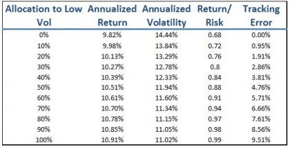
A fund comfortable with 4% tracking error may resist a 100% allocation to low vol but could still benefit from a 40% allocation.  Historically, that would have provided enhanced return with a reduction in volatility versus the S&P 500. When it comes to low vol, a little exposure goes a long way.

The posts on this blog are opinions, not advice. Please read our Disclaimers.

Rieger Report: Insured municipal bonds remain cheap

Contributor Image
J.R. Rieger

Former Head of Fixed Income Indices

S&P Dow Jones Indices

Okay, the mono-line insurance companies aren’t going to enjoy this note.  After all, yields of insured bonds should be lower than bonds that are un-insured.  Prior to the great recession approximately half of the municipal bonds outstanding were insured and during that time insured bonds were more in demand than un-insured bonds.  Beginning with the great recession we have seen yields of insured bonds higher than un-insured bonds as questions about the viability of the insurers themselves were prominent worries in the market place.  It is understood that not all mono-line insurers are the same credit quality, some are stronger than others.  However, in aggregate the impact is impressive.

Using the weighted average yields of bonds in the S&P Municipal Bond Insured Index and the S&P Municipal Bond Investment Grade Index the difference can be highlighted. The result has been yield ‘pickup’ between insured and investment grade municipal bonds as of Feb. 25 2016 was 28bps.  In general, it is cheaper to buy insured bonds than un-insured bonds and as a result returns have been higher.

Chart 1: Select municipal bond indices and their yields and returns over three year period

Source: S&P Dow Jones Indices, LLC.  www.spindices.com.   Data as of February 25, 2016.
Source: S&P Dow Jones Indices, LLC. www.spindices.com. Data as of February 25, 2016.

The risk of generalizing or over simplifying the complex municipal bond market  is inherent in any broad analysis.  Each issuer and each mono-line insurer has their own credit profile. The indices aggregate the bonds to provide the weighted average statistics used.

The posts on this blog are opinions, not advice. Please read our Disclaimers.

The True North Strong and Free! (But Not Free From Debt)

Contributor Image
Kevin Horan

Former Director, Fixed Income Indices

S&P Dow Jones Indices

Lyrics to the Canadian national anthem, “O Canada,” state “The true north strong and free!”  Like in the U.S and many other countries, government and corporate debt has become a big issue in Canada.

The Canadian overnight rate stands at 0.5% and will most likely remain unchanged or decrease even more.  Central Bank Governor Stephen Poloz’s decision on Jan. 20, 2016, to keep the benchmark rate at 0.5% halted a slide in the currency.

With rates so low, governments have been looking to more than just monetary policy to stimulate their economies.  The newly elected Canadian government has looked to infrastructure spending as a way to grease the economic skids.  Prime Minister Justin Trudeau said the federal government would fast-track infrastructure spending.

The newly elected liberal government said the deficit could swell to CAD 30 billion in the 2016-2017 fiscal year amid a starkly weaker outlook for the economy.  Such a large deficit would be 1.5% of GDP.  Compared to the amount of debt the U.S. carries, with obligations to other countries such as China, Canada’s AAA rating and debt amount look pretty good, but investors should be aware that the situation is and will be changing.  Larger amounts of longer-term debt may make the Canadian indices more sensitive to interest rate movements.

Exhibit 1 shows the percentage changes in the Canadian dollar amount of debt for each fixed income asset class for 2015.  The amount of debt outstanding for 2016 is expected to grow as the new government’s policies are put into place.

Exhibit 1: Index Increases of Market Value
Douglas Porter Quote

Canada Fixed Income Annual Issuance

Source: S&P Dow Jones Indices LLC.  Data as of Dec. 31, 2015.  Past performance is no guarantee of future results.  Chart is provided for illustrative purposes. *Globe and Mail, BoC holds rates; bets stimulus, global gains will ease economic pain, Barrie McKenna, January 20, 2016.

The posts on this blog are opinions, not advice. Please read our Disclaimers.

Rieger Report: Puerto Rico Watch

Contributor Image
J.R. Rieger

Former Head of Fixed Income Indices

S&P Dow Jones Indices

Another way to track the impact of the storm that is Puerto Rico is to look at the municipal bond market in two ways: with and without Puerto Rico.  The new S&P Municipal Bond High Yield ex Puerto Rico Index excludes any bond issued by Puerto Rico.  Puerto Rico bonds are included in the S&P Municipal Bond High Yield Index  and as a result add 129bps to the yield of the entire muni junk bond market (as of Feb. 24, 2016).

Chart 1: S&P Municipal Bond High Yield ex Puerto Rico vs. S&P Municipal Bond High Yield Index

Source: S&P Dow Jones Indices, LLC. www.spindices.com. Data as of February 24, 2016.


The posts on this blog are opinions, not advice. Please read our Disclaimers.

Where Are Spreads?

Contributor Image
Kevin Horan

Former Director, Fixed Income Indices

S&P Dow Jones Indices

In case you have had  your head down focusing on other things, and not taken a moment to look at what  spreads have been doing, the following chart will provide you with  a snapshot as of February 23, 2016.  Key takeaways include:

  • Looking at commodities, Oil, as measured by WTI futures contracts, has bounced from a low of $28 to a current price of $31; the Energy sector is a whopping 119 bps wider year-to-date and the Materials sector is 49 bps wider.
  • Telecommunications moved 41 bps wider due to the valuation of companies such as Verizon, AT&T and Qwest. Smaller rivals competing for sales have been a concern.
  • Consumer Discretionary has widened as spending has slowed possibly due to the winter season and consumers holding back until the economy shows more of a positive direction.


Chart 1: Year-To-Date Change in Option Adjusted Spreads of the S&P 500 Bond Index
Year-to-date Change in Option Adjusted Spread

Source: S&P Dow Jones Indices LLC., Data as of Feb. 23, 206. Past performance is no guarantee of future results. Chart is provided for illustrative purposes.

The posts on this blog are opinions, not advice. Please read our Disclaimers.