Get Indexology® Blog updates via email.

In This List

What's Brewing In The Commodities Cauldron?

How Indexing Works in Financial Literacy

The FOMC and GDP: Not As Confusing As It Looks

Rising Rates' Silver Linings

How Did European Active Managers Perform Over the Past 10 Years?

What's Brewing In The Commodities Cauldron?

Contributor Image
Jodie Gunzberg

Former Managing Director, Head of U.S. Equities

S&P Dow Jones Indices

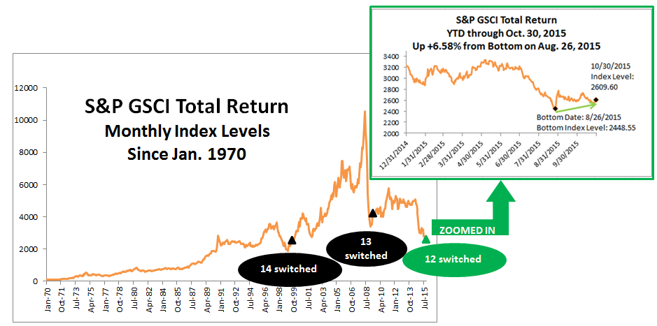
Overall in October, the gassy hogs (natural gas -15.3%, lean hogs -11.3%) cast a spell over the sweet meat (sugar +12.7%, all cattle +8.5%) for a flat brew of commodities that were neither a trick nor treat. Although the S&P GSCI was up just 23 basis points and the Dow Jones Commodity Index was down only 87 basis points, commodities in October may be waking from the dead.

This past July, just three months ago, every single commodity was negative except for one. Commodities have made a remarkable comeback with more than half (13 of 24) posting positive returns in October. There has never been a time in history where 12 single commodities went from posting a negative month to a positive month this quickly after 23 were negative together. However, in January 2009, 11 single commodities came back, just before the S&P GSCI hit its bottom, the next month in February 2009. That month, 8 commodities were positive but by May 2009, 13 additional commodities posted gains so that almost all were positive (21 of 24.) Also, in August 1999, 18 single commodities were positive after just 4 were positive in May that year, following its bottom, just a couple months earlier in February.

Source: S&P Dow Jones Indices

A few other scary statistics in October are the following:

  • S&P GSCI Total Return is -19.3% YTD through October 30, 2015, the 4th worst on record since 1970.  Worse YTD returns through Oct happened in 2008, 2001 and 1998, down 27.5%, 27.1% and 25.6%, respectively.
  • S&P GSCI Total Return is on pace for the 6th worst year on record since 1970. 2008,1998, 2014, 2001 and 1981 were worse, losing 46.5%, 35.8%, 33.1%, 31.9% and 23.0%, respectively.
  • S&P GSCI is on pace to set the 1st 3-year consecutive negative annual return. 2013 and 2014 lost 1.2% and 33.1%, respectively.
  • S&P GSCI is set to have the worst back-to-back 2-year loss in history since 1970, but 2008’s loss alone, is still worse by 51 basis points – even with 2013 included.
  • This is the 3rd worst October on record for number of commodities in contango. 17 of 24 commodities in the S&P GSCI were in contango in October, compared to just 12 in October 2014. Only October 2001 and October 2009 had more commodities in contango with 18 and 20 in contango, respectively.
  • S&P GSCI Natural Gas Total Return lost 15.3% in October 2015, recording its 3rd worst October in history (since Feb 1994) and worst October in 10 years. October 1998 lost 15.9% and October 2005 lost 15.3%.


The posts on this blog are opinions, not advice. Please read our Disclaimers.

How Indexing Works in Financial Literacy

Contributor Image
Shaun Wurzbach

Managing Director, Head of Commercial Group (North America)

S&P Dow Jones Indices

It is encouraging and inspiring to see that organizations and professional bodies are willing to roll up their sleeves and help for a good cause.  The good cause in this case is financial literacy, and the organizing body was the New York Public Library during their semi-annual Financial Planning Day on October 23rd.

McGraw Hill Financial (MHFI), the parent company of S&P Dow Jones Indices, supports the New York Public Library’s Science, Industry, and Business Library (SIBL) in their Financial Literacy campaign.  MHFI’s Corporate Responsibility and Sustainability team Co-Sponsored this event with the Financial Planning Association (FPA) of New York.  More than a dozen other organizations participated with volunteers and information for attendees.  Counselors from FPA NY, Community Service Society of NY, and the Health Insurance Information and Counseling and Assistance Program were on hand to provide advice.  MHFI was asked by the organizers to provide an information session to attendees on how indexing works.

To do that, I invited Dr. David Blitzer, Chairman of our S&P DJI Index Committees, and Todd Rosenbluth, Head of ETF and Mutual Fund Evaluation at S&P Capital IQ, to collaborate and present on this topic together.  Our approach was to combine index education from S&P DJI with fund education from S&P Capital IQ to help the audience better understand some of the investment choices they might find in everyday life such as investing with funds in an Individual Retirement Account (IRA) or through a 401K plan.  Here are some of the key points that David and Todd communicated:

Dr David Blitzer, S&P DJI:

  • Historically, over any period of a year or more, about 2 out of 5 mutual funds outperform and three of five underperform their benchmark
  • Good performance does not persist for many active mutual funds – our data has shown a 40% chance of beating an S&P benchmark in 1 year, 16% for two years in a row, 6% in three consecutive years
  • Why? Index products typically have lower fees than active products – better to keep as much of your money as you can, not give it away to manager fees.

Todd Rosenbluth, S&P Capital IQ / SNL:

  • Finding actively managed funds that outperformed the S&P 500 index over the short and long term is hard. This is why investors pulled $150 billion out of active mutual funds and ETFs in the 12 months ended September 2015 and added $461 billion to passive products according to Morningstar data.
  • Those that want active management should seek out funds with a below-average expense ratio and an experienced management team, and that have generated strong returns with below average volatility.
  • If investors do their homework they may reduce the likelihood of holding a below-average fund, but it may still end up in their portfolio.

The audience of 75 was interested, attentive, and asked very good questions, such as “why use an equally weighted index rather than the S&P 500?” and “Can an index keep pace with rapidly adopted innovations in an economy, or is it too passive to do that?”  David and Todd answered all questions and stayed afterwards with attendees who lined up to ask more questions.

The posts on this blog are opinions, not advice. Please read our Disclaimers.

The FOMC and GDP: Not As Confusing As It Looks

Contributor Image
David Blitzer

Former Managing Director and Chairman of the Index Committee

S&P Dow Jones Indices

The statement issued by the FOMC, the Fed’s policy making unit, following its meeting on Wednesday sent a clear message that the central bank expects to raise interest rates at its next sit-down in December.  Thursday morning at 8:30 AM the Bureau of Economic Analysis published the advance estimate of third quarter GDP showing a 1.5% real (inflation adjusted) annual growth rate for the economy, down by more than half from the second quarter’s 3.9% pace.  Is the Fed right to be bullish on the economy or were they as disappointed by the GDP report as most other people?

First, the FOMC’s statement: the key change was dropping the warning, “Recent global economic and financial developments may restrain economic activity somewhat and are likely to put further downward pressure on inflation in the near term” from September’s statement.  The current statement goes on to reiterate that “economic activity will expand at a moderate pace with labor market indicators continuing to move towards levels the Committee judges consistent with its dual mandate.”  Finally, the statement makes mention of raising interest rates and notes that any action will be based on both actual data and expected developments: “In determining whether it will be appropriate to raise the target range [for the Fed funds rate] its next meeting, the Committee will assess progress – both realized and expected – towards its objectives of maximum employment and two percent inflation.”

In simple terms, unless the economy is a lot worse than we think, we will raise interest rates by Christmas.

The top line GDP number looks weak, but a glance at the details shows that the Fed’s position is consistent the GDP release.   If one ignores inventories and imports and looks at the growth in real final sales of domestic product, the third quarter figure is 3.0%, down from 3.9%, a modest drop.  There were some soft spots in third quarter GDP, but nothing alarming. Personal consumption expenditures were up 3.2% at real annual rates compared to 3.6% in the second quarter, total government expenditures and investment (which excludes transfer payments like social security) slowed as did construction. Imports – which reflect buying by domestic purchasers and reduces GDP – grew faster in the third than the second quarter.  Exports grew, but less rapidly, than in the previous quarter.

All in all, the GDP report was reasonably good even if the headline was a cause for concern. In any event, it will be revised at the end of November, before the next FOMC meeting. Most revisions generate a small improvement.

The chart compares GDP growth with the growth in final sales of domestic product. The latter excludes volatile inventory moves and may give a more accurate picture of the economy.  Growth rates throughout are seasonally adjusted real annual rates.

The posts on this blog are opinions, not advice. Please read our Disclaimers.

Rising Rates' Silver Linings

Contributor Image
Fei Mei Chan

Former Director, Core Product Management

S&P Dow Jones Indices

Bond values will, definitionally, fall when interest rates rise. However, different types of bonds have differing characteristics.

The chart below shows the annual performance of the S&P 500 Bond Index and the S&P/BG Cantor 7-10 US Treasury Bond Index. (The S&P/BG Cantor 7-10 US Treasury Bond Index is the treasury index most similar to the S&P 500 Bond Index in duration and yield.) Notably, the performance of corporate debt and Treasuries diverged in the 2008 financial crisis and the recovery thereafter.

Rising Rates' Silver Linings1

As between the S&P 500 Bond index and the S&P/BG Cantor 7-10 US Treasury Bond Index, the former is much more correlated to the S&P 500, 0.256 versus -0.194, respectively. This is not surprising, since corporate debt carries a higher risk than Treasuries. When crisis is such a threat that corporations’ survival is at peril then naturally debt issued by corporations will also be in danger of default.

The two bond indices also had varying performance profiles in increasing and declining interest rate environments. Between 1995 and 2015, the months when Treasuries delivered their worst performance were the months when corporate bonds outperformed Treasuries by the largest spread (see table below). We divided the 249 months in this period into modified quartiles based on whether the S&P/BGCantor 7-10 Year US Treasury Bond Index was positive or negative and then further divided those months equally into the biggest and moderate changes in each direction. In the worst quartile for Treasuries, an average monthly decline of 2.04%, the S&P 500 Bond Index’s average decline was only 0.79%, an outperformance of 1.24%. In those same months, an archetypal 60/40 allocation with corporate bonds yielded outperformance of 0.49% versus one with Treasuries.

Rising Rates' Silver Linings2

Heightened sensitivity to anticipated interest rate increases is understandable. However, the impact of interest rate changes varies with different types of bonds. Historically, when interest rates rose, their effect on corporate bonds have been muted compared to that of Treasuries. Similarly, a balanced allocation incorporating corporate bonds has offered more protection relative to Treasuries during these times.

The posts on this blog are opinions, not advice. Please read our Disclaimers.

How Did European Active Managers Perform Over the Past 10 Years?

Contributor Image
Daniel Ung

Former Director

Global Research & Design

Like in recent years, Greece has yet again dominated the European headlines for most of this year.  Contagion effects have been somewhat contained, thanks to a more solid European economy and financial system.  Nevertheless, the market has experienced bouts of heightened volatility, especially in June 2015 when the Greek authorities decided to shut their banks down to stem a potential liquidity crisis in the country.

Given this backdrop, we have decided to compile data on the 10-year performance of European active managers for the first time, and here are the results.

EUROPE

  • Over the one-year period, 55% of the euro-denominated active funds invested in European equities lagged their respective benchmarks.
  • This level of underperformance was even more acute over the longer term. When viewed over a 10-year period, about 92% of actively managed eurozone equity funds trailed their respective benchmark.

For more information, you can access the full report via this link.

Capture

The posts on this blog are opinions, not advice. Please read our Disclaimers.